MeDo

Générateur de Hero Section IA.

Écrivez une phrase sur ce que vous construisez et obtenez un hero complet above-the-fold — titre, sous-titre, appel à l'action et mise en page — prêt à publier.

Hero Section
Hero Section

Tout site web se joue dans les cinq premières secondes

La hero section est l'espace le plus scruté de n'importe quelle page web — c'est là que les visiteurs décident en quelques secondes s'ils restent, scrollent ou partent. Un titre clair qui nomme la valeur, un sous-titre qui inspire confiance et un CTA qui élimine la friction peuvent doubler le temps passé sur la page et les inscriptions à l'essai sans rien changer d'autre. Maîtrisez le hero, et chaque section en dessous bénéficie d'une audience plus réceptive.

6 modèles

Modèles de Hero Section que vous pouvez générer

Chaque modèle est un vrai prompt, pas une capture d'écran. Copiez-le dans n'importe quel éditeur IA, ou exécutez-le dans MeDo pour récupérer du code React + Tailwind.

Split screenAcme

Copy Left, Product Screenshot Right

The default B2B SaaS hero. It works because the screenshot answers "what is this" while the headline is still being read — an abstract illustration in that slot leaves the visitor guessing.

Create a split-screen hero section: a left column with an eyebrow label, an H1 of six to ten words naming the outcome, a two-line subheading, a primary "Start free trial" button and a subordinate ghost "Watch demo" button, and a row of five grayscale customer logos underneath. The right column holds a product screenshot inside a browser chrome frame, rendered at an explicit width and height so it never shifts the layout, eagerly loaded and marked as the LCP image with a low-quality blur placeholder behind it. Stack to a single column below 1024px with the screenshot after the copy, and reduce the H1 by one step on mobile.

Tester dans MeDo
CenteredMega

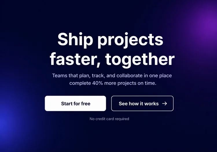
Centered Headline With a Logo Wall

One column, everything on the axis, proof directly beneath the buttons. Reach for it when you have no screenshot worth showing yet but do have recognisable customers.

Create a centered hero section on a single column with a max width of 48rem: a small pill badge announcing a launch, an H1 of seven to nine words, a supporting paragraph of no more than two lines, then one primary button with a quiet text-link secondary beside it. Below that, a one-line trust note and a wall of six monochrome customer logos at reduced opacity that lifts to full on hover. Keep everything above 720px of viewport height on a laptop. On mobile, drop to four logos in two rows and make the primary button full width.

Tester dans MeDo
TerminalShipfast

Developer Hero With an Install Command

For dev tools the install line is the CTA. A "Book a demo" button in this hero reads as enterprise friction and gets skipped by exactly the audience you wanted.

Create a developer-tool hero section: a left column with a GitHub star count chip, an H1 stating the problem in plain language, one line of supporting copy, and a monospace install command in a bordered box with a copy-to-clipboard button that switches to a "Copied" state for two seconds. Beside it, a secondary link to the docs. The right column shows a syntax-highlighted code block with a filename tab, pre-rendered as static markup rather than a client-side highlighter. Single column under 900px with the code block collapsing to a horizontally scrollable pane.

Tester dans MeDo
Full bleedStudio

Full-Bleed Image Hero With Overlay Copy

An agency and consumer-brand staple. The risk is legibility: text over a photograph needs a gradient scrim, not a hopeful guess about how dark that corner of the image is.

Create a full-bleed hero section with a background photograph covering the viewport width at a fixed 70vh height on desktop and 60vh on mobile. Serve the image at responsive widths with a srcset, load it eagerly as the LCP element, and lay a bottom-up dark gradient scrim over it so overlaid text keeps at least 4.5:1 contrast regardless of the photo. On top, left-aligned: an H1 of five to eight words in large tight-tracked type, one line of positioning copy, and a single outlined white button. No secondary action. Add a reduced-motion-safe fade-in on the copy only.

Tester dans MeDo
TypographicBuilders

Oversized Type, No Imagery

No image means no LCP image — the largest paintable element is text, which is the fastest hero you can ship. Use it when the positioning line is strong enough to carry the fold alone.

Create a typographic hero section with no imagery: an H1 spanning most of the container width at a fluid clamp between 2.5rem and 6rem with tight leading and negative letter spacing, broken deliberately across three lines. Underneath, a single supporting sentence at body size in a muted tone, then one primary button and a text link. Add a thin rule and a small row of three metrics with labels at the bottom of the section. Since the H1 is the LCP element, self-host the display font with font-display: swap and preload it. Reflow the H1 to smaller steps at 768px and 480px.

Tester dans MeDo
Form-firstBrand*

Hero With an Inline Signup Form

Puts the conversion step in the fold instead of linking to it. Worth the extra complexity only when the form is one field — a three-field hero form converts worse than a button.

Create a hero section with an inline signup form: centered copy with an H1 of six to nine words and a one-line subheading, then a single-field form on one row — an email input with a visible label, a submit button reading "Get early access", and a helper line about no spam. Handle three states inline: idle, submitting with a disabled button and spinner, and a success message that replaces the form while keeping the container height stable. Show validation errors under the input, associated by aria-describedby. Stack input above button below 640px and keep both full width.

Tester dans MeDo

Comment personnaliser votre Hero Section

Commencez par le résultat que votre utilisateur recherche déjà

Les meilleurs titres de hero nomment l'état final que le visiteur poursuit déjà — « Lancez plus vite », « Dormez tranquille en sachant que vos données sont en sécurité », « Divisez vos dépenses pub par deux ». Oubliez ce qu'est votre produit ; commencez par ce qu'il fait pour eux. Vous pouvez expliquer le comment dans le sous-titre.

Utilisez un seul CTA principal impossible à manquer

Chaque élément de la hero section doit diriger le regard vers un bouton principal. Proposer trois liens de poids égal divise l'intention et tue les clics. Si vous avez besoin d'une option secondaire (ex. « Voir la démo »), rendez-la visuellement subordonnée — style ghost, plus petite ou texte seul.

Ancrez la crédibilité avec une bande de preuve sociale compacte

Une rangée de logos clients reconnaissables, une courte ligne de statistiques (« Approuvé par plus de 12 000 équipes ») ou une note en étoiles juste sous le CTA agit comme un point de preuve silencieux. Cela réduit l'hésitation « est-ce fiable ? » sans détourner l'attention du message principal.

Montrez le produit, pas une illustration abstraite

Une capture d'écran recadrée ou un mockup animé du produit réel dans un cadre de navigateur ou d'appareil convertit mieux qu'une photo stock générique ou un élément décoratif. Les visiteurs veulent savoir à quoi ils s'inscrivent — montrer l'interface répond à cette question avant qu'ils n'aient à la poser.

Qui utilise le composant Hero Section

Landing page de produit SaaS

Les hero sections SaaS associent typiquement un titre court axé sur le bénéfice avec une capture du produit ou un mockup de tableau de bord, un CTA d'essai gratuit et une rangée de logos clients — donnant aux visiteurs assez de contexte pour s'inscrire sans scroller.

Outil développeur ou projet open-source

Les heroes d'outils dev sont techniques : un titre en gras formulant le problème, un snippet de code ou bloc terminal montrant l'intégration clé, un compteur d'étoiles GitHub et une commande npm install comme CTA principal.

Agence ou studio créatif

Les heroes d'agences privilégient l'impact visuel — arrière-plans vidéo plein écran ou grands traitements typographiques, une déclaration de positionnement sur une ligne et un seul CTA « Voir nos réalisations » ou « Demander un devis » avec un minimum de texte autour.

E-commerce ou produit grand public

Les heroes de produits grand public combinent une photographie lifestyle avec un titre émotionnel accrocheur, une brève ligne de caractéristiques et un bouton « Ajouter au panier » ou « Acheter maintenant » — souvent accompagné d'une offre limitée dans le temps ou d'une mention de livraison gratuite.

Modèles de Hero Section pour différents sites web

Le même composant hero section, adapté au type de site sur lequel il est publié.

01 / 06

SaaS Product Hero

Split layout, product screenshot on the right, free-trial CTA and a logo strip. The screenshot is the whole argument here, so crop it to one legible screen rather than shrinking the full dashboard until every label is unreadable.

Styles et variantes de Hero Section

Choisissez la variante qui correspond au reste de la page, puis générez-la.

01 / 06

Split-Screen Hero

Copy on one side, visual on the other, at roughly a 50/50 or 60/40 split. The most forgiving layout because the text column keeps a natural measure. Decide explicitly whether the image or the copy comes first when it stacks — usually copy.

Hero Section en React, Next.js, Vue et Svelte

React, Next.js, Vue 3, SvelteKit, Astro ou HTML simple — le même hero section, six façons de l'intégrer.

01 / 06

React Hero Section

A plain function component — a hero has no state unless it carries a form or carousel. Take the headline, subheading and CTA labels as props so the same hero serves several campaign pages.

src/components/Hero.tsx

export function Hero({ title, subtitle, cta }) {
  return (
    <section className="grid gap-10 py-24 lg:grid-cols-2">
      <div>
        <h1 className="text-5xl font-semibold">{title}</h1>
        <p className="mt-4 text-lg text-zinc-400">{subtitle}</p>
        {cta}
      </div>
      <img src="/product.png" alt="" width={960} height={640} />
    </section>
  )
}

Comment ajouter votre Hero Section à un projet

Quatre étapes, du choix d'un modèle de hero section à sa mise en production.

01~30s

Pick a Hero Template

Choose by what you actually have to show: a screenshot means split-screen, recognisable customers mean centered with a logo wall, neither means typographic.

02~10s

Copy the Prompt

Take the prompt into MeDo, Lovable, Bolt, v0 or Cursor. Replace the placeholder headline with your real one before you run it — the layout is decided by how long that line is.

03~2min

Generate and Refine

You get React + Tailwind back with a live preview. Follow up in plain English — "make the secondary button a text link", "tighten the H1 tracking" — rather than editing class strings by hand.

04~1min

Place It Above the Fold

Drop it in as the first section after your header, swap the placeholder for a real image with explicit dimensions and eager loading, and confirm the page still has exactly one h1.

Questions fréquentes à propos de Hero Section

Qu'est-ce qu'un générateur de hero section IA ?

Un générateur de hero section IA est un outil qui prend une description en langage naturel de votre produit, audience et style et produit un hero complet above-the-fold — titre, sous-titre, boutons CTA et code stylisé prêt pour la production. MeDo génère le composant complet incluant la mise en page, la typographie, les couleurs et le comportement responsive, pas juste un bout de code.

Comment créer une hero section avec l'IA ?

Ouvrez MeDo et décrivez ce que vous construisez : le produit, l'audience cible, le ton et toute préférence visuelle. Par exemple : « Hero section pour une app de facturation freelance ciblant les designers — fond blanc épuré, titre en gras sur le paiement à temps, un CTA principal et une capture produit à droite. » MeDo génère la section ; vous pouvez l'affiner avec des prompts de suivi pour ajuster le texte, la mise en page ou les couleurs.

Que doit contenir une hero section ?

Une hero section efficace nécessite au minimum : un titre qui énonce la proposition de valeur principale en une ligne, un sous-titre qui ajoute du contexte ou une preuve, un bouton CTA principal avec un libellé orienté résultat et un visuel de support (capture, illustration ou vidéo). Les heroes performants incluent aussi un signal de confiance bref — un nombre de clients, une bande de logos ou une mention presse — pour réduire le scepticisme initial.

Quel est le meilleur outil IA pour générer des hero sections ?

MeDo est conçu spécifiquement pour générer des composants UI individuels à partir de prompts en langage naturel, y compris les hero sections. Contrairement aux outils de chat IA généraux, MeDo comprend les patterns de conversion des landing pages, les bonnes pratiques d'accessibilité et la structure des composants — le résultat est donc réellement utilisable en production, pas juste du code d'apparence plausible nécessitant une réécriture.

Quelle longueur doit avoir le titre d'une hero section ?

Les titres de hero les plus efficaces font 5 à 10 mots — assez courts pour être lus d'un seul coup d'œil, assez spécifiques pour signaler exactement à qui s'adresse le produit et ce qu'il fait. Évitez le jargon et les superlatifs. Si votre titre a besoin d'un point-virgule ou d'une seconde proposition pour avoir du sens, ce sont probablement deux titres : choisissez le plus percutant.

Puis-je générer différents styles de hero section avec l'IA ?

Oui. MeDo prend en charge tout layout ou style visuel que vous pouvez décrire — texte centré avec fond en gradient, division texte-gauche/image-droite, hero vidéo plein écran, hero typographique minimaliste, vitrine produit en mode sombre et plus. Incluez le style visuel dans votre prompt, ou demandez à MeDo de générer deux ou trois variantes pour comparer avant de choisir.