
MeDo

KI-Hero-Section-Generator.

Schreiben Sie einen Satz darüber, was Sie entwickeln, und erhalten Sie einen vollständigen Above-the-Fold-Hero — Überschrift, Unterüberschrift, Call-to-Action und Layout — sofort einsatzbereit.

Hero Section
Hero Section

Jede Website steht und fällt mit den ersten fünf Sekunden

Die Hero Section ist das meistbeachtete Stück Fläche auf jeder Webseite — hier entscheiden Besucher in Sekunden, ob sie bleiben, scrollen oder gehen. Eine klare Überschrift, die den Mehrwert benennt, eine Unterüberschrift, die Vertrauen schafft, und ein CTA, der Reibung beseitigt, können die Verweildauer und Trial-Anmeldungen verdoppeln, ohne etwas anderes zu ändern. Meistere den Hero, und jeder Abschnitt darunter erhält ein aufgeschlosseneres Publikum.

6 Vorlagen

Hero Section-Vorlagen, die Sie generieren können

Jede Vorlage ist ein echter Prompt, kein Screenshot. Kopieren Sie ihn in einen KI-Editor oder führen Sie ihn in MeDo aus und erhalten Sie React- und Tailwind-Code zurück.

Split screenAcme

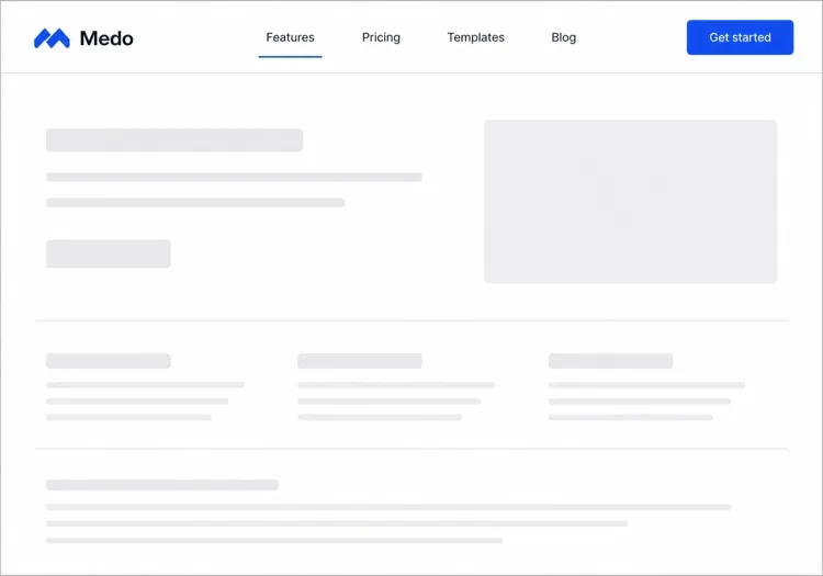
Copy Left, Product Screenshot Right

The default B2B SaaS hero. It works because the screenshot answers "what is this" while the headline is still being read — an abstract illustration in that slot leaves the visitor guessing.

Create a split-screen hero section: a left column with an eyebrow label, an H1 of six to ten words naming the outcome, a two-line subheading, a primary "Start free trial" button and a subordinate ghost "Watch demo" button, and a row of five grayscale customer logos underneath. The right column holds a product screenshot inside a browser chrome frame, rendered at an explicit width and height so it never shifts the layout, eagerly loaded and marked as the LCP image with a low-quality blur placeholder behind it. Stack to a single column below 1024px with the screenshot after the copy, and reduce the H1 by one step on mobile.

In MeDo testen
CenteredMega

Centered Headline With a Logo Wall

One column, everything on the axis, proof directly beneath the buttons. Reach for it when you have no screenshot worth showing yet but do have recognisable customers.

Create a centered hero section on a single column with a max width of 48rem: a small pill badge announcing a launch, an H1 of seven to nine words, a supporting paragraph of no more than two lines, then one primary button with a quiet text-link secondary beside it. Below that, a one-line trust note and a wall of six monochrome customer logos at reduced opacity that lifts to full on hover. Keep everything above 720px of viewport height on a laptop. On mobile, drop to four logos in two rows and make the primary button full width.

In MeDo testen
TerminalShipfast

Developer Hero With an Install Command

For dev tools the install line is the CTA. A "Book a demo" button in this hero reads as enterprise friction and gets skipped by exactly the audience you wanted.

Create a developer-tool hero section: a left column with a GitHub star count chip, an H1 stating the problem in plain language, one line of supporting copy, and a monospace install command in a bordered box with a copy-to-clipboard button that switches to a "Copied" state for two seconds. Beside it, a secondary link to the docs. The right column shows a syntax-highlighted code block with a filename tab, pre-rendered as static markup rather than a client-side highlighter. Single column under 900px with the code block collapsing to a horizontally scrollable pane.

In MeDo testen
Full bleedStudio

Full-Bleed Image Hero With Overlay Copy

An agency and consumer-brand staple. The risk is legibility: text over a photograph needs a gradient scrim, not a hopeful guess about how dark that corner of the image is.

Create a full-bleed hero section with a background photograph covering the viewport width at a fixed 70vh height on desktop and 60vh on mobile. Serve the image at responsive widths with a srcset, load it eagerly as the LCP element, and lay a bottom-up dark gradient scrim over it so overlaid text keeps at least 4.5:1 contrast regardless of the photo. On top, left-aligned: an H1 of five to eight words in large tight-tracked type, one line of positioning copy, and a single outlined white button. No secondary action. Add a reduced-motion-safe fade-in on the copy only.

In MeDo testen
TypographicBuilders

Oversized Type, No Imagery

No image means no LCP image — the largest paintable element is text, which is the fastest hero you can ship. Use it when the positioning line is strong enough to carry the fold alone.

Create a typographic hero section with no imagery: an H1 spanning most of the container width at a fluid clamp between 2.5rem and 6rem with tight leading and negative letter spacing, broken deliberately across three lines. Underneath, a single supporting sentence at body size in a muted tone, then one primary button and a text link. Add a thin rule and a small row of three metrics with labels at the bottom of the section. Since the H1 is the LCP element, self-host the display font with font-display: swap and preload it. Reflow the H1 to smaller steps at 768px and 480px.

In MeDo testen
Form-firstBrand*

Hero With an Inline Signup Form

Puts the conversion step in the fold instead of linking to it. Worth the extra complexity only when the form is one field — a three-field hero form converts worse than a button.

Create a hero section with an inline signup form: centered copy with an H1 of six to nine words and a one-line subheading, then a single-field form on one row — an email input with a visible label, a submit button reading "Get early access", and a helper line about no spam. Handle three states inline: idle, submitting with a disabled button and spinner, and a success message that replaces the form while keeping the container height stable. Show validation errors under the input, associated by aria-describedby. Stack input above button below 640px and keep both full width.

In MeDo testen

So passen Sie Ihre Hero Section an

Führen Sie mit dem Ergebnis, das Ihr Nutzer bereits anstrebt

Die besten Hero-Überschriften benennen den Endzustand, den der Besucher bereits verfolgt — „Schneller launchen", „Besser schlafen in dem Wissen, dass Ihre Daten sicher sind", „Werbeausgaben halbieren". Überspringen Sie, was Ihr Produkt ist; führen Sie mit dem, was es für den Nutzer tut. Das Wie können Sie in der Unterüberschrift erklären.

Verwenden Sie einen einzigen, unübersehbaren primären CTA

Jedes Element in der Hero Section sollte den Blick auf einen primären Button lenken. Drei gleichwertige Links aufzubieten spaltet die Absicht und killt Klicks. Wenn Sie eine sekundäre Option brauchen (z. B. „Demo ansehen"), machen Sie diese visuell untergeordnet — Ghost-Stil, kleiner oder nur Text.

Verankern Sie Glaubwürdigkeit mit einer kompakten Social-Proof-Leiste

Eine Reihe erkennbarer Kundenlogos, eine kurze Statistikzeile („Vertraut von über 12.000 Teams") oder eine Sternebewertung direkt unter dem CTA wirkt als stiller Vertrauensbeweis. Es reduziert das „Ist das seriös?"-Zögern, ohne den Fokus von der Hauptbotschaft abzulenken.

Zeigen Sie das Produkt, nicht eine abstrakte Illustration

Ein beschnittener Screenshot oder ein animiertes Mockup des tatsächlichen Produkts in einem Browser- oder Geräterahmen konvertiert besser als ein generisches Stockfoto oder ein dekoratives Element. Besucher wollen wissen, wofür sie sich anmelden — die UI zu zeigen beantwortet diese Frage, bevor sie gestellt werden muss.

Wer die Hero Section-Komponente nutzt

SaaS-Produkt-Landingpage

SaaS-Hero-Sections kombinieren typischerweise eine kurze, nutzenorientierte Überschrift mit einem Produkt-Screenshot oder Dashboard-Mockup, einem Kostenlos-testen-CTA und einer Reihe von Kundenlogos — genug Kontext, damit Besucher sich ohne Scrollen anmelden können.

Entwicklertool oder Open-Source-Projekt

Dev-Tool-Heroes sind technisch ausgerichtet: eine fettgedruckte Problemstellung als Überschrift, ein Code-Snippet oder Terminalblock mit der wichtigsten Integration, eine GitHub-Sternezahl und ein npm-install-Befehl als primärer CTA.

Agentur oder Kreativstudio

Agentur-Heroes priorisieren visuelle Wirkung — flächenfüllende Videohintergründe oder große typografische Gestaltungen, eine einzeilige Positionierungsaussage und ein einzelner „Unsere Arbeit ansehen"- oder „Angebot einholen"-CTA mit minimalem umgebendem Text.

E-Commerce oder Konsumprodukt

Konsumprodukt-Heroes kombinieren ein Lifestyle-Foto mit einer emotionalen Überschrift, einer kurzen Feature-Zeile und einem „In den Warenkorb"- oder „Jetzt kaufen"-Button — oft gepaart mit einem zeitlich begrenzten Angebot oder Gratis-Versand-Hinweis.

Hero Section-Muster für verschiedene Websites

Dieselbe hero section-Komponente, abgestimmt auf die Art der Website, auf der sie läuft.

01 / 06

SaaS Product Hero

Split layout, product screenshot on the right, free-trial CTA and a logo strip. The screenshot is the whole argument here, so crop it to one legible screen rather than shrinking the full dashboard until every label is unreadable.

Hero Section-Stile und -Varianten

Wählen Sie die Variante, die zum Rest der Seite passt, und generieren Sie sie.

01 / 06

Split-Screen Hero

Copy on one side, visual on the other, at roughly a 50/50 or 60/40 split. The most forgiving layout because the text column keeps a natural measure. Decide explicitly whether the image or the copy comes first when it stacks — usually copy.

Hero Section in React, Next.js, Vue und Svelte

React, Next.js, Vue 3, SvelteKit, Astro oder reines HTML — dieselbe hero section, sechs Wege zur Einbindung.

01 / 06

React Hero Section

A plain function component — a hero has no state unless it carries a form or carousel. Take the headline, subheading and CTA labels as props so the same hero serves several campaign pages.

src/components/Hero.tsx

export function Hero({ title, subtitle, cta }) {
  return (
    <section className="grid gap-10 py-24 lg:grid-cols-2">
      <div>
        <h1 className="text-5xl font-semibold">{title}</h1>
        <p className="mt-4 text-lg text-zinc-400">{subtitle}</p>
        {cta}
      </div>
      <img src="/product.png" alt="" width={960} height={640} />
    </section>
  )
}

So fügen Sie Ihre Hero Section einem Projekt hinzu

Vier Schritte, von der Auswahl einer hero section-Vorlage bis zum Einsatz in der Produktion.

01~30s

Pick a Hero Template

Choose by what you actually have to show: a screenshot means split-screen, recognisable customers mean centered with a logo wall, neither means typographic.

02~10s

Copy the Prompt

Take the prompt into MeDo, Lovable, Bolt, v0 or Cursor. Replace the placeholder headline with your real one before you run it — the layout is decided by how long that line is.

03~2min

Generate and Refine

You get React + Tailwind back with a live preview. Follow up in plain English — "make the secondary button a text link", "tighten the H1 tracking" — rather than editing class strings by hand.

04~1min

Place It Above the Fold

Drop it in as the first section after your header, swap the placeholder for a real image with explicit dimensions and eager loading, and confirm the page still has exactly one h1.

Häufige Fragen zu Hero Section

Was ist ein KI-Hero-Section-Generator?

Ein KI-Hero-Section-Generator ist ein Tool, das eine alltagssprachliche Beschreibung Ihres Produkts, Ihrer Zielgruppe und Ihres Stils entgegennimmt und einen vollständigen Above-the-Fold-Hero produziert — Überschrift, Unterüberschrift, CTA-Buttons und gestylten, produktionsreifen Code. MeDo generiert die komplette Komponente inklusive Layout, Typografie, Farben und responsivem Verhalten, nicht nur einen Code-Stub.

Wie erstelle ich eine Hero Section mit KI?

Öffnen Sie MeDo und beschreiben Sie, was Sie entwickeln: das Produkt, die Zielgruppe, den Ton und visuelle Präferenzen. Zum Beispiel: „Hero Section für eine Freelancer-Rechnungs-App für Designer — sauberer weißer Hintergrund, fette Überschrift über pünktliche Bezahlung, ein primärer CTA und ein Produkt-Screenshot rechts." MeDo generiert die Section; Sie können sie mit Folgeprompts verfeinern, um Text, Layout oder Farben anzupassen.

Was sollte eine Hero Section enthalten?

Eine starke Hero Section braucht mindestens: eine Überschrift, die das Kernversprechen in einer Zeile formuliert, eine Unterüberschrift, die Kontext oder Beweis liefert, einen primären CTA-Button mit ergebnisorientiertem Label und ein unterstützendes Visual (Screenshot, Illustration oder Video). Hochperformante Heroes enthalten außerdem ein kurzes Vertrauenssignal — eine Kundenzahl, Logoleiste oder Pressemention — um anfängliche Skepsis zu reduzieren.

Was ist das beste KI-Tool zum Generieren von Hero Sections?

MeDo ist speziell für die Generierung einzelner UI-Komponenten aus natürlichsprachlichen Prompts gebaut, einschließlich Hero Sections. Anders als allgemeine KI-Chat-Tools versteht MeDo Landingpage-Conversion-Muster, Barrierefreiheits-Best-Practices und Komponentenstruktur — so ist das Ergebnis tatsächlich produktionsreif nutzbar, nicht nur plausibel aussehender Code, der umgeschrieben werden muss.

Wie lang sollte eine Hero-Section-Überschrift sein?

Die effektivsten Hero-Überschriften sind 5–10 Wörter lang — kurz genug, um auf einen Blick gelesen zu werden, spezifisch genug, um genau zu signalisieren, für wen das Produkt ist und was es tut. Vermeiden Sie Fachjargon und Superlative. Wenn Ihre Überschrift ein Semikolon oder einen zweiten Nebensatz braucht, um Sinn zu ergeben, sind es wahrscheinlich zwei Überschriften: Wählen Sie die stärkere.

Kann ich verschiedene Hero-Section-Stile mit KI generieren?

Ja. MeDo unterstützt jedes Layout und jeden visuellen Stil, den Sie beschreiben können — zentrierter Text mit Gradient-Hintergrund, geteiltes Links-Text/Rechts-Bild-Layout, flächenfüllender Video-Hero, minimalistischer typografischer Hero, Dark-Mode-Produktpräsentation und mehr. Geben Sie den visuellen Stil in Ihrem Prompt an, oder bitten Sie MeDo, zwei oder drei Varianten zu generieren, damit Sie vergleichen können.
