MeDo

Generador de Hero Section con IA.

Escribe una frase sobre lo que estás construyendo y obtén un hero completo above-the-fold — titular, subtítulo, llamada a la acción y diseño — listo para publicar.

Hero Section
Hero Section

Todo sitio web triunfa o fracasa en los primeros cinco segundos

La hero section es el espacio más examinado de cualquier página web — es donde los visitantes deciden en segundos si quedarse, hacer scroll o irse. Un titular claro que nombra el valor, un subtítulo que genera confianza y un CTA que elimina la fricción pueden duplicar el tiempo en página y las inscripciones a pruebas sin cambiar nada más. Domina el hero, y cada sección debajo recibe una audiencia más receptiva.

6 plantillas

Plantillas de Hero Section que puedes generar

Cada plantilla es un prompt real, no una captura de pantalla. Cópialo en cualquier editor de IA o ejecútalo en MeDo y obtén código React + Tailwind.

Split screenAcme

Copy Left, Product Screenshot Right

The default B2B SaaS hero. It works because the screenshot answers "what is this" while the headline is still being read — an abstract illustration in that slot leaves the visitor guessing.

Create a split-screen hero section: a left column with an eyebrow label, an H1 of six to ten words naming the outcome, a two-line subheading, a primary "Start free trial" button and a subordinate ghost "Watch demo" button, and a row of five grayscale customer logos underneath. The right column holds a product screenshot inside a browser chrome frame, rendered at an explicit width and height so it never shifts the layout, eagerly loaded and marked as the LCP image with a low-quality blur placeholder behind it. Stack to a single column below 1024px with the screenshot after the copy, and reduce the H1 by one step on mobile.

Prueba en MeDo
CenteredMega

Centered Headline With a Logo Wall

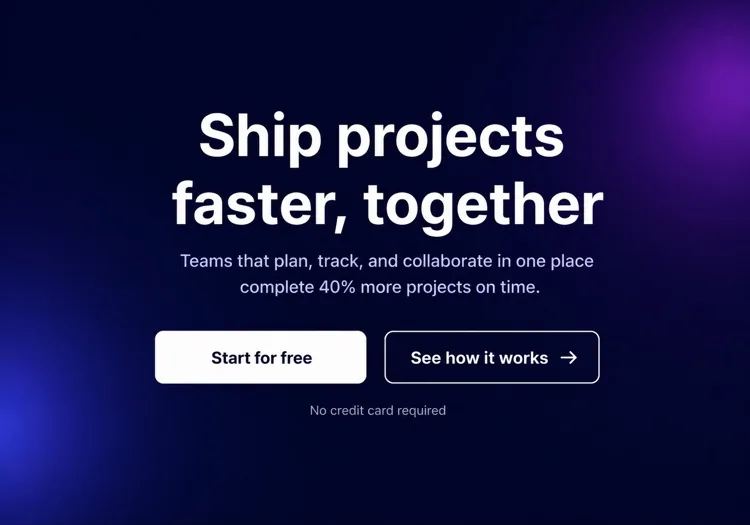
One column, everything on the axis, proof directly beneath the buttons. Reach for it when you have no screenshot worth showing yet but do have recognisable customers.

Create a centered hero section on a single column with a max width of 48rem: a small pill badge announcing a launch, an H1 of seven to nine words, a supporting paragraph of no more than two lines, then one primary button with a quiet text-link secondary beside it. Below that, a one-line trust note and a wall of six monochrome customer logos at reduced opacity that lifts to full on hover. Keep everything above 720px of viewport height on a laptop. On mobile, drop to four logos in two rows and make the primary button full width.

Prueba en MeDo
TerminalShipfast

Developer Hero With an Install Command

For dev tools the install line is the CTA. A "Book a demo" button in this hero reads as enterprise friction and gets skipped by exactly the audience you wanted.

Create a developer-tool hero section: a left column with a GitHub star count chip, an H1 stating the problem in plain language, one line of supporting copy, and a monospace install command in a bordered box with a copy-to-clipboard button that switches to a "Copied" state for two seconds. Beside it, a secondary link to the docs. The right column shows a syntax-highlighted code block with a filename tab, pre-rendered as static markup rather than a client-side highlighter. Single column under 900px with the code block collapsing to a horizontally scrollable pane.

Prueba en MeDo
Full bleedStudio

Full-Bleed Image Hero With Overlay Copy

An agency and consumer-brand staple. The risk is legibility: text over a photograph needs a gradient scrim, not a hopeful guess about how dark that corner of the image is.

Create a full-bleed hero section with a background photograph covering the viewport width at a fixed 70vh height on desktop and 60vh on mobile. Serve the image at responsive widths with a srcset, load it eagerly as the LCP element, and lay a bottom-up dark gradient scrim over it so overlaid text keeps at least 4.5:1 contrast regardless of the photo. On top, left-aligned: an H1 of five to eight words in large tight-tracked type, one line of positioning copy, and a single outlined white button. No secondary action. Add a reduced-motion-safe fade-in on the copy only.

Prueba en MeDo
TypographicBuilders

Oversized Type, No Imagery

No image means no LCP image — the largest paintable element is text, which is the fastest hero you can ship. Use it when the positioning line is strong enough to carry the fold alone.

Create a typographic hero section with no imagery: an H1 spanning most of the container width at a fluid clamp between 2.5rem and 6rem with tight leading and negative letter spacing, broken deliberately across three lines. Underneath, a single supporting sentence at body size in a muted tone, then one primary button and a text link. Add a thin rule and a small row of three metrics with labels at the bottom of the section. Since the H1 is the LCP element, self-host the display font with font-display: swap and preload it. Reflow the H1 to smaller steps at 768px and 480px.

Prueba en MeDo
Form-firstBrand*

Hero With an Inline Signup Form

Puts the conversion step in the fold instead of linking to it. Worth the extra complexity only when the form is one field — a three-field hero form converts worse than a button.

Create a hero section with an inline signup form: centered copy with an H1 of six to nine words and a one-line subheading, then a single-field form on one row — an email input with a visible label, a submit button reading "Get early access", and a helper line about no spam. Handle three states inline: idle, submitting with a disabled button and spinner, and a success message that replaces the form while keeping the container height stable. Show validation errors under the input, associated by aria-describedby. Stack input above button below 640px and keep both full width.

Prueba en MeDo

Cómo personalizar tu Hero Section

Lidera con el resultado que tu usuario ya desea

Los mejores titulares de hero nombran el estado final que el visitante ya persigue — "Lanza más rápido", "Duerme tranquilo sabiendo que tus datos están seguros", "Reduce tu gasto en publicidad a la mitad". Omite lo que tu producto es; lidera con lo que hace por ellos. Puedes explicar el cómo en el subtítulo.

Usa un CTA principal único e imposible de ignorar

Cada elemento en la hero section debe dirigir la mirada hacia un botón principal. Ofrecer tres enlaces con el mismo peso divide la intención y mata los clics. Si necesitas una opción secundaria (ej., "Ver demo"), hazla visualmente subordinada — estilo ghost, más pequeña o solo texto.

Ancla la credibilidad con una franja de prueba social compacta

Una fila de logos de clientes reconocibles, una línea de estadísticas corta ("Confianza de más de 12.000 equipos") o una calificación con estrellas justo debajo del CTA actúa como punto de prueba silencioso. Reduce la duda de "¿esto es legítimo?" sin quitar el foco del mensaje principal.

Muestra el producto, no una ilustración abstracta

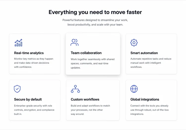
Una captura recortada o un mockup animado del producto real dentro de un marco de navegador o dispositivo convierte mejor que una foto de stock genérica o un elemento decorativo. Los visitantes quieren saber a qué se están inscribiendo — mostrar la interfaz responde esa pregunta antes de que tengan que hacerla.

Quién usa el componente Hero Section

Landing page de producto SaaS

Las hero sections de SaaS típicamente combinan un titular corto orientado al beneficio con una captura del producto o mockup de dashboard, un CTA de prueba gratuita y una fila de logos de clientes — dando a los visitantes suficiente contexto para registrarse sin hacer scroll.

Herramienta para desarrolladores o proyecto open-source

Los heroes de herramientas dev son técnicos: un titular en negrita con la declaración del problema, un snippet de código o bloque de terminal mostrando la integración clave, un conteo de estrellas en GitHub y un comando npm install como CTA principal.

Agencia o estudio creativo

Los heroes de agencias priorizan el impacto visual — fondos de video de borde a borde o grandes tratamientos tipográficos, una declaración de posicionamiento en una línea y un único CTA de "Ver nuestro trabajo" o "Pedir presupuesto" con texto mínimo alrededor.

E-commerce o producto de consumo

Los heroes de productos de consumo combinan una fotografía de estilo de vida con un titular emocional, una breve línea de características y un botón de "Añadir al carrito" o "Comprar ahora" — a menudo acompañado de una oferta por tiempo limitado o nota de envío gratis.

Patrones de Hero Section para distintos sitios web

El mismo componente hero section, adaptado al tipo de sitio donde se publica.

01 / 06

SaaS Product Hero

Split layout, product screenshot on the right, free-trial CTA and a logo strip. The screenshot is the whole argument here, so crop it to one legible screen rather than shrinking the full dashboard until every label is unreadable.

Estilos y variantes de Hero Section

Elige la variante que encaje con el resto de la página y genérala.

01 / 06

Split-Screen Hero

Copy on one side, visual on the other, at roughly a 50/50 or 60/40 split. The most forgiving layout because the text column keeps a natural measure. Decide explicitly whether the image or the copy comes first when it stacks — usually copy.

Hero Section en React, Next.js, Vue y Svelte

React, Next.js, Vue 3, SvelteKit, Astro o HTML puro: el mismo hero section, seis formas de integrarlo.

01 / 06

React Hero Section

A plain function component — a hero has no state unless it carries a form or carousel. Take the headline, subheading and CTA labels as props so the same hero serves several campaign pages.

src/components/Hero.tsx

export function Hero({ title, subtitle, cta }) {
  return (
    <section className="grid gap-10 py-24 lg:grid-cols-2">
      <div>
        <h1 className="text-5xl font-semibold">{title}</h1>
        <p className="mt-4 text-lg text-zinc-400">{subtitle}</p>
        {cta}
      </div>
      <img src="/product.png" alt="" width={960} height={640} />
    </section>
  )
}

Cómo añadir tu Hero Section a un proyecto

Cuatro pasos, desde elegir una plantilla de hero section hasta llevarlo a producción.

01~30s

Pick a Hero Template

Choose by what you actually have to show: a screenshot means split-screen, recognisable customers mean centered with a logo wall, neither means typographic.

02~10s

Copy the Prompt

Take the prompt into MeDo, Lovable, Bolt, v0 or Cursor. Replace the placeholder headline with your real one before you run it — the layout is decided by how long that line is.

03~2min

Generate and Refine

You get React + Tailwind back with a live preview. Follow up in plain English — "make the secondary button a text link", "tighten the H1 tracking" — rather than editing class strings by hand.

04~1min

Place It Above the Fold

Drop it in as the first section after your header, swap the placeholder for a real image with explicit dimensions and eager loading, and confirm the page still has exactly one h1.

Preguntas frecuentes sobre Hero Section

¿Qué es un generador de hero section con IA?

Un generador de hero section con IA es una herramienta que toma una descripción en lenguaje natural de tu producto, audiencia y estilo y produce un hero completo above-the-fold — titular, subtítulo, botones CTA y código estilizado listo para producción. MeDo genera el componente completo incluyendo layout, tipografía, colores y comportamiento responsive, no solo un fragmento de código.

¿Cómo creo una hero section con IA?

Abre MeDo y describe lo que estás construyendo: el producto, la audiencia objetivo, el tono y cualquier preferencia visual. Por ejemplo: "Hero section para una app de facturación freelance dirigida a diseñadores — fondo blanco limpio, titular en negrita sobre cobrar a tiempo, un CTA principal y una captura del producto a la derecha." MeDo genera la sección; puedes refinarla con prompts de seguimiento para ajustar texto, layout o colores.

¿Qué debe incluir una hero section?

Una hero section fuerte necesita como mínimo: un titular que declare la propuesta de valor principal en una línea, un subtítulo que añada contexto o prueba, un botón CTA principal con etiqueta orientada al resultado y un visual de apoyo (captura, ilustración o video). Los heroes de alto rendimiento también incluyen una señal de confianza breve — un conteo de clientes, franja de logos o mención en prensa — para reducir el escepticismo inicial.

¿Cuál es la mejor herramienta de IA para generar hero sections?

MeDo está diseñado específicamente para generar componentes UI individuales a partir de prompts en lenguaje natural, incluyendo hero sections. A diferencia de herramientas de chat IA generales, MeDo entiende patrones de conversión de landing pages, mejores prácticas de accesibilidad y estructura de componentes — así que el resultado es realmente usable en producción, no solo código de apariencia plausible que necesita reescritura.

¿Qué longitud debe tener el titular de una hero section?

Los titulares de hero más efectivos tienen 5–10 palabras — lo suficientemente cortos para leer de un vistazo, lo suficientemente específicos para señalar exactamente para quién es el producto y qué hace. Evita la jerga y los superlativos. Si tu titular necesita un punto y coma o una segunda cláusula para tener sentido, probablemente son dos titulares: elige el más fuerte.

¿Puedo generar diferentes estilos de hero section con IA?

Sí. MeDo soporta cualquier layout o estilo visual que puedas describir — texto centrado con fondo de gradiente, división texto-izquierda/imagen-derecha, hero de video de borde a borde, hero tipográfico minimalista, showcase de producto en modo oscuro y más. Incluye el estilo visual en tu prompt, o pide a MeDo que genere dos o tres variantes para que puedas comparar antes de elegir.