MeDo

Generatore di Hero Section IA.

Scrivi una frase su quello che stai costruendo e ottieni un hero completo above-the-fold — titolo, sottotitolo, call-to-action e layout — pronto per la pubblicazione.

Hero Section
Hero Section

Ogni sito web si gioca tutto nei primi cinque secondi

La hero section è lo spazio più esaminato di qualsiasi pagina web — è dove i visitatori decidono in pochi secondi se restare, scrollare o andarsene. Un titolo chiaro che nomina il valore, un sottotitolo che ispira fiducia e un CTA che elimina l'attrito possono raddoppiare il tempo sulla pagina e le iscrizioni alla prova senza cambiare nient'altro. Domina l'hero, e ogni sezione sottostante riceve un pubblico più ricettivo.

6 modelli

Modelli di Hero Section che puoi generare

Ogni modello è un prompt reale, non uno screenshot. Copialo in qualsiasi editor IA, oppure eseguilo in MeDo e ottieni codice React + Tailwind.

Split screenAcme

Copy Left, Product Screenshot Right

The default B2B SaaS hero. It works because the screenshot answers "what is this" while the headline is still being read — an abstract illustration in that slot leaves the visitor guessing.

Create a split-screen hero section: a left column with an eyebrow label, an H1 of six to ten words naming the outcome, a two-line subheading, a primary "Start free trial" button and a subordinate ghost "Watch demo" button, and a row of five grayscale customer logos underneath. The right column holds a product screenshot inside a browser chrome frame, rendered at an explicit width and height so it never shifts the layout, eagerly loaded and marked as the LCP image with a low-quality blur placeholder behind it. Stack to a single column below 1024px with the screenshot after the copy, and reduce the H1 by one step on mobile.

Prova in MeDo
CenteredMega

Centered Headline With a Logo Wall

One column, everything on the axis, proof directly beneath the buttons. Reach for it when you have no screenshot worth showing yet but do have recognisable customers.

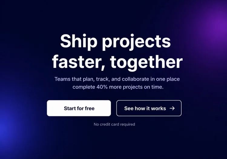
Create a centered hero section on a single column with a max width of 48rem: a small pill badge announcing a launch, an H1 of seven to nine words, a supporting paragraph of no more than two lines, then one primary button with a quiet text-link secondary beside it. Below that, a one-line trust note and a wall of six monochrome customer logos at reduced opacity that lifts to full on hover. Keep everything above 720px of viewport height on a laptop. On mobile, drop to four logos in two rows and make the primary button full width.

Prova in MeDo
TerminalShipfast

Developer Hero With an Install Command

For dev tools the install line is the CTA. A "Book a demo" button in this hero reads as enterprise friction and gets skipped by exactly the audience you wanted.

Create a developer-tool hero section: a left column with a GitHub star count chip, an H1 stating the problem in plain language, one line of supporting copy, and a monospace install command in a bordered box with a copy-to-clipboard button that switches to a "Copied" state for two seconds. Beside it, a secondary link to the docs. The right column shows a syntax-highlighted code block with a filename tab, pre-rendered as static markup rather than a client-side highlighter. Single column under 900px with the code block collapsing to a horizontally scrollable pane.

Prova in MeDo
Full bleedStudio

Full-Bleed Image Hero With Overlay Copy

An agency and consumer-brand staple. The risk is legibility: text over a photograph needs a gradient scrim, not a hopeful guess about how dark that corner of the image is.

Create a full-bleed hero section with a background photograph covering the viewport width at a fixed 70vh height on desktop and 60vh on mobile. Serve the image at responsive widths with a srcset, load it eagerly as the LCP element, and lay a bottom-up dark gradient scrim over it so overlaid text keeps at least 4.5:1 contrast regardless of the photo. On top, left-aligned: an H1 of five to eight words in large tight-tracked type, one line of positioning copy, and a single outlined white button. No secondary action. Add a reduced-motion-safe fade-in on the copy only.

Prova in MeDo
TypographicBuilders

Oversized Type, No Imagery

No image means no LCP image — the largest paintable element is text, which is the fastest hero you can ship. Use it when the positioning line is strong enough to carry the fold alone.

Create a typographic hero section with no imagery: an H1 spanning most of the container width at a fluid clamp between 2.5rem and 6rem with tight leading and negative letter spacing, broken deliberately across three lines. Underneath, a single supporting sentence at body size in a muted tone, then one primary button and a text link. Add a thin rule and a small row of three metrics with labels at the bottom of the section. Since the H1 is the LCP element, self-host the display font with font-display: swap and preload it. Reflow the H1 to smaller steps at 768px and 480px.

Prova in MeDo
Form-firstBrand*

Hero With an Inline Signup Form

Puts the conversion step in the fold instead of linking to it. Worth the extra complexity only when the form is one field — a three-field hero form converts worse than a button.

Create a hero section with an inline signup form: centered copy with an H1 of six to nine words and a one-line subheading, then a single-field form on one row — an email input with a visible label, a submit button reading "Get early access", and a helper line about no spam. Handle three states inline: idle, submitting with a disabled button and spinner, and a success message that replaces the form while keeping the container height stable. Show validation errors under the input, associated by aria-describedby. Stack input above button below 640px and keep both full width.

Prova in MeDo

Come personalizzare il tuo Hero Section

Inizia con il risultato che il tuo utente già desidera

I migliori titoli hero nominano lo stato finale che il visitatore sta già inseguendo — "Lancia più veloce", "Dormi tranquillo sapendo che i tuoi dati sono al sicuro", "Dimezza la tua spesa pubblicitaria". Salta quello che il tuo prodotto è; inizia con quello che fa per loro. Puoi spiegare il come nel sottotitolo.

Usa un singolo CTA principale impossibile da ignorare

Ogni elemento nella hero section deve dirigere lo sguardo verso un pulsante principale. Offrire tre link di peso uguale divide l'intenzione e uccide i clic. Se hai bisogno di un'opzione secondaria (es. "Guarda la demo"), rendila visivamente subordinata — stile ghost, più piccola o solo testo.

Ancora la credibilità con una striscia di prova sociale compatta

Una riga di loghi clienti riconoscibili, una breve linea di statistiche ("Scelto da oltre 12.000 team") o una valutazione a stelle appena sotto il CTA agisce come punto di prova silenzioso. Riduce l'esitazione "è affidabile?" senza togliere il focus dal messaggio principale.

Mostra il prodotto, non un'illustrazione astratta

Uno screenshot ritagliato o un mockup animato del prodotto reale in una cornice di browser o dispositivo converte meglio di una foto stock generica o un elemento decorativo. I visitatori vogliono sapere a cosa si stanno iscrivendo — mostrare l'interfaccia risponde a quella domanda prima che debbano porla.

Chi usa il componente Hero Section

Landing page di prodotto SaaS

Le hero sections SaaS tipicamente abbinano un titolo breve orientato al beneficio con uno screenshot del prodotto o mockup di dashboard, un CTA di prova gratuita e una riga di loghi clienti — dando ai visitatori abbastanza contesto per iscriversi senza scrollare.

Strumento per sviluppatori o progetto open-source

Gli hero di strumenti dev sono tecnici: un titolo in grassetto che dichiara il problema, uno snippet di codice o blocco terminale che mostra l'integrazione chiave, un contatore di stelle GitHub e un comando npm install come CTA principale.

Agenzia o studio creativo

Gli hero delle agenzie privilegiano l'impatto visivo — sfondi video a tutto schermo o grandi trattamenti tipografici, una dichiarazione di posizionamento su una riga e un singolo CTA "Vedi i nostri lavori" o "Richiedi un preventivo" con testo minimo circostante.

E-commerce o prodotto di consumo

Gli hero di prodotti di consumo combinano una fotografia lifestyle con un titolo emotivo accattivante, una breve riga di caratteristiche e un pulsante "Aggiungi al carrello" o "Acquista ora" — spesso accompagnato da un'offerta a tempo limitato o nota di spedizione gratuita.

Pattern di Hero Section per siti web diversi

Lo stesso componente hero section, calibrato sul tipo di sito su cui viene pubblicato.

01 / 06

SaaS Product Hero

Split layout, product screenshot on the right, free-trial CTA and a logo strip. The screenshot is the whole argument here, so crop it to one legible screen rather than shrinking the full dashboard until every label is unreadable.

Stili e varianti di Hero Section

Scegli la variante che si adatta al resto della pagina, poi generala.

01 / 06

Split-Screen Hero

Copy on one side, visual on the other, at roughly a 50/50 or 60/40 split. The most forgiving layout because the text column keeps a natural measure. Decide explicitly whether the image or the copy comes first when it stacks — usually copy.

Hero Section in React, Next.js, Vue e Svelte

React, Next.js, Vue 3, SvelteKit, Astro o HTML puro: lo stesso hero section, sei modi per integrarlo.

01 / 06

React Hero Section

A plain function component — a hero has no state unless it carries a form or carousel. Take the headline, subheading and CTA labels as props so the same hero serves several campaign pages.

src/components/Hero.tsx

export function Hero({ title, subtitle, cta }) {
  return (
    <section className="grid gap-10 py-24 lg:grid-cols-2">
      <div>
        <h1 className="text-5xl font-semibold">{title}</h1>
        <p className="mt-4 text-lg text-zinc-400">{subtitle}</p>
        {cta}
      </div>
      <img src="/product.png" alt="" width={960} height={640} />
    </section>
  )
}

Come aggiungere il tuo Hero Section a un progetto

Quattro passaggi, dalla scelta di un modello di hero section alla messa in produzione.

01~30s

Pick a Hero Template

Choose by what you actually have to show: a screenshot means split-screen, recognisable customers mean centered with a logo wall, neither means typographic.

02~10s

Copy the Prompt

Take the prompt into MeDo, Lovable, Bolt, v0 or Cursor. Replace the placeholder headline with your real one before you run it — the layout is decided by how long that line is.

03~2min

Generate and Refine

You get React + Tailwind back with a live preview. Follow up in plain English — "make the secondary button a text link", "tighten the H1 tracking" — rather than editing class strings by hand.

04~1min

Place It Above the Fold

Drop it in as the first section after your header, swap the placeholder for a real image with explicit dimensions and eager loading, and confirm the page still has exactly one h1.

Domande comuni su Hero Section

Cos'è un generatore di hero section IA?

Un generatore di hero section IA è uno strumento che prende una descrizione in linguaggio naturale del tuo prodotto, pubblico e stile e produce un hero completo above-the-fold — titolo, sottotitolo, pulsanti CTA e codice stilizzato pronto per la produzione. MeDo genera il componente completo includendo layout, tipografia, colori e comportamento responsive, non solo uno stub di codice.

Come creo una hero section con l'IA?

Apri MeDo e descrivi cosa stai costruendo: il prodotto, il pubblico target, il tono e qualsiasi preferenza visiva. Per esempio: "Hero section per un'app di fatturazione freelance rivolta ai designer — sfondo bianco pulito, titolo in grassetto sul pagamento puntuale, un CTA principale e uno screenshot del prodotto a destra." MeDo genera la sezione; puoi perfezionarla con prompt di follow-up per regolare testo, layout o colori.

Cosa deve includere una hero section?

Una hero section efficace richiede come minimo: un titolo che dichiari la proposta di valore principale in una riga, un sottotitolo che aggiunga contesto o prova, un pulsante CTA principale con etichetta orientata al risultato e un visual di supporto (screenshot, illustrazione o video). Gli hero ad alte prestazioni includono anche un breve segnale di fiducia — un conteggio clienti, striscia di loghi o menzione stampa — per ridurre lo scetticismo iniziale.

Qual è il miglior strumento IA per generare hero sections?

MeDo è progettato appositamente per generare componenti UI individuali da prompt in linguaggio naturale, incluse le hero sections. A differenza degli strumenti di chat IA generici, MeDo comprende i pattern di conversione delle landing page, le best practice di accessibilità e la struttura dei componenti — quindi il risultato è effettivamente utilizzabile in produzione, non solo codice dall'aspetto plausibile che necessita riscrittura.

Quanto deve essere lungo il titolo di una hero section?

I titoli hero più efficaci sono di 5–10 parole — abbastanza corti da leggere con un solo sguardo, abbastanza specifici da segnalare esattamente a chi si rivolge il prodotto e cosa fa. Evita il gergo e i superlativi. Se il tuo titolo ha bisogno di un punto e virgola o di una seconda proposizione per avere senso, probabilmente sono due titoli: scegli quello più forte.

Posso generare diversi stili di hero section con l'IA?

Sì. MeDo supporta qualsiasi layout o stile visivo che puoi descrivere — testo centrato con sfondo a gradiente, divisione testo-sinistra/immagine-destra, hero video a tutto schermo, hero tipografico minimalista, vetrina prodotto in dark mode e altro. Includi lo stile visivo nel tuo prompt, oppure chiedi a MeDo di generare due o tre varianti così puoi confrontare prima di scegliere.