AI Hero Section Generator.

Write one sentence about what you are building and get a complete above-the-fold hero — headline, subheading, call-to-action, and layout — ready to ship.

Hero Section
Hero Section

Every Website Lives or Dies in the First Five Seconds

The hero section is the single most scrutinized piece of real estate on any webpage — it is where visitors decide in seconds whether to stay, scroll, or leave. A clear headline that names the value, a subheading that earns trust, and a CTA that removes friction can double time-on-page and trial signups without changing anything else. Nail the hero, and every section below it gets a warmer audience.

6 templates

Hero Section Templates You Can Generate

Every template is a real prompt, not a screenshot. Copy it into any AI editor, or run it in MeDo and get React + Tailwind code back.

Split screenAcme

Copy Left, Product Screenshot Right

The default B2B SaaS hero. It works because the screenshot answers "what is this" while the headline is still being read — an abstract illustration in that slot leaves the visitor guessing.

Create a split-screen hero section: a left column with an eyebrow label, an H1 of six to ten words naming the outcome, a two-line subheading, a primary "Start free trial" button and a subordinate ghost "Watch demo" button, and a row of five grayscale customer logos underneath. The right column holds a product screenshot inside a browser chrome frame, rendered at an explicit width and height so it never shifts the layout, eagerly loaded and marked as the LCP image with a low-quality blur placeholder behind it. Stack to a single column below 1024px with the screenshot after the copy, and reduce the H1 by one step on mobile.

Try in MeDo
CenteredMega

Centered Headline With a Logo Wall

One column, everything on the axis, proof directly beneath the buttons. Reach for it when you have no screenshot worth showing yet but do have recognisable customers.

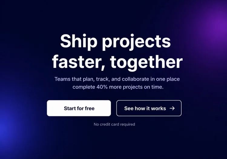
Create a centered hero section on a single column with a max width of 48rem: a small pill badge announcing a launch, an H1 of seven to nine words, a supporting paragraph of no more than two lines, then one primary button with a quiet text-link secondary beside it. Below that, a one-line trust note and a wall of six monochrome customer logos at reduced opacity that lifts to full on hover. Keep everything above 720px of viewport height on a laptop. On mobile, drop to four logos in two rows and make the primary button full width.

Try in MeDo
TerminalShipfast

Developer Hero With an Install Command

For dev tools the install line is the CTA. A "Book a demo" button in this hero reads as enterprise friction and gets skipped by exactly the audience you wanted.

Create a developer-tool hero section: a left column with a GitHub star count chip, an H1 stating the problem in plain language, one line of supporting copy, and a monospace install command in a bordered box with a copy-to-clipboard button that switches to a "Copied" state for two seconds. Beside it, a secondary link to the docs. The right column shows a syntax-highlighted code block with a filename tab, pre-rendered as static markup rather than a client-side highlighter. Single column under 900px with the code block collapsing to a horizontally scrollable pane.

Try in MeDo
Full bleedStudio

Full-Bleed Image Hero With Overlay Copy

An agency and consumer-brand staple. The risk is legibility: text over a photograph needs a gradient scrim, not a hopeful guess about how dark that corner of the image is.

Create a full-bleed hero section with a background photograph covering the viewport width at a fixed 70vh height on desktop and 60vh on mobile. Serve the image at responsive widths with a srcset, load it eagerly as the LCP element, and lay a bottom-up dark gradient scrim over it so overlaid text keeps at least 4.5:1 contrast regardless of the photo. On top, left-aligned: an H1 of five to eight words in large tight-tracked type, one line of positioning copy, and a single outlined white button. No secondary action. Add a reduced-motion-safe fade-in on the copy only.

Try in MeDo
TypographicBuilders

Oversized Type, No Imagery

No image means no LCP image — the largest paintable element is text, which is the fastest hero you can ship. Use it when the positioning line is strong enough to carry the fold alone.

Create a typographic hero section with no imagery: an H1 spanning most of the container width at a fluid clamp between 2.5rem and 6rem with tight leading and negative letter spacing, broken deliberately across three lines. Underneath, a single supporting sentence at body size in a muted tone, then one primary button and a text link. Add a thin rule and a small row of three metrics with labels at the bottom of the section. Since the H1 is the LCP element, self-host the display font with font-display: swap and preload it. Reflow the H1 to smaller steps at 768px and 480px.

Try in MeDo
Form-firstBrand*

Hero With an Inline Signup Form

Puts the conversion step in the fold instead of linking to it. Worth the extra complexity only when the form is one field — a three-field hero form converts worse than a button.

Create a hero section with an inline signup form: centered copy with an H1 of six to nine words and a one-line subheading, then a single-field form on one row — an email input with a visible label, a submit button reading "Get early access", and a helper line about no spam. Handle three states inline: idle, submitting with a disabled button and spinner, and a success message that replaces the form while keeping the container height stable. Show validation errors under the input, associated by aria-describedby. Stack input above button below 640px and keep both full width.

Try in MeDo

How to Customize Your Hero Section

Lead with the outcome your user already wants

The best hero headlines name the end state the visitor is already chasing — "Launch faster", "Sleep better knowing your data is safe", "Cut your ad spend in half". Skip what your product is; lead with what it does for them. You can explain the how in the subheading.

Use a single, unmissable primary CTA

Every element in the hero section should direct the eye toward one primary button. Offering three equal-weight links splits intent and kills clicks. If you need a secondary option (e.g., "Watch demo"), make it visually subordinate — ghost style, smaller, or text-only.

Anchor credibility with a tight social-proof strip

A row of recognizable customer logos, a short stats line ("Trusted by 12,000+ teams"), or a star rating immediately below the CTA acts as a silent proof point. It reduces the "is this legit?" hesitation without pulling focus from the main message.

Show the product, not an abstract illustration

A cropped screenshot or animated mockup of the actual product inside a browser or device frame converts better than a generic stock photo or decorative blob. Visitors want to know what they are signing up for — showing the UI answers that question before they have to ask.

Who Uses the Hero Section Component

SaaS product landing page

SaaS hero sections typically pair a short, benefit-driven headline with a product screenshot or dashboard mockup, a free-trial CTA, and a row of customer logos — giving visitors enough context to sign up without scrolling.

Developer tool or open-source project

Dev-tool heroes lean technical: a bold problem-statement headline, a code snippet or terminal block showing the key integration, a GitHub star count, and an npm install command as the primary CTA.

Agency or creative studio

Agency heroes prioritize visual impact — full-bleed video backgrounds or large typographic treatments, a one-line positioning statement, and a single "See our work" or "Get a quote" CTA with minimal surrounding text.

E-commerce or consumer product

Consumer product heroes combine a lifestyle photograph with an emotional hook headline, a brief feature line, and an "Add to cart" or "Shop now" button — often paired with a limited-time offer or free-shipping note.

Hero Section Patterns for Different Websites

The same hero section component, tuned to the kind of site it ships on.

01 / 06

SaaS Product Hero

Split layout, product screenshot on the right, free-trial CTA and a logo strip. The screenshot is the whole argument here, so crop it to one legible screen rather than shrinking the full dashboard until every label is unreadable.

Hero Section Styles and Variants

Pick the variant that matches the rest of the page, then generate it.

01 / 06

Split-Screen Hero

Copy on one side, visual on the other, at roughly a 50/50 or 60/40 split. The most forgiving layout because the text column keeps a natural measure. Decide explicitly whether the image or the copy comes first when it stacks — usually copy.

Hero Section in React, Next.js, Vue and Svelte

React, Next.js, Vue 3, SvelteKit, Astro or plain HTML — the same hero section, six ways to drop it in.

01 / 06

React Hero Section

A plain function component — a hero has no state unless it carries a form or carousel. Take the headline, subheading and CTA labels as props so the same hero serves several campaign pages.

src/components/Hero.tsx

export function Hero({ title, subtitle, cta }) {
  return (
    <section className="grid gap-10 py-24 lg:grid-cols-2">
      <div>
        <h1 className="text-5xl font-semibold">{title}</h1>
        <p className="mt-4 text-lg text-zinc-400">{subtitle}</p>
        {cta}
      </div>
      <img src="/product.png" alt="" width={960} height={640} />
    </section>
  )
}

How to Add Your Hero Section to a Project

Four steps, from picking a hero section template to shipping it in production.

01~30s

Pick a Hero Template

Choose by what you actually have to show: a screenshot means split-screen, recognisable customers mean centered with a logo wall, neither means typographic.

02~10s

Copy the Prompt

Take the prompt into MeDo, Lovable, Bolt, v0 or Cursor. Replace the placeholder headline with your real one before you run it — the layout is decided by how long that line is.

03~2min

Generate and Refine

You get React + Tailwind back with a live preview. Follow up in plain English — "make the secondary button a text link", "tighten the H1 tracking" — rather than editing class strings by hand.

04~1min

Place It Above the Fold

Drop it in as the first section after your header, swap the placeholder for a real image with explicit dimensions and eager loading, and confirm the page still has exactly one h1.

Common Questions About Hero Section

What is an AI hero section generator?

An AI hero section generator is a tool that takes a plain-language description of your product, audience, and style and produces a complete above-the-fold hero — headline, subheading, CTA buttons, and styled, production-ready code. MeDo generates the full component including layout, typography, colors, and responsive behavior, not just a code stub.

How do I create a hero section with AI?

Open MeDo and describe what you are building: the product, the target audience, the tone, and any visual preferences. For example: "Hero section for a freelance invoicing app targeting designers — clean white background, bold headline about getting paid on time, one primary CTA, and a product screenshot on the right." MeDo generates the section; you can refine it with follow-up prompts to adjust copy, layout, or colors.

What should a hero section include?

A strong hero section needs at minimum: a headline that states the core value proposition in one line, a subheading that adds context or proof, a primary CTA button with outcome-focused label, and a supporting visual (screenshot, illustration, or video). High-performing heroes also include a short trust signal — a customer count, logo strip, or press mention — to reduce initial skepticism.

What is the best AI tool for generating hero sections?

MeDo is purpose-built for generating individual UI components from natural-language prompts, including hero sections. Unlike general AI chat tools, MeDo understands landing-page conversion patterns, accessibility best practices, and component structure — so the output is actually usable in production, not just plausible-looking code that needs a rewrite.

How long should a hero section headline be?

The most effective hero headlines are 5–10 words — short enough to read in a single glance, specific enough to signal exactly who the product is for and what it does. Avoid jargon and superlatives. If your headline needs a semicolon or a second clause to make sense, it is probably two headlines: pick the stronger one.

Can I generate different hero section styles with AI?

Yes. MeDo supports any layout or visual style you can describe — centered text with gradient background, split left-text / right-image, full-bleed video hero, minimal typographic hero, dark-mode product showcase, and more. Include the visual style in your prompt, or ask MeDo to generate two or three variants so you can compare before picking one.