MeDo

AIヒーローセクションジェネレーター。

何を作っているか一文で書くだけで、完全なアバブ・ザ・フォールド・ヒーロー — 見出し、サブ見出し、コールトゥアクション、レイアウト — がすぐに完成します。

ヒーローセクション
ヒーローセクション

すべてのウェブサイトは最初の5秒で決まる

ヒーローセクションはあらゆるウェブページで最も注目される領域です — 訪問者が数秒で滞在するか、スクロールするか、離脱するかを決める場所です。価値を明確に示す見出し、信頼を築くサブ見出し、摩擦を取り除くCTAがあれば、他を何も変えずにページ滞在時間とトライアル登録を倍増させることができます。ヒーローを制すれば、その下のすべてのセクションがより温かいオーディエンスを受け取ります。

6 個のテンプレート

生成できる ヒーローセクション テンプレート

どのテンプレートもスクリーンショットではなく実際のプロンプトです。任意の AI エディタに貼り付けるか、MeDo で実行して React + Tailwind のコードを受け取れます。

Split screenAcme

Copy Left, Product Screenshot Right

The default B2B SaaS hero. It works because the screenshot answers "what is this" while the headline is still being read — an abstract illustration in that slot leaves the visitor guessing.

Create a split-screen hero section: a left column with an eyebrow label, an H1 of six to ten words naming the outcome, a two-line subheading, a primary "Start free trial" button and a subordinate ghost "Watch demo" button, and a row of five grayscale customer logos underneath. The right column holds a product screenshot inside a browser chrome frame, rendered at an explicit width and height so it never shifts the layout, eagerly loaded and marked as the LCP image with a low-quality blur placeholder behind it. Stack to a single column below 1024px with the screenshot after the copy, and reduce the H1 by one step on mobile.

MeDoで試す
CenteredMega

Centered Headline With a Logo Wall

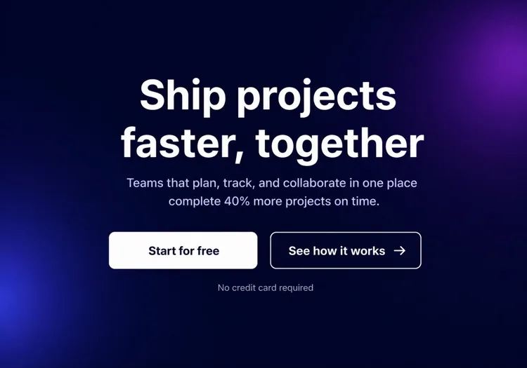
One column, everything on the axis, proof directly beneath the buttons. Reach for it when you have no screenshot worth showing yet but do have recognisable customers.

Create a centered hero section on a single column with a max width of 48rem: a small pill badge announcing a launch, an H1 of seven to nine words, a supporting paragraph of no more than two lines, then one primary button with a quiet text-link secondary beside it. Below that, a one-line trust note and a wall of six monochrome customer logos at reduced opacity that lifts to full on hover. Keep everything above 720px of viewport height on a laptop. On mobile, drop to four logos in two rows and make the primary button full width.

MeDoで試す
TerminalShipfast

Developer Hero With an Install Command

For dev tools the install line is the CTA. A "Book a demo" button in this hero reads as enterprise friction and gets skipped by exactly the audience you wanted.

Create a developer-tool hero section: a left column with a GitHub star count chip, an H1 stating the problem in plain language, one line of supporting copy, and a monospace install command in a bordered box with a copy-to-clipboard button that switches to a "Copied" state for two seconds. Beside it, a secondary link to the docs. The right column shows a syntax-highlighted code block with a filename tab, pre-rendered as static markup rather than a client-side highlighter. Single column under 900px with the code block collapsing to a horizontally scrollable pane.

MeDoで試す
Full bleedStudio

Full-Bleed Image Hero With Overlay Copy

An agency and consumer-brand staple. The risk is legibility: text over a photograph needs a gradient scrim, not a hopeful guess about how dark that corner of the image is.

Create a full-bleed hero section with a background photograph covering the viewport width at a fixed 70vh height on desktop and 60vh on mobile. Serve the image at responsive widths with a srcset, load it eagerly as the LCP element, and lay a bottom-up dark gradient scrim over it so overlaid text keeps at least 4.5:1 contrast regardless of the photo. On top, left-aligned: an H1 of five to eight words in large tight-tracked type, one line of positioning copy, and a single outlined white button. No secondary action. Add a reduced-motion-safe fade-in on the copy only.

MeDoで試す
TypographicBuilders

Oversized Type, No Imagery

No image means no LCP image — the largest paintable element is text, which is the fastest hero you can ship. Use it when the positioning line is strong enough to carry the fold alone.

Create a typographic hero section with no imagery: an H1 spanning most of the container width at a fluid clamp between 2.5rem and 6rem with tight leading and negative letter spacing, broken deliberately across three lines. Underneath, a single supporting sentence at body size in a muted tone, then one primary button and a text link. Add a thin rule and a small row of three metrics with labels at the bottom of the section. Since the H1 is the LCP element, self-host the display font with font-display: swap and preload it. Reflow the H1 to smaller steps at 768px and 480px.

MeDoで試す
Form-firstBrand*

Hero With an Inline Signup Form

Puts the conversion step in the fold instead of linking to it. Worth the extra complexity only when the form is one field — a three-field hero form converts worse than a button.

Create a hero section with an inline signup form: centered copy with an H1 of six to nine words and a one-line subheading, then a single-field form on one row — an email input with a visible label, a submit button reading "Get early access", and a helper line about no spam. Handle three states inline: idle, submitting with a disabled button and spinner, and a success message that replaces the form while keeping the container height stable. Show validation errors under the input, associated by aria-describedby. Stack input above button below 640px and keep both full width.

MeDoで試す

ヒーローセクション をカスタマイズする方法

ユーザーがすでに求めている結果でリードする

最高のヒーロー見出しは、訪問者がすでに追い求めている最終状態を示します — 「より速くローンチ」「データが安全だと安心して眠る」「広告費を半分にカット」。製品が何であるかはスキップし、ユーザーに何をもたらすかでリードしましょう。方法はサブ見出しで説明できます。

見逃せない単一のプライマリCTAを使う

ヒーローセクションのすべての要素が1つのプライマリボタンに視線を導くべきです。同等の重みのリンクを3つ並べると意図が分散してクリックが減ります。セカンダリオプション(例:「デモを見る」)が必要な場合は、視覚的に従属させましょう — ゴーストスタイル、小さめ、またはテキストのみ。

コンパクトなソーシャルプルーフストリップで信頼性を固定する

CTA直下の認知度の高い顧客ロゴの行、短い統計行(「12,000以上のチームが信頼」)、または星評価は、無言の証明ポイントとして機能します。メインメッセージから注意をそらすことなく、「これは本物?」というためらいを減らします。

抽象的なイラストではなく製品を見せる

ブラウザやデバイスフレーム内の実際の製品のトリミングされたスクリーンショットやアニメーションモックアップは、汎用的なストックフォトや装飾的な要素よりも高いコンバージョンを生みます。訪問者は何にサインアップするのか知りたいのです — UIを見せることで、質問される前にその疑問に答えます。

ヒーローセクション コンポーネントを使うのは誰か

SaaS製品ランディングページ

SaaSのヒーローセクションは通常、ベネフィット重視の短い見出しと製品スクリーンショットまたはダッシュボードモックアップ、無料トライアルCTA、顧客ロゴの行を組み合わせます — スクロールせずに登録できる十分なコンテキストを提供します。

開発者ツールまたはオープンソースプロジェクト

開発ツールのヒーローは技術的です:太字の問題提起見出し、主要な統合を示すコードスニペットまたはターミナルブロック、GitHubスター数、そしてプライマリCTAとしてのnpm installコマンド。

エージェンシーまたはクリエイティブスタジオ

エージェンシーのヒーローはビジュアルインパクトを優先します — 全画面ビデオ背景や大きなタイポグラフィ処理、1行のポジショニングステートメント、そして最小限のテキストを伴う単一の「実績を見る」または「見積もりを取る」CTA。

ECまたはコンシューマー製品

コンシューマー製品のヒーローはライフスタイル写真とエモーショナルなフック見出し、簡潔な特徴行、「カートに追加」または「今すぐ購入」ボタンを組み合わせます — しばしば期間限定オファーや送料無料の表示が添えられます。

サイト種別ごとの ヒーローセクション パターン

同じ ヒーローセクション コンポーネントを、掲載するサイトの種類に合わせて調整します。

01 / 06

SaaS Product Hero

Split layout, product screenshot on the right, free-trial CTA and a logo strip. The screenshot is the whole argument here, so crop it to one legible screen rather than shrinking the full dashboard until every label is unreadable.

ヒーローセクション のスタイルとバリアント

ページ全体のトーンに合うバリアントを選び、そのまま生成します。

01 / 06

Split-Screen Hero

Copy on one side, visual on the other, at roughly a 50/50 or 60/40 split. The most forgiving layout because the text column keeps a natural measure. Decide explicitly whether the image or the copy comes first when it stacks — usually copy.

React・Next.js・Vue・Svelte での ヒーローセクション

React、Next.js、Vue 3、SvelteKit、Astro、素の HTML — 同じ ヒーローセクション を 6 通りの方法で組み込めます。

01 / 06

React Hero Section

A plain function component — a hero has no state unless it carries a form or carousel. Take the headline, subheading and CTA labels as props so the same hero serves several campaign pages.

src/components/Hero.tsx

export function Hero({ title, subtitle, cta }) {
  return (
    <section className="grid gap-10 py-24 lg:grid-cols-2">
      <div>
        <h1 className="text-5xl font-semibold">{title}</h1>
        <p className="mt-4 text-lg text-zinc-400">{subtitle}</p>
        {cta}
      </div>
      <img src="/product.png" alt="" width={960} height={640} />
    </section>
  )
}

ヒーローセクション をプロジェクトに追加する方法

ヒーローセクション テンプレートを選んで本番に載せるまでの 4 ステップ。

01~30s

Pick a Hero Template

Choose by what you actually have to show: a screenshot means split-screen, recognisable customers mean centered with a logo wall, neither means typographic.

02~10s

Copy the Prompt

Take the prompt into MeDo, Lovable, Bolt, v0 or Cursor. Replace the placeholder headline with your real one before you run it — the layout is decided by how long that line is.

03~2min

Generate and Refine

You get React + Tailwind back with a live preview. Follow up in plain English — "make the secondary button a text link", "tighten the H1 tracking" — rather than editing class strings by hand.

04~1min

Place It Above the Fold

Drop it in as the first section after your header, swap the placeholder for a real image with explicit dimensions and eager loading, and confirm the page still has exactly one h1.

ヒーローセクションに関するよくある質問

AIヒーローセクションジェネレーターとは?

AIヒーローセクションジェネレーターは、製品、オーディエンス、スタイルの自然言語による説明を受け取り、完全なアバブ・ザ・フォールド・ヒーロー — 見出し、サブ見出し、CTAボタン、スタイル付きの本番対応コード — を生成するツールです。MeDoはレイアウト、タイポグラフィ、色、レスポンシブ動作を含む完全なコンポーネントを生成します。コードの断片だけではありません。

AIでヒーローセクションを作成するには?

MeDoを開いて、何を作っているかを説明してください:製品、ターゲットオーディエンス、トーン、ビジュアルの好み。例:「デザイナー向けのフリーランス請求アプリ用ヒーローセクション — クリーンな白背景、期日通りの支払いについての太字見出し、プライマリCTA1つ、右側に製品スクリーンショット。」MeDoがセクションを生成し、テキスト、レイアウト、色を調整するフォローアッププロンプトで洗練できます。

ヒーローセクションには何を含めるべき?

強力なヒーローセクションには最低限必要なもの:コアバリュープロポジションを1行で述べる見出し、コンテキストまたは証明を追加するサブ見出し、結果志向のラベル付きプライマリCTAボタン、サポートビジュアル(スクリーンショット、イラスト、またはビデオ)。高パフォーマンスのヒーローには短い信頼シグナル — 顧客数、ロゴストリップ、プレスメンション — も含まれ、初期の懐疑心を軽減します。

ヒーローセクション生成に最適なAIツールは?

MeDoはヒーローセクションを含む、自然言語プロンプトからの個別UIコンポーネント生成に特化して構築されています。一般的なAIチャットツールとは異なり、MeDoはランディングページのコンバージョンパターン、アクセシビリティのベストプラクティス、コンポーネント構造を理解しています — そのため出力は実際に本番で使用可能であり、書き直しが必要なもっともらしいだけのコードではありません。

ヒーローセクションの見出しはどのくらいの長さが良い?

最も効果的なヒーロー見出しは5〜10語です — 一目で読めるほど短く、製品が誰のためのもので何をするかを正確に示すのに十分具体的。専門用語や最上級表現は避けましょう。見出しにセミコロンや2番目の節が必要なら、おそらく2つの見出しです:より強い方を選びましょう。

AIで異なるヒーローセクションスタイルを生成できる?

はい。MeDoは説明できるあらゆるレイアウトやビジュアルスタイルに対応します — グラデーション背景のセンターテキスト、左テキスト/右画像の分割、フルブリードビデオヒーロー、ミニマルなタイポグラフィックヒーロー、ダークモードの製品ショーケースなど。プロンプトにビジュアルスタイルを含めるか、MeDoに2〜3つのバリエーションを生成させて選ぶ前に比較できます。