MeDo

AI 히어로 섹션 생성기.

무엇을 만들고 있는지 한 문장으로 작성하면 완전한 Above-the-Fold 히어로 — 헤드라인, 서브헤딩, 콜투액션, 레이아웃 — 이 바로 완성됩니다.

히어로 섹션
히어로 섹션

모든 웹사이트는 처음 5초에 성패가 갈린다

히어로 섹션은 모든 웹페이지에서 가장 주목받는 영역입니다 — 방문자가 몇 초 안에 머물지, 스크롤할지, 떠날지를 결정하는 곳입니다. 가치를 명확히 밝히는 헤드라인, 신뢰를 구축하는 서브헤딩, 마찰을 제거하는 CTA는 다른 것을 바꾸지 않고도 페이지 체류 시간과 트라이얼 가입을 두 배로 늘릴 수 있습니다. 히어로를 완벽하게 만들면 그 아래 모든 섹션이 더 호의적인 오디언스를 맞이합니다.

템플릿 6개

생성할 수 있는 히어로 섹션 템플릿

모든 템플릿은 스크린샷이 아니라 실제 프롬프트입니다. 어떤 AI 에디터에든 붙여넣거나 MeDo에서 실행해 React + Tailwind 코드를 그대로 받으세요.

Split screenAcme

Copy Left, Product Screenshot Right

The default B2B SaaS hero. It works because the screenshot answers "what is this" while the headline is still being read — an abstract illustration in that slot leaves the visitor guessing.

Create a split-screen hero section: a left column with an eyebrow label, an H1 of six to ten words naming the outcome, a two-line subheading, a primary "Start free trial" button and a subordinate ghost "Watch demo" button, and a row of five grayscale customer logos underneath. The right column holds a product screenshot inside a browser chrome frame, rendered at an explicit width and height so it never shifts the layout, eagerly loaded and marked as the LCP image with a low-quality blur placeholder behind it. Stack to a single column below 1024px with the screenshot after the copy, and reduce the H1 by one step on mobile.

MeDo에서 시도하기
CenteredMega

Centered Headline With a Logo Wall

One column, everything on the axis, proof directly beneath the buttons. Reach for it when you have no screenshot worth showing yet but do have recognisable customers.

Create a centered hero section on a single column with a max width of 48rem: a small pill badge announcing a launch, an H1 of seven to nine words, a supporting paragraph of no more than two lines, then one primary button with a quiet text-link secondary beside it. Below that, a one-line trust note and a wall of six monochrome customer logos at reduced opacity that lifts to full on hover. Keep everything above 720px of viewport height on a laptop. On mobile, drop to four logos in two rows and make the primary button full width.

MeDo에서 시도하기
TerminalShipfast

Developer Hero With an Install Command

For dev tools the install line is the CTA. A "Book a demo" button in this hero reads as enterprise friction and gets skipped by exactly the audience you wanted.

Create a developer-tool hero section: a left column with a GitHub star count chip, an H1 stating the problem in plain language, one line of supporting copy, and a monospace install command in a bordered box with a copy-to-clipboard button that switches to a "Copied" state for two seconds. Beside it, a secondary link to the docs. The right column shows a syntax-highlighted code block with a filename tab, pre-rendered as static markup rather than a client-side highlighter. Single column under 900px with the code block collapsing to a horizontally scrollable pane.

MeDo에서 시도하기
Full bleedStudio

Full-Bleed Image Hero With Overlay Copy

An agency and consumer-brand staple. The risk is legibility: text over a photograph needs a gradient scrim, not a hopeful guess about how dark that corner of the image is.

Create a full-bleed hero section with a background photograph covering the viewport width at a fixed 70vh height on desktop and 60vh on mobile. Serve the image at responsive widths with a srcset, load it eagerly as the LCP element, and lay a bottom-up dark gradient scrim over it so overlaid text keeps at least 4.5:1 contrast regardless of the photo. On top, left-aligned: an H1 of five to eight words in large tight-tracked type, one line of positioning copy, and a single outlined white button. No secondary action. Add a reduced-motion-safe fade-in on the copy only.

MeDo에서 시도하기
TypographicBuilders

Oversized Type, No Imagery

No image means no LCP image — the largest paintable element is text, which is the fastest hero you can ship. Use it when the positioning line is strong enough to carry the fold alone.

Create a typographic hero section with no imagery: an H1 spanning most of the container width at a fluid clamp between 2.5rem and 6rem with tight leading and negative letter spacing, broken deliberately across three lines. Underneath, a single supporting sentence at body size in a muted tone, then one primary button and a text link. Add a thin rule and a small row of three metrics with labels at the bottom of the section. Since the H1 is the LCP element, self-host the display font with font-display: swap and preload it. Reflow the H1 to smaller steps at 768px and 480px.

MeDo에서 시도하기
Form-firstBrand*

Hero With an Inline Signup Form

Puts the conversion step in the fold instead of linking to it. Worth the extra complexity only when the form is one field — a three-field hero form converts worse than a button.

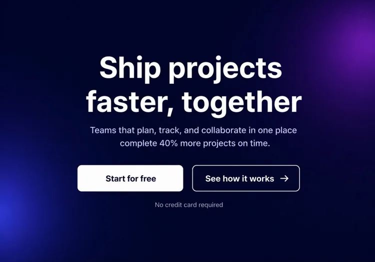
Create a hero section with an inline signup form: centered copy with an H1 of six to nine words and a one-line subheading, then a single-field form on one row — an email input with a visible label, a submit button reading "Get early access", and a helper line about no spam. Handle three states inline: idle, submitting with a disabled button and spinner, and a success message that replaces the form while keeping the container height stable. Show validation errors under the input, associated by aria-describedby. Stack input above button below 640px and keep both full width.

MeDo에서 시도하기

히어로 섹션 커스터마이즈 방법

사용자가 이미 원하는 결과로 시작하세요

최고의 히어로 헤드라인은 방문자가 이미 추구하는 최종 상태를 제시합니다 — "더 빠르게 출시", "데이터가 안전하다는 확신으로 편히 잠드세요", "광고비를 절반으로 줄이세요". 제품이 무엇인지 건너뛰고, 사용자에게 무엇을 해주는지로 시작하세요. 방법은 서브헤딩에서 설명할 수 있습니다.

놓칠 수 없는 단일 기본 CTA를 사용하세요

히어로 섹션의 모든 요소가 하나의 기본 버튼으로 시선을 이끌어야 합니다. 동일한 비중의 링크 3개를 제공하면 의도가 분산되고 클릭이 줄어듭니다. 보조 옵션(예: "데모 보기")이 필요하면 시각적으로 종속되게 만드세요 — 고스트 스타일, 더 작게, 또는 텍스트만.

간결한 소셜 프루프 스트립으로 신뢰를 고정하세요

CTA 바로 아래의 인지도 높은 고객 로고 행, 짧은 통계 라인("12,000개 이상의 팀이 신뢰"), 또는 별점은 무언의 증거 포인트로 작용합니다. 메인 메시지에서 초점을 빼앗지 않으면서 "이게 진짜인가?" 하는 망설임을 줄여줍니다.

추상적 일러스트 대신 제품을 보여주세요

브라우저 또는 기기 프레임 안의 실제 제품 잘린 스크린샷이나 애니메이션 목업은 일반적인 스톡 사진이나 장식 요소보다 전환율이 높습니다. 방문자는 무엇에 가입하는지 알고 싶어합니다 — UI를 보여주면 질문하기 전에 그 궁금증을 해결해 줍니다.

히어로 섹션 컴포넌트를 사용하는 사람

SaaS 제품 랜딩페이지

SaaS 히어로 섹션은 일반적으로 짧은 혜택 중심 헤드라인과 제품 스크린샷 또는 대시보드 목업, 무료 체험 CTA, 고객 로고 행을 결합합니다 — 스크롤 없이 가입할 수 있는 충분한 컨텍스트를 제공합니다.

개발자 도구 또는 오픈소스 프로젝트

개발 도구 히어로는 기술적입니다: 굵은 문제 제기 헤드라인, 핵심 통합을 보여주는 코드 스니펫 또는 터미널 블록, GitHub 스타 수, 그리고 기본 CTA로서의 npm install 명령.

에이전시 또는 크리에이티브 스튜디오

에이전시 히어로는 시각적 임팩트를 우선시합니다 — 전체 화면 비디오 배경 또는 큰 타이포그래피 처리, 한 줄 포지셔닝 문구, 최소한의 텍스트와 함께하는 단일 "우리 작품 보기" 또는 "견적 받기" CTA.

E커머스 또는 소비자 제품

소비자 제품 히어로는 라이프스타일 사진과 감성적인 훅 헤드라인, 간단한 특징 라인, "장바구니 추가" 또는 "지금 구매" 버튼을 결합합니다 — 종종 한정 기간 혜택이나 무료 배송 안내가 함께합니다.

웹사이트 유형별 히어로 섹션 패턴

같은 히어로 섹션 컴포넌트를 게시되는 사이트 유형에 맞춰 조정합니다.

01 / 06

SaaS Product Hero

Split layout, product screenshot on the right, free-trial CTA and a logo strip. The screenshot is the whole argument here, so crop it to one legible screen rather than shrinking the full dashboard until every label is unreadable.

히어로 섹션 스타일과 변형

페이지의 나머지 부분과 어울리는 변형을 골라 바로 생성하세요.

01 / 06

Split-Screen Hero

Copy on one side, visual on the other, at roughly a 50/50 or 60/40 split. The most forgiving layout because the text column keeps a natural measure. Decide explicitly whether the image or the copy comes first when it stacks — usually copy.

React, Next.js, Vue, Svelte에서의 히어로 섹션

React, Next.js, Vue 3, SvelteKit, Astro 또는 순수 HTML — 같은 히어로 섹션을 여섯 가지 방식으로 넣을 수 있습니다.

01 / 06

React Hero Section

A plain function component — a hero has no state unless it carries a form or carousel. Take the headline, subheading and CTA labels as props so the same hero serves several campaign pages.

src/components/Hero.tsx

export function Hero({ title, subtitle, cta }) {
  return (
    <section className="grid gap-10 py-24 lg:grid-cols-2">
      <div>
        <h1 className="text-5xl font-semibold">{title}</h1>
        <p className="mt-4 text-lg text-zinc-400">{subtitle}</p>
        {cta}
      </div>
      <img src="/product.png" alt="" width={960} height={640} />
    </section>
  )
}

히어로 섹션을 프로젝트에 추가하는 방법

히어로 섹션 템플릿을 고르고 프로덕션에 배포하기까지 네 단계.

01~30s

Pick a Hero Template

Choose by what you actually have to show: a screenshot means split-screen, recognisable customers mean centered with a logo wall, neither means typographic.

02~10s

Copy the Prompt

Take the prompt into MeDo, Lovable, Bolt, v0 or Cursor. Replace the placeholder headline with your real one before you run it — the layout is decided by how long that line is.

03~2min

Generate and Refine

You get React + Tailwind back with a live preview. Follow up in plain English — "make the secondary button a text link", "tighten the H1 tracking" — rather than editing class strings by hand.

04~1min

Place It Above the Fold

Drop it in as the first section after your header, swap the placeholder for a real image with explicit dimensions and eager loading, and confirm the page still has exactly one h1.

히어로 섹션에 대한 자주 묻는 질문

AI 히어로 섹션 생성기란?

AI 히어로 섹션 생성기는 제품, 대상, 스타일에 대한 자연어 설명을 받아 완전한 Above-the-Fold 히어로 — 헤드라인, 서브헤딩, CTA 버튼, 스타일링된 프로덕션 준비 코드 — 를 생성하는 도구입니다. MeDo는 레이아웃, 타이포그래피, 색상, 반응형 동작을 포함한 완전한 컴포넌트를 생성합니다. 코드 스텁만이 아닙니다.

AI로 히어로 섹션을 어떻게 만드나요?

MeDo를 열고 무엇을 만들고 있는지 설명하세요: 제품, 타겟 오디언스, 톤, 시각적 선호도. 예: "디자이너 대상 프리랜서 인보이스 앱용 히어로 섹션 — 깔끔한 흰색 배경, 제때 받는 결제에 대한 굵은 헤드라인, 기본 CTA 하나, 오른쪽에 제품 스크린샷." MeDo가 섹션을 생성하고, 후속 프롬프트로 텍스트, 레이아웃, 색상을 조정할 수 있습니다.

히어로 섹션에는 무엇이 포함되어야 하나요?

강력한 히어로 섹션에는 최소한 다음이 필요합니다: 핵심 가치 제안을 한 줄로 제시하는 헤드라인, 컨텍스트나 증거를 추가하는 서브헤딩, 결과 중심 라벨이 있는 기본 CTA 버튼, 지원 비주얼(스크린샷, 일러스트 또는 비디오). 고성능 히어로에는 짧은 신뢰 신호 — 고객 수, 로고 스트립 또는 언론 언급 — 도 포함되어 초기 회의감을 줄입니다.

히어로 섹션 생성에 가장 좋은 AI 도구는?

MeDo는 히어로 섹션을 포함한 자연어 프롬프트에서 개별 UI 컴포넌트를 생성하기 위해 특별히 구축되었습니다. 일반 AI 채팅 도구와 달리, MeDo는 랜딩페이지 전환 패턴, 접근성 모범 사례, 컴포넌트 구조를 이해합니다 — 그래서 결과물이 실제로 프로덕션에서 사용 가능하며, 재작성이 필요한 그럴듯해 보이기만 하는 코드가 아닙니다.

히어로 섹션 헤드라인은 얼마나 길어야 하나요?

가장 효과적인 히어로 헤드라인은 5~10단어입니다 — 한눈에 읽을 수 있을 만큼 짧고, 제품이 누구를 위한 것이며 무엇을 하는지 정확히 전달할 만큼 구체적. 전문 용어와 최상급 표현을 피하세요. 헤드라인에 세미콜론이나 두 번째 절이 필요하다면 아마 두 개의 헤드라인입니다: 더 강한 것을 고르세요.

AI로 다양한 히어로 섹션 스타일을 생성할 수 있나요?

네. MeDo는 설명할 수 있는 모든 레이아웃이나 비주얼 스타일을 지원합니다 — 그라데이션 배경의 센터 텍스트, 왼쪽 텍스트/오른쪽 이미지 분할, 풀블리드 비디오 히어로, 미니멀 타이포그래피 히어로, 다크 모드 제품 쇼케이스 등. 프롬프트에 비주얼 스타일을 포함하거나, MeDo에게 2~3개 변형을 생성하도록 요청하여 선택 전에 비교할 수 있습니다.