MeDo

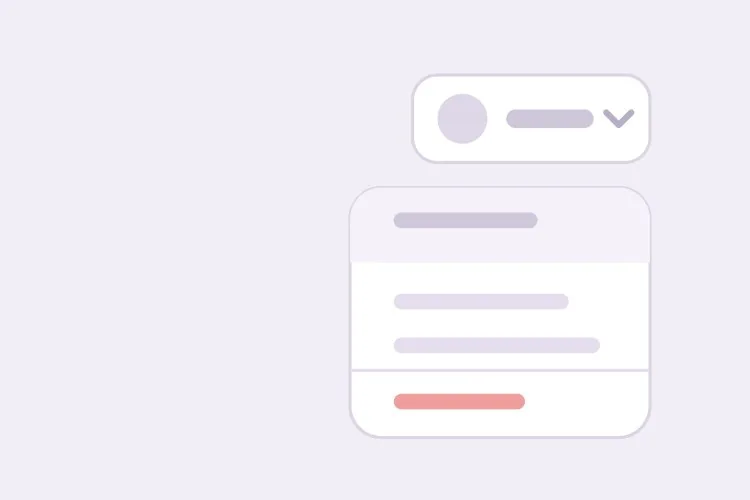
AI ड्रॉपडाउन मेनू जेनरेटर।

अपने आइटम बताएं और MeDo पूरा मेनू जेनरेट करता है — ट्रिगर, पैनल, सेपरेटर वाले ग्रुप्ड सेक्शन, सबमेनू, ऐरो-की और टाइप-अहेड नेविगेशन, Escape और बाहर क्लिक से बंद होना, और बंद होने पर ट्रिगर पर लौटने वाला फोकस।

ड्रॉपडाउन मेनू
ड्रॉपडाउन मेनू

मेनू एक ही टैब स्टॉप होता है, और लोग यही हिस्सा गलत करते हैं

सहज प्रवृत्ति हर आइटम को फोकसेबल बनाने की होती है, ताकि Tab उन्हें एक-एक करके पार करे। ARIA menu पैटर्न इसका उल्टा करता है: पूरा मेनू एक ही टैब स्टॉप होता है, और ऐरो कीज़ आइटम के बीच roving tabindex हिलाती हैं जबकि Tab मेनू बंद करके बाहर निकल जाता है। इसी वजह से 12 आइटम वाले अकाउंट मेनू को छोड़ने में बारह के बजाय एक कीस्ट्रोक लगता है। यह यह भी समझाता है कि मेनू को स्पष्ट फोकस रीस्टोरेशन क्यों चाहिए: चूंकि फोकस प्रोग्रामेटिक रूप से पैनल में ले जाया गया था, उसे ट्रिगर पर वापस भेजे बिना बंद करना कीबोर्ड यूज़र को डॉक्यूमेंट के शीर्ष पर छोड़ देता है। ट्रिगर और पैनल को एक ही कम्पोनेंट के रूप में जेनरेट करना इस राउंड ट्रिप को बरकरार रखता है, क्योंकि दोनों हिस्से एक ही फोकस कॉन्ट्रैक्ट के अनुसार लिखे जाते हैं।

6 टेम्पलेट

ड्रॉपडाउन मेनू टेम्पलेट जो आप जेनरेट कर सकते हैं

हर टेम्पलेट एक असली प्रॉम्प्ट है, स्क्रीनशॉट नहीं। इसे किसी भी AI एडिटर में कॉपी करें, या MeDo में चलाकर React + Tailwind कोड सीधे पाएं।

BasicAccount Menu

Avatar Trigger With Grouped Actions

The top-right menu every product has. Get the focus round trip right here and the rest of your menus inherit it — closing without returning focus drops keyboard users at the top of the document.

Create an account dropdown menu: a 32px avatar trigger with aria-haspopup="menu" and aria-expanded, and a 240px panel with role="menu" anchored 6px below it. Each row is role="menuitem", 32px tall, with a 16px leading icon. Use a roving tabindex so the whole menu is one tab stop — Tab closes it and leaves rather than walking the items. Enter, Space or Arrow Down opens the menu and focuses the first item; Arrow Up opens it focusing the last. Arrow Down and Up cycle with wrapping, Home and End jump to the ends, typing a letter jumps to the next item starting with it, Escape and outside pointerdown close it, and focus returns to the trigger on every close path. Group items with 1px dividers and style Sign out as a destructive red item in its own group.


MeDo में आज़माएं
Table rowRow Overflow

Three-Dot Menu on a Table Row

Repeated once per row, which makes the trigger label the real problem: twenty buttons all called "More options" tell a screen reader user nothing about which record they are about to delete.

Create a row-level overflow menu for a data table: a 32px icon-only three-dot trigger with aria-haspopup="menu", aria-expanded, and an accessible name that names its record — "More actions for invoice 1042" — so repeated triggers are distinguishable. The panel is role="menu" with Edit, Duplicate and Export, then a divider and a destructive Delete that opens a confirmation dialog and moves focus into it rather than acting immediately. Roving tabindex, Arrow Up and Down with wrapping, Home and End, single-letter type-ahead, Escape and outside pointerdown to close, focus back to the trigger. Close the menu when its ancestor scroll container scrolls, since an anchored panel detaches from a row that has moved.

MeDo में आज़माएं
NestedSubmenu

Parent Items With Nested Panels

One level of nesting, with a hover intent delay. Without the delay, dragging the pointer diagonally to the item you wanted opens and closes three submenus on the way there.

Create a dropdown menu with one level of submenus: the parent item carries aria-haspopup="menu", aria-expanded and a trailing chevron, and its child panel is a separate role="menu" anchored to the parent's right edge, flipping to the left when it would leave the viewport. Open the submenu on Arrow Right or Enter with focus on the first child, and on hover after a 150ms intent delay with a similar grace period before closing so a diagonal pointer path does not toggle three panels. Arrow Left closes the submenu and returns focus to the parent item; Escape closes the whole menu and focuses the trigger. Keep type-ahead scoped to the currently open panel, and do not nest a second level.

MeDo में आज़माएं
TogglesCheckable Items

Menu With Checkbox and Radio Rows

View options and sort order inside a menu. The roles change with the semantics — menuitemcheckbox for independent toggles, menuitemradio in a group for one-of-many — and so does whether the panel closes on select.

Create a view-options dropdown mixing checkable rows: a group of role="menuitemcheckbox" rows with aria-checked for column visibility, and below a divider a group of role="menuitemradio" rows inside role="group" with aria-labelledby a Sort by heading, where exactly one is aria-checked. Keep the panel open when a checkbox row is toggled so several can be set in one pass, and close it after a radio selection since the choice is complete. Reserve the check indicator column at a fixed width so labels do not shift when a state changes. Roving tabindex, Arrow Up and Down with wrapping, Home and End, Space toggles without closing, Enter selects, Escape closes and returns focus to the trigger.

MeDo में आज़माएं
NavigationNav Disclosure

Header Dropdown of Plain Links

Deliberately not a menu. A products dropdown holds links, so role="menu" would collapse them into one tab stop and stop cmd+click from opening a new tab.

Create a navigation dropdown for a marketing header that is a disclosure, not an ARIA menu: a trigger button with aria-expanded and aria-controls, and a panel containing a plain ul of anchor elements — no role="menu" or role="menuitem", so each link stays individually focusable and openable in a new tab with cmd+click or middle click. Tab moves through the links in order rather than a roving tabindex. Open on click and on Arrow Down, close on Escape with focus returning to the trigger, close on outside pointerdown, and close on focusout when focus leaves the panel entirely. Do not open on hover alone on touch devices. Mark the link matching the current route with aria-current="page".

MeDo में आज़माएं
FilterableSearch Menu

Long Menu With a Filter Field

Past roughly fifteen items, single-letter type-ahead stops being enough. Adding a text field changes the contract: the field keeps focus and the highlight moves by aria-activedescendant.

Create a filterable dropdown for a long list: a trigger with aria-haspopup and aria-expanded, and a panel whose first element is a search input that receives focus on open. Because a text field now holds focus, switch from a roving tabindex to the combobox approach — role="listbox" on the list, role="option" on rows, and aria-activedescendant on the input so Arrow Up and Down move the highlight while typing keeps working. Filter as the user types with a 150ms debounce, bold the matched substring, cap the list at 280px with internal scroll, and scroll the active option into view with block nearest. Show a no-matches row rather than an empty panel. Escape clears a non-empty filter first, then closes on a second press with focus returning to the trigger.

MeDo में आज़माएं

अपने ड्रॉपडाउन मेनू को कैसे कस्टमाइज़ करें

बताएं कि यह एक्शन का मेनू है, <select> नहीं

role="menu" असिस्टिव टेक को बताता है कि हर आइटम एक कमांड चलाता है। अगर आइटम इसके बजाय फॉर्म वैल्यू सेट करते हैं, तो listbox या नेटिव <select> मांगें। फॉर्म फील्ड के लिए मेनू उपयोग करने पर स्क्रीन रीडर वहां कमांड बोलते हैं जहां यूज़र विकल्प की अपेक्षा करता है।

सबमेनू के लिए हॉवर इंटेंट डिले बताएं

सबमेनू खुलने से पहले लगभग 150ms डिले और बंद होने से पहले उतना ही ग्रेस पीरियड मांगें। इसके बिना, पॉइंटर को पैरेंट लिस्ट पर तिरछा खींचने से जिस सबमेनू तक आप पहुंचना चाहते थे, उस रास्ते में तीन सबमेनू खुलते और बंद होते हैं।

स्क्रीन किनारों का ध्यान रखने वाली पोज़िशनिंग स्पष्ट रूप से मांगें

बताएं कि पैनल निचले किनारे के पास ट्रिगर के ऊपर फ्लिप हो और दिखता रहने के लिए क्षैतिज रूप से खिसके। ऊपर-दाएं कोने में अवतार से एंकर किया मेनू सबसे आम मामला है जहां फिक्स्ड ऑफसेट आधे आइटम स्क्रीन से बाहर रेंडर कर देता है।

डिस्ट्रक्टिव आइटम को अलग करें

साइन आउट, डिलीट या एक्सेस रिवोक जैसी क्रियाएं एक डिवाइडर के नीचे अपने अलग ग्रुप में रखें और डिस्ट्रक्टिव कलर ट्रीटमेंट मांगें। गलत क्लिक रोकने वाली चीज़ रोज़मर्रा के आइटम से भौतिक दूरी है, लाल टेक्स्ट नहीं।

ड्रॉपडाउन मेनू कंपोनेंट का उपयोग कौन करता है

SaaS प्रोडक्ट

ऊपर-दाएं एक अवतार मेनू जिसमें अकाउंट ईमेल स्टैटिक हेडर पंक्ति के रूप में हो, फिर प्रोफाइल और बिलिंग लिंक, एक टीम सबमेनू, एक थीम टॉगल, और डिवाइडर के नीचे अलग किया साइन आउट।

डैशबोर्ड या एडमिन टूल

तीन-डॉट आइकन बटन के पीछे रो-लेवल ओवरफ्लो मेनू, जिसमें एडिट, डुप्लिकेट, एक्सपोर्ट और एक डिस्ट्रक्टिव डिलीट हों, और ट्रिगर उस पंक्ति से लेबल हो जिससे वह जुड़ा है ताकि स्क्रीन रीडर बताएं कि किस रिकॉर्ड पर कार्रवाई हो रही है।

कंटेंट एडिटर

ग्रुप्ड आइटम टाइप्स, एम्बेड प्रोवाइडर का सबमेनू, और टाइप-अहेड लेटर जंपिंग वाला ब्लॉक इन्सर्ट मेनू, ताकि जो लिस्ट जानता है वह ऐरो से गुज़रे बिना सीधे आइटम तक पहुंच सके।

मार्केटिंग साइट नेविगेशन

नेवबार में प्रोडक्ट ड्रॉपडाउन जो role="menu" के बजाय सादे लिंक की लिस्ट से बना हो, ताकि पैनल उस नेविगेशन जैसा व्यवहार करे जो वह है और लिंक अलग-अलग फोकसेबल रहें और नए टैब में खुल सकें।

अलग-अलग वेबसाइटों के लिए ड्रॉपडाउन मेनू पैटर्न

वही ड्रॉपडाउन मेनू कंपोनेंट, उस वेबसाइट के प्रकार के हिसाब से ढाला गया जहाँ वह लगेगा।

01 / 06

SaaS Account Menu

Avatar trigger, the account email as a static non-focusable header row, then profile and billing links, a team submenu and Sign out below a divider. Keep the email row out of the roving tabindex — a label that takes an arrow keypress to skip reads as a broken menu item.

ड्रॉपडाउन मेनू की शैलियाँ और वेरिएंट

जो वेरिएंट बाकी पेज से मेल खाता है उसे चुनें और जेनरेट करें।

01 / 06

Grouped Action Menu

Rows split into two or three sections by 1px dividers, with the destructive action alone at the bottom. The physical gap is what prevents the misclick on Sign out or Delete — red text alone does not, because the pointer is already moving before the color registers.

React, Next.js, Vue और Svelte में ड्रॉपडाउन मेनू

React, Next.js, Vue 3, SvelteKit, Astro या सादा HTML — वही ड्रॉपडाउन मेनू, जोड़ने के छह तरीके।

01 / 06

React Dropdown Menu

Hold the active index in state and derive tabIndex from it — that is the roving tabindex. Keep a ref to the trigger and focus it in the close handler, since the browser will not restore focus for you.

src/components/Menu.tsx

const [open, setOpen] = useState(false)
const [active, setActive] = useState(0)
const triggerRef = useRef(null)

function close() {
  setOpen(false)
  triggerRef.current?.focus()
}

<button ref={triggerRef} aria-haspopup="menu" aria-expanded={open}>
  Account
</button>

अपने ड्रॉपडाउन मेनू को प्रोजेक्ट में कैसे जोड़ें

ड्रॉपडाउन मेनू टेम्पलेट चुनने से प्रोडक्शन में भेजने तक, चार चरण।

01~30s

Pick a Menu Template

Answer one question first: do the items run commands or navigate? Actions get the menu templates and their roving tabindex; links get the navigation disclosure, where every anchor stays its own tab stop.

02~10s

Copy the Prompt

Take the prompt into MeDo, Lovable, Bolt, v0 or Cursor and list your real items with the dividers where you want them. Say which item is destructive and which opens a submenu, since both change the generated markup.

03~1min

Generate and Refine

You get React + Tailwind back with a live preview. Follow up in plain English — "add a filter field", "flip above the trigger near the bottom edge", "turn Sort into radio items" — instead of touching the keydown handler.

04~2min

Wire the Actions and Ship

Connect each item to its handler, then verify the focus round trip with the keyboard alone: open, arrow down, Escape, and confirm focus lands back on the trigger rather than the top of the page.

ड्रॉपडाउन मेनू के बारे में सामान्य प्रश्न

AI से ड्रॉपडाउन मेनू कैसे जेनरेट करें?

जो आइटम चाहिए उन्हें सूचीबद्ध करें, बताएं कौन से सबमेनू खोलते हैं, और डिवाइडर कहां जाएंगे यह बताएं। MeDo ट्रिगर, एंकर्ड पैनल, ग्रुप्ड आइटम और कीबोर्ड हैंडलिंग को एक कम्पोनेंट के रूप में जेनरेट करता है, इसलिए ऐरो कीज़, Escape, बाहर क्लिक और फोकस रीस्टोरेशन आपके खोलने से पहले ही जुड़े होते हैं।

ड्रॉपडाउन मेनू और <select> में क्या अंतर है?

मेनू क्रियाएं चलाता है, इसलिए कोई आइटम चुनने पर तुरंत कुछ होता है और कुछ भी स्टोर नहीं होता। <select> फॉर्म वैल्यू रखता है, इसलिए विकल्प चुनने पर वह स्टेट बदलती है जो बाद में सबमिट होती है। ये अलग role और अलग कीबोर्ड कॉन्ट्रैक्ट उपयोग करते हैं, और एक को दूसरे की जगह इस्तेमाल करना कस्टम ड्रॉपडाउन में सबसे आम एक्सेसिबिलिटी दोष है।

क्या नेविगेशन ड्रॉपडाउन में role="menu" उपयोग करना चाहिए?

नहीं। role="menu" एप्लिकेशन-शैली के कमांड मेनू के लिए है, और लिंक की लिस्ट पर लगाने से हर लिंक menuitem के रूप में बोला जाता है और सब मिलकर एक ही टैब स्टॉप बन जाते हैं। नेविगेशन ड्रॉपडाउन एक डिस्क्लोज़र के अंदर सादे एंकर की लिस्ट होनी चाहिए जिसे ट्रिगर aria-expanded से टॉगल करे। MeDo को बताएं कि पैनल नेविगेशन है और यह मेनू आइटम की जगह लिंक जेनरेट करेगा।

ड्रॉपडाउन मेनू में कीबोर्ड नेविगेशन कैसे काम करना चाहिए?

Enter, Space या Arrow Down मेनू खोलते हैं और पहले आइटम पर फोकस करते हैं। Arrow Up और Down आइटम के बीच जाते हैं और सिरों पर लपेटते हैं, Home और End पहले और आखिरी पर जाते हैं, और कोई अक्षर टाइप करने पर उस अक्षर से शुरू होने वाले अगले आइटम पर पहुंचते हैं। Arrow Right सबमेनू खोलता है, Arrow Left उसे बंद करता है, और Escape या Tab पूरा मेनू बंद कर देते हैं और फोकस ट्रिगर पर लौट आता है।

क्या AI सबमेनू वाला ड्रॉपडाउन मेनू जेनरेट कर सकता है?

हाँ। नेस्टिंग बताएं और MeDo aria-haspopup वाला पैरेंट आइटम, चाइल्ड पैनल, हॉवर इंटेंट डिले, और Arrow Right व Arrow Left बाइंडिंग जेनरेट करता है। जहां संभव हो नेस्टिंग एक स्तर तक रखें, क्योंकि दूसरा स्तर पॉइंटर से पकड़ना मुश्किल है और स्क्रीन रीडर यूज़र को समझाना भी कठिन है।

क्या ड्रॉपडाउन मेनू को बाहर क्लिक पर बंद होना चाहिए?

हाँ, और इसे Escape पर, किसी पूर्वज कंटेनर के स्क्रॉल पर, और ट्रिगर दोबारा क्लिक होने पर भी बंद होना चाहिए। बाहरी लिसनर को click के बजाय pointerdown पर लगाएं ताकि पैनल के बाहर शुरू होने वाला ड्रैग भी उसे बंद कर दे, और फोकस हमेशा ट्रिगर पर लौटाएं ताकि कीबोर्ड यूज़र पेज के शीर्ष पर न छूट जाएं।

अभी अपना ड्रॉपडाउन मेनू जेनरेट करें।

कोई भी प्रॉम्प्ट आज़माएं — मुफ्त, कोई साइन अप नहीं।
