MeDo

Gerador de Menu Suspenso com IA.

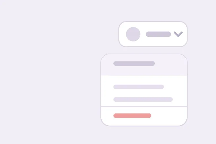
Descreva seus itens e o MeDo gera o menu completo — gatilho, painel, seções agrupadas com separadores, submenus, navegação por setas e digitação rápida, fechamento com Escape e clique fora, e foco que retorna ao gatilho ao fechar.

Menu suspenso
Menu suspenso

Um menu é uma única parada de tabulação, e é justamente aí que as pessoas erram

O instinto é tornar cada item focalizável, para que o Tab passe por eles um a um. O padrão ARIA menu faz o oposto: o menu inteiro é uma única parada de tabulação, e as setas movem um roving tabindex entre os itens enquanto o Tab fecha o menu e sai dele. É isso que faz um menu de conta com 12 itens custar uma tecla para ser ignorado em vez de doze. Também explica por que menus precisam de restauração explícita do foco: como o foco foi movido para o painel de forma programática, fechar sem devolvê-lo ao gatilho deixa o usuário de teclado no topo do documento. Gerar o gatilho e o painel como um único componente mantém esse trajeto de ida e volta intacto, porque as duas metades são escritas segundo o mesmo contrato de foco.

6 modelos

Modelos de Menu suspenso que você pode gerar

Cada modelo é um prompt real, não uma captura de tela. Copie para qualquer editor de IA, ou rode no MeDo e receba código React + Tailwind.

BasicAccount Menu

Avatar Trigger With Grouped Actions

The top-right menu every product has. Get the focus round trip right here and the rest of your menus inherit it — closing without returning focus drops keyboard users at the top of the document.

Create an account dropdown menu: a 32px avatar trigger with aria-haspopup="menu" and aria-expanded, and a 240px panel with role="menu" anchored 6px below it. Each row is role="menuitem", 32px tall, with a 16px leading icon. Use a roving tabindex so the whole menu is one tab stop — Tab closes it and leaves rather than walking the items. Enter, Space or Arrow Down opens the menu and focuses the first item; Arrow Up opens it focusing the last. Arrow Down and Up cycle with wrapping, Home and End jump to the ends, typing a letter jumps to the next item starting with it, Escape and outside pointerdown close it, and focus returns to the trigger on every close path. Group items with 1px dividers and style Sign out as a destructive red item in its own group.


Teste no MeDo
Table rowRow Overflow

Three-Dot Menu on a Table Row

Repeated once per row, which makes the trigger label the real problem: twenty buttons all called "More options" tell a screen reader user nothing about which record they are about to delete.

Create a row-level overflow menu for a data table: a 32px icon-only three-dot trigger with aria-haspopup="menu", aria-expanded, and an accessible name that names its record — "More actions for invoice 1042" — so repeated triggers are distinguishable. The panel is role="menu" with Edit, Duplicate and Export, then a divider and a destructive Delete that opens a confirmation dialog and moves focus into it rather than acting immediately. Roving tabindex, Arrow Up and Down with wrapping, Home and End, single-letter type-ahead, Escape and outside pointerdown to close, focus back to the trigger. Close the menu when its ancestor scroll container scrolls, since an anchored panel detaches from a row that has moved.

Teste no MeDo
NestedSubmenu

Parent Items With Nested Panels

One level of nesting, with a hover intent delay. Without the delay, dragging the pointer diagonally to the item you wanted opens and closes three submenus on the way there.

Create a dropdown menu with one level of submenus: the parent item carries aria-haspopup="menu", aria-expanded and a trailing chevron, and its child panel is a separate role="menu" anchored to the parent's right edge, flipping to the left when it would leave the viewport. Open the submenu on Arrow Right or Enter with focus on the first child, and on hover after a 150ms intent delay with a similar grace period before closing so a diagonal pointer path does not toggle three panels. Arrow Left closes the submenu and returns focus to the parent item; Escape closes the whole menu and focuses the trigger. Keep type-ahead scoped to the currently open panel, and do not nest a second level.

Teste no MeDo
TogglesCheckable Items

Menu With Checkbox and Radio Rows

View options and sort order inside a menu. The roles change with the semantics — menuitemcheckbox for independent toggles, menuitemradio in a group for one-of-many — and so does whether the panel closes on select.

Create a view-options dropdown mixing checkable rows: a group of role="menuitemcheckbox" rows with aria-checked for column visibility, and below a divider a group of role="menuitemradio" rows inside role="group" with aria-labelledby a Sort by heading, where exactly one is aria-checked. Keep the panel open when a checkbox row is toggled so several can be set in one pass, and close it after a radio selection since the choice is complete. Reserve the check indicator column at a fixed width so labels do not shift when a state changes. Roving tabindex, Arrow Up and Down with wrapping, Home and End, Space toggles without closing, Enter selects, Escape closes and returns focus to the trigger.

Teste no MeDo
NavigationNav Disclosure

Header Dropdown of Plain Links

Deliberately not a menu. A products dropdown holds links, so role="menu" would collapse them into one tab stop and stop cmd+click from opening a new tab.

Create a navigation dropdown for a marketing header that is a disclosure, not an ARIA menu: a trigger button with aria-expanded and aria-controls, and a panel containing a plain ul of anchor elements — no role="menu" or role="menuitem", so each link stays individually focusable and openable in a new tab with cmd+click or middle click. Tab moves through the links in order rather than a roving tabindex. Open on click and on Arrow Down, close on Escape with focus returning to the trigger, close on outside pointerdown, and close on focusout when focus leaves the panel entirely. Do not open on hover alone on touch devices. Mark the link matching the current route with aria-current="page".

Teste no MeDo
FilterableSearch Menu

Long Menu With a Filter Field

Past roughly fifteen items, single-letter type-ahead stops being enough. Adding a text field changes the contract: the field keeps focus and the highlight moves by aria-activedescendant.

Create a filterable dropdown for a long list: a trigger with aria-haspopup and aria-expanded, and a panel whose first element is a search input that receives focus on open. Because a text field now holds focus, switch from a roving tabindex to the combobox approach — role="listbox" on the list, role="option" on rows, and aria-activedescendant on the input so Arrow Up and Down move the highlight while typing keeps working. Filter as the user types with a 150ms debounce, bold the matched substring, cap the list at 280px with internal scroll, and scroll the active option into view with block nearest. Show a no-matches row rather than an empty panel. Escape clears a non-empty filter first, then closes on a second press with focus returning to the trigger.

Teste no MeDo

Como personalizar seu Menu suspenso

Diga que é um menu de ações, não um <select>

role="menu" informa à tecnologia assistiva que cada item executa um comando. Se os itens, em vez disso, definem um valor de formulário, peça um listbox ou um <select> nativo. Usar um menu para um campo de formulário faz os leitores de tela anunciarem comandos onde o usuário espera opções.

Especifique o atraso de intenção de hover nos submenus

Peça cerca de 150ms de atraso antes de um submenu abrir e um período de tolerância semelhante antes de fechar. Sem isso, arrastar o ponteiro diagonalmente pela lista pai abre e fecha três submenus no caminho até aquele que você queria.

Peça explicitamente posicionamento que evite as bordas

Diga que o painel deve inverter para cima do gatilho perto da borda inferior e deslocar-se horizontalmente para continuar visível. Um menu ancorado a um avatar no canto superior direito é o caso mais comum em que um deslocamento fixo renderiza metade dos itens fora da tela.

Separe o item destrutivo

Coloque ações como Sair, Excluir ou Revogar acesso em seu próprio grupo abaixo de um divisor e peça o tratamento de cor destrutiva. O que evita o clique errado é a distância física dos itens rotineiros, não o texto vermelho.

Quem usa o componente Menu suspenso

Produto SaaS

Um menu de avatar no canto superior direito com o e-mail da conta como linha de cabeçalho estática, depois links de perfil e faturamento, um submenu de equipe, um alternador de tema e Sair isolado abaixo de um divisor.

Dashboard ou ferramenta de administração

Um menu de excedente no nível da linha atrás de um botão de três pontos, contendo Editar, Duplicar, Exportar e um Excluir destrutivo, com o gatilho rotulado pela linha a que pertence para que leitores de tela anunciem sobre qual registro se está agindo.

Editor de conteúdo

Um menu de inserção de blocos com tipos de item agrupados, um submenu de provedores de embed e salto por letra com digitação rápida, para que quem conhece a lista alcance um item sem percorrê-la com as setas.

Navegação de site de marketing

Um menu suspenso de produtos na navbar construído a partir de uma lista simples de links em vez de role="menu", para que o painel se comporte como a navegação que é e os links continuem focalizáveis individualmente e abríveis em uma nova aba.

Padrões de Menu suspenso para diferentes sites

O mesmo componente menu suspenso, ajustado ao tipo de site em que ele entra.

01 / 06

SaaS Account Menu

Avatar trigger, the account email as a static non-focusable header row, then profile and billing links, a team submenu and Sign out below a divider. Keep the email row out of the roving tabindex — a label that takes an arrow keypress to skip reads as a broken menu item.

Estilos e variações de Menu suspenso

Escolha a variação que combina com o resto da página e gere-a.

01 / 06

Grouped Action Menu

Rows split into two or three sections by 1px dividers, with the destructive action alone at the bottom. The physical gap is what prevents the misclick on Sign out or Delete — red text alone does not, because the pointer is already moving before the color registers.

Menu suspenso em React, Next.js, Vue e Svelte

React, Next.js, Vue 3, SvelteKit, Astro ou HTML puro — o mesmo menu suspenso, seis formas de integrar.

01 / 06

React Dropdown Menu

Hold the active index in state and derive tabIndex from it — that is the roving tabindex. Keep a ref to the trigger and focus it in the close handler, since the browser will not restore focus for you.

src/components/Menu.tsx

const [open, setOpen] = useState(false)
const [active, setActive] = useState(0)
const triggerRef = useRef(null)

function close() {
  setOpen(false)
  triggerRef.current?.focus()
}

<button ref={triggerRef} aria-haspopup="menu" aria-expanded={open}>
  Account
</button>

Como adicionar o seu Menu suspenso a um projeto

Quatro passos, de escolher um modelo de menu suspenso até subir para produção.

01~30s

Pick a Menu Template

Answer one question first: do the items run commands or navigate? Actions get the menu templates and their roving tabindex; links get the navigation disclosure, where every anchor stays its own tab stop.

02~10s

Copy the Prompt

Take the prompt into MeDo, Lovable, Bolt, v0 or Cursor and list your real items with the dividers where you want them. Say which item is destructive and which opens a submenu, since both change the generated markup.

03~1min

Generate and Refine

You get React + Tailwind back with a live preview. Follow up in plain English — "add a filter field", "flip above the trigger near the bottom edge", "turn Sort into radio items" — instead of touching the keydown handler.

04~2min

Wire the Actions and Ship

Connect each item to its handler, then verify the focus round trip with the keyboard alone: open, arrow down, Escape, and confirm focus lands back on the trigger rather than the top of the page.

Perguntas comuns sobre Menu suspenso

Como gerar um menu suspenso com IA?

Liste os itens que você quer, indique quais abrem submenus e diga onde ficam os divisores. O MeDo gera o gatilho, o painel ancorado, os itens agrupados e o tratamento de teclado como um único componente, então as setas, o Escape, o clique fora e a restauração do foco já estão ligados antes de você abri-lo.

Qual é a diferença entre um menu suspenso e um <select>?

Um menu invoca ações: escolher um item faz algo imediatamente e nada é armazenado. Um <select> guarda um valor de formulário: escolher uma opção altera um estado que será enviado depois. Eles usam roles diferentes e contratos de teclado diferentes, e trocar um pelo outro é o defeito de acessibilidade mais comum em menus suspensos personalizados.

Um menu suspenso de navegação deve usar role="menu"?

Não. role="menu" serve para menus de comandos no estilo de aplicativo, e aplicá-lo a uma lista de links faz cada link ser anunciado como menuitem e os reduz a uma única parada de tabulação. Um menu suspenso de navegação deve ser uma lista simples de âncoras dentro de um disclosure que o gatilho alterna com aria-expanded. Diga ao MeDo que o painel é navegação e ele gerará links em vez de itens de menu.

Como a navegação por teclado deve funcionar em um menu suspenso?

Enter, Space ou Arrow Down abrem o menu e focam o primeiro item. Arrow Up e Down movem entre os itens e dão a volta nas extremidades, Home e End saltam para o primeiro e o último, e digitar uma letra move para o próximo item que comece com aquele caractere. Arrow Right abre um submenu, Arrow Left o fecha, e Escape ou Tab fecham o menu inteiro com o foco retornando ao gatilho.

A IA pode gerar um menu suspenso com submenus?

Sim. Descreva o aninhamento e o MeDo gera o item pai com aria-haspopup, o painel filho, o atraso de intenção de hover e as ligações de Arrow Right e Arrow Left. Mantenha o aninhamento em um nível quando possível, já que um segundo nível é difícil de acertar com o ponteiro e difícil de descrever para quem usa leitor de tela.

Um menu suspenso precisa fechar ao clicar fora?

Sim, e ele também deve fechar com Escape, ao rolar um contêiner ancestral e quando o gatilho é clicado novamente. Anexe o listener externo em pointerdown em vez de click, para que um arraste iniciado fora do painel o dispense, e devolva sempre o foco ao gatilho para que usuários de teclado não sejam deixados no topo da página.
