MeDo

AI इनपुट जेनरेटर।

अपना फॉर्म बताएं और MeDo टेक्स्ट इनपुट और textarea दोनों साथ जेनरेट करता है — label, helper text, error states, prefix और suffix affixes, character counter और autosizing, सब सही एक्सेसिबिलिटी attributes से जुड़े हुए।

Input
Input

इनपुट का box उसका सबसे छोटा हिस्सा है

इनपुट में ज्यादातर काम field से नहीं जुड़ा होता। label, helper text, error slot और इनके बीच की spacing ही फॉर्म को उपयोगी बनाती है, और यही हिस्से component libraries आम तौर पर उपभोक्ता पर छोड़ देती हैं। इसलिए टीमें हर फॉर्म के लिए अलग wrapper markup लिखती हैं, और vertical rhythm field-by-field बहकता जाता है जब तक कुछ भी align नहीं रहता। label, description और error region को एक इकाई के रूप में जेनरेट करना उनका रिश्ता एक बार में तय कर देता है। इससे वेब फॉर्म की सबसे आम एक्सेसिबिलिटी खामी भी दूर हो जाती है — एक error message जो field के बगल में दिखता है लेकिन प्रोग्रामेटिक रूप से उससे कभी जुड़ा नहीं होता।

6 टेम्पलेट

Input टेम्पलेट जो आप जेनरेट कर सकते हैं

हर टेम्पलेट एक असली प्रॉम्प्ट है, स्क्रीनशॉट नहीं। इसे किसी भी AI एडिटर में कॉपी करें, या MeDo में चलाकर React + Tailwind कोड सीधे पाएं।

BasicLabel + Field

Labeled Input With Helper Text

The baseline every other field extends. Label, field, and a message region that already occupies its line at rest so the form does not grow when an error appears.

Create a text input component with a visible label above the field, wired with a generated id and a matching for attribute rather than wrapping the input in the label. Below it, a helper text line linked through aria-describedby. Reserve the height of that line at rest so the form does not shift when an error replaces it. The field is 40px tall with an 8px radius, a 1px grey border, and a 2px focus-visible ring offset from the border. Add a required prop that sets the required attribute and appends a visually hidden "required" to the label rather than relying on an asterisk alone. Accept type, inputMode and autocomplete as props with no defaults, so each call site declares them.


MeDo में आज़माएं
ErrorsValidation States

Error, Success and Warning States

Where most form bugs live. An error message rendered beside a field but never connected to it is the most common accessibility defect in web forms.

Add validation states to a text input: error with a red border, a red message replacing the helper text, aria-invalid="true", and the message linked through aria-describedby so it is announced when focus enters the field. Add success and warning states that change the border and the leading icon but keep the same message slot and line height. Never signal state by border color alone — pair every state with an icon and text. Validate on blur, then revalidate on change only once the field is already in an error state, so a half-typed email is not flagged mid-entry. Announce late server-side errors through a polite live region.

MeDo में आज़माएं
AffixesAffix Slots

Prefix and Suffix Inside the Field

Search icons, currency symbols, unit suffixes, password toggles. The trap is padding — an affix rendered over the field without matching inset padding lets typed text slide underneath it.

Create a text input with optional prefix and suffix slots rendered inside the field border. Static affixes such as a currency symbol or a .com suffix get aria-hidden and muted text; interactive affixes such as a password visibility toggle or a clear button render as real buttons with their own aria-label and stay reachable by keyboard. Increase the field padding to match each affix width so typed text never slides under it. Keep the focus ring on the outer wrapper, not the bare input, so the ring surrounds the affixes too. Include a search variant with a leading magnifier and a trailing clear button that appears only when the field has a value.

MeDo में आज़माएं
TextareaAutosize Textarea

Growing Textarea With a Counter

A fixed three-row box for a support message forces people to scroll inside a scroll. Growing to a cap keeps the submit button on screen.

Create a textarea that shares the label, helper text and error layout of the text input. Autosize from a three-row minimum up to eight rows, recalculating the height from scrollHeight on input after resetting it, then switch to internal scrolling at the cap so a long message cannot push the submit button off screen. Add an optional character counter in the bottom right showing used and total, turning amber at 90 percent of the limit and red at the limit, announced through a polite live region rather than on every keystroke. Disable the native resize handle only when autosizing is on, otherwise leave it available.

MeDo में आज़माएं
FormattingMasked Field

Card, Phone and Date Inputs

Formatted fields where the input event rewrites the value. Get the caret handling wrong and editing the middle of a card number jumps the cursor to the end on every keystroke.

Create a formatted input for card numbers, phone numbers and expiry dates. Insert separators as the user types — spaces every four digits for cards, a slash after the month for expiry — while storing the unformatted value in state and submitting that. Preserve the caret position when the mask inserts a character mid-string, rather than letting the value reset send it to the end. Set inputMode="numeric" and the correct autocomplete token: cc-number, tel, cc-exp. Accept paste of an already-formatted value by stripping non-digits first. Validate length on blur and keep the field editable in the error state.

MeDo में आज़माएं
LayoutField Group

Multi-Field Row With Shared Rhythm

City and postcode on one line, expiry and CVC side by side. The point is a single spacing scale, since per-form wrapper markup is what makes vertical rhythm drift.

Create a form field group component that lays out two or three inputs on one row using a grid, collapsing to a single column below 640px. Keep a shared vertical gap between rows and align the labels on a single baseline even when one field carries helper text and its neighbor does not, by reserving the message line in every field. Group semantically related fields in a fieldset with a legend, such as an address block, so screen readers announce the group name before each field. Let each field declare its own width in grid columns rather than a hardcoded percentage, so a postcode field can be narrower than a city field.

MeDo में आज़माएं

अपने Input को कैसे कस्टमाइज़ करें

हमेशा एक असली label मांगें

placeholder label नहीं है। जैसे ही कोई टाइप करना शुरू करता है यह गायब हो जाता है, जिससे फॉर्म के बीच में रुकने वाला व्यक्ति फंस जाता है, और ज्यादातर screen readers इसे optional text मानते हैं। <label for> से field से जुड़ा visible label मांगें, और placeholder सिर्फ MM/YY जैसे format उदाहरणों के लिए इस्तेमाल करें।

error message के लिए जगह आरक्षित रखें

अगर error text सिर्फ validation fail होने पर दिखता है, तो submit पर नीचे का field उछल जाता है। बताएं कि helper और error region आराम की स्थिति में भी एक fixed line height लेता है, जिससे message आने पर फॉर्म की ऊंचाई कभी न बदले।

जिन input types की जरूरत है उन्हें नाम दें

हर field के लिए type और inputMode बताएं: email, tel और numeric अलग-अलग mobile keyboards खोलते हैं। इन्हें सही autocomplete tokens के साथ जोड़ें, जैसे email, tel, current-password और one-time-code, ताकि browsers और password managers फॉर्म भर सकें।

तय करें validation कब चले

हर keystroke पर validate करने से आधा टाइप हुआ email किसी के पूरा करने से पहले ही गलत मार्क हो जाता है। blur पर validation मांगें और field पहले से error state में हो तो change पर revalidation — इससे गलतियां सुधरती हैं, परेशान किए बिना।

Input कंपोनेंट का उपयोग कौन करता है

साइनअप या लॉगिन फॉर्म

email और password fields, suffix slot में inline visibility toggle, helper text में password strength hint, और autocomplete tokens सेट किए हुए ताकि browsers खाली fields की जगह सेव किए गए credentials सुझाएं।

चेकआउट फ्लो

card number, expiry और postal code inputs numeric input modes के साथ, amount field पर currency prefix, और blur पर validation ताकि आधा टाइप हुआ card number कभी invalid न बताया जाए।

सपोर्ट या कॉन्टैक्ट फॉर्म

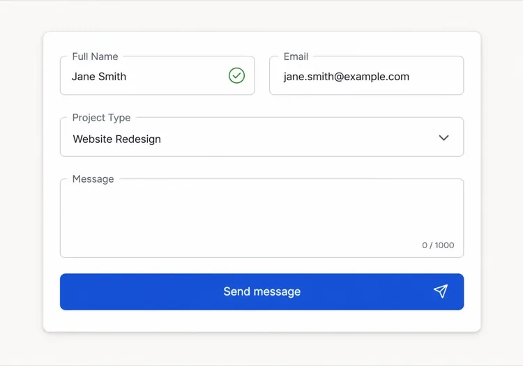
एक छोटा subject input और उसके नीचे 1,000-character counter वाला autosizing message textarea, ताकि लंबे संदेश field को बढ़ाएं, न कि लोगों को एक fixed box के अंदर scroll करने पर मजबूर करें।

डैशबोर्ड सेटिंग्स पैनल

छोटे inputs की घनी rows जिनके labels बाईं ओर aligned हों, उन values के लिए read-only fields जिन्हें यूज़र बदल नहीं सकता, और helper text जो बताए कि हर setting किस पर असर डालती है।

अलग-अलग वेबसाइटों के लिए Input पैटर्न

वही input कंपोनेंट, उस वेबसाइट के प्रकार के हिसाब से ढाला गया जहाँ वह लगेगा।

01 / 06

SaaS Signup and Login Inputs

Two fields decide whether the account gets created, so the autocomplete tokens matter more than the styling. Set email and current-password on login and new-password on signup, or password managers offer the wrong entry and people retype credentials they already saved. Put the visibility toggle in the suffix slot as a real button, not a click handler on an icon.

Input की शैलियाँ और वेरिएंट

जो वेरिएंट बाकी पेज से मेल खाता है उसे चुनें और जेनरेट करें।

01 / 06

Outlined Input

A 1px border on a light surface with the label above — the default that works in the widest range of layouts. Keep the focus ring offset from the border rather than replacing it, so the resting and focused widths match and the field does not appear to move on focus.

React, Next.js, Vue और Svelte में Input

React, Next.js, Vue 3, SvelteKit, Astro या सादा HTML — वही input, जोड़ने के छह तरीके।

01 / 06

React Input

Generate the id with useId so label association survives rendering the field twice on one page. Forward the ref so form libraries like React Hook Form can register the element directly.

src/components/Input.tsx

export const Input = forwardRef(function Input(
  { label, hint, error, ...props },
  ref
) {
  const id = useId()
  return (
    <div className="space-y-1.5">
      <label htmlFor={id}>{label}</label>
      <input id={id} ref={ref} aria-invalid={!!error}
        aria-describedby={id + '-msg'} {...props} />
      <p id={id + '-msg'}>{error ?? hint}</p>
    </div>
  )
})

अपने Input को प्रोजेक्ट में कैसे जोड़ें

input टेम्पलेट चुनने से प्रोडक्शन में भेजने तक, चार चरण।

01~30s

Pick an Input Template

Scan the six templates and start from the field you actually need — labeled text input, affix slots for search or currency, autosizing textarea, or a masked card field.

02~10s

Copy the Prompt

Take the prompt into MeDo, Lovable, Bolt, v0 or Cursor. Name the type, inputMode and autocomplete token per field before you run it, since those three decide which mobile keyboard opens and whether autofill works.

03~1min

Generate and Refine

You get React + Tailwind back with a live preview. Follow up in plain English — "validate on blur only", "add a clear button in the suffix", "reserve the error line" — rather than editing the aria wiring by hand.

04~2min

Wire It to Your Form State

Register the forwarded ref with React Hook Form, Formik or a Server Action and pass the resolver error straight into the error prop. The component owns layout and aria; your form library owns the validation rules.

Input के बारे में सामान्य प्रश्न

AI से फॉर्म इनपुट कैसे जेनरेट करें?

एक ही प्रॉम्प्ट में field, उसका label, helper text और जो states चाहिए वो बताएं, जैसे "label, hint text और error state वाला email input"। MeDo label, field और message region को एक ही कम्पोनेंट के रूप में जेनरेट करता है जिसमें aria attributes पहले से जुड़े होते हैं। आप एक ही प्रॉम्प्ट में कई field types गिना सकते हैं और एक consistent सेट पा सकते हैं।

placeholder और label में क्या अंतर है?

label field को स्थायी नाम देता है और टाइप करते समय भी दिखता रहता है। placeholder field के अंदर का अस्थायी hint text है जो input पर गायब हो जाता है, इसलिए इसे अकेला label बनाने से लोग अंदाजा लगाते रह जाते हैं कि उन्होंने क्या भरा था। field के नाम के लिए label और format उदाहरण के लिए ही placeholder इस्तेमाल करें।

input errors टाइप करते समय दिखें या submit के बाद?

हर keystroke की जगह blur पर validate करें, ताकि आधा टाइप हुआ value बीच में गलत मार्क न हो। जब field पहले से error दिखा रहा हो, तो change पर revalidate करें ताकि value valid होते ही message हट जाए। submit-time validation उन checks के लिए रखें जिनमें पूरा फॉर्म चाहिए, जैसे password confirmation।

क्या AI एक्सेसिबल input fields जेनरेट कर सकता है?

हाँ। MeDo label को field से for और id के जरिए जोड़ता है, helper और error text को aria-describedby से लिंक करता है, और validation fail होने पर aria-invalid सेट करता है। प्रॉम्प्ट में required fields का जिक्र करें और यह सिर्फ asterisk पर भरोसा करने की जगह required attribute लगाएगा।

textarea को content के साथ बढ़ाने का तरीका क्या है?

minimum और maximum row count वाला autosizing textarea मांगें, उदाहरण के लिए तीन rows जो आठ तक बढ़ें और उसके बाद scroll करें। ऊंचाई हर input पर scroll height से फिर से गणना होती है, और maximum तय करने से लंबा संदेश submit button को स्क्रीन से बाहर नहीं धकेलता।

क्या autocomplete attribute वाकई मायने रखता है?

रखता है। सही autocomplete tokens browsers और password managers को fields एक ही कदम में भरने देते हैं, जिससे signup और checkout फॉर्म पर abandonment मापने योग्य रूप से घटता है। MeDo को बताएं कि हर field क्या इकट्ठा करता है और यह मिलता हुआ token सेट करेगा, उन address और payment values सहित जिनमें गलती आसानी से होती है।

अभी अपना input जेनरेट करें।

कोई भी प्रॉम्प्ट आज़माएं — मुफ्त, कोई साइन अप नहीं।