MeDo

AI फ़ीचर ग्रिड जेनरेटर।

अपने प्रोडक्ट के फ़ायदे सरल हिंदी में बताएं और MeDo सेकंडों में एक पॉलिश्ड, रेस्पॉन्सिव फ़ीचर ग्रिड जेनरेट करता है। आइकन बदलें, कॉलम एडजस्ट करें, और कॉपी को फाइन-ट्यून करें — सब कोड की एक लाइन छुए बिना।

फ़ीचर ग्रिड
फ़ीचर ग्रिड

एक शानदार फ़ीचर ग्रिड विज़िटर्स को विश्वासी बनाती है।

फ़ीचर ग्रिड अक्सर वह पहली जगह होती है जहां विज़िटर आपकी हेडलाइन पढ़ने के बाद देखता है — यह "लेकिन यह वास्तव में क्या करता है?" सवाल का जवाब एक स्कैन करने योग्य, विज़ुअल फ़ॉर्मेट में देती है। एक अच्छी तरह संरचित ग्रिड तेज़ी से विश्वसनीयता बनाती है: स्पष्ट आइकन कॉग्निटिव लोड कम करते हैं, संक्षिप्त विवरण ध्यान अवधि का सम्मान करते हैं, और सुसंगत लेआउट एक सुविचारित प्रोडक्ट का संकेत देता है। अध्ययन लगातार दिखाते हैं कि फ़ोल्ड के ऊपर रखे गए फ़ीचर सेक्शन पेज पर समय और ट्रायल साइन-अप दरों को काफ़ी बढ़ाते हैं।

6 टेम्पलेट

फ़ीचर ग्रिड टेम्पलेट जो आप जेनरेट कर सकते हैं

हर टेम्पलेट एक असली प्रॉम्प्ट है, स्क्रीनशॉट नहीं। इसे किसी भी AI एडिटर में कॉपी करें, या MeDo में चलाकर React + Tailwind कोड सीधे पाएं।

Icon cardsAcme

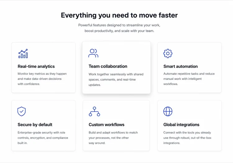
Three-Column Icon Card Grid

The workhorse feature grid. Six cards is the ceiling before scanning turns into reading — at nine the visitor stops comparing cards and starts skipping them.

Create a three-column feature grid holding exactly six cards. Above the grid, a centered eyebrow label, an h2 section heading and one line of supporting copy at a max width of 42rem. Each card has a filled icon in a tinted rounded square, an h3 title of two to four words, and a description of one to two sentences. Cards share a light surface, a 12px radius and a hairline border, with a hover state that raises the shadow and shifts the card up 2px — guarded behind prefers-reduced-motion. Collapse to two columns at 1024px and one at 640px, keeping equal card heights via the grid rather than fixed pixel values.

MeDo में आज़माएं
BentoMega

Bento Grid With One Feature Card

Unequal cells let one feature carry a screenshot while the rest stay text. Use it when the features are genuinely unequal in importance — a bento of six equally weighted cells is just a grid with worse alignment.

Create a bento-style feature grid on a twelve-column base: one hero cell spanning eight columns and two rows containing a title, two lines of copy and a cropped product screenshot; two cells of four columns each with an icon, title and one-line description; and a full-width cell at the bottom with a title, a short paragraph and a text link. Give every cell the same radius, border and internal padding so the varied spans still read as one system. Below 900px, flatten to a single column in importance order and drop the screenshot to full width with explicit dimensions.

MeDo में आज़माएं
Alternating rowsShipfast

Feature Rows With Alternating Screenshots

Not a grid at all — three stacked rows that flip image side each time. The right choice when each feature needs a screenshot to make sense, which an icon card can never provide.

Create a feature section as three alternating rows instead of a grid. Each row is a two-column layout: copy on one side with an eyebrow label, an h3, a two-sentence description and a bulleted list of three sub-points, and a product screenshot on the other side in a bordered frame at explicit width and height. Flip the image from right to left to right down the rows using an order utility at the desktop breakpoint only. Add generous vertical rhythm between rows and a hairline divider. Below 900px, every row stacks with the copy first so the reading order stays consistent.

MeDo में आज़माएं
Minimal listBuilders

Borderless Grid With Small Icons

No cards, no shadows — just a two-by-four field of small icons with tight copy. Fits documentation and developer sites where card chrome reads as marketing decoration.

Create a borderless feature grid with no cards or shadows: a four-column layout on desktop holding eight items, each with a 20px outline icon above an h3 title of two or three words and a description capped at two lines. Rely on column and row gap for separation rather than borders, and keep the icons a single stroke weight from one library. Add a left-aligned section heading and a single text link to the docs beneath the grid. Collapse to two columns at 768px and one at 480px, preserving the icon-above-title stacking at every size.

MeDo में आज़माएं
NumberedStudio

Numbered Capability Grid

Swaps icons for large numerals, which is the honest move when your features have no natural iconography. Reads as a deliverables list, so agencies and service pages get more from it than products do.

Create a numbered feature grid of six cells in three columns. Each cell opens with an oversized two-digit numeral in a muted tint, then an h3 title and a two-sentence description. Numbering runs left to right and must be visual only — set the numerals as decorative text with aria-hidden so a screen reader hears the titles as a clean list. Use a shared top border on each cell instead of full card outlines. Include a section heading and a short intro paragraph above. Two columns at 1024px, one at 640px, with the numeral scaling down one step on mobile.

MeDo में आज़माएं
ComparisonBrand*

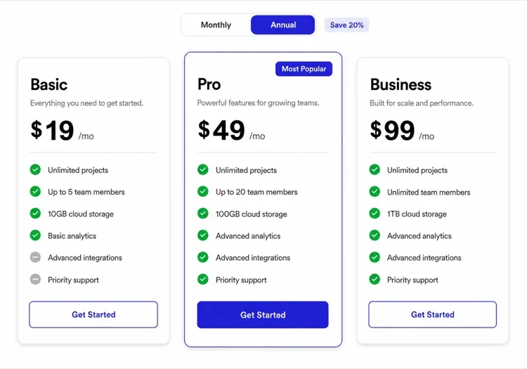
Feature Grid With Plan Availability

Each card names the tier that includes it. Removes the click to pricing at the cost of maintenance — if the tiers change and this grid does not, it becomes a support ticket generator.

Create a feature grid where each card carries plan availability: three columns, six cards, and inside each an icon, an h3 title, a two-sentence description and a small badge row reading Starter, Pro or Enterprise. Style the badge by tier with distinguishable text labels rather than color alone. Add a filter row of tier pills above the grid that hides non-matching cards on click, keeping the pressed state on the active pill with aria-pressed. Announce the visible count in a live region. Collapse to two columns at 1024px and one at 640px, with the filter row scrolling horizontally on mobile.

MeDo में आज़माएं

अपने फ़ीचर ग्रिड को कैसे कस्टमाइज़ करें

फ़ीचर नहीं, परिणामों से शुरू करें

"रोल-बेस्ड परमिशन" की जगह लिखें "IT टिकट के बिना कंट्रोल करें कि कौन क्या देखे।" प्रत्येक कार्ड को फ़ीचर नाम के बजाय यूज़र बेनिफ़िट के इर्द-गिर्द रीफ़्रेम करने से ग्रिड तुरंत अधिक आकर्षक और कन्वर्ज़न-केंद्रित बन जाती है।

एक सुसंगत आइकन स्टाइल और वेट का उपयोग करें

आउटलाइन आइकन को फ़िल्ड आइकन के साथ मिलाना, या अलग-अलग स्ट्रोक वेट का उपयोग करना, विज़ुअल नॉइज़ पैदा करता है। एक स्टाइल चुनें — आउटलाइन, फ़िल्ड, या डुओटोन — और इसे हर कार्ड पर लागू करें। MeDo से कहें कि सभी आइकन एक ही लाइब्रेरी (Lucide, Heroicons, Phosphor) से लें ताकि एकरूपता ऑटोमैटिक बनी रहे।

ग्रिड को एक प्रूफ पॉइंट के साथ जोड़ें

हर फ़ीचर कार्ड के नीचे एक सूक्ष्म स्टैट या सोशल प्रूफ़ टैग जोड़ें — "12,000 टीमों द्वारा उपयोग किया गया" या "औसतन प्रति सप्ताह 3 घंटे बचाता है।" एक अकेला नंबर लाभ को वास्तविकता में एंकर करता है और कथित विश्वसनीयता को नाटकीय रूप से बढ़ाता है।

फ़ीचर डेंसिटी के अनुसार कॉलम संख्या एडजस्ट करें

तीन या चार फ़ीचर 2-कॉलम लेआउट में सबसे अच्छे काम करते हैं ताकि हर कार्ड को सांस लेने की जगह मिले। छह से नौ फ़ीचर 3-कॉलम ग्रिड के लिए उपयुक्त हैं। नौ से अधिक होने पर, अधिक कार्ड जोड़ने के बजाय कैटेगरी हेडर के तहत फ़ीचर्स को ग्रुप करने पर विचार करें — ग्रिड 9 आइटम से अधिक होने पर भारी हो जाती है।

फ़ीचर ग्रिड कंपोनेंट का उपयोग कौन करता है

SaaS प्रोडक्ट पेज

फ़ीचर ग्रिड हर SaaS मार्केटिंग पेज की रीढ़ हैं। वे प्रॉस्पेक्ट्स को क्षमताओं को स्कैन करके सेल्फ़-क्वालिफ़ाई करने देती हैं — एक विज़िटर जो किसी कार्ड में अपनी समस्या पहचानता है, ट्रायल शुरू करने की कहीं अधिक संभावना रखता है।

डेवलपर टूल लैंडिंग पेज

डेवलपर टूल तकनीकी क्षमताओं को हाइलाइट करने के लिए फ़ीचर ग्रिड का उपयोग करते हैं — SDK सपोर्ट, परफ़ॉर्मेंस बेंचमार्क, इंटीग्रेशन — एक ऐसे फ़ॉर्मेट में जिसे इंजीनियर 30 सेकंड से कम में बिना लंबा टेक्स्ट पढ़े समझ सकते हैं।

मोबाइल ऐप शोकेस पेज

ऐप लैंडिंग पेज आइकन-ड्रिवन फ़ीचर ग्रिड का उपयोग करके सीमित वर्टिकल स्पेस में एक समृद्ध फ़ीचर सेट को कम्युनिकेट करते हैं, अक्सर लेआउट को विज़ुअली बैलेंस्ड रखने के लिए ग्रिड को ऐप मॉकअप स्क्रीनशॉट के साथ जोड़ते हैं।

एजेंसी और फ़्रीलांसर पोर्टफ़ोलियो

सर्विस-बेस्ड बिज़नेस पैकेज में शामिल चीज़ों की लिस्ट बनाने के लिए फ़ीचर ग्रिड का उपयोग करते हैं — डिज़ाइन, डेवलपमेंट, SEO, सपोर्ट — जो प्रपोज़ल्स को पारदर्शी बनाता है और बिक्री प्रक्रिया में आगे-पीछे को कम करता है।

अलग-अलग वेबसाइटों के लिए फ़ीचर ग्रिड पैटर्न

वही फ़ीचर ग्रिड कंपोनेंट, उस वेबसाइट के प्रकार के हिसाब से ढाला गया जहाँ वह लगेगा।

01 / 06

SaaS Product Feature Grid

Six icon cards framed as outcomes, not feature names. Visitors self-qualify by scanning for their own problem, so a card titled "Role-based permissions" does less work than one titled "Control who sees what". Keep the card count fixed as the product grows or this section becomes a changelog.

फ़ीचर ग्रिड की शैलियाँ और वेरिएंट

जो वेरिएंट बाकी पेज से मेल खाता है उसे चुनें और जेनरेट करें।

01 / 06

Icon Card Grid

Bordered or shadowed cards with a tinted icon tile, title and description. The most legible default because the card boundary does the grouping for you. Keep icons from one library at one stroke weight or the grid reads as assembled from three different sites.

React, Next.js, Vue और Svelte में फ़ीचर ग्रिड

React, Next.js, Vue 3, SvelteKit, Astro या सादा HTML — वही फ़ीचर ग्रिड, जोड़ने के छह तरीके।

01 / 06

React Feature Grid

Drive it from a typed array and map over it rather than hand-writing six near-identical card blocks. No state is involved, so this stays a plain function component even in a heavily interactive app.

src/components/FeatureGrid.tsx

const features = [
  { icon: Zap, title: 'Real-time sync', body: 'Changes land everywhere at once.' },
]

export function FeatureGrid() {
  return (
    <div className="grid gap-6 sm:grid-cols-2 lg:grid-cols-3">
      {features.map(({ icon: Icon, title, body }) => (
        <article key={title} className="rounded-xl border p-6">
          <Icon className="h-5 w-5" aria-hidden />
          <h3 className="mt-4 font-medium">{title}</h3>
          <p className="mt-2 text-sm text-zinc-500">{body}</p>
        </article>
      ))}
    </div>
  )
}

अपने फ़ीचर ग्रिड को प्रोजेक्ट में कैसे जोड़ें

फ़ीचर ग्रिड टेम्पलेट चुनने से प्रोडक्शन में भेजने तक, चार चरण।

01~30s

Pick a Feature Grid Template

Choose by what each feature needs to show. Icons and a sentence means a card grid; a screenshot per feature means alternating rows; no natural iconography means numbered cells.

02~10s

Copy the Prompt

Take the prompt into MeDo, Lovable, Bolt, v0 or Cursor. Replace the placeholder feature names with your real ones first — the card count decides the column count, not the other way round.

03~2min

Generate and Refine

You get React + Tailwind back with a live preview. Follow up in plain English — "make it four columns", "drop the shadows", "rewrite the titles as outcomes" — rather than hand-editing the array.

04~1min

Drop It Below the Hero

Place it after the hero and check the outline: one h2 for the section, h3 on each card. Then move the feature copy into a typed array or your CMS so the next edit does not touch JSX.

फ़ीचर ग्रिड के बारे में सामान्य प्रश्न

AI से फ़ीचर ग्रिड कैसे बनाएं?

MeDo खोलें, उन फ़ीचर्स का वर्णन करें जो आप दिखाना चाहते हैं — कितने कॉलम, कौन से आइकन या रंग उपयोग करने हैं, और टेक्स्ट का टोन — और MeDo एक पूरी तरह स्टाइल्ड, रेस्पॉन्सिव फ़ीचर ग्रिड कंपोनेंट जेनरेट करता है। आप फ़ॉलो-अप प्रॉम्प्ट से लेआउट एडजस्ट कर सकते हैं, आइकन बदल सकते हैं, या व्यक्तिगत कार्ड डिस्क्रिप्शन रीराइट कर सकते हैं।

सबसे अच्छा AI फ़ीचर ग्रिड जेनरेटर कौन सा है?

MeDo विशेष रूप से नैचुरल लैंग्वेज प्रॉम्प्ट से पॉलिश्ड UI कंपोनेंट जेनरेट करने के लिए बनाया गया है। जनरल-पर्पज AI कोड टूल्स के विपरीत, MeDo डिज़ाइन कन्वेंशन समझता है — कंसिस्टेंट स्पेसिंग, एक्सेसिबल कलर कॉन्ट्रास्ट, रेस्पॉन्सिव ब्रेकपॉइंट — इसलिए जेनरेटेड फ़ीचर ग्रिड एक सीनियर डिज़ाइनर के काम जैसी दिखती है, टेम्प्लेट लाइब्रेरी जैसी नहीं।

फ़ीचर ग्रिड में कितने फ़ीचर दिखाने चाहिए?

3 से 9 फ़ीचर आदर्श रेंज है। 3 से कम हल्का लगता है; 9 से अधिक विज़िटर्स को ओवरव्हेल्म करता है और ध्यान बिखेरता है। अगर आपके पास 9 से अधिक फ़ीचर हैं, तो उन्हें थीमैटिक कैटेगरी में ग्रुप करें — हर ग्रुप अपनी मिनी-ग्रिड बन जाता है — बजाय सबको एक अंतहीन ग्रिड में लिस्ट करने के।

क्या मैं अपने मौजूदा डिज़ाइन सिस्टम से मैच करने वाली फ़ीचर ग्रिड जेनरेट कर सकता हूं?

हां। अपने MeDo प्रॉम्प्ट में अपने डिज़ाइन टोकन स्पेसिफ़ाई करें — प्राइमरी कलर, फ़ॉन्ट फ़ैमिली, बॉर्डर रेडियस, शैडो इंटेंसिटी — और MeDo उन्हें पूरे जेनरेटेड कंपोनेंट में अप्लाई करेगा। आप Tailwind कॉन्फ़िग या CSS वेरिएबल लिस्ट भी पेस्ट कर सकते हैं और MeDo से कह सकते हैं कि वह आपके मौजूदा सिस्टम के अनुसार ग्रिड बनाए।

फ़ीचर ग्रिड के लिए कौन से आइकन सबसे अच्छे हैं?

आउटलाइन आइकन (जैसे Heroicons या Lucide) मिनिमल, मॉडर्न डिज़ाइन के लिए अच्छे काम करते हैं। फ़िल्ड या डुओटोन आइकन बोल्डर, अधिक रंगीन लेआउट के लिए उपयुक्त हैं। सबसे महत्वपूर्ण नियम एकरूपता है: ग्रिड में हर आइकन एक ही लाइब्रेरी से आना चाहिए और एक ही स्ट्रोक वेट का उपयोग करना चाहिए। MeDo डिफ़ॉल्ट रूप से Lucide आइकन का उपयोग करता है लेकिन आप जो भी लाइब्रेरी स्पेसिफ़ाई करें उसका उपयोग करेगा।

क्या MeDo React या Next.js में फ़ीचर ग्रिड जेनरेट कर सकता है?

हां। अपना फ़्रेमवर्क स्पेसिफ़ाई करें — React, Next.js, Vue, Svelte — और MeDo एक फ़्रेमवर्क-नेटिव कंपोनेंट आउटपुट करता है। React और Next.js प्रोजेक्ट्स के लिए, MeDo प्रॉप टाइपिंग के लिए TypeScript इंटरफ़ेस का उपयोग करता है, और कंपोनेंट को स्टैटिक डेटा-ड्रिवन ऐरे के रूप में जेनरेट कर सकता है ताकि आपकी कंटेंट टीम JSX एडिट किए बिना फ़ीचर्स अपडेट कर सके।

अभी अपना फ़ीचर ग्रिड जेनरेट करें।

कोई भी प्रॉम्प्ट आज़माएं — मुफ्त, कोई साइन अप नहीं।