AI Navbar Generator.

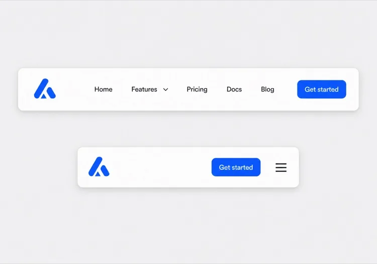
Describe your site and get a fully responsive navbar — with logo, nav links, dropdown menus, and a mobile hamburger — generated from a single prompt. No templates, no fiddling.

Navbar
Navbar

The Navbar Is the Map Users Read Before They Read Anything Else

A navbar is not decoration at the top of a page; it is the compressed table of contents for your entire site. The set of links you choose, the order you put them in, and what you push into a dropdown all tell a visitor what your product is and where the important parts live. Get the grouping wrong and users bounce even though the page they wanted exists two clicks away. Search crawlers read it the same way, treating navbar links as a strong signal about which pages matter most. That makes the navbar worth designing as an information architecture problem first and a layout problem second.

6 templates

Navbar Templates You Can Generate

Every template is a real prompt, not a screenshot. Copy it into any AI editor, or run it in MeDo and get React + Tailwind code back.

ClassicAcme

Logo, Five Links, One CTA

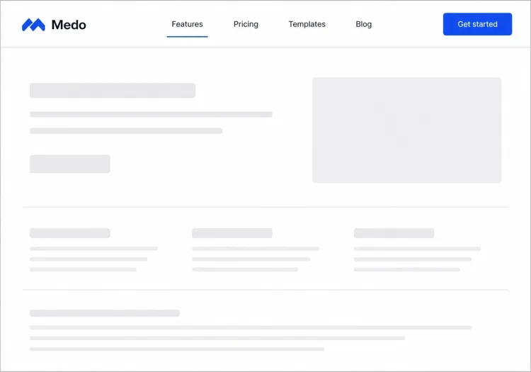
The default that fits most product sites. Reach for it only when your top level really is five items or fewer — a single row of nine links makes a small site feel disorganised rather than complete.

Create a horizontal navbar with a logo mark plus wordmark on the left, five links — Product, Pricing, Docs, Customers, Blog — centered, and one filled Get started button on the right. Mark the current route with aria-current="page" plus a 2px underline sitting on the text baseline rather than the container edge. Below 768px, replace the link row with a hamburger button that toggles aria-expanded and opens a full-height drawer sliding in from the right. Trap focus inside the drawer, close it on Escape and on route change, lock body scroll while it is open, and return focus to the hamburger button when it closes.
Try in MeDo
Mega menuMega

Mega Menu With Grouped Columns

For sites with more sections than a link row can hold. The mega panel buys you depth, but it also means two of your top-level items are no longer clickable destinations — decide that deliberately.

Create a navbar where two of five top-level items open a full-width mega menu panel: three columns of grouped links, each label with a one-line description underneath, plus a highlighted card on the right. Open the panel on hover after a 120ms delay and on Enter or Space for keyboard users. Give each trigger aria-expanded and aria-controls, move between panel links with arrow keys, close on Escape and when focus leaves the panel, and let Tab move on to the next top-level item. Below 1024px, flatten every mega panel into a nested accordion inside the mobile drawer instead of a hover panel.

Try in MeDo
CenteredShipfast

Centered Links With a Dual CTA

Sign in beside Start free, links dead center. Use a three-column grid rather than flexbox centering, or the link block drifts every time the button labels change length.

Create a navbar laid out as a three-column grid so the center block stays optically centered regardless of logo width or button label length: logo left, four links centered, and two actions right — a text Sign in link and a filled Start free button. Start fully transparent over the hero, then switch to a solid background with a 1px bottom border once the page scrolls past 80px, transitioning over 200ms, and swap the logo from its light variant to its dark variant at the same threshold. On mobile, collapse the links into a hamburger and keep only the Start free button visible next to it.

Try in MeDo
Docs navDocs

Version Switcher and Search Trigger

A navbar for a documentation site, where the nav is mostly controls rather than links. The search trigger earns more clicks here than every link beside it combined.

Create a navbar for a documentation site: logo on the left, then Docs, API and Changelog links, a version select showing v3.2 with older majors listed beneath, a search button showing a Command-K hint, a theme toggle and a GitHub star count. Bind Command-K and Control-K globally to open search, and make sure the shortcut is ignored while focus is inside an input or textarea. Below the tablet breakpoint, keep the search button and the sidebar toggle visible in the bar and move the links, version switcher and theme toggle into a drawer.

Try in MeDo
CommerceShop

Category Nav With Cart Count

Search takes real width, categories take the rest, and the cart lives at the far right. On a store the navbar is a working control surface, not a signpost — treat the search field as the primary element.

Create an e-commerce navbar: logo on the left, six category links with two opening a dropdown of subcategories, a search input that expands to fill the available row width on focus, and on the right an account link and a cart button with a count badge. Announce cart changes through an aria-live="polite" region so the count is not a silent visual update. Below 768px, keep the logo, a search icon and the cart in the bar, move categories into a left-hand drawer as a nested accordion, and expand search into a full-width overlay when its icon is tapped.

Try in MeDo
MinimalStudio

Wordmark and Four Links

No CTA, no dropdowns — a wordmark and four links, letting the work carry the page. The restraint only holds if the four labels are nouns a stranger recognises.

Create a minimal navbar for a design studio: a lowercase wordmark on the left and four links — Work, Studio, Journal, Contact — right-aligned in a light weight with generous letter spacing. Mark the current route with aria-current="page" and a subtle opacity change rather than an underline. Keep the bar static rather than sticky so it scrolls away with the page. Below 640px, keep all four links visible by dropping to a two-line layout with the wordmark above the links instead of introducing a hamburger, since four short labels do not justify a drawer.

Try in MeDo

How to Customize Your Navbar

Pin it with sticky positioning

Ask MeDo to make the navbar sticky so it follows users as they scroll. Add a backdrop blur or a slight shadow on scroll to give it depth without being intrusive.

Add a mega-menu for complex sites

If your site has many product areas or docs sections, prompt for a mega-menu with columns and icons. It turns a cluttered nav into an organized discovery surface.

Tailor the CTA to your funnel stage

The navbar CTA is prime real estate. Specify whether you want a "Sign up free" button, a "Book a demo" link, or a dual-button layout — and MeDo will wire it up accordingly.

Control mobile behavior explicitly

Describe how the mobile menu should open (slide-in drawer vs. full-screen overlay), what animations to use, and whether the hamburger icon should animate into an X on toggle.

Who Uses the Navbar Component

SaaS product

Clean two-tier nav with a logo, top-level product/pricing/docs links, and a sticky "Start free trial" CTA that stays visible as users scroll through long landing pages.

E-commerce store

A navbar with a search bar, category dropdowns, a cart icon with item count badge, and a login/account link — all collapsing into a mobile-friendly side drawer.

Documentation site

A minimal fixed navbar with a logo, version selector dropdown, a GitHub star button, and a full-width search input that expands on focus.

Marketing / agency site

A transparent navbar that sits over a hero image, transitions to a solid background on scroll, and features a prominent "Get a quote" button to drive lead generation.

Navbar Patterns for Different Websites

The same navbar component, tuned to the kind of site it ships on.

01 / 06

SaaS Product Navbar

Five top-level links and one CTA, grouped by what a visitor is trying to do rather than by your internal teams. If Pricing is not in the top level, expect support tickets asking what it costs — a Pricing link buried in a dropdown reliably suppresses trial starts.

Navbar Styles and Variants

Pick the variant that matches the rest of the page, then generate it.

01 / 06

Sticky Navbar

Stays pinned as the page scrolls, usually gaining a border or a backdrop blur once past the fold. Give it an explicit height and set scroll-margin-top on your headings, or in-page anchor links land with the target hidden behind the bar.

Navbar in React, Next.js, Vue and Svelte

React, Next.js, Vue 3, SvelteKit, Astro or plain HTML — the same navbar, six ways to drop it in.

01 / 06

React Navbar

One piece of state — whether the mobile drawer is open — so keep the hook at the navbar root and pass the current path in as a prop rather than reading a router inside it.

src/components/Navbar.tsx

export function Navbar({ pathname }) {
  const [open, setOpen] = useState(false)

  return (
    <nav aria-label="Main">
      {links.map((l) => (
        <a key={l.href} href={l.href}
           aria-current={pathname === l.href ? 'page' : undefined}>
          {l.label}
        </a>
      ))}
      <button aria-expanded={open} onClick={() => setOpen(!open)} />
    </nav>
  )
}

How to Add Your Navbar to a Project

Four steps, from picking a navbar template to shipping it in production.

01~30s

Pick a Navbar Template

Count your real top-level destinations first. Five or fewer takes the classic row, more than that needs the mega menu, and a store needs the commerce variant with search and cart.

02~10s

Copy the Prompt

Paste it into MeDo, Lovable, Bolt, v0 or Cursor with your actual link labels substituted. Keep the mobile-drawer sentences intact — the focus trap and scroll lock are the parts that get dropped when a prompt is trimmed.

03~1min

Generate and Refine

You get React + Tailwind back with a live preview. Follow up in plain English — "move Pricing before Docs", "add a Sign in link beside the CTA", "close the drawer on route change".

04~2min

Mount It in Your Layout

Put the navbar in your root layout, then wire the active link to your router — usePathname, useRoute or $page.url.pathname — so aria-current is set from the real route rather than a hardcoded index.

Common Questions About Navbar

How do I create a navbar with AI?

Write a prompt describing your site type, the links you need, any dropdown structure, and your preferred visual style. Paste it into MeDo and it will generate a fully structured, responsive navbar component you can copy straight into your project.

What is the best AI navbar generator?

MeDo is purpose-built for generating production-ready UI components from natural language prompts. Unlike generic AI coding tools, MeDo understands design patterns like sticky headers, mega-menus, and mobile drawers — so you get clean, usable output rather than boilerplate.

Can I generate a responsive mobile navbar with AI?

Yes. Just include mobile behavior in your prompt — for example, "add a hamburger menu that opens a slide-in drawer on mobile." MeDo will generate the toggle logic, animation, and responsive breakpoints alongside the desktop layout.

How do I add a dropdown menu to an AI-generated navbar?

Mention the dropdown in your prompt: "add a dropdown under the Products link with three items: Features, Integrations, and Changelog." MeDo will generate the hover/focus interaction and accessible keyboard navigation for the submenu.

What is the difference between a navbar and a header?

A header is the whole strip at the top of the page, including the logo, any announcement bar, and the scroll behavior of that strip. A navbar is specifically the set of navigation links inside it. If your question is about link structure, dropdowns, and mobile menus, you want a navbar; if it is about branding, sticky positioning, and how the top of the page behaves as you scroll, see the AI header generator.

Does MeDo generate accessible navbar code?

Yes. MeDo-generated navbars include semantic HTML (nav, ul, li, button elements), ARIA labels for the mobile toggle, and keyboard-navigable dropdowns — so you get accessibility without extra effort.