
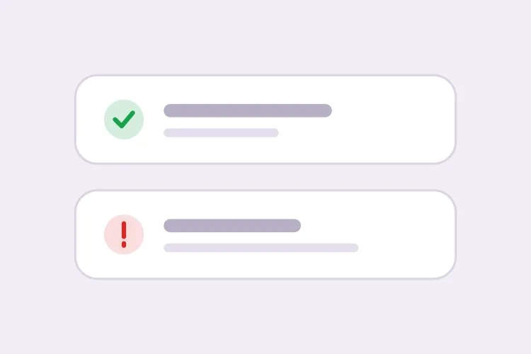
Success, Error, Warning, Info Stack
The baseline set, and the only one where per-type rules matter more than styling. Errors that auto-dismiss are the single most common toast bug in production.
Create a toast system with four semantic types — success with a check icon and green accent, error with an alert icon and red accent, warning with a triangle and amber accent, info with a circle and blue accent. Each toast is 360px wide with a 12px radius, 16px padding, a semibold title, an optional description and a close button with an accessible label. Stack in the bottom-right with 8px gaps, newest on top, three visible at once and the rest queued. Auto-dismiss success, info and warning after 5000ms; keep errors until the user closes them. Wrap non-error toasts in role="status" with aria-live="polite" and give errors role="alert". Slide in 16px from the right and fade out; under prefers-reduced-motion, fade only.


