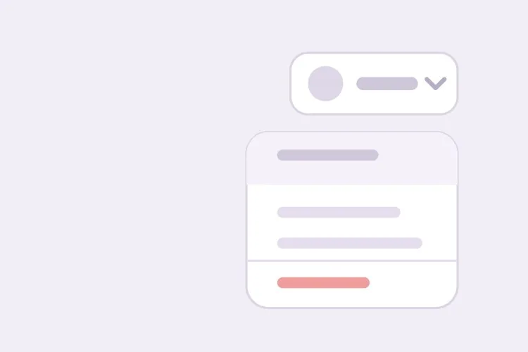
AI提示框生成器。

描述你需要的提示,MeDo會生成完整行為 — 開啟與關閉延遲、避開視區邊緣的翻轉、始終對準觸發元素的箭頭、鍵盤焦點觸發,以及aria-describedby關聯。

提示框
提示框

提示框是三分之一用戶永遠看不到的那個元件

觸控螢幕上並不存在懸停。手機上沒有任何手勢能可靠地表達「給我看說明,但不要啟動這個控制項」,這意味著每個提示框對相當大比例的流量而言都是看不見的。單憑這一點,就在爭論開始前解決了大部分關於提示框的設計分歧:提示框只能承載用戶並不需要的資訊。欄位填寫要求、錯誤訊息、價格附加條件,以及純圖示按鈕的含義,都必須放在看得見的位置或寫進無障礙名稱裡。把提示框視為一個本身已能正常運作的介面之上的錦上添花,無障礙方面的問題大多會自然而然有了答案。

6 個模板

可以產生的 提示框 模板

每個模板都是真實的提示詞,而非截圖。複製到任何 AI 編輯器,或在 MeDo 中執行,直接取得 React + Tailwind 程式碼。

BasicLabel Hint

Dark Panel Hint on Hover and Focus

The default tooltip: one line of plain text, dark panel, arrow, delays in both directions. Reach for it when a control is already named and you only want to add a detail a mouse user might appreciate.

Create a tooltip component that wraps a single trigger child and renders a short plain-text hint on pointer enter and on focus-visible. Use a dark slate panel with 13px white text, 6px vertical and 10px horizontal padding, a 6px radius, a 240px max width and an 8px offset from the trigger, plus a 6px arrow aimed at the trigger. Open after a 300ms delay and close after 100ms so the pointer can cross the gap without the panel vanishing. Dismiss on Escape, on blur and on scroll. Give the panel role="tooltip" and link it to the trigger with aria-describedby only while it is open, rather than leaving hidden markup in the tree. Fade and translate 4px on entry, and drop the transition entirely under prefers-reduced-motion.


在 MeDo 中試試
Icon-onlyIcon Button

Tooltip as the Only Label a Control Has

When the icon is the whole button, the tooltip text is the accessible name — not a description. Getting that distinction wrong is why so many toolbars announce the same word twice.

Create a tooltip for an icon-only button where the tooltip text is the only name the control has. Put that string in aria-label on the button and do not also set aria-describedby, so the same words are not announced twice. The visible panel exists for sighted pointer users: dark surface, 12px text, a single line that does not wrap under 200px. Open on hover after a 400ms delay but open immediately on focus-visible, since a keyboard user has already committed to the control. Close on Escape, on blur and on pointer leave. Keep the button hit area at least 44px even when the glyph is 20px, and skip rendering the panel entirely when a coarse pointer is detected.

在 MeDo 中試試
CollisionAuto Flip

Edge-Aware Placement With a Tracking Arrow

Handles the case a fixed side always breaks: a trigger near the top of a scroll container or the right edge of the viewport. The arrow has to re-anchor after the flip or it points at nothing.

Create a tooltip with collision-aware placement: a preferred side prop of top, bottom, left or right, an explicit fallback order, and shifting along the cross axis when the panel would overflow the viewport or the nearest scrolling ancestor. Add a 6px arrow that re-anchors to the trigger centre after any flip or shift, clamped so it never slides past the panel corner radius. Recompute position on scroll and resize behind a requestAnimationFrame throttle, and close rather than reposition once the trigger leaves the visible area. Keep the aria-describedby relationship stable across repositioning so the description is not re-announced. Use role="tooltip" and plain text content with no interactive children.

在 MeDo 中試試
ToolbarGroup Skip

Shared Delay Across a Button Row

One provider, one timer. Once the first tooltip in a toolbar has opened, moving along the row should switch content instantly instead of making the user wait 300ms per button.

Create a tooltip provider that shares open state across a group of triggers in a toolbar. The first tooltip in the group waits the full 300ms open delay; while any tooltip in the group is open, moving to a sibling trigger swaps the content with no delay and no exit animation, so the panel appears to slide along the row. Leaving the group entirely closes after a 150ms grace period. Reuse a single positioned panel element rather than mounting one per trigger, and update its aria-describedby target as the active trigger changes. Escape closes the group and returns focus behaviour to normal. Under prefers-reduced-motion, replace the slide with an instant content swap.

在 MeDo 中試試
Multi-lineRich Hint

Two-Line Tooltip With a Keyboard Shortcut

A label line plus a monospace shortcut hint on the right. Still passive, still text-only — the moment you want a link in here, you want a popover instead.

Create a tooltip that renders a label line plus a secondary line, with an optional keyboard shortcut rendered as a small monospace chip aligned to the right of the label. Cap the panel at 260px, allow the description to wrap to two lines, and keep line-height at 1.4 so the two lines read as one block. Content stays non-interactive: no links, no buttons, no selectable code — if the user needs to click inside, use a popover. Announce the whole panel as one description via aria-describedby so the shortcut is read as part of the sentence rather than as a separate node. Open after 300ms, close after 100ms, dismiss on Escape and blur.

在 MeDo 中試試
OverflowTruncation

Tooltip Only When the Text Is Clipped

Table cells and file names truncate with an ellipsis; a tooltip that repeats already-visible text is noise. Measure the element and only attach the tooltip when scrollWidth exceeds clientWidth.

Create a conditional tooltip for truncated text: compare scrollWidth against clientWidth on the target element and only register hover and focus handlers when the text is actually clipped, so a fully visible cell never shows a tooltip repeating itself. Re-measure on resize and whenever the text content changes, using a ResizeObserver rather than a window listener. When active, show the full string in a dark panel capped at 320px with wrapping enabled, positioned below the cell to avoid covering the row header. Make the truncated element focusable with tabindex="0" only while the tooltip is registered, so keyboard users can reach it without collecting empty tab stops across the whole table.

在 MeDo 中試試

如何自訂你的 提示框

分別設定開啟與關閉延遲

共用同一個延遲在兩個方向上都不對。開啟前約300ms可避免指標經過工具列時提示閃動,而100ms的短暫關閉延遲能讓指標從觸發元素移動到提示面板,而不會中途消失。

要求碰撞偵測,而非固定方向

固定顯示在上方的提示會被視區頂部或捲動容器邊緣裁切。指定首選方向加備選方向,讓元件自行翻轉和平移,並說明移動後箭頭仍須指向觸發元素。

要求焦點也能觸發,而不只是懸停

如果提示只回應滑鼠,鍵盤用戶就什麼也得不到。要求在focus-visible時開啟,在Escape和blur時關閉,這同時也讓使用開關裝置或螢幕閱讀器的人能夠使用它。

內容保持被動且只用文字

一旦提示框裡放了連結、按鈕或可複製的文字,就需要一種能到達它並讓它保持開啟的方式,它也就不再是提示框了。明確說明內容是純文字且不可互動,需要在裡面放可點擊元素時改用彈出層(popover)。

誰在使用 提示框 組件

儀表板或管理後台

純圖示的工具列按鈕帶有真正的無障礙名稱,再加一個為使用滑鼠的視力正常用戶重複標籤的提示框;指標在相鄰按鈕之間移動時跳過開啟延遲。

SaaS產品

圖表圖例上的提示,說明某項指標如何計算;靠近面板頂部時翻轉至觸發元素下方,並在捲動時關閉,絕不會脫離所描述的位置浮在頁面上。

電商商店

尺碼表縮寫和運送標記圖示在懸停時給出註解,同時在商品頁的正文中重複相同資訊,因為用手機購物的人永遠不會觸發懸停。

開發者文件

行內程式碼標記和縮寫在懸停或取得焦點時顯示一行型別簽名,並限制較窄的最大寬度,讓面板絕不會遮住它正在說明的程式碼範例。

不同網站的 提示框 方案

同一個 提示框 組件,針對它所在網站的類型作調整。

01 / 06

Dashboard and Admin Tools

Dense toolbars are where tooltips earn their keep and where a per-trigger delay is most annoying. Use one shared provider so moving along a row of icon buttons swaps the label instantly. The tooltip still cannot be the only place the label exists — every icon button needs a real accessible name regardless.

提示框 的風格與變體

挑選與頁面其餘部分相襯的變體,然後產生它。

01 / 06

Dark Panel Tooltip

A dark slate surface with white text is the default for a reason: it reads as an overlay rather than as page content, so users do not mistake it for a permanent part of the layout. Keep the panel opaque — a translucent tooltip over a chart becomes unreadable exactly where it is needed.

在 React、Next.js、Vue 與 Svelte 中使用 提示框

React、Next.js、Vue 3、SvelteKit、Astro 或純 HTML —— 同一個 提示框,六種接入方式。

01 / 06

React Tooltip

Positioning needs real DOM measurement, so this is a client component with refs on both trigger and panel. Portal the panel to document.body — a tooltip inside a container with overflow: hidden will be clipped no matter how correct the coordinates are.

src/components/Tooltip.tsx

export function Tooltip({ label, children }) {
  const [open, setOpen] = useState(false)
  const id = useId()

  return (
    <span
      onPointerEnter={() => setOpen(true)}
      onPointerLeave={() => setOpen(false)}
    >
      {cloneElement(children, { 'aria-describedby': open ? id : undefined })}
      {open && createPortal(<Panel id={id}>{label}</Panel>, document.body)}
    </span>
  )
}

如何把 提示框 加入專案

四個步驟,從挑選 提示框 模板到推上生產環境。

01~30s

Pick a Tooltip Pattern

Choose by what the trigger already tells the user: a label hint for a named control, the icon-only variant when the tooltip text is the accessible name, or the truncation variant for table cells.

02~10s

Copy the Prompt

Take it into MeDo, Lovable, Bolt, v0 or Cursor, and set the open and close delays before you run it. Those two numbers are what separates a helpful hint from a panel that flickers across a toolbar.

03~1min

Generate and Refine

You get React + Tailwind back with a live preview. Follow up in plain English — "flip below near the top edge", "open instantly on focus", "skip the delay between toolbar buttons" — rather than editing coordinate math by hand.

04~2min

Wire the Triggers and Test the Keyboard

Portal the panel out of any overflow-hidden ancestor, then tab to each trigger and press Escape. If the hint only appears on hover, or Escape does not close it, the component is not shippable yet.

關於 提示框 的常見問題

如何用AI生成提示框元件?

在一個提示詞裡描述觸發元素、顯示位置和時間設定 — 例如「觸發元素上方的深色提示框,300ms開啟延遲,碰到視區邊緣時翻轉,取得焦點時也開啟」。MeDo會一併生成定位邏輯、箭頭、延遲和aria-describedby關聯,因此得到的是完整的互動行為,而不是一個加了樣式的絕對定位div。

提示框和彈出層(popover)有什麼分別?

提示框是被動的:它顯示你所指向元素的簡短文字說明,指標離開就關閉,且不包含任何可點擊內容。彈出層是互動式的:點擊開啟,保持展開,可容納連結、按鈕或表單欄位,並會捕獲或管理焦點。如果你發現自己想在提示框裡放一個按鈕,那你要的其實是彈出層。

提示框應該用aria-describedby還是aria-label?

當觸發元素已經有可見名稱或無障礙名稱,而提示框提供補充細節時,使用aria-describedby,因為描述會在名稱之後播報。當提示框文字是該控制項唯一的名稱時(例如純圖示按鈕),使用aria-label,並在這種情況下省略aria-describedby,以免同一段文字被播報兩次。

提示框能在觸控裝置上使用嗎?

並不可靠。觸控螢幕沒有懸停狀態,長按又已被文字選取和快顯選單佔用,因此任何「點擊顯示提示」的模式都在與平台對抗。請假定手機和平板用戶永遠看不到它,把所有關鍵資訊放在可見文案或無障礙名稱中。

提示框開啟前的延遲應該設多久?

大約200至500ms效果較好,300ms是穩妥的預設值。這個延遲的作用是避免指標在前往別處、途經一排控制項時讓提示不斷閃動。請搭配一個短得多的關閉延遲(約100ms),這樣指標朝提示移動時面板不會消失。

提示框需要可以用鍵盤關閉嗎?

需要。WCAG要求懸停或取得焦點時出現的內容能夠在不移動指標和焦點的情況下被關閉,實際做法就是按Escape關閉。它還必須保持足夠長的可見時間以供閱讀,並且可以被懸停,以便指標移動到它上面。在提示詞中提到鍵盤支援,MeDo就會接好Escape、blur以及懸停橋接行為。