AI 警示訊息產生器。

描述訊息內容,MeDo 便會產生完整的頁內警示訊息組合 — 資訊、成功、警告、錯誤四款變體,附強調色條、圖示、標題、說明文字、選用的操作連結,以及當警示訊息毋須長期顯示時的關閉控制項。

警示訊息
警示訊息

嚴重程度必須脫離顏色亦能傳達

警示訊息是唯一一個全部職責就是傳達「事情有多嚴重」的元件,而顏色恰恰是完成這件事最不可靠的途徑。大約每十二名男性就有一人有某種色覺缺陷,紅與綠是最常被混淆的一對,同一個警示訊息在深色主題下、在亮度偏暗的筆電螢幕上,或在灰階列印中,級別差異會完全消失。實際結論是:警示訊息從設計之初就需要冗餘編碼 — 每個級別配一個形狀不同的圖示,文案直接說明狀況,而不是指望讀者從色調中推斷。把四個級別放在同一段描述裡產生,正是保證圖示組真正可區分的方法,因為它們是互相對照著挑選,而不是逐個單獨決定。

6 個模板

可以產生的 警示訊息 模板

每個模板都是真實的提示詞,而非截圖。複製到任何 AI 編輯器,或在 MeDo 中執行,直接取得 React + Tailwind 程式碼。

BasicFour Severities

Accent-Bar Alert in Four Tones

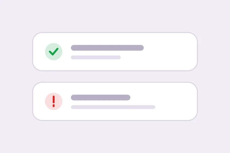
The baseline set. Generating all four together is what keeps the icon shapes distinguishable from each other rather than four recolors of one glyph.

Create an inline alert component with four severities — info in blue with a circle icon, success in green with a check, warning in amber with a triangle, error in red with an octagon. Each is full width within its container with a 4px left accent bar in the severity color, a background tinted to roughly 8% of that color, 16px padding, an 8px radius, and a 20px icon aligned to the first text line rather than vertically centered. Render a semibold 15px title with an optional 14px muted description below. Because the alert renders with the page rather than appearing dynamically, use role="region" with an aria-label naming the severity, not role="alert" — an assertive live region on initial paint talks over everything else. Check every tinted background against its text color for 4.5:1 contrast.

在 MeDo 中試試
ClosableDismissible

Alert With an Opt-In Close Button

Dismissal has to be per-instance, not global. A close button on an expired-payment alert lets the user hide a problem that still exists, and they will.

Add an opt-in dismiss control to an inline alert: a 32px icon button on the right with aria-label="Dismiss" and a visible focus ring, rendered only when a dismissible prop is passed so permanent alerts cannot be closed by accident. On dismiss, remove the alert from the DOM and move focus to the next focusable element after it rather than leaving focus on a detached node. Animate the collapse with height and opacity over 150ms, and skip the animation entirely under prefers-reduced-motion. Accept an onDismiss callback so the caller can persist the dismissal, and document that the alert should reappear on the next session while the underlying condition is unresolved.

在 MeDo 中試試
With actionActionable

Alert Carrying One Next Step

An alert that names a problem without a route out of it just relocates the work. One action, concretely worded — two actions and neither reads as the primary.

Create an alert variant with a single inline action below the description, rendered in the severity color as a text link with an underline on hover and focus. Keep it to exactly one action so the next step is unambiguous, and require concrete wording in the label — "Update payment method", not "Learn more". If the action navigates, use an anchor; if it mutates state, use a button, and show an inline pending state on the button rather than replacing the alert while the request is in flight. Place the action inside the alert region so its purpose is announced together with the message, and keep its hit area at least 44px tall on touch.

在 MeDo 中試試
CompactField Error

Single-Line Error Under an Input

No title, no icon block, no accent bar — just the message wired to the input it belongs to. The full alert anatomy next to a text field is visual noise that pushes the form apart.

Create a compact single-line alert for form-field errors: 13px text in the error color with a 14px inline icon, no title, no accent bar and no background tint, sitting 6px below its input with no vertical margin collapse. Give it a stable ID and reference it from the input with aria-describedby, and set aria-invalid="true" on the input at the same time. Because the message appears in response to a submit attempt, wrap it in role="alert" so it is announced immediately — but render the element only when there is an error rather than keeping an empty live region in the DOM, or the first error will be announced as a change to existing content. Reserve the line height so the layout does not jump when the message appears.

在 MeDo 中試試
GlobalPage Banner

Full-Width Banner Above the App Shell

Trial countdowns, maintenance windows, degraded service. It sits above the layout rather than inside a page, so the thing that breaks is sticky-header offset math, not the alert itself.

Create a full-width alert banner that mounts above the application shell: edge-to-edge tinted background, centered content capped at the app container width, a 16px icon, one line of text and a single inline action, at 44px total height. Because it displaces the layout, expose its height as a CSS custom property on the root element so a sticky header can offset itself instead of being covered. Support a dismissible mode that persists to localStorage keyed by banner ID and version, so editing the message re-shows it to users who dismissed the previous one. Use role="region" with an aria-label rather than role="alert", since the banner is present on load and should not interrupt.

在 MeDo 中試試
ValidationError Summary

Alert Listing Every Failed Field

The summary above the submit button, with one link per failure jumping to its input. It tells the user how many problems exist — the field-level messages tell them what to fix.

Create a validation summary alert for the top of a form: an error-severity block with a title stating the count — "3 fields need attention" — and an unordered list of links, each labelled with the field name plus the specific problem, each jumping to and focusing its input on click. Render it only after a submit attempt fails, give it role="alert" and move keyboard focus to the alert container itself with tabindex="-1" so a screen reader user lands on the summary rather than hunting for it. Rebuild the list on every failed submit and re-announce even when the set of errors is unchanged. Pair it with per-field messages wired through aria-describedby rather than replacing them.

在 MeDo 中試試

如何自訂你的 警示訊息

為每個顏色配一個形狀不同的圖示

為每個級別指定具體圖示 — 成功用勾號、警告用三角、錯誤用八邊形、資訊用圓圈。形狀在灰階環境與色盲用戶眼中依然可讀,也讓人在讀到文字之前就能用餘光判斷嚴重程度。

事先決定警示訊息可否關閉

為描述未解決狀況(例如付款方式已過期)的警示訊息加上關閉按鈕,等於讓用戶把仍然存在的問題藏起來。把關閉設成按個別實例選用,當訊息只應在底層狀態改變後才消失時,就讓警示訊息長期顯示。

區分頁面層級橫幅與欄位層級錯誤

頁面層級的警示訊息是總結,放在表單頂部;欄位層級的錯誤緊貼在對應輸入框下方,並透過 aria-describedby 關聯。欄位情境請要求精簡單行變體,這樣它就不會在文字輸入框旁邊帶上標題與圖示區塊。

把行動寫進警示訊息

只描述問題卻不給出路的警示訊息,只是把工作搬到別處。指定一個措辭具體的頁內操作連結,例如「更新付款方式」,並只保留一個操作,讓下一步始終清晰。

誰在使用 警示訊息 組件

SaaS 產品

試用期剩三天時在應用程式頂部橫跨整個畫面的長期警告橫幅,附「升級」操作連結;設定頁內則用成功警示訊息確認設定已儲存。

電商商店

購物車頁面用資訊警示訊息說明送貨截止時間,結帳表單上方用錯誤警示訊息總結付款被拒的詳情,讓訊息在頁面重新繪製後依然存在。

儀表板或後台工具

資料匯入畫面用錯誤警示訊息列出哪些列未通過驗證;預定維護時段則用資訊警示訊息說明,並在時段結束前一直顯示。

文件網站

頁內提示型警示訊息把已淘汰的 API 標為警告、把版本相關行為標為資訊,直接放在正文流程中 — 浮動通知在這裡毫無用處。

不同網站的 警示訊息 方案

同一個 警示訊息 組件,針對它所在網站的類型作調整。

01 / 06

SaaS Product Alerts

Trial countdowns and plan limits as permanent banners above the app shell, success alerts inside settings pages after a save. The banner is the tricky one: expose its height as a custom property or your sticky header will sit under it on every route.

警示訊息 的風格與變體

挑選與頁面其餘部分相襯的變體,然後產生它。

01 / 06

Left Accent Bar Alert

A 4px bar in the severity color with a tinted fill. The bar gives the eye a vertical edge to scan a stack of alerts against, which matters when three appear together on a settings page — four flat tinted boxes are much harder to separate.

在 React、Next.js、Vue 與 Svelte 中使用 警示訊息

React、Next.js、Vue 3、SvelteKit、Astro 或純 HTML —— 同一個 警示訊息,六種接入方式。

01 / 06

React Alert

A static alert needs no state at all — keep the severity map outside the component so tones and icons stay in one place. Only the dismissible variant needs a hook, so split it out rather than making every alert stateful.

src/components/Alert.tsx

const tones = {
  info: { bar: 'bg-blue-500', bg: 'bg-blue-50', Icon: InfoIcon },
  error: { bar: 'bg-red-500', bg: 'bg-red-50', Icon: OctagonIcon },
}

export function Alert({ severity = 'info', title, children }) {
  const { bar, bg, Icon } = tones[severity]
  return (
    <div role="region" aria-label={severity} className={`flex gap-3 ${bg}`}>
      <span className={`w-1 ${bar}`} />
      <Icon className="mt-0.5 h-5 w-5" />
      <div>
        <p className="font-semibold">{title}</p>
        {children}
      </div>
    </div>
  )
}

如何把 警示訊息 加入專案

四個步驟,從挑選 警示訊息 模板到推上生產環境。

01~30s

Pick an Alert Pattern

Choose by where the message lives: the four-severity block for in-page state, the compact variant for a field error, the summary for a failed submit, the banner for something app-wide.

02~10s

Copy the Prompt

Take it into MeDo, Lovable, Bolt, v0 or Cursor. Decide whether this alert is dismissible before you run it — that choice determines whether a user can hide an unresolved problem.

03~1min

Generate and Refine

You get all four severities back with a live preview. Follow up in plain English — "add an Update payment method link", "make the error variant outlined", "drop the title on the compact one" — rather than recoloring tints by hand.

04~2min

Place It and Check the Roles

Put page-level alerts above the submit area and field errors under their inputs with aria-describedby. Then confirm the load-time alerts are not using role="alert", or a screen reader will announce them over the rest of the page.

關於 警示訊息 的常見問題

如何用 AI 產生警示訊息元件?

描述嚴重級別、結構組成,以及警示訊息可否關閉 — 例如「資訊、成功、警告、錯誤四款警示訊息,附左側強調色條、圖示、標題、說明文字與選用操作連結」— MeDo 便會從這段描述產生全部四款變體。因為它們是一併產出,各級別之間的內距、圓角與圖示尺寸都保持一致。

警示訊息與 Toast 提示有何分別?

頁內警示訊息存在於頁面版面之中,會一直保留到它所描述的狀況改變,因此適合用戶可能需要反覆查看的狀態:帳單問題、維護公告、表單錯誤。Toast 是浮在頁面之上、幾秒後自動消失的短暫提示,適合確認用戶剛剛完成的操作。如果訊息在捲動或重新載入之後仍必須存在,就用警示訊息。

警示訊息應該可以關閉嗎?

只有當訊息屬於純資訊告知、用戶錯過也沒有損失時才可以。如果警示訊息描述的是尚未解決的問題,就讓它長期顯示,等狀態解決後自行消失,否則關閉動作會掩蓋一個仍需處理的問題。常見的折衷做法是允許關閉,但在問題修正前的下一次工作階段再次出現。

警示訊息可以不用顏色傳達嚴重程度嗎?

必須可以。為每個級別配一個形狀不同的圖示,再用直接點明狀況的文案,這樣灰階螢幕或色盲讀者亦能收到訊息。在提示詞中要求 MeDo 採用「圖示 + 文字」的編碼方式,它就會為每個級別分配不同字形,而不是把同一個圖示換四種顏色。

表單錯誤的警示訊息應該放在哪裡?

總結警示訊息放在提交區域正上方或表單頂部,各條具體訊息放在對應欄位下方,並用 aria-describedby 與 aria-invalid 關聯。總結告訴用戶一共有多少問題,欄位層級訊息告訴他們具體要改甚麼;兩者兼備,鍵盤用戶與螢幕閱讀器用戶才毋須四處尋找錯誤所在。

警示訊息需要 role="alert" 嗎?

並非總是需要。只在訊息是動態出現且需要打斷用戶時才用 role="alert",例如提交後出現的驗證失敗。頁面載入時已存在的警示訊息應該用普通 region 或 role="status",因為在首次繪製時使用 assertive 即時區域,只會蓋過頁面上其他所有內容。