AI按鈕生成器。

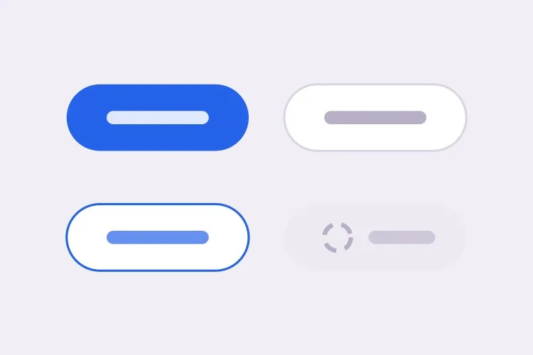
描述你的品牌,MeDo即可生成整套按鈕體系 — primary、secondary、ghost 與危險操作四種變體,三種尺寸,再加上懸停、聚焦、載入及停用狀態。一個提示詞,一套統一規範。

按鈕
按鈕

按鈕約佔每個設計系統的四分之一

沒有任何元件比按鈕用得更頻繁。每一次表單提交、每一個CTA、每一個確認對話框都要經過按鈕 — 這正是此處不一致特別明顯的原因。產品裡出現十個略有差異的按鈕,早在有人說得出原因之前,就已經給人粗疏的觀感。用一段描述一次生成整套,可讓各變體在結構上就共用同一套間距階梯、圓角與聚焦處理,而不必靠人手自律維持。

6 個模板

可以產生的 按鈕 模板

每個模板都是真實的提示詞,而非截圖。複製到任何 AI 編輯器,或在 MeDo 中執行,直接取得 React + Tailwind 程式碼。

BasicVariant Set

Four Roles, Three Sizes

The set you generate first and edit for a year. Roles rather than colors, so a rebrand moves one token instead of forty class strings.

Create a reusable button component with four role-based variants: primary as a solid brand fill with white text, secondary as a white surface with a grey border, ghost as transparent with a tinted background on hover, and destructive as a solid red. Support sm at 32px tall, md at 40px and lg at 48px, plus a fullWidth prop. Wire hover, active, focus-visible, disabled and loading states for every variant, keeping the focus ring on focus-visible only so mouse clicks do not draw it. Render a real button element with an explicit type attribute, and drive all four variants from one shared spacing and radius scale rather than per-variant values.
在 MeDo 中試試
IconsIcon + Label

Leading and Trailing Icon Slots

Two slots, one gap token. Most icon bugs are spacing bugs — an icon glued to its label, or optically misaligned because the SVG box is taller than the cap height.

Extend a button component with optional leading and trailing icon slots. Size the icon to 16px at sm and md and 18px at lg, set a consistent 8px gap between icon and label, and add aria-hidden="true" to the icon so screen readers announce the label only. Flip the slot order automatically under a right-to-left direction. Use inline-flex with items-center so the icon aligns to the label cap height rather than the line box, and give the SVG shrink-0 so a long wrapping label cannot squash it. Accept any React node so a spinner or an avatar can occupy the same slot.

在 MeDo 中試試
LoadingAsync Submit

Loading Button With a Locked Width

A submit button that shrinks when the spinner replaces the label makes the whole form jump. Reserve the width and the click feels instant instead of broken.

Create a submit button with a loading prop. While loading, replace the label with a centered spinner but keep the button at its resting width by rendering the label at zero opacity underneath the spinner rather than removing it from the DOM. Set aria-busy="true" and aria-disabled="true", block repeat submissions, and keep the button focusable so a screen reader can still read the pending state. Respect prefers-reduced-motion by swapping the rotating spinner for a static pulsing dot. Add an optional loadingText prop that announces progress through a polite live region instead of changing the visible label.

在 MeDo 中試試
ToolbarIcon Only

Square Icon Button With a Tooltip

Dense toolbars need it, and it fails accessibility more often than any other button. No visible text means the accessible name has to come from somewhere explicit.

Create an icon-only button for a dense toolbar: a square target at 32px, 36px and 40px with the icon centered and no label. Require an ariaLabel prop and render it as aria-label on the button, since there is no visible text to name the control. Expand the hit area to at least 44px with a negative-margin pseudo-element so touch targets meet the minimum without widening the toolbar. Pair it with a tooltip that appears on hover and on keyboard focus, referenced with aria-describedby so the tooltip supplements the label rather than replacing it. Include a pressed state driven by aria-pressed for toggle uses.

在 MeDo 中試試
GroupSplit Action

Split Button With a Menu Half

One default action plus a menu of alternates — Save and Save as, Deploy and Deploy to staging. Two buttons that must look like one and stay independently reachable.

Create a split button: a primary action on the left and a narrow chevron trigger on the right, joined into one visual unit with a 1px divider, the outer corners rounded and the inner corners square. Render them as two separate button elements so each keeps its own accessible name, giving the chevron a label such as "More save options". Wire the chevron to a menu with aria-haspopup="menu" and aria-expanded, opening on click and on ArrowDown, closing on Escape with focus returned to the trigger. Keep the focus ring visible on each half by drawing it outside the shared border rather than inside it.

在 MeDo 中試試
PolymorphicLink as Button

Anchor With Button Styling

A styled div with an onClick is not a button and a button that navigates is not a link. One asChild prop keeps the styling while the correct element still ships.

Create a polymorphic button that accepts an asChild prop and forwards its variant, size and state classes onto a child element, so a Next.js Link or a plain anchor can carry button styling without nesting an interactive element inside a button. Forward the ref, merge className rather than overwriting it, and skip the type attribute when the rendered element is not a button. When the target is an anchor, omit the disabled attribute — which anchors ignore — and instead drop href and set aria-disabled with pointer-events none. Add an external variant that appends rel="noopener noreferrer" and a visually hidden "opens in a new tab" note.

在 MeDo 中試試

如何自訂你的 按鈕

定義變體,而非只定義顏色

按角色而非顏色要求變體 — primary、secondary、ghost、destructive。以角色命名能經得起品牌改版:品牌色改變時,"primary"的含義不變,只需調整一個 token。

明確指定載入狀態

說明載入指示器應取代文字標籤,同時維持按鈕寬度。否則按鈕會在提交過程中縮小,牽動周圍版面跳動 — 這是生成式介面最常見的細節瑕疵之一。

要求 focus-visible,而非 focus

:focus 的聚焦環在滑鼠點擊時也會出現,看起來像錯誤。指定 :focus-visible,聚焦環只對鍵盤及輔助技術使用者顯示,這也正是無障礙審核真正檢查的行為。

確定停用狀態的語意

決定停用按鈕使用 disabled 屬性還是 aria-disabled。前者會攔截包括聚焦在內的所有事件;aria-disabled 讓按鈕仍可聚焦,螢幕閱讀器因此能說明它為何不可用。明確告訴MeDo你要哪一種。

誰在使用 按鈕 組件

SaaS 產品

試用CTA用主按鈕,「預約示範」用次要按鈕,卡片內的第三層連結用 ghost,刪除帳戶用危險操作變體 — 全部共用同一圓角與聚焦環,讓整個介面看起來像同一個產品。

電商商店

高對比度的「加入購物車」按鈕在庫存核對期間顯示載入狀態,再配一個較低調的「稍後再買」次要變體,不與主按鈕爭奪注意力。

儀表板或後台工具

高密度工具列需要帶無障礙標籤的小尺寸純圖示按鈕,與標準尺寸的操作按鈕並列。一套涵蓋 sm 至 lg 的尺寸階梯就能讓工具列保持緊湊,而不必臨時另造樣式。

行銷落地頁

首屏放一個特大主按鈕,頁面底部再重複一次;引導捲動而非轉換的次要連結「看看它如何運作」使用 ghost 變體。

不同網站的 按鈕 方案

同一個 按鈕 組件,針對它所在網站的類型作調整。

01 / 06

SaaS Product Buttons

One primary per screen is the rule that keeps a product feeling directed. Everything else drops to secondary or ghost, and destructive stays reserved for irreversible actions so a red button always means the same thing. The moment two primaries appear in one view, users start reading the layout instead of acting on it.

按鈕 的風格與變體

挑選與頁面其餘部分相襯的變體,然後產生它。

01 / 06

Solid Button

A filled surface with white or near-white text, carrying the highest visual weight on the page. Check the contrast against the fill rather than the page background, and remember that a lightened hover state can quietly drop a passing 4.5:1 pairing below the line.

在 React、Next.js、Vue 與 Svelte 中使用 按鈕

React、Next.js、Vue 3、SvelteKit、Astro 或純 HTML —— 同一個 按鈕,六種接入方式。

01 / 06

React Button

Derive the class string from variant and size lookups instead of chained ternaries, and forward the ref so tooltips and popovers can anchor to the element. Spread the remaining props last so a caller can still pass type or aria attributes through.

src/components/Button.tsx

export const Button = forwardRef(function Button(
  { variant = 'primary', size = 'md', loading, ...props },
  ref
) {
  return (
    <button
      ref={ref}
      type="button"
      aria-busy={loading}
      className={cn(base, variants[variant], sizes[size])}
      {...props}
    />
  )
})

如何把 按鈕 加入專案

四個步驟,從挑選 按鈕 模板到推上生產環境。

01~30s

Pick a Button Template

Scan the six templates and start from the closest surface — the full variant set for a design system, the async submit for a form, the icon-only for a toolbar.

02~10s

Copy the Prompt

Take the prompt into MeDo, Lovable, Bolt, v0 or Cursor. Swap in your brand color, radius and font before you run it, since those three values are what every variant inherits.

03~1min

Generate and Refine

You get React + Tailwind back with a live preview. Follow up in plain English — "add an xs size", "make the disabled state use aria-disabled" — rather than hand-editing the class lookups.

04~2min

Replace Your Ad-Hoc Buttons

Import one Button and delete the one-off styles it supersedes. The value is in the variants sharing a spacing scale and focus ring by construction, which only holds if nothing else on the page is styling its own button.

關於 按鈕 的常見問題

如何用AI生成按鈕元件?

在一個提示詞中描述所需的變體、尺寸與狀態 — 例如「primary、secondary 及 ghost 三種變體,三個尺寸,帶懸停、停用及載入狀態」 — MeDo會生成接好所有組合的完整元件。你拿到的是涵蓋整套的一個檔案,而非一個寫死的按鈕。

設計系統應該有哪些按鈕變體?

大多數產品需要四種:primary 對應畫面上最重要的單一操作,secondary 對應輔助操作,ghost 或第三層用於高密度介面中的弱化操作,destructive 用於任何不可回復的操作。變體多於此通常代表層級關係出了問題,而非缺少樣式。

AI能生成無障礙的按鈕嗎?

可以。MeDo會渲染帶明確 type 屬性的真實 button 元素、focus-visible 聚焦環、純圖示按鈕的無障礙名稱,以及能被螢幕閱讀器正確播報的停用狀態。在提示詞中提到無障礙,它還會在載入期間加入 aria-busy。

如何為按鈕加入載入狀態?

要求一個 loading 屬性:以載入指示器取代標籤、固定按鈕寬度、停用互動,並設定 aria-busy,讓輔助技術播報待處理狀態。固定寬度正是最容易被忽略的一環 — 少了它,每次點擊頁面都會重新排版。

按鈕應該用 button 還是連結?

如果是導覽跳轉,就應該用 anchor;如果是執行操作,就應該用 button。告訴MeDo你想要哪種行為,它會渲染正確的元素;當你需要把按鈕樣式套在路由連結上時,還提供類似 asChild 的替代做法。

能生成符合我現有品牌的按鈕嗎?

可以。在提示詞中給出品牌色、圓角半徑、字型與既有的間距階梯,生成的各個變體會一致地採用。你也可以貼上程式碼庫中現有的按鈕,請MeDo把它擴充成完整的變體組合。