AI Button Generator.

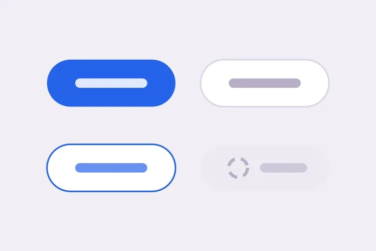
Describe your brand and MeDo generates the entire button system — primary, secondary, ghost, and destructive variants, three sizes, plus hover, focus, loading, and disabled states. One prompt, one consistent set.

Button
Button

Buttons Make Up Roughly a Quarter of Every Design System

No component is used more often. Every form submission, every CTA, every confirmation dialog runs through a button — which is exactly why inconsistency here is so visible. Ten slightly different buttons across a product reads as sloppy long before anyone can articulate why. Generating the whole set at once, from one description, means the variants share a spacing scale, a radius, and a focus treatment by construction rather than by discipline.

6 templates

Button Templates You Can Generate

Every template is a real prompt, not a screenshot. Copy it into any AI editor, or run it in MeDo and get React + Tailwind code back.

BasicVariant Set

Four Roles, Three Sizes

The set you generate first and edit for a year. Roles rather than colors, so a rebrand moves one token instead of forty class strings.

Create a reusable button component with four role-based variants: primary as a solid brand fill with white text, secondary as a white surface with a grey border, ghost as transparent with a tinted background on hover, and destructive as a solid red. Support sm at 32px tall, md at 40px and lg at 48px, plus a fullWidth prop. Wire hover, active, focus-visible, disabled and loading states for every variant, keeping the focus ring on focus-visible only so mouse clicks do not draw it. Render a real button element with an explicit type attribute, and drive all four variants from one shared spacing and radius scale rather than per-variant values.
Try in MeDo
IconsIcon + Label

Leading and Trailing Icon Slots

Two slots, one gap token. Most icon bugs are spacing bugs — an icon glued to its label, or optically misaligned because the SVG box is taller than the cap height.

Extend a button component with optional leading and trailing icon slots. Size the icon to 16px at sm and md and 18px at lg, set a consistent 8px gap between icon and label, and add aria-hidden="true" to the icon so screen readers announce the label only. Flip the slot order automatically under a right-to-left direction. Use inline-flex with items-center so the icon aligns to the label cap height rather than the line box, and give the SVG shrink-0 so a long wrapping label cannot squash it. Accept any React node so a spinner or an avatar can occupy the same slot.

Try in MeDo
LoadingAsync Submit

Loading Button With a Locked Width

A submit button that shrinks when the spinner replaces the label makes the whole form jump. Reserve the width and the click feels instant instead of broken.

Create a submit button with a loading prop. While loading, replace the label with a centered spinner but keep the button at its resting width by rendering the label at zero opacity underneath the spinner rather than removing it from the DOM. Set aria-busy="true" and aria-disabled="true", block repeat submissions, and keep the button focusable so a screen reader can still read the pending state. Respect prefers-reduced-motion by swapping the rotating spinner for a static pulsing dot. Add an optional loadingText prop that announces progress through a polite live region instead of changing the visible label.

Try in MeDo
ToolbarIcon Only

Square Icon Button With a Tooltip

Dense toolbars need it, and it fails accessibility more often than any other button. No visible text means the accessible name has to come from somewhere explicit.

Create an icon-only button for a dense toolbar: a square target at 32px, 36px and 40px with the icon centered and no label. Require an ariaLabel prop and render it as aria-label on the button, since there is no visible text to name the control. Expand the hit area to at least 44px with a negative-margin pseudo-element so touch targets meet the minimum without widening the toolbar. Pair it with a tooltip that appears on hover and on keyboard focus, referenced with aria-describedby so the tooltip supplements the label rather than replacing it. Include a pressed state driven by aria-pressed for toggle uses.

Try in MeDo
GroupSplit Action

Split Button With a Menu Half

One default action plus a menu of alternates — Save and Save as, Deploy and Deploy to staging. Two buttons that must look like one and stay independently reachable.

Create a split button: a primary action on the left and a narrow chevron trigger on the right, joined into one visual unit with a 1px divider, the outer corners rounded and the inner corners square. Render them as two separate button elements so each keeps its own accessible name, giving the chevron a label such as "More save options". Wire the chevron to a menu with aria-haspopup="menu" and aria-expanded, opening on click and on ArrowDown, closing on Escape with focus returned to the trigger. Keep the focus ring visible on each half by drawing it outside the shared border rather than inside it.

Try in MeDo
PolymorphicLink as Button

Anchor With Button Styling

A styled div with an onClick is not a button and a button that navigates is not a link. One asChild prop keeps the styling while the correct element still ships.

Create a polymorphic button that accepts an asChild prop and forwards its variant, size and state classes onto a child element, so a Next.js Link or a plain anchor can carry button styling without nesting an interactive element inside a button. Forward the ref, merge className rather than overwriting it, and skip the type attribute when the rendered element is not a button. When the target is an anchor, omit the disabled attribute — which anchors ignore — and instead drop href and set aria-disabled with pointer-events none. Add an external variant that appends rel="noopener noreferrer" and a visually hidden "opens in a new tab" note.

Try in MeDo

How to Customize Your Button

Define the variants, not just the colors

Ask for variants by role — primary, secondary, ghost, destructive — instead of by color. Role-based naming survives a rebrand: when your brand color changes, "primary" still means the same thing and only one token has to move.

Specify the loading state explicitly

Say that the spinner should replace the label while preserving the button width. Otherwise buttons shrink mid-submit and the surrounding layout jumps — one of the most common polish bugs in generated UI.

Ask for focus-visible, not focus

A ring on :focus fires on mouse clicks too and looks like a bug. Prompt for :focus-visible so the ring appears for keyboard and assistive-tech users only, which is what accessibility audits actually check for.

Pin down the disabled semantics

Decide whether disabled buttons should use the disabled attribute or aria-disabled. The attribute blocks all events including focus; aria-disabled keeps the button focusable so screen readers can still announce why it is unavailable. Say which one you want.

Who Uses the Button Component

SaaS product

A primary button for the trial CTA, secondary for "Book a demo", ghost for tertiary links inside cards, and destructive for account deletion — all sharing a radius and focus ring so the interface reads as one product.

E-commerce store

A high-contrast "Add to cart" button with a loading state during the inventory check, plus a quieter "Save for later" secondary variant that does not compete with it for attention.

Dashboard or admin tool

Dense toolbars need small, icon-only buttons with accessible labels alongside standard-size action buttons. One size scale covering sm through lg keeps the toolbar tight without inventing one-off styles.

Marketing landing page

A single oversized primary button above the fold, repeated at the bottom of the page, with a ghost variant for the secondary "See how it works" link that scrolls rather than converts.

Button Patterns for Different Websites

The same button component, tuned to the kind of site it ships on.

01 / 06

SaaS Product Buttons

One primary per screen is the rule that keeps a product feeling directed. Everything else drops to secondary or ghost, and destructive stays reserved for irreversible actions so a red button always means the same thing. The moment two primaries appear in one view, users start reading the layout instead of acting on it.

Button Styles and Variants

Pick the variant that matches the rest of the page, then generate it.

01 / 06

Solid Button

A filled surface with white or near-white text, carrying the highest visual weight on the page. Check the contrast against the fill rather than the page background, and remember that a lightened hover state can quietly drop a passing 4.5:1 pairing below the line.

Button in React, Next.js, Vue and Svelte

React, Next.js, Vue 3, SvelteKit, Astro or plain HTML — the same button, six ways to drop it in.

01 / 06

React Button

Derive the class string from variant and size lookups instead of chained ternaries, and forward the ref so tooltips and popovers can anchor to the element. Spread the remaining props last so a caller can still pass type or aria attributes through.

src/components/Button.tsx

export const Button = forwardRef(function Button(
  { variant = 'primary', size = 'md', loading, ...props },
  ref
) {
  return (
    <button
      ref={ref}
      type="button"
      aria-busy={loading}
      className={cn(base, variants[variant], sizes[size])}
      {...props}
    />
  )
})

How to Add Your Button to a Project

Four steps, from picking a button template to shipping it in production.

01~30s

Pick a Button Template

Scan the six templates and start from the closest surface — the full variant set for a design system, the async submit for a form, the icon-only for a toolbar.

02~10s

Copy the Prompt

Take the prompt into MeDo, Lovable, Bolt, v0 or Cursor. Swap in your brand color, radius and font before you run it, since those three values are what every variant inherits.

03~1min

Generate and Refine

You get React + Tailwind back with a live preview. Follow up in plain English — "add an xs size", "make the disabled state use aria-disabled" — rather than hand-editing the class lookups.

04~2min

Replace Your Ad-Hoc Buttons

Import one Button and delete the one-off styles it supersedes. The value is in the variants sharing a spacing scale and focus ring by construction, which only holds if nothing else on the page is styling its own button.

Common Questions About Button

How do I generate a button component with AI?

Describe the variants, sizes, and states you need in one prompt — for example "primary, secondary, and ghost variants in three sizes with hover, disabled, and loading states" — and MeDo generates the full component with all combinations wired up. You get one file covering the whole set rather than a single hard-coded button.

What button variants should a design system have?

Most products need four: primary for the single most important action on a screen, secondary for supporting actions, ghost or tertiary for low-emphasis actions inside dense UI, and destructive for anything irreversible. Adding more variants than that usually signals a hierarchy problem rather than a missing style.

Can AI generate accessible buttons?

Yes. MeDo renders real button elements with explicit type attributes, focus-visible rings, accessible names for icon-only buttons, and disabled states that screen readers announce correctly. Mention accessibility in your prompt and it will also add aria-busy during loading.

How do I add a loading state to a button?

Ask for a loading prop that swaps the label for a spinner while keeping the button width fixed, disables interaction, and sets aria-busy so assistive tech announces the pending state. Fixing the width is the part people forget — without it the page reflows on every click.

Should a button be a button or a link?

If it navigates, it should be an anchor; if it performs an action, it should be a button. Tell MeDo which behavior you want and it will render the correct element, with an asChild-style escape hatch when you need the button styling on a routed link.

Can I generate buttons that match my existing brand?

Yes. Give MeDo your brand color, corner radius, font, and any existing spacing scale in the prompt, and the generated variants will use them consistently. You can also paste an existing button from your codebase and ask MeDo to extend it into a full variant set.