AI頁首生成器。

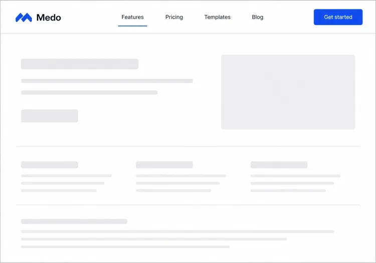
描述您頁面的頂部,MeDo就會建構整條橫帶 — Logo與品牌標誌組合、置於其上方的選用公告列、帶毛玻璃模糊的置頂捲動行為,以及CTA。導覽連結就住在裡面;頁首是把它們框起來的一切。

頁首
頁首

頁首是唯一一個出現在每個頁面上的元件

無論登陸頁、文件和結帳流程之間還有什麼在變,頁首始終不變。這讓它成為承載品牌識別的元素,同時也成為效能出錯代價最高的位置:一個在字體載入時發生位移、或在 hydration 前沒有預留高度的頁首,會在訪客看到的每一個頁面上產生版面位移,而不只是某一頁。置頂行為同樣有這個倍數效應。一個在每格捲動畫面都重繪的模糊,會讓全站的流暢度都打折。正因為它只生成一次卻處處使用,頁首值得在提示詞裡過度細化地描述。

6 個模板

可以產生的 頁首 模板

每個模板都是真實的提示詞,而非截圖。複製到任何 AI 編輯器,或在 MeDo 中執行,直接取得 React + Tailwind 程式碼。

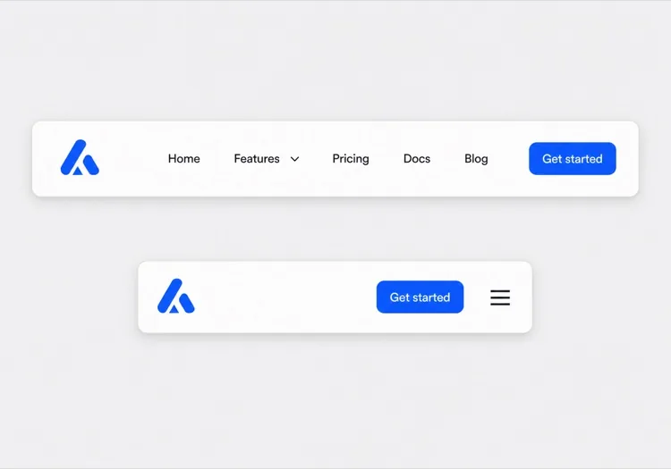
Fixed heightAcme

Sticky Header With a Frosted Scroll State

The default worth starting from: a pinned height and a blur that only appears once you have scrolled. Specifying the height is the whole point — a header that sizes to its content shifts on every page as the webfont swaps in.

Create a sticky website header with an explicit 64px height set on the container so the space is reserved before the logo and webfonts load. Logo mark plus wordmark on the left, four navigation links in the middle, one filled Get started button on the right. Start with a solid white background and a 1px bottom border, then switch to a semi-transparent surface with a backdrop blur once the page scrolls past 80px, transitioning over 200ms. Drive the state from an IntersectionObserver watching a 1px sentinel above the header rather than a scroll listener, so nothing runs on the scroll thread. Below 768px, replace the links with a hamburger that opens a drawer.

在 MeDo 中試試
Announcement barMega

Promo Bar Above a Sticky Row

Two stacked strips where only the lower one stays pinned. The trap is the sticky offset: dismiss the bar without recomputing it and the header floats 36px below the viewport top for the rest of the session.

Create a two-part header: a dismissible 36px announcement bar on an accent background with a short promo line, an inline link and a close button, and beneath it a 64px main row with logo, links and a CTA. Only the main row is sticky. Persist the dismissal in localStorage so the bar does not return on the next page, and recompute the sticky top offset when it is removed so the main row still pins flush to the viewport top. Render the bar server-side and hide it with a class rather than mounting it after hydration, so dismissing it never causes a visible reflow of the page below.

在 MeDo 中試試
TransparentShipfast

Transparent Over Hero, Solid on Scroll

For landing pages with a full-bleed hero behind the header. Everything that depends on the background — logo variant, link color, border, button style — has to flip in one state change, not four.

Create a header that overlays a full-bleed hero image: fully transparent with no border at the top of the page, with a light logo variant and white links. Once the page scrolls past the hero height, switch in a single state change to a solid white surface, a dark logo variant, dark links and a 1px bottom border, transitioning over 200ms. Keep the header height fixed at 72px in both states so the switch does not move the links. Add a scroll-margin-top equal to the header height on all headings so in-page anchors do not land behind the bar.

在 MeDo 中試試
Two-rowShop

Utility Row Over a Sticky Search Row

A storefront header where the top row scrolls away and the search row stays. Pinning both eats 100px of a phone viewport, which is most of a product image.

Create a two-row e-commerce header. The top row, 32px tall, carries a free-shipping message on the left and Track order, Help and account links on the right, and scrolls away with the page. The bottom row, 64px tall, holds the logo, a wide search input, a wishlist icon and a cart button with a count badge, and is the only row that stays sticky. Announce cart count changes through an aria-live="polite" region. Below 768px, collapse the top row entirely, keep logo, search icon and cart in the sticky row, and open search as a full-width overlay when the icon is tapped.

在 MeDo 中試試
App shellDocs

Fixed Header With a Sidebar Toggle

A docs header that has to coordinate with a sidebar below it. Reserve the toggle button's space at every breakpoint, otherwise the logo jumps sideways when the button appears at the tablet threshold.

Create a fixed 56px documentation header: a sidebar toggle button on the far left that is only interactive below 1024px but keeps its 40px slot reserved at every breakpoint so the logo never shifts, then the logo, a version switcher, a search button with a Command-K hint, a theme toggle and a GitHub link. Because the header is fixed rather than sticky, add matching top padding to the page body and set scroll-margin-top on every heading so deep links from search land below the bar. Give the toggle aria-expanded and aria-controls pointing at the sidebar element.

在 MeDo 中試試
StaticStudio

Oversized Wordmark, No Sticky

Not everything needs to be pinned. A tall static header that scrolls away gives an agency site its full viewport back, and removes the scroll listener along with it.

Create a static header for a design studio that scrolls away with the page rather than sticking: 120px tall, with an oversized lowercase wordmark on the left, a one-line location and availability note beneath it, and four right-aligned links in a light weight with wide letter spacing. No border, no background change, no scroll listener at all. Below 640px, reduce the height to 80px, keep the wordmark, and move the four links into a full-screen overlay opened by a text Menu button — labelled Menu rather than a hamburger icon, and closing on Escape with focus returned to the button.

在 MeDo 中試試

如何自訂你的 頁首

在調任何樣式之前先釘住高度

明確要求一個頁首高度。這只花一行,卻能消除本來會在每個頁面上隨Logo和網頁字體載入而出現的版面位移 — 這是最常見的、可追溯到頁首的Core Web Vitals退化。

給捲動狀態做節流

靠裸捲動監聽器切換的backdrop blur每秒會重繪數十次。明確要求捲動處理函式用requestAnimationFrame節流,或改由IntersectionObserver哨兵元素驅動,這樣中階裝置上的捲動也能保持順暢。

把公告列當成頁首的一部分

如果想在主行上方放一條促銷帶,請在同一個提示詞裡描述它,讓它的高度被計入置頂偏移。事後再加上去,要麼遮住內容,要麼在關閉後把自身高度重複計算一次。

精確說明品牌標誌組合

說清您要的是只有圖示、圖示加文字標誌,還是在小螢幕上退化為只剩圖示的文字標誌。頁首是每個頁面都有的唯一元件,品牌一致性正是在這裡被守住或丟掉。

誰在使用 頁首 組件

SaaS產品網站

一個64px高、高度固定的白色頁首,捲動後加上毛玻璃模糊,上方還有一條可關閉的公告列,在整個活動期間投放上線促銷。

電商網站

雙行頁首:上行放免運橫幅和帳戶連結,下行放搜尋和購物車,購物者捲動時只有下行保持置頂。

行銷或登陸頁面

一個覆蓋在滿版主視覺圖上的透明頁首,捲動時過渡為實色背景,Logo在同一中斷點從淺色版本切換為深色版本。

開發者文件網站

一個帶版本切換器和搜尋觸發器的固定頁首,外加一個在平板中斷點以下出現的側邊欄開關,它會預留自己的空間,讓文件內容永不重排。

不同網站的 頁首 方案

同一個 頁首 組件,針對它所在網站的類型作調整。

01 / 06

SaaS Product Header

One fixed-height sticky strip with a brand lockup, links and a single CTA. Because it renders on every route, any layout shift here is multiplied across your whole Core Web Vitals field data rather than isolated to the landing page.

頁首 的風格與變體

挑選與頁面其餘部分相襯的變體,然後產生它。

01 / 06

Fixed-Height Sticky Header

An explicit height on the container, pinned to the top. The height is not a styling detail — without it the strip resizes as the logo and webfonts resolve, and that shift lands on every page a visitor opens.

在 React、Next.js、Vue 與 Svelte 中使用 頁首

React、Next.js、Vue 3、SvelteKit、Astro 或純 HTML —— 同一個 頁首,六種接入方式。

01 / 06

React Header

Keep the scroll state in the header itself with an IntersectionObserver on a sentinel div, not a scroll listener. Render it once above your router outlet so the observer is created once per session.

src/components/Header.tsx

export function Header() {
  const [pinned, setPinned] = useState(false)
  const ref = useRef(null)

  useEffect(() => {
    const io = new IntersectionObserver(
      ([e]) => setPinned(!e.isIntersecting)
    )
    io.observe(ref.current)
    return () => io.disconnect()
  }, [])

  return <header className={pinned ? 'backdrop-blur' : ''} />
}

如何把 頁首 加入專案

四個步驟,從挑選 頁首 模板到推上生產環境。

01~30s

Pick a Header Template

Decide two things first: does the strip stay pinned, and is there an announcement bar. Those choices drive the sticky offset and the scroll state, and they are the awkward ones to retrofit.

02~10s

Copy the Prompt

Paste it into MeDo, Lovable, Bolt, v0 or Cursor. Keep the explicit pixel height and the sentinel-based scroll state in the text — those two sentences are what stop the header shifting and repainting on every page.

03~1min

Generate and Refine

You get React + Tailwind back with a live preview. Follow up in plain English — "make the blur stronger", "persist the dismissed announcement bar", "flip the logo variant on scroll".

04~2min

Mount It in Your Layout

Put the header above {children} in your root layout. If it is fixed rather than sticky, add matching top padding to the body and scroll-margin-top to your headings so anchor links do not land underneath it.

關於 頁首 的常見問題

什麼是AI頁首生成器?

AI頁首生成器是一種工具,它接受您對網站的自然語言描述,自動生成完整、有樣式的頁首元件的HTML、CSS和JavaScript。無需從零編寫佈局程式碼,只需描述想要的效果即可獲得可運作的程式碼。

如何用AI建立網站頁首?

開啟MeDo,輸入類似「為設計公司建立一個置頂頁首,左側放Logo,包含作品、關於、聯絡連結,右側放'聯絡我們'按鈕」的提示詞,MeDo即生成完整元件。然後您可以複製程式碼或透過後續提示詞繼續編輯。

能用AI生成響應式頁首嗎?

可以。MeDo預設生成行動裝置優先的頁首。告訴它您關心的中斷點或裝置 — 「768px以下折疊為漢堡選單」 — 它會為您處理響應式邏輯。

頁首(header)和導覽列(navbar)有什麼分別?

頁首是每個頁面頂部那條通欄橫帶:品牌標誌組合、選用的公告列、置頂與捲動行為,以及容納這一切的容器。導覽列是其中的那組導覽連結。如果您關心的是全站範圍內頁面頂部的外觀與行為,就做頁首;如果您的問題其實是連結結構、下拉選單和行動裝置選單,請參閱AI導覽列生成器。

怎樣避免頁首造成版面位移?

在提示詞裡給頁首一個明確高度,讓瀏覽器在字體和Logo載入前就預留出空間;如果有公告列,也一併預留位置,而不是讓它在 hydration 之後把內容往下推。如果頁首用的是fixed而不是position: sticky,請給頁面主體加上等量的頂部內距。向MeDo要一個固定的頁首高度,它會把兩者都處理好。

生成網站頁首最好的AI工具是什麼?

MeDo專為從提示詞生成單個網站元件而建構,包括頁首。與通用AI聊天工具不同,MeDo理解元件結構、無障礙要求和真實世界的UX模式 — 因此輸出更接近資深前端開發者會交付的成果。