AI博客區塊生成器。

描述你想要的博客版面 — 卡片樣式、文章數量、精選文章、分類篩選器 — MeDo生成完整元件。無需觸碰一行CSS grid屬性,就能交付精美的博客區塊。

博客區塊
博客區塊

出色的博客區塊能將讀者轉化為回頭客。

博客是你最高價值的SEO和信任建立資產之一 — 但前提是訪客能夠找到並探索它。精心設計的博客區塊能即時展示你的最佳內容,透過可見的分類傳達主題權威,並引導讀者從著陸頁進入你的內容漏斗。MeDo讓你生成完全契合品牌和內容量的版面,而不是被迫適應通用模板。

6 個模板

可以產生的 博客區塊 模板

每個模板都是真實的提示詞,而非截圖。複製到任何 AI 編輯器,或在 MeDo 中執行,直接取得 React + Tailwind 程式碼。

Three cardAcme

Three-Card Homepage Preview

The smallest blog section that still looks intentional. Three posts and a View all link — enough to prove the blog is alive without turning a marketing page into an index.

Create a blog preview section with a section heading, a one-line subheading and a three-column card grid. Each card holds a 16:9 cover image in a fixed aspect-ratio box, a category pill above the title, a two-line title clamped with line-clamp-2, a two-line excerpt clamped with line-clamp-2, and a footer row with author name, publish date in a time element with a machine-readable datetime, and a reading-time estimate. Make the whole card one link with the heading as the accessible name rather than adding a separate Read more link. Below the grid, a centred View all posts link. Two columns on tablet, one on mobile, with the cover images lazy loaded.

在 MeDo 中試試
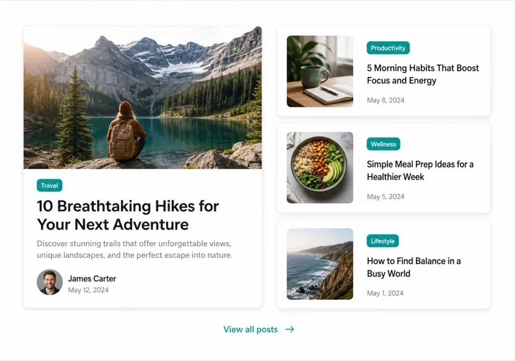
Featured splitEditorial

One Featured Post, Three Stacked

Creates a clear lead story, which an even grid never does. Only works if the featured post is genuinely your best — promoting whatever published last makes the asymmetry look arbitrary.

Create an asymmetric blog section: on the left, a featured post card taking about 60% of the width with a large 3:2 cover image, a category pill, a headline at display size, a three-line excerpt and an author row with avatar, date and reading time. On the right, three compact cards stacked vertically, each with a small square thumbnail on the left and a category, a two-line clamped title and a date on the right. Divide the stacked cards with hairline rules rather than shadows so they read as a list next to the feature. Stack the feature above the list on tablet and below on mobile, keeping the feature image eager loaded.

在 MeDo 中試試
Index gridMega

Paginated Post Index

The standalone blog page rather than a homepage teaser. Nine cards is the ceiling before the grid stops being scannable — past that, pagination beats a longer page or infinite scroll.

Create a blog index section: a page heading, a horizontal row of category filter chips, and a nine-card grid at three columns. Each card carries a cover image in a fixed 16:9 box, a category pill, a clamped two-line title, a clamped two-line excerpt, and a meta row with author, a time element for the date and a reading time. Below the grid, numbered pagination with previous and next controls, aria-current on the active page, and real anchor hrefs to /blog/page/2 so pages are crawlable and linkable rather than swapped in by client state. Show a labelled empty state when a filter returns nothing. Two columns on tablet, one on mobile.

在 MeDo 中試試
Text listLedger

Dated List With No Images

No thumbnails, just date, title and one line of description. Faster to scan than any card grid and the honest choice when your posts have no cover art — a grid of stock photography reads worse than plain text.

Create an image-free blog list: rows separated by hairline rules, each row showing a left-aligned date in a fixed-width muted column, then the post title as a link at large text size, a one-line clamped description beneath it, and a right-aligned reading time. Group the rows under year headings when the list spans multiple years. Give each row a full-width hover background so the whole row reads as the hit target, and keep the vertical rhythm tight so twenty posts fit in two screens. Stack the date above the title on mobile. Use an ordered list with time elements for the dates.

在 MeDo 中試試
Category tabsStudio

Topic Tabs Over a Card Grid

Turns a mixed blog into something a reader can navigate by interest. Needs at least a few posts per tab — a tab that opens onto two articles makes the blog look thinner than one undivided grid would.

Create a blog section with topic tabs above a six-card grid: tabs labelled All, Engineering, Design and Product with a post count beside each. Use real tab semantics — a tablist with arrow-key navigation, aria-selected, and managed focus — and reflect the active tab in the URL so a topic view is linkable. Switching a tab swaps the card set with a short fade rather than a layout jump, and keeps the grid height stable by always rendering a fixed number of card slots. Each card has a cover image, category pill, clamped title and excerpt, and a meta row with author and date. Announce the result count in an aria-live region.

在 MeDo 中試試
ChangelogShipfast

Release Notes Timeline

A blog section for product updates, where version and date matter more than a cover image. Keep the newest entry expanded and the rest collapsed so the page opens on what changed most recently.

Create a changelog-style blog section: a vertical timeline with a left rail of dots and connecting line, each entry showing a version tag, a date in a time element, a type pill for Added, Fixed or Changed, a title and a two-to-three sentence summary. Expand the most recent entry by default and render the rest as collapsed disclosure panels using button plus aria-expanded so keyboard users can open them. Add anchor links on each version so a specific release can be linked directly, and a Subscribe to updates link at the top of the section. Collapse the left rail to a simple stacked list on mobile.

在 MeDo 中試試

如何自訂你的 博客區塊

以精選文章開篇

用更大的卡片突出最重要的文章 — 包含全寬封面圖片、較長摘要和獨特視覺處理。告訴MeDo哪篇是「featured」,它會自動建立不對稱版面。

新增分類或標籤篩選器

如果你發佈多個主題的內容,可以讓MeDo在網格上方新增水平篩選欄。這能將博客區塊變成自助探索工具,讓讀者在頁面停留更長時間。

展示作者資訊

新增作者頭像、姓名和閱讀時間估計能建立信任並設定讀者期望。在提示詞中提及這些元數據欄位,它們就會融入每張卡片。

透過文章數量控制卡片密度

精確指定顯示多少篇文章 — 主頁緊湊預覽3張,獨立博客索引頁6到9張。搭配「查看全部」CTA,避免在行銷頁面出現無限滾動網格。

誰在使用 博客區塊 組件

SaaS行銷網站

主頁上的三卡預覽區塊,連結到產品教學、客戶案例和發布說明 — 在不影響轉化流程的前提下為博客引流。

內容型媒體

全寬編輯版面,包含主文章、分類標籤和分頁卡片網格 — 專業媒體讀者期待的一切。

設計機構或工作室

案例研究和思想領導力文章的簡約雙欄馬賽克,在潛在客戶點擊之前就展示專業深度。

電商品牌

大圖片和短文預告的生活方式博客區塊,連結到購買指南、趨勢彙整和幕後故事,提升購買意向。

不同網站的 博客區塊 方案

同一個 博客區塊 組件,針對它所在網站的類型作調整。

01 / 06

SaaS Marketing Blog Section

A three-card teaser on the homepage, not an index. The job is proving the product is maintained and that someone is writing about the problem, so lead with the tutorial or customer story — release notes belong in their own changelog, not competing for the same three slots.

博客區塊 的風格與變體

挑選與頁面其餘部分相襯的變體,然後產生它。

01 / 06

Three-Card Grid

Equal cards in one row with a View all link beneath. The right default on a marketing page where the blog is supporting evidence rather than the destination, and it stays honest when you have only published a handful of posts.

在 React、Next.js、Vue 與 Svelte 中使用 博客區塊

React、Next.js、Vue 3、SvelteKit、Astro 或純 HTML —— 同一個 博客區塊,六種接入方式。

01 / 06

React Blog Section

Keep the posts in one typed array and let the card be a pure function of a post. No state is needed unless you add filters, which is what makes this section safe to render on the server.

src/components/BlogSection.tsx

type Post = { slug: string; title: string; excerpt: string; date: string; minutes: number }

export function BlogSection({ posts }: { posts: Post[] }) {
  return (
    <ul className="grid gap-8 md:grid-cols-3">
      {posts.map((post) => (
        <PostCard key={post.slug} post={post} />
      ))}
    </ul>
  )
}

如何把 博客區塊 加入專案

四個步驟,從挑選 博客區塊 模板到推上生產環境。

01~30s

Pick a Blog Layout

Choose by post volume and by whether you have cover art — three cards for a homepage teaser, a featured split when one post should lead, a dated list when the posts have no images worth showing.

02~10s

Copy the Prompt

Take the prompt into MeDo, or paste it into Lovable, Bolt, v0 or Cursor. Name the metadata you actually have first — author, reading time, category — since a card designed around fields you cannot populate is the usual reason these sections get rebuilt.

03~1min

Generate and Refine

You get React + Tailwind back with a live preview. Follow up in plain English — "clamp titles to two lines", "drop the excerpt on mobile", "move the category above the title" — instead of tuning class strings by hand.

04~2min

Connect Your Posts

Point the component at your real source — an MDX directory, a content collection or a CMS query — and map the fields once. Sort by date server-side and let the card stay a pure function of a post.

關於 博客區塊 的常見問題

如何用AI建立博客區塊?

開啟MeDo,描述你需要的博客版面 — 卡片樣式、文章數量、是否需要精選文章、顯示哪些元數據欄位(作者、日期、閱讀時間)以及篩選器。MeDo在數秒內生成完整的元件程式碼。然後可以複製到專案中,並透過後續提示詞繼續優化。

最好的AI博客區塊生成器是哪個?

MeDo專門為生成真實網站元件而構建,而不僅僅是設計稿。與通用AI聊天工具不同,MeDo理解版面系統、卡片模式和響應式行為 — 因此博客區塊輸出的是整潔的生產就緒程式碼,而不是需要大量編輯的粗糙起點。

AI能生成響應式博客卡片網格嗎?

可以。MeDo生成響應式優先的元件。指定桌面端需要多少欄,它會自動處理斷點 — 在行動裝置上自動折疊為單欄堆疊,無需額外工作。

如何在AI生成的博客區塊中新增分類篩選器?

在提示詞中包含篩選器需求 — 例如,「在卡片網格上方新增設計、工程和產品的分類篩選標籤。」MeDo會生成篩選器UI和對應的條件顯示邏輯。

我可以用AI生成精選博客文章版面嗎?

當然可以。讓MeDo生成不對稱版面,包含一張大型精選卡片和旁邊較小的次級卡片。這種編輯模式是突出核心內容同時展示多篇近期文章最有效的方式之一。

AI生成的博客區塊包含作者和日期元數據嗎?

包含 — 只需在提示詞中提及你想要的元數據。MeDo可以包含作者姓名和頭像、發佈日期、預計閱讀時間、分類標籤和摘要。你完全掌控每張卡片顯示的內容。