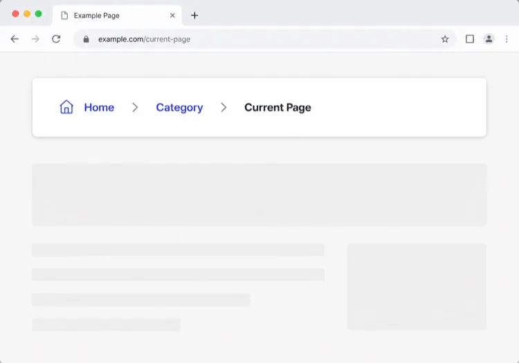
AI導覽列生成器。

描述您的網站,獲得完全響應式導覽列 — 包含Logo、導覽連結、下拉選單和行動裝置漢堡選單 — 從一個提示詞生成。無需範本,無需繁瑣調整。

導覽列
導覽列

導覽列是使用者在讀其他內容之前先讀的那張地圖

導覽列不是頁面頂部的裝飾,而是整個網站壓縮後的目錄。您挑選哪些連結、按什麼順序排列、把什麼收進下拉選單,都在告訴訪客您的產品是什麼、重要的部分在哪裡。分組一錯,使用者就會離開,即使他們想找的頁面只在兩次點擊之外。搜尋引擎爬蟲也以同樣方式解讀它,把導覽列連結視為判斷哪些頁面最重要的強訊號。因此,導覽列值得先當作資訊架構問題來設計,其次才是版面配置問題。

6 個模板

可以產生的 導覽列 模板

每個模板都是真實的提示詞,而非截圖。複製到任何 AI 編輯器,或在 MeDo 中執行,直接取得 React + Tailwind 程式碼。

ClassicAcme

Logo, Five Links, One CTA

The default that fits most product sites. Reach for it only when your top level really is five items or fewer — a single row of nine links makes a small site feel disorganised rather than complete.

Create a horizontal navbar with a logo mark plus wordmark on the left, five links — Product, Pricing, Docs, Customers, Blog — centered, and one filled Get started button on the right. Mark the current route with aria-current="page" plus a 2px underline sitting on the text baseline rather than the container edge. Below 768px, replace the link row with a hamburger button that toggles aria-expanded and opens a full-height drawer sliding in from the right. Trap focus inside the drawer, close it on Escape and on route change, lock body scroll while it is open, and return focus to the hamburger button when it closes.

在 MeDo 中試試
Mega menuMega

Mega Menu With Grouped Columns

For sites with more sections than a link row can hold. The mega panel buys you depth, but it also means two of your top-level items are no longer clickable destinations — decide that deliberately.

Create a navbar where two of five top-level items open a full-width mega menu panel: three columns of grouped links, each label with a one-line description underneath, plus a highlighted card on the right. Open the panel on hover after a 120ms delay and on Enter or Space for keyboard users. Give each trigger aria-expanded and aria-controls, move between panel links with arrow keys, close on Escape and when focus leaves the panel, and let Tab move on to the next top-level item. Below 1024px, flatten every mega panel into a nested accordion inside the mobile drawer instead of a hover panel.

在 MeDo 中試試
CenteredShipfast

Centered Links With a Dual CTA

Sign in beside Start free, links dead center. Use a three-column grid rather than flexbox centering, or the link block drifts every time the button labels change length.

Create a navbar laid out as a three-column grid so the center block stays optically centered regardless of logo width or button label length: logo left, four links centered, and two actions right — a text Sign in link and a filled Start free button. Start fully transparent over the hero, then switch to a solid background with a 1px bottom border once the page scrolls past 80px, transitioning over 200ms, and swap the logo from its light variant to its dark variant at the same threshold. On mobile, collapse the links into a hamburger and keep only the Start free button visible next to it.

在 MeDo 中試試
Docs navDocs

Version Switcher and Search Trigger

A navbar for a documentation site, where the nav is mostly controls rather than links. The search trigger earns more clicks here than every link beside it combined.

Create a navbar for a documentation site: logo on the left, then Docs, API and Changelog links, a version select showing v3.2 with older majors listed beneath, a search button showing a Command-K hint, a theme toggle and a GitHub star count. Bind Command-K and Control-K globally to open search, and make sure the shortcut is ignored while focus is inside an input or textarea. Below the tablet breakpoint, keep the search button and the sidebar toggle visible in the bar and move the links, version switcher and theme toggle into a drawer.

在 MeDo 中試試
CommerceShop

Category Nav With Cart Count

Search takes real width, categories take the rest, and the cart lives at the far right. On a store the navbar is a working control surface, not a signpost — treat the search field as the primary element.

Create an e-commerce navbar: logo on the left, six category links with two opening a dropdown of subcategories, a search input that expands to fill the available row width on focus, and on the right an account link and a cart button with a count badge. Announce cart changes through an aria-live="polite" region so the count is not a silent visual update. Below 768px, keep the logo, a search icon and the cart in the bar, move categories into a left-hand drawer as a nested accordion, and expand search into a full-width overlay when its icon is tapped.

在 MeDo 中試試
MinimalStudio

Wordmark and Four Links

No CTA, no dropdowns — a wordmark and four links, letting the work carry the page. The restraint only holds if the four labels are nouns a stranger recognises.

Create a minimal navbar for a design studio: a lowercase wordmark on the left and four links — Work, Studio, Journal, Contact — right-aligned in a light weight with generous letter spacing. Mark the current route with aria-current="page" and a subtle opacity change rather than an underline. Keep the bar static rather than sticky so it scrolls away with the page. Below 640px, keep all four links visible by dropping to a two-line layout with the wordmark above the links instead of introducing a hamburger, since four short labels do not justify a drawer.

在 MeDo 中試試

如何自訂你的 導覽列

使用固定定位釘住

讓MeDo將導覽列設為sticky,使其在使用者捲動時跟隨。在捲動時新增背景模糊或輕微陰影,既增加層次感又不會顯得突兀。

為複雜網站新增超級選單

如果您的網站有多個產品區域或文件部分,請要求帶有欄和圖示的超級選單。它將雜亂的導覽變成有組織的探索介面。

根據漏斗階段客製CTA

導覽列CTA是黃金位置。指定您想要「免費註冊」按鈕、「預約示範」連結還是雙按鈕佈局 — MeDo會相應設定。

明確控制行動裝置行為

描述行動裝置選單應如何開啟(滑入抽屜 vs 全螢幕覆蓋)、使用什麼動畫、以及漢堡圖示在切換時是否應動畫變為X。

誰在使用 導覽列 組件

SaaS產品

乾淨的雙層導覽,帶Logo、頂級產品/定價/文件連結,以及使用者捲動長著陸頁時始終可見的固定「開始免費試用」CTA。

電商平台

帶搜尋列、分類下拉選單、帶數量徽章的購物車圖示和登入/帳戶連結的導覽列 — 全部摺疊進行動裝置友善的側邊抽屜。

文件網站

帶Logo、版本選擇器下拉、GitHub Star按鈕和聚焦時展開的全寬搜尋輸入框的極簡固定導覽列。

行銷/代理網站

覆蓋在英雄圖片上的透明導覽列,捲動時過渡為實色背景,並配有醒目的「取得報價」按鈕以推動潛在客戶生成。

不同網站的 導覽列 方案

同一個 導覽列 組件,針對它所在網站的類型作調整。

01 / 06

SaaS Product Navbar

Five top-level links and one CTA, grouped by what a visitor is trying to do rather than by your internal teams. If Pricing is not in the top level, expect support tickets asking what it costs — a Pricing link buried in a dropdown reliably suppresses trial starts.

導覽列 的風格與變體

挑選與頁面其餘部分相襯的變體,然後產生它。

01 / 06

Sticky Navbar

Stays pinned as the page scrolls, usually gaining a border or a backdrop blur once past the fold. Give it an explicit height and set scroll-margin-top on your headings, or in-page anchor links land with the target hidden behind the bar.

在 React、Next.js、Vue 與 Svelte 中使用 導覽列

React、Next.js、Vue 3、SvelteKit、Astro 或純 HTML —— 同一個 導覽列,六種接入方式。

01 / 06

React Navbar

One piece of state — whether the mobile drawer is open — so keep the hook at the navbar root and pass the current path in as a prop rather than reading a router inside it.

src/components/Navbar.tsx

export function Navbar({ pathname }) {
  const [open, setOpen] = useState(false)

  return (
    <nav aria-label="Main">
      {links.map((l) => (
        <a key={l.href} href={l.href}
           aria-current={pathname === l.href ? 'page' : undefined}>
          {l.label}
        </a>
      ))}
      <button aria-expanded={open} onClick={() => setOpen(!open)} />
    </nav>
  )
}

如何把 導覽列 加入專案

四個步驟,從挑選 導覽列 模板到推上生產環境。

01~30s

Pick a Navbar Template

Count your real top-level destinations first. Five or fewer takes the classic row, more than that needs the mega menu, and a store needs the commerce variant with search and cart.

02~10s

Copy the Prompt

Paste it into MeDo, Lovable, Bolt, v0 or Cursor with your actual link labels substituted. Keep the mobile-drawer sentences intact — the focus trap and scroll lock are the parts that get dropped when a prompt is trimmed.

03~1min

Generate and Refine

You get React + Tailwind back with a live preview. Follow up in plain English — "move Pricing before Docs", "add a Sign in link beside the CTA", "close the drawer on route change".

04~2min

Mount It in Your Layout

Put the navbar in your root layout, then wire the active link to your router — usePathname, useRoute or $page.url.pathname — so aria-current is set from the real route rather than a hardcoded index.

關於 導覽列 的常見問題

如何用AI建立導覽列?

編寫一個描述您網站類型、所需連結、下拉結構和偏好視覺風格的提示詞。貼到MeDo中,它將生成一個完全結構化的響應式導覽列元件,您可以直接複製到專案中。

最好的AI導覽列生成器是什麼?

MeDo專為從自然語言提示詞生成生產級UI元件而建構。與通用AI編碼工具不同,MeDo理解固定標頭、超級選單和行動裝置抽屜等設計模式 — 因此您獲得的是乾淨可用的輸出,而非樣板程式碼。

可以用AI生成響應式行動裝置導覽列嗎?

可以。只需在提示詞中包含行動裝置行為 — 例如「新增在行動裝置開啟滑入抽屜的漢堡選單」。MeDo會與桌面佈局一起生成切換邏輯、動畫和響應式斷點。

如何在AI生成的導覽列中新增下拉選單?

在提示詞中提及下拉選單:「在產品連結下新增包含三個項目的下拉選單:功能、整合和更新日誌。」MeDo會生成懸停/焦點互動以及子選單的無障礙鍵盤導覽。

導覽列和頁首(header)有什麼分別?

頁首是頁面最頂部的整條橫帶,包括Logo、可能存在的公告列,以及這條橫帶的捲動行為。導覽列專指其中那組導覽連結。如果您的問題是關於連結結構、下拉選單和行動裝置選單,您需要的是導覽列;如果是關於品牌呈現、置頂定位以及頁面頂部在捲動時的表現,請參閱AI頁首生成器。

MeDo生成的導覽列程式碼是否無障礙?

是的。MeDo生成的導覽列包含語義化HTML(nav、ul、li、button元素)、行動裝置切換的ARIA標籤和可鍵盤導覽的下拉選單 — 無需額外努力即可獲得無障礙性。