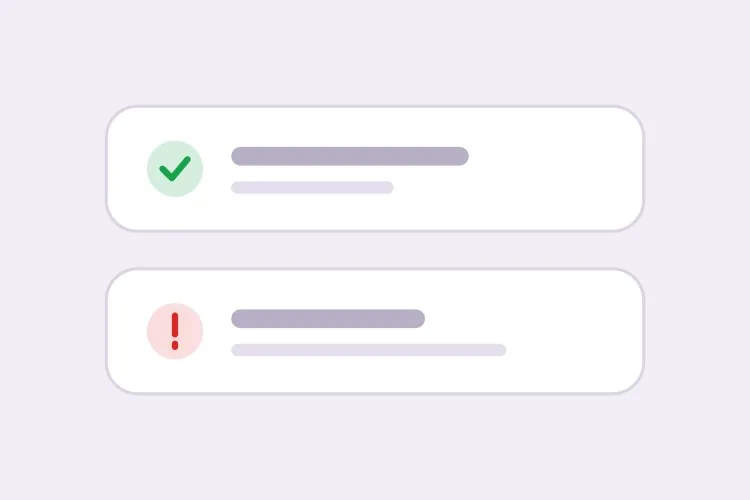
AI Toast提示產生器。

描述你的通知行為,MeDo即可產生完整的Toast系統 — 四種語意類型、堆疊佇列、游標懸停時暫停的自動消失計時器、觸控滑動關閉,以及為每種類型設定正確的aria-live播報層級。

浮動提示
浮動提示

Toast本質上是一個偽裝成小方塊的計時器、佇列和live region

Toast的視覺部分幾分鐘就能完成,底層的東西卻並非如此。Toast必須決定停留多久、三則同時到達時怎麼辦、使用者正在填表途中怎麼辦,以及螢幕閱讀器如何在不被打斷的情況下播報它。不太明顯的後果是:Toast的缺陷會表現為信任的缺陷 — 儲存確認還未讀完就消失,或使用者正在看對應欄位時錯誤提示就不見了,這會讓人學會不再相信介面。把計時規則、佇列上限和live region播報層級一起產生,能讓這些決策保持一致,而不是散落在每個觸發通知的呼叫點上。

6 個模板

可以產生的 浮動提示 模板

每個模板都是真實的提示詞,而非截圖。複製到任何 AI 編輯器,或在 MeDo 中執行,直接取得 React + Tailwind 程式碼。

BasicFour Tones

Success, Error, Warning, Info Stack

The baseline set, and the only one where per-type rules matter more than styling. Errors that auto-dismiss are the single most common toast bug in production.

Create a toast system with four semantic types — success with a check icon and green accent, error with an alert icon and red accent, warning with a triangle and amber accent, info with a circle and blue accent. Each toast is 360px wide with a 12px radius, 16px padding, a semibold title, an optional description and a close button with an accessible label. Stack in the bottom-right with 8px gaps, newest on top, three visible at once and the rest queued. Auto-dismiss success, info and warning after 5000ms; keep errors until the user closes them. Wrap non-error toasts in role="status" with aria-live="polite" and give errors role="alert". Slide in 16px from the right and fade out; under prefers-reduced-motion, fade only.


在 MeDo 中試試
TimingPausable Timer

Countdown Bar That Freezes on Hover

A visible progress bar plus a timer that stops while the pointer or keyboard focus is on the toast. Without the pause, a toast can vanish while the user is reaching for its own action button.

Create a toast with a visible dismiss countdown: a 2px progress bar along the bottom edge animating from full to zero over the toast duration. Pause the timer and freeze the bar on pointerenter and on focusin anywhere inside the toast, then resume from the remaining time on pointerleave and focusout — track elapsed time explicitly rather than restarting the interval, or the toast will live longer every time the pointer crosses it. Reset to the full duration when the toast content is updated in place. Under prefers-reduced-motion, replace the animated bar with a static severity stripe and keep the timer behaviour unchanged. Keep the toast in a role="status" region with aria-live="polite".

在 MeDo 中試試
UndoAction Toast

Toast With an Undo or Retry Action

The moment a toast carries a button, it stops being decoration and becomes the only route to a reversible operation — so it must not auto-dismiss while the action is still valid.

Create a toast variant with a single inline action button — Undo or Retry — beside the close control. Do not auto-dismiss while an action is present unless the caller passes an explicit duration, and never dismiss on a timer shorter than the window in which the action is still valid server-side. Move keyboard focus nowhere on mount; instead expose the toast region via a landmark and make the action reachable through a documented shortcut plus normal tab order, so a toast never steals focus from a form the user is typing in. Announce the toast with role="status" and aria-live="polite", and include the action label in the announced text so the option is heard, not just seen.

在 MeDo 中試試
AsyncPromise Toast

One Toast That Updates in Place

Pending, then success or error, on the same node. Firing a second toast when a request resolves stacks two notifications about one event and doubles the screen reader announcement.

Create a promise-driven toast that mounts in a pending state with a spinner and a loading title, then updates the same toast node to success or error when the promise settles rather than mounting a second toast. Keep the toast ID stable across the transition so the stack position does not change, swap the icon and accent, and start the auto-dismiss timer only once the promise resolves. On rejection, switch the container to role="alert" and cancel auto-dismiss. Because the live region content changes in place, debounce the announcement so a request that resolves in under 400ms announces the final state only. Cap the pending state with a timeout that converts to an error toast rather than spinning forever.

在 MeDo 中試試
MobileSwipe Toast

Top-Center Toast With Swipe Dismiss

On a phone the bottom corner is under the thumb and the home indicator. Top-center with a horizontal drag threshold is the only placement that does not fight the platform.

Create a mobile-first toast pinned to the top-center with a safe-area inset using env(safe-area-inset-top), full width minus 16px gutters, capped at a single line of title text with the description truncated to two lines. Add horizontal swipe-to-dismiss with a 60px or 40% drag threshold, translating with the pointer and springing back below the threshold; suppress the pointer handlers while the user is scrolling the page underneath. Keep the close button hit area at 44px even though the glyph is 16px. Show one toast at a time and replace rather than stack, since a stack on a 375px viewport covers the content. Use role="status" with aria-live="polite" and disable the spring under prefers-reduced-motion.

在 MeDo 中試試
SnackbarCompact Snackbar

Single-Line Bar With No Icon

One line, no title, no icon — for low-stakes confirmations like "Link copied" where a 360px card with an icon block is more furniture than the message deserves.

Create a compact snackbar toast: a single line of 14px text on a dark surface, 8px radius, 12px vertical and 16px horizontal padding, no icon and no separate title, with an optional text-only action on the right. Anchor it bottom-center with a 24px offset and allow only one at a time — a new snackbar replaces the current one and resets its 4000ms timer instead of queueing, because these fire from rapid interactions like copy and toggle. Announce via role="status" with aria-live="polite", and when the text is identical to the previous message, force re-announcement by clearing the live region for one frame. Fade and lift 8px on entry; fade only under prefers-reduced-motion.

在 MeDo 中試試

如何自訂你的 浮動提示

給錯誤類型設定不同於其他類型的規則

要求success、info和warning自動消失,而錯誤提示保留至使用者手動關閉。錯誤通常需要使用者採取行動,一則在被理解之前就自行消失的訊息,比沒有訊息更糟。

設定堆疊上限並說明溢出如何處理

明確同時可見的Toast數量 — 三則是合理的上限 — 以及超出的部分是排隊等候還是取代最舊的一則。沒有上限時,逐則觸發通知的迴圈會把整個視窗塞滿。

要求計時器在懸停和聚焦時暫停

在提示詞中要求:只要指標停留在Toast上,或其內部控制項取得鍵盤焦點,消失倒數就凍結。否則Toast可能在使用者正要點擊它自己的操作按鈕時消失。

指明擺放的角落和安全區域

選定一個位置並描述清楚:右下角遠離大多數主導覽,頂部置中最容易被快速讀到。行動裝置請要求加上env(safe-area-inset-bottom)內距,避免Toast落到主畫面指示器或固定標籤列下方。

誰在使用 浮動提示 組件

SaaS產品

用簡短的成功提示確認自動儲存和邀請寄送,背景同步失敗時用帶「重試」操作的常駐錯誤提示。右下角的位置可避開應用側邊欄。

電商商店

帶縮圖和「查看購物車」連結的「已加入購物車」提示,五秒後消失。庫存和付款失敗使用錯誤類型並保持顯示,讓購物者能讀清出了什麼問題。

儀表板或管理後台

批次操作只發出一則彙總提示,而非每筆記錄一則;長時間執行的作業在原位把同一則Toast從處理中更新為成功,而非在上面再疊一則通知。

行動版Web應用

頂部置中的Toast,支援滑動關閉並配合安全區域內距,尺寸控制在單行,確保絕不遮擋使用者正在輸入的欄位。

不同網站的 浮動提示 方案

同一個 浮動提示 組件,針對它所在網站的類型作調整。

01 / 06

SaaS Product Toasts

Autosave confirmations and invite receipts, bottom-right so they clear the sidebar. The rule that matters most here is that background-sync failures get persistent error toasts with a Retry action — a sync error that dismisses itself is indistinguishable from a sync that worked.

浮動提示 的風格與變體

挑選與頁面其餘部分相襯的變體,然後產生它。

01 / 06

Card Toast With Icon and Accent

The full anatomy: icon, semibold title, description, close button, colored accent. Worth the vertical space when the message has a subject and a detail. It is overkill for "Copied" — use the snackbar for those.

在 React、Next.js、Vue 與 Svelte 中使用 浮動提示

React、Next.js、Vue 3、SvelteKit、Astro 或純 HTML —— 同一個 浮動提示,六種接入方式。

01 / 06

React Toast

A context provider holding the queue plus a portal for the container. Mount the provider once above the router so navigating between routes does not unmount the toast that was just fired.

src/components/ToastProvider.tsx

export function ToastProvider({ children }) {
  const [toasts, setToasts] = useState([])
  const push = (t) => setToasts((prev) => [...prev, { id: uid(), ...t }])

  return (
    <ToastContext.Provider value={{ push }}>
      {children}
      {createPortal(<ToastStack toasts={toasts} />, document.body)}
    </ToastContext.Provider>
  )
}

如何把 浮動提示 加入專案

四個步驟,從挑選 浮動提示 模板到推上生產環境。

01~30s

Pick a Toast Pattern

Choose by the event, not the look: the four-tone stack for general notifications, the promise toast for async jobs, the action toast for anything reversible, the swipe variant for phone-first surfaces.

02~10s

Copy the Prompt

Take it into MeDo, Lovable, Bolt, v0 or Cursor. Set the duration and the stack limit before you run it, and decide there whether errors auto-dismiss — that is the decision you will otherwise relitigate at every call site.

03~1min

Generate and Refine

You get the provider, the queue and the toast back with a live preview. Follow up in plain English — "pause the timer on hover", "move it to top-center on mobile", "cap the stack at two" — instead of hand-editing timer logic.

04~2min

Mount the Provider Once

Put it above the router in your root layout so a toast fired just before a navigation survives it, then fire one from a real form submit and confirm a screen reader announces it without cutting off the page.

關於 浮動提示 的常見問題

如何用AI產生Toast提示元件?

在一段提示詞裡描述語意類型、位置和計時 — 例如「success、error、warning和info提示堆疊在右下角,除錯誤外5秒後自動消失」— MeDo會產生Provider、佇列和Toast本體。你拿到的是觸發函式加上標記,而非一個還需自行接線的靜態方塊。

Toast應該在畫面上停留多久?

簡短的確認訊息四到六秒即可,5000ms是合理的預設值。較長的訊息需要更多時間,決定下限的是閱讀速度而非美觀。錯誤以及任何帶操作按鈕的提示都不應自動消失。

Alert和Toast有什麼差別?

Toast是短暫的,浮在頁面固定角落,適合確認使用者剛完成的操作。行內Alert是文件流的一部分,會一直存在直到條件改變,因此適合表達比單次操作更持久的狀態 — 失效的付款方式、維護時段、表單層級錯誤。如果使用者需要能回來重新閱讀,就用Alert。

Toast應該用role="status"還是role="alert"?

成功和資訊類Toast用role="status"搭配aria-live="polite",讓播報等到語音停頓處再進行。role="alert"隱含assertive會打斷當前朗讀,應只留給需要立即關注的錯誤和警告。把每則Toast都標記為alert會讓螢幕閱讀器不斷搶在使用者前面說話。

可以堆疊多則Toast而不互相重疊嗎?

可以。讓MeDo提供一個Toast容器,以固定間距算繪數量受限的堆疊,超出上限的進入佇列,每關閉一則就釋出下一則。加入退場轉場,並在動畫結束前保留離場元素的高度,就能避免其餘的Toast跳動。

Toast在觸控裝置上能用嗎?

只要你要求手勢支援就能用。指定帶拖曳閾值的橫向滑動關閉,保持關閉按鈕的可點擊區域至少44px,並加上安全區域內距,讓Toast避開主畫面指示器和任何固定底列。
