AI功能網格產生器。

用簡單的中文描述您的產品優勢,MeDo在幾秒內產生一個精緻的響應式功能網格。更換圖示、調整欄數、優化文案 — 全程無需編寫一行程式碼。

功能網格
功能網格

出色的功能網格將訪客轉化為信徒。

功能網格通常是訪客在閱讀標題後首先關注的地方 — 它以可掃描的視覺格式回答「它到底能做什麼?」的問題。結構良好的網格能快速建立可信度:清晰的圖示降低認知負荷,簡潔的描述尊重注意力時長,一致的佈局表明產品經過深思熟慮。研究一致表明,放置在首屏之上的功能區域能顯著增加頁面停留時間和試用註冊率。

6 個模板

可以產生的 功能網格 模板

每個模板都是真實的提示詞,而非截圖。複製到任何 AI 編輯器,或在 MeDo 中執行,直接取得 React + Tailwind 程式碼。

Icon cardsAcme

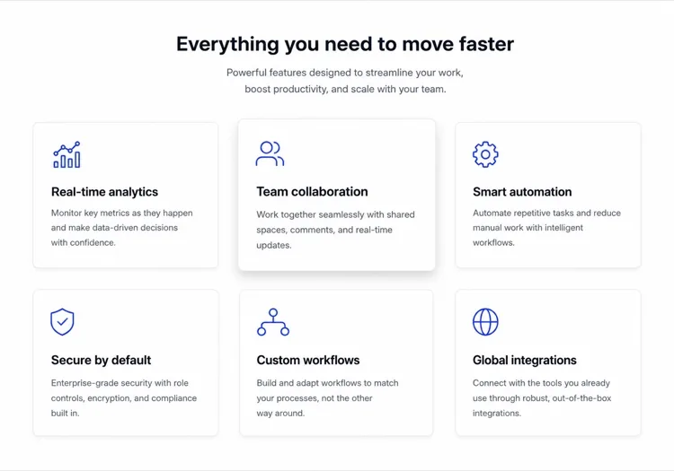
Three-Column Icon Card Grid

The workhorse feature grid. Six cards is the ceiling before scanning turns into reading — at nine the visitor stops comparing cards and starts skipping them.

Create a three-column feature grid holding exactly six cards. Above the grid, a centered eyebrow label, an h2 section heading and one line of supporting copy at a max width of 42rem. Each card has a filled icon in a tinted rounded square, an h3 title of two to four words, and a description of one to two sentences. Cards share a light surface, a 12px radius and a hairline border, with a hover state that raises the shadow and shifts the card up 2px — guarded behind prefers-reduced-motion. Collapse to two columns at 1024px and one at 640px, keeping equal card heights via the grid rather than fixed pixel values.

在 MeDo 中試試
BentoMega

Bento Grid With One Feature Card

Unequal cells let one feature carry a screenshot while the rest stay text. Use it when the features are genuinely unequal in importance — a bento of six equally weighted cells is just a grid with worse alignment.

Create a bento-style feature grid on a twelve-column base: one hero cell spanning eight columns and two rows containing a title, two lines of copy and a cropped product screenshot; two cells of four columns each with an icon, title and one-line description; and a full-width cell at the bottom with a title, a short paragraph and a text link. Give every cell the same radius, border and internal padding so the varied spans still read as one system. Below 900px, flatten to a single column in importance order and drop the screenshot to full width with explicit dimensions.

在 MeDo 中試試
Alternating rowsShipfast

Feature Rows With Alternating Screenshots

Not a grid at all — three stacked rows that flip image side each time. The right choice when each feature needs a screenshot to make sense, which an icon card can never provide.

Create a feature section as three alternating rows instead of a grid. Each row is a two-column layout: copy on one side with an eyebrow label, an h3, a two-sentence description and a bulleted list of three sub-points, and a product screenshot on the other side in a bordered frame at explicit width and height. Flip the image from right to left to right down the rows using an order utility at the desktop breakpoint only. Add generous vertical rhythm between rows and a hairline divider. Below 900px, every row stacks with the copy first so the reading order stays consistent.

在 MeDo 中試試
Minimal listBuilders

Borderless Grid With Small Icons

No cards, no shadows — just a two-by-four field of small icons with tight copy. Fits documentation and developer sites where card chrome reads as marketing decoration.

Create a borderless feature grid with no cards or shadows: a four-column layout on desktop holding eight items, each with a 20px outline icon above an h3 title of two or three words and a description capped at two lines. Rely on column and row gap for separation rather than borders, and keep the icons a single stroke weight from one library. Add a left-aligned section heading and a single text link to the docs beneath the grid. Collapse to two columns at 768px and one at 480px, preserving the icon-above-title stacking at every size.

在 MeDo 中試試
NumberedStudio

Numbered Capability Grid

Swaps icons for large numerals, which is the honest move when your features have no natural iconography. Reads as a deliverables list, so agencies and service pages get more from it than products do.

Create a numbered feature grid of six cells in three columns. Each cell opens with an oversized two-digit numeral in a muted tint, then an h3 title and a two-sentence description. Numbering runs left to right and must be visual only — set the numerals as decorative text with aria-hidden so a screen reader hears the titles as a clean list. Use a shared top border on each cell instead of full card outlines. Include a section heading and a short intro paragraph above. Two columns at 1024px, one at 640px, with the numeral scaling down one step on mobile.

在 MeDo 中試試
ComparisonBrand*

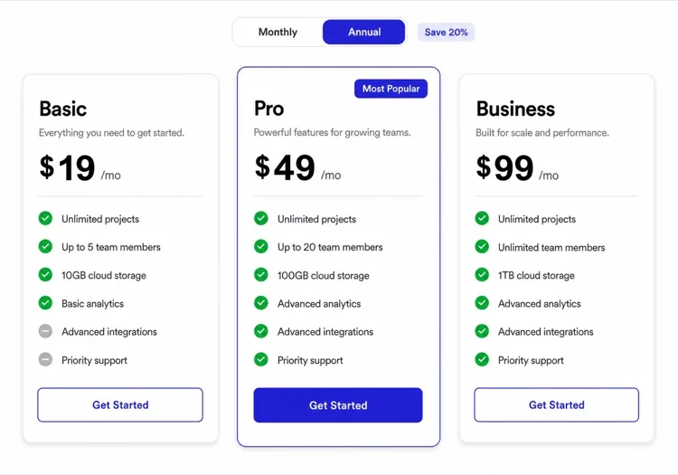
Feature Grid With Plan Availability

Each card names the tier that includes it. Removes the click to pricing at the cost of maintenance — if the tiers change and this grid does not, it becomes a support ticket generator.

Create a feature grid where each card carries plan availability: three columns, six cards, and inside each an icon, an h3 title, a two-sentence description and a small badge row reading Starter, Pro or Enterprise. Style the badge by tier with distinguishable text labels rather than color alone. Add a filter row of tier pills above the grid that hides non-matching cards on click, keeping the pressed state on the active pill with aria-pressed. Announce the visible count in a live region. Collapse to two columns at 1024px and one at 640px, with the filter row scrolling horizontally on mobile.

在 MeDo 中試試

如何自訂你的 功能網格

以成果而非功能引領

不要寫「基於角色的權限」,而是寫「無需IT工單,即可控制誰能看到什麼。」圍繞使用者收益而非功能名稱重構每張卡片,能讓網格立即更有說服力、更注重轉換。

使用一致的圖示風格和粗細

混合使用線框圖示和填充圖示,或不同的描邊粗細,會產生視覺噪音。選擇一種風格 — 線框、填充或雙色調 — 並套用到每張卡片。讓MeDo從同一個圖示庫(Lucide、Heroicons、Phosphor)取得所有圖示,自動保持一致性。

為網格搭配證據點

在每張功能卡片下方新增一個微妙的數據或社會證明標籤 — 「12,000個團隊在使用」或「平均每週節省3小時。」一個數字將收益錨定在現實中,並大幅提升感知可信度。

根據功能密度調整欄數

三到四個功能在2欄佈局中效果最佳,讓每張卡片有呼吸空間。六到九個功能適合3欄網格。超過九個,考慮將功能分組在類別標題下,而不是新增更多卡片 — 網格超過9個元素就會變得令人難以承受。

誰在使用 功能網格 組件

SaaS產品頁面

功能網格是每個SaaS行銷頁面的支柱。它讓潛在客戶透過掃描功能自我篩選 — 在卡片中識別出自己痛點的訪客更有可能開始試用。

開發者工具登陸頁

開發者工具使用功能網格來突顯技術能力 — SDK支援、效能基準、整合 — 以工程師在30秒內無需閱讀大段文字就能理解的格式呈現。

行動應用展示頁

應用登陸頁使用圖示驅動的功能網格在有限的縱向空間中傳達豐富的功能集,通常將網格與應用程式模型截圖搭配以保持佈局的視覺平衡。

代理機構和自由工作者作品集

服務型企業使用功能網格列出方案包含的內容 — 設計、開發、SEO、支援 — 使提案感覺透明,並減少銷售過程中的來回溝通。

不同網站的 功能網格 方案

同一個 功能網格 組件,針對它所在網站的類型作調整。

01 / 06

SaaS Product Feature Grid

Six icon cards framed as outcomes, not feature names. Visitors self-qualify by scanning for their own problem, so a card titled "Role-based permissions" does less work than one titled "Control who sees what". Keep the card count fixed as the product grows or this section becomes a changelog.

功能網格 的風格與變體

挑選與頁面其餘部分相襯的變體,然後產生它。

01 / 06

Icon Card Grid

Bordered or shadowed cards with a tinted icon tile, title and description. The most legible default because the card boundary does the grouping for you. Keep icons from one library at one stroke weight or the grid reads as assembled from three different sites.

在 React、Next.js、Vue 與 Svelte 中使用 功能網格

React、Next.js、Vue 3、SvelteKit、Astro 或純 HTML —— 同一個 功能網格,六種接入方式。

01 / 06

React Feature Grid

Drive it from a typed array and map over it rather than hand-writing six near-identical card blocks. No state is involved, so this stays a plain function component even in a heavily interactive app.

src/components/FeatureGrid.tsx

const features = [
  { icon: Zap, title: 'Real-time sync', body: 'Changes land everywhere at once.' },
]

export function FeatureGrid() {
  return (
    <div className="grid gap-6 sm:grid-cols-2 lg:grid-cols-3">
      {features.map(({ icon: Icon, title, body }) => (
        <article key={title} className="rounded-xl border p-6">
          <Icon className="h-5 w-5" aria-hidden />
          <h3 className="mt-4 font-medium">{title}</h3>
          <p className="mt-2 text-sm text-zinc-500">{body}</p>
        </article>
      ))}
    </div>
  )
}

如何把 功能網格 加入專案

四個步驟,從挑選 功能網格 模板到推上生產環境。

01~30s

Pick a Feature Grid Template

Choose by what each feature needs to show. Icons and a sentence means a card grid; a screenshot per feature means alternating rows; no natural iconography means numbered cells.

02~10s

Copy the Prompt

Take the prompt into MeDo, Lovable, Bolt, v0 or Cursor. Replace the placeholder feature names with your real ones first — the card count decides the column count, not the other way round.

03~2min

Generate and Refine

You get React + Tailwind back with a live preview. Follow up in plain English — "make it four columns", "drop the shadows", "rewrite the titles as outcomes" — rather than hand-editing the array.

04~1min

Drop It Below the Hero

Place it after the hero and check the outline: one h2 for the section, h3 on each card. Then move the feature copy into a typed array or your CMS so the next edit does not touch JSX.

關於 功能網格 的常見問題

如何用AI建立功能網格?

開啟MeDo,描述您想展示的功能 — 包括欄數、使用什麼圖示或顏色、文案的語氣 — MeDo會產生一個完全樣式化的響應式功能網格元件。您可以透過後續提示詞來調整佈局、更換圖示或重寫單個卡片描述。

最好的AI功能網格產生器是什麼?

MeDo專為從自然語言提示詞產生精美UI元件而設計。與通用AI程式碼工具不同,MeDo理解設計慣例 — 一致的間距、可存取的顏色對比、響應式中斷點 — 因此產生的功能網格看起來像出自資深設計師之手,而非範本庫。

功能網格應該展示多少個功能?

3到9個功能是最佳範圍。少於3個顯得單薄;超過9個會讓訪客不知所措並分散注意力。如果您有超過9個功能,請將它們分組在主題類別下 — 每個組成為自己的迷你網格 — 而不是全部列在一個無盡的網格中。

能產生與現有設計系統匹配的功能網格嗎?

可以。在MeDo提示詞中指定您的設計權杖 — 主色、字型系列、邊框圓角、陰影強度 — MeDo會在整個產生的元件中套用它們。您也可以貼上Tailwind設定或CSS變數列表,讓MeDo圍繞您的現有系統建構網格。

功能網格最適合用什麼圖示?

線框圖示(如Heroicons或Lucide)適合簡約現代的設計。填充或雙色調圖示適合更大膽、更豐富多彩的佈局。最重要的規則是一致性:網格中的每個圖示都應來自同一個庫並使用相同的描邊粗細。MeDo預設使用Lucide圖示,但會使用您指定的任何庫。

MeDo能用React或Next.js產生功能網格嗎?

可以。指定您的框架 — React、Next.js、Vue、Svelte — MeDo會輸出框架原生元件。對於React和Next.js專案,MeDo使用TypeScript介面進行prop型別定義,並可以將元件產生為靜態資料驅動陣列,以便您的內容團隊無需編輯JSX即可更新功能。