MeDo

مولّد شريط جانبي بالذكاء الاصطناعي.

صِف الشريط الجانبي الذي تحتاجه — روابط تنقل، قوائم متداخلة، فلاتر أو أدوات مصغّرة — وMeDo يولّد كوداً نظيفاً جاهزاً للإنتاج في ثوانٍ. بدون هيكلة مسبقة، بدون كود نمطي.

الشريط الجانبي
الشريط الجانبي

الشريط الجانبي المصمم جيداً هو العمود الفقري لكل تطبيق معقد

الأشرطة الجانبية تفعل أكثر بكثير من مجرد سرد الروابط — فهي تحدد التسلسل الهرمي للمعلومات في تطبيقك، وتقلل احتكاك التنقل، وتبقي المستخدمين موجّهين في كل مستوى عمق. الشريط الجانبي ذو البنية السيئة يجعل المستخدمين يفقدون السياق ويتخلون عن المسارات. ابدأ بشكل صحيح من البداية ببنية مولّدة بالذكاء الاصطناعي تعكس كيف يفكر مستخدموك فعلاً.

6 قالبًا

قوالب الشريط الجانبي التي يمكنك توليدها

كل قالب هو طلب حقيقي لا صورة. انسخه إلى أي محرّر ذكاء اصطناعي، أو شغّله في MeDo لتحصل على كود React و Tailwind مباشرة.

App shellAcme

Fixed 240px Nav With Nested Sections

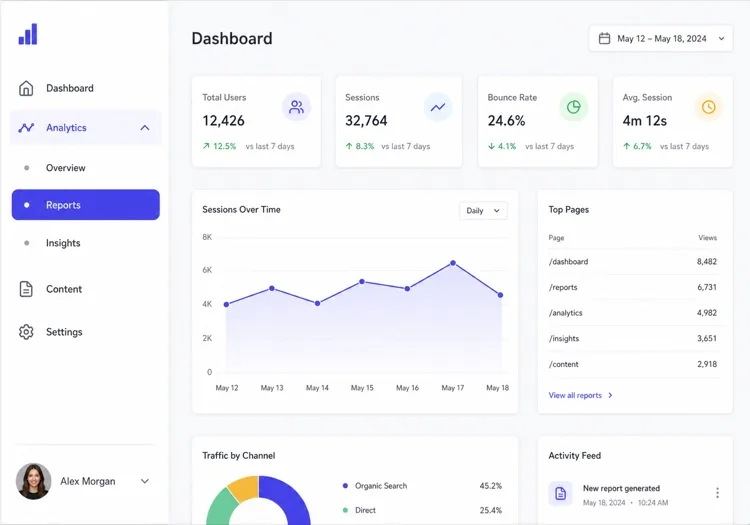
The dashboard default: icon plus label rows, two levels of nesting, a user block pinned to the bottom. Persist which sections are expanded, or the sidebar resets its shape on every page load.

Create a fixed 240px sidebar for an app shell: logo at the top, then icon-and-label rows for Dashboard, Analytics, Content and Settings, with Analytics and Content expanding into two or three nested sub-items behind a chevron that rotates 90 degrees when open. Mark the active route with aria-current="page", a left accent bar and a tinted row background, and auto-expand the section containing it on load. Persist expanded sections in localStorage. Pin a user block with avatar, name and workspace to the bottom with margin-top auto. Below 1024px, hide the sidebar off-canvas and open it as a drawer from a header toggle.

جرّبه في MeDo
CollapsibleMega

Rail That Expands to Full Width

Toggles between a 64px icon rail and a 240px labelled panel. Icons alone are not self-explanatory — without tooltips in the collapsed state, users learn the rail by clicking things at random.

Create a collapsible sidebar that toggles between a 64px icon rail and a 240px expanded panel, animating the width over 200ms with a transform-friendly transition and no layout thrash on the main content. In the collapsed state, center each icon, hide the labels, and show the label as a tooltip on hover and on keyboard focus so the icons are not guesswork. Keep the toggle button at the bottom of the rail with aria-expanded and a chevron that mirrors direction. Persist the collapsed state in localStorage and honour it during server rendering so the panel does not flash open on load.

جرّبه في MeDo
Docs TOCDocs

Scroll-Spy Table of Contents

A full documentation tree with the current heading tracked as you scroll. The hard part is not the highlight — it is keeping the active item inside the sidebar's own scroll viewport on load.

Create a documentation sidebar showing a full table of contents: six collapsible guide groups with four to eight page links each, the current page marked with aria-current="page", and beneath it an on-page heading list tracked by an IntersectionObserver so the visible section highlights as the reader scrolls. Give the sidebar its own overflow-y-auto scroll container with the header height subtracted from its max height, and scroll the active item into view on load using scrollIntoView with block: nearest so the page itself does not jump. Below 1024px, move the whole tree into a drawer.

جرّبه في MeDo
FiltersShop

Faceted Filter Panel

Not navigation at all — a form that happens to sit in the left column. Each applied filter has to survive a page refresh, which means the URL is the state, not a hook.

Create a faceted filter sidebar for a product listing page: collapsible groups for Category with checkboxes and result counts, Price as a dual-handle range with numeric inputs, Brand as a searchable checkbox list capped at six visible items behind a Show all toggle, plus Rating and In stock. Reflect every applied filter in the URL query string so the filtered view is refreshable and shareable, and show applied filters as removable chips at the top with a Clear all. Announce the updated result count through an aria-live="polite" region. Below 1024px, present the whole panel as a bottom sheet behind a Filters button showing the active count.

جرّبه في MeDo
Content railStudio

Sticky Article Companion

A right-hand rail on a blog or docs article carrying the table of contents, share links and related posts. Sticky positioning fails silently here if any ancestor has overflow set.

Create a sticky right-hand sidebar for a long article: an On this page heading list built from the h2 and h3 elements with the current section highlighted by an IntersectionObserver, a reading-time estimate, a vertical share row, and a three-item related-posts list at the bottom. Use position: sticky with a top offset equal to the header height, and make sure no ancestor of the sidebar sets overflow to hidden or auto, since that silently breaks sticky. Hide the rail entirely below 1280px and render the heading list as a collapsed details element above the article body instead.

جرّبه في MeDo
Multi-levelShipfast

Three-Level Tree With Search

For CMS and admin tools where the tree is genuinely deep. Filtering the tree is what makes three levels usable — without a search field, level three is effectively unreachable.

Create a three-level sidebar tree for a CMS: a filter input at the top that matches labels at any depth and auto-expands the branches containing a match, then top-level sections each holding groups which hold page links. Indent each level by 12px with a hairline guide line rather than more padding, so depth stays readable at 240px. Support full keyboard traversal with arrow keys — down and up between visible rows, right to expand, left to collapse or move to the parent — and give each expandable row aria-expanded. Keep the active branch expanded across navigations.

جرّبه في MeDo

كيف تخصّص الشريط الجانبي الخاص بك

تكيّف مع عمق المعلومات لديك

للتطبيقات المسطحة ذات 5-8 أقسام، الشريط الجانبي أحادي المستوى أنظف. للتطبيقات العميقة مثل لوحات تحكم المسؤول أو مواقع التوثيق، اطلب 2-3 مستويات تداخل مع سلوك التوسيع/الطي.

حدد سلوك الطي

أخبر MeDo ما إذا كان الشريط الجانبي يجب أن يُطوى إلى أيقونات على الهاتف المحمول، أو ينزلق خارج اللوحة مع زر هامبرغر، أو يبقى مرئياً دائماً. كل نمط يناسب أحجام شاشات وحالات استخدام مختلفة.

أضف أدوات مصغّرة سياقية

الأشرطة الجانبية ليست مجرد تنقل — اطلب بطاقات ملف المستخدم الشخصي، أشرطة استخدام التخزين، شارات الإشعارات، أو أزرار الإجراء السريع لجعل شريطك الجانبي مركز إنتاجية حقيقي.

تحكم في العرض والتثبيت

حدد عرضاً ثابتاً للشريط الجانبي (مثل 240px) أو لوحة قابلة لتغيير الحجم. للصفحات ذات المحتوى الطويل، اطلب شريطاً جانبياً لاصقاً يتبع التمرير حتى يكون التنقل دائماً في المتناول.

من يستخدم مكوّن الشريط الجانبي

لوحة تحكم SaaS

تستخدم لوحات تحكم الإدارة والتحليلات أشرطة جانبية لتنظيم وحدات مثل المستخدمين والتقارير والفواتير والإعدادات — مع عناصر فرعية متداخلة وعدادات شارات للإشعارات غير المقروءة.

موقع التوثيق

تعتمد مواقع التوثيق على الأشرطة الجانبية لعرض جدول محتويات كامل، غالباً مع أقسام قابلة للطي لكل دليل ومراقب تمرير لاصق حتى يعرف القراء دائماً موقعهم.

فلتر فئات التجارة الإلكترونية

تستخدم صفحات قوائم المنتجات لوحات جانبية للتصفية متعددة الأوجه — الفئات، نطاقات الأسعار، مربعات اختيار العلامات التجارية — مما يتيح للمتسوقين تضييق آلاف النتائج دون مغادرة الصفحة.

نظام إدارة المحتوى

تستخدم واجهات أنظمة إدارة المحتوى أشرطة جانبية للتنقل بين أنواع المحتوى والمسودات ومكتبات الوسائط وسير عمل النشر، مع الحفاظ على اللوحة الرئيسية نظيفة للتحرير.

أنماط الشريط الجانبي لمواقع مختلفة

المكوّن الشريط الجانبي نفسه، مُهيّأ لنوع الموقع الذي يُنشر عليه.

01 / 06

SaaS Dashboard Sidebar

The primary navigation for a logged-in product: sections, sub-items, badge counts and a user block at the bottom. Persist which groups are expanded — a sidebar that collapses back to its default shape on every page load makes the app feel like it forgets you.

أنماط الشريط الجانبي وتنويعاته

اختر التنويعة التي تناسب بقية الصفحة، ثم ولّدها.

01 / 06

Fixed Sidebar

Always visible at 240 to 280px, with the main content offset by the same width. The right default for a dashboard on desktop: navigation that never has to be summoned is navigation people actually use.

الشريط الجانبي في React و Next.js و Vue و Svelte

React و Next.js و Vue 3 و SvelteKit و Astro أو HTML صِرف — المكوّن الشريط الجانبي نفسه بست طرق للإضافة.

01 / 06

React Sidebar

Two pieces of state — the expanded groups and the mobile drawer — so keep both in the sidebar rather than lifting them to a layout provider. Take the current path as a prop so the component stays router-agnostic.

src/components/Sidebar.tsx

export function Sidebar({ sections, pathname }) {
  const [open, setOpen] = useState(() => activeGroup(sections, pathname))

  return (
    <aside className="w-60 shrink-0 overflow-y-auto">
      <nav aria-label="Sidebar">
        {sections.map((s) => (
          <Group key={s.id} section={s} expanded={open === s.id} />
        ))}
      </nav>
    </aside>
  )
}

كيف تضيف الشريط الجانبي إلى مشروعك

أربع خطوات، من اختيار قالب الشريط الجانبي إلى إطلاقه في الإنتاج.

01~30s

Pick a Sidebar Template

Match it to what the column actually holds: app routes take the fixed nav, a docs tree takes scroll-spy, product facets take the filter panel. Those three have almost nothing in common beyond their position on screen.

02~10s

Copy the Prompt

Paste it into MeDo, Lovable, Bolt, v0 or Cursor with your real section names. Keep the persistence and mobile-drawer clauses — the localStorage state and the focus trap are the first things a trimmed prompt loses.

03~1min

Generate and Refine

You get React + Tailwind back with a live preview. Follow up in plain English — "add badge counts to Inbox", "collapse to an icon rail", "pin the user block to the bottom".

04~2min

Mount It in Your Layout

Put it in a nested layout — app/(app)/layout.tsx or +layout.svelte — beside a flex-1 main, not inside the page. Mounted per page it remounts on every navigation and loses its scroll position and expanded groups.

أسئلة شائعة حول الشريط الجانبي

كيف أنشئ شريطاً جانبياً بالذكاء الاصطناعي؟

افتح MeDo، وصِف الشريط الجانبي الذي تريده بنص عادي — بما في ذلك بنية الروابط والسلوك (قابل للطي، لاصق، أيقونات فقط) ونظام الألوان — وMeDo يولّد كود المكوّن الكامل. يمكنك التكرار عن طريق تحسين موجّهك حتى يطابق رؤيتك تماماً.

ما هو أفضل مولّد شريط جانبي بالذكاء الاصطناعي؟

MeDo مصمم خصيصاً لتوليد مكونات واجهة مستخدم مصقولة مثل الأشرطة الجانبية. على عكس مولّدات الكود العامة، يفهم MeDo دلالات التخطيط والسلوك المتجاوب وأنظمة التصميم — لذا تحصل على شريط جانبي يعمل، وليس فقط واحداً يبدو جيداً في لقطة شاشة.

هل يمكنني توليد شريط جانبي قابل للطي بالذكاء الاصطناعي؟

نعم. فقط أضِف "قابل للطي" في موجّهك وحدد هدف الطي — وضع الأيقونات فقط، خارج اللوحة بالكامل، أو لوحة قابلة لتغيير الحجم. يتعامل MeDo مع منطق التبديل بـ JavaScript وانتقالات CSS تلقائياً.

كيف أنشئ شريطاً جانبياً متجاوباً يعمل على الهاتف المحمول؟

اطلب من MeDo توليد شريط جانبي يُطوى إلى درج يُفعَّل بزر هامبرغر على الشاشات تحت نقطة قطع معينة (مثل 768px). المكوّن المُولَّد يتضمن استعلامات الوسائط وإدارة حالة التبديل ليعمل بشكل صحيح من البداية.

هل يستطيع الذكاء الاصطناعي توليد شريط جانبي بعناصر قائمة متداخلة؟

بالتأكيد. صِف عمق قائمتك في الموجّه — على سبيل المثال، "شريط جانبي من مستويين حيث كل عنصر رئيسي يتوسع ليكشف 3 عناصر فرعية مع شيفرون متحرك" — وMeDo يولّد البنية التكرارية أو المتداخلة المسطحة وفقاً لذلك.

هل يدعم MeDo مكونات الشريط الجانبي لـ React و Next.js؟

نعم. يولّد MeDo المكونات في الإطار واللغة التي تحددها. اطلب مكوّن React وظيفي مع TypeScript، أو شريط جانبي لتخطيط Next.js App Router، أو نسخة HTML/CSS/JS خالصة — المخرجات تتكيف مع مجموعتك التقنية.