AI输入框生成器。

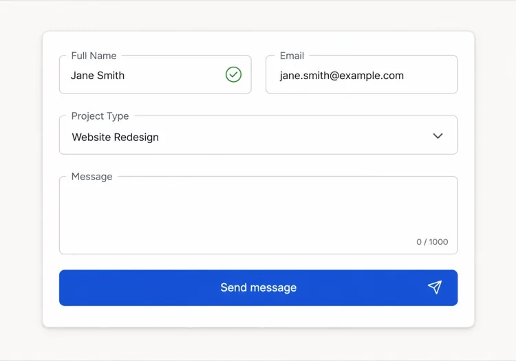
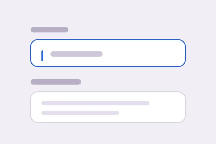
描述你的表单,MeDo 会同时生成文本输入框和多行文本框 — 标签、辅助文字、错误状态、前缀和后缀附加元素、字数统计以及高度自适应,全部连接到正确的无障碍属性。

输入框
输入框

输入框本身是整个组件里最小的一部分

输入框的大部分工作与字段本身无关。标签、辅助文字、错误提示区以及它们之间的间距才决定表单是否好用,而这些恰恰是组件库倾向于丢给使用者的部分。于是团队为每个表单手写包装标记,垂直节奏一个字段一个字段地跑偏,最后什么都对不齐。把标签、说明和错误区域作为一个整体生成,可以一次性固定它们的关系。这同时消除了网页表单中最常见的无障碍缺陷:错误消息渲染在字段旁边,却从未在程序层面与它关联。

6 个模板

可以生成的 输入框 模板

每个模板都是真实的提示词,而不是截图。复制到任意 AI 编辑器,或在 MeDo 中运行,直接拿到 React + Tailwind 代码。

BasicLabel + Field

Labeled Input With Helper Text

The baseline every other field extends. Label, field, and a message region that already occupies its line at rest so the form does not grow when an error appears.

Create a text input component with a visible label above the field, wired with a generated id and a matching for attribute rather than wrapping the input in the label. Below it, a helper text line linked through aria-describedby. Reserve the height of that line at rest so the form does not shift when an error replaces it. The field is 40px tall with an 8px radius, a 1px grey border, and a 2px focus-visible ring offset from the border. Add a required prop that sets the required attribute and appends a visually hidden "required" to the label rather than relying on an asterisk alone. Accept type, inputMode and autocomplete as props with no defaults, so each call site declares them.


在 MeDo 中尝试
ErrorsValidation States

Error, Success and Warning States

Where most form bugs live. An error message rendered beside a field but never connected to it is the most common accessibility defect in web forms.

Add validation states to a text input: error with a red border, a red message replacing the helper text, aria-invalid="true", and the message linked through aria-describedby so it is announced when focus enters the field. Add success and warning states that change the border and the leading icon but keep the same message slot and line height. Never signal state by border color alone — pair every state with an icon and text. Validate on blur, then revalidate on change only once the field is already in an error state, so a half-typed email is not flagged mid-entry. Announce late server-side errors through a polite live region.

在 MeDo 中尝试
AffixesAffix Slots

Prefix and Suffix Inside the Field

Search icons, currency symbols, unit suffixes, password toggles. The trap is padding — an affix rendered over the field without matching inset padding lets typed text slide underneath it.

Create a text input with optional prefix and suffix slots rendered inside the field border. Static affixes such as a currency symbol or a .com suffix get aria-hidden and muted text; interactive affixes such as a password visibility toggle or a clear button render as real buttons with their own aria-label and stay reachable by keyboard. Increase the field padding to match each affix width so typed text never slides under it. Keep the focus ring on the outer wrapper, not the bare input, so the ring surrounds the affixes too. Include a search variant with a leading magnifier and a trailing clear button that appears only when the field has a value.

在 MeDo 中尝试
TextareaAutosize Textarea

Growing Textarea With a Counter

A fixed three-row box for a support message forces people to scroll inside a scroll. Growing to a cap keeps the submit button on screen.

Create a textarea that shares the label, helper text and error layout of the text input. Autosize from a three-row minimum up to eight rows, recalculating the height from scrollHeight on input after resetting it, then switch to internal scrolling at the cap so a long message cannot push the submit button off screen. Add an optional character counter in the bottom right showing used and total, turning amber at 90 percent of the limit and red at the limit, announced through a polite live region rather than on every keystroke. Disable the native resize handle only when autosizing is on, otherwise leave it available.

在 MeDo 中尝试
FormattingMasked Field

Card, Phone and Date Inputs

Formatted fields where the input event rewrites the value. Get the caret handling wrong and editing the middle of a card number jumps the cursor to the end on every keystroke.

Create a formatted input for card numbers, phone numbers and expiry dates. Insert separators as the user types — spaces every four digits for cards, a slash after the month for expiry — while storing the unformatted value in state and submitting that. Preserve the caret position when the mask inserts a character mid-string, rather than letting the value reset send it to the end. Set inputMode="numeric" and the correct autocomplete token: cc-number, tel, cc-exp. Accept paste of an already-formatted value by stripping non-digits first. Validate length on blur and keep the field editable in the error state.

在 MeDo 中尝试
LayoutField Group

Multi-Field Row With Shared Rhythm

City and postcode on one line, expiry and CVC side by side. The point is a single spacing scale, since per-form wrapper markup is what makes vertical rhythm drift.

Create a form field group component that lays out two or three inputs on one row using a grid, collapsing to a single column below 640px. Keep a shared vertical gap between rows and align the labels on a single baseline even when one field carries helper text and its neighbor does not, by reserving the message line in every field. Group semantically related fields in a fieldset with a legend, such as an address block, so screen readers announce the group name before each field. Let each field declare its own width in grid columns rather than a hardcoded percentage, so a postcode field can be narrower than a city field.

在 MeDo 中尝试

如何自定义你的 输入框

始终要求一个真正的标签

占位符不是标签。用户一开始输入它就消失,中途被打断的人会失去线索,而且大多数屏幕阅读器把它当作可选文字。要求一个通过 <label for> 与字段关联的可见标签,占位符只用于展示 MM/YY 这类格式示例。

为错误消息预留空间

如果错误文字只在校验失败时出现,提交时下方字段会向下跳动。说明辅助与错误区域在静止状态下也占据固定行高,这样出现消息时表单高度不会变化。

明确说明需要的输入类型

为每个字段指定 type 和 inputMode:email、tel 和 numeric 会唤起不同的移动键盘。再搭配正确的 autocomplete 令牌,比如 email、tel、current-password 和 one-time-code,浏览器和密码管理器才能自动填写表单。

决定校验的触发时机

每次按键都校验,会在用户写完之前就把半个邮箱标记为错误。要求在 blur 时校验,字段已处于错误状态后再在 change 时重新校验,这样既能纠错又不会一直打扰用户。

谁在使用 输入框 组件

注册或登录表单

邮箱和密码字段,后缀插槽里带内联的可见性切换,辅助文字中显示密码强度提示,并设置 autocomplete 令牌,让浏览器提供已保存的凭据而不是空白字段。

结算流程

卡号、有效期和邮政编码输入框使用数字输入模式,金额字段带货币前缀,并在 blur 时校验,使输入中的卡号不会被误判为无效。

客服或联系表单

一个简短的主题输入框,下方是带 1,000 字计数器的高度自适应留言文本框,长消息会撑开字段,而不是迫使用户在固定框内滚动。

仪表盘设置面板

密集排列的小尺寸输入框,标签左对齐,用户无法修改的值使用 read-only 字段,辅助文字解释每项设置的作用。

不同网站的 输入框 方案

同一个 输入框 组件,针对它所在网站的类型做调整。

01 / 06

SaaS Signup and Login Inputs

Two fields decide whether the account gets created, so the autocomplete tokens matter more than the styling. Set email and current-password on login and new-password on signup, or password managers offer the wrong entry and people retype credentials they already saved. Put the visibility toggle in the suffix slot as a real button, not a click handler on an icon.

输入框 的风格与变体

挑选与页面其余部分匹配的变体,然后生成它。

01 / 06

Outlined Input

A 1px border on a light surface with the label above — the default that works in the widest range of layouts. Keep the focus ring offset from the border rather than replacing it, so the resting and focused widths match and the field does not appear to move on focus.

在 React、Next.js、Vue 与 Svelte 中使用 输入框

React、Next.js、Vue 3、SvelteKit、Astro 或纯 HTML —— 同一个 输入框,六种接入方式。

01 / 06

React Input

Generate the id with useId so label association survives rendering the field twice on one page. Forward the ref so form libraries like React Hook Form can register the element directly.

src/components/Input.tsx

export const Input = forwardRef(function Input(
  { label, hint, error, ...props },
  ref
) {
  const id = useId()
  return (
    <div className="space-y-1.5">
      <label htmlFor={id}>{label}</label>
      <input id={id} ref={ref} aria-invalid={!!error}
        aria-describedby={id + '-msg'} {...props} />
      <p id={id + '-msg'}>{error ?? hint}</p>
    </div>
  )
})

如何把 输入框 加入项目

四个步骤,从挑选 输入框 模板到上线生产环境。

01~30s

Pick an Input Template

Scan the six templates and start from the field you actually need — labeled text input, affix slots for search or currency, autosizing textarea, or a masked card field.

02~10s

Copy the Prompt

Take the prompt into MeDo, Lovable, Bolt, v0 or Cursor. Name the type, inputMode and autocomplete token per field before you run it, since those three decide which mobile keyboard opens and whether autofill works.

03~1min

Generate and Refine

You get React + Tailwind back with a live preview. Follow up in plain English — "validate on blur only", "add a clear button in the suffix", "reserve the error line" — rather than editing the aria wiring by hand.

04~2min

Wire It to Your Form State

Register the forwarded ref with React Hook Form, Formik or a Server Action and pass the resolver error straight into the error prop. The component owns layout and aria; your form library owns the validation rules.

关于 输入框 的常见问题

如何用AI生成表单输入框?

在一个提示词里描述字段、标签、辅助文字和需要的状态,例如"带标签、提示文字和错误状态的邮箱输入框"。MeDo 会把标签、字段和消息区域生成为一个组件,aria 属性已经连接好。你可以在同一个提示词里列出多种字段类型,得到风格一致的整套组件。

占位符和标签有什么区别?

标签永久标明字段名称,用户输入时依然可见。占位符是字段内的临时提示文字,一输入就消失,因此只用它当标签会让用户猜自己已经填了什么。字段名称用标签,占位符只用于展示格式示例。

输入错误应该在输入时显示还是提交后显示?

在 blur 时校验而不是每次按键都校验,这样输入中的值不会在录入过程中被标记为错误。字段已经显示错误后,改用 change 时重新校验,值一旦有效消息就消失。提交时校验留给需要整个表单的检查,比如密码确认。

AI能生成无障碍的输入字段吗?

可以。MeDo 用 for 和 id 把标签与字段关联,用 aria-describedby 连接辅助文字和错误文字,并在校验失败时设置 aria-invalid。在提示词里提到必填字段,它会用 required 属性标记,而不是只依赖一个星号。

如何让多行文本框随内容增高?

要求一个带最小和最大行数的自适应文本框,例如从三行增长到八行后开始滚动。高度会在每次输入时根据 scroll height 重新计算,限制最大值可以避免长消息把提交按钮挤出屏幕。

autocomplete 属性真的有用吗?

有用。正确的 autocomplete 令牌能让浏览器和密码管理器一步填完字段,这在注册和结算表单上能明显降低放弃率。告诉 MeDo 每个字段收集什么,它就会设置对应的令牌,包括那些容易写错的地址和支付相关取值。