MeDo

AIナビバージェネレーター。

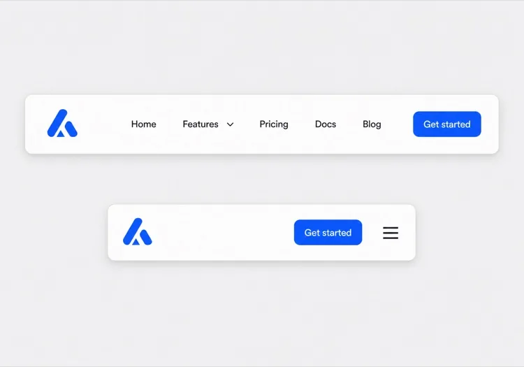
サイトを説明して完全レスポンシブなナビバーを取得 — ロゴ、ナビリンク、ドロップダウンメニュー、モバイルハンバーガーメニュー付き — 1つのプロンプトから生成。テンプレート不要、調整不要。

ナビバー
ナビバー

ナビバーは、ユーザーが他のどこよりも先に読む「地図」です

ナビバーはページ上部の飾りではなく、サイト全体を圧縮した目次です。どのリンクを選ぶか、どの順番で並べるか、何をドロップダウンに押し込むかが、あなたの製品が何であり重要な部分がどこにあるかを訪問者に伝えます。グループ分けを誤れば、求めていたページが2クリック先に存在していてもユーザーは離脱します。検索クローラーも同じように読み取り、ナビバーのリンクをどのページが最も重要かを示す強いシグナルとして扱います。だからこそナビバーは、まず情報アーキテクチャの問題として、次にレイアウトの問題として設計する価値があるのです。

6 個のテンプレート

生成できる ナビバー テンプレート

どのテンプレートもスクリーンショットではなく実際のプロンプトです。任意の AI エディタに貼り付けるか、MeDo で実行して React + Tailwind のコードを受け取れます。

ClassicAcme

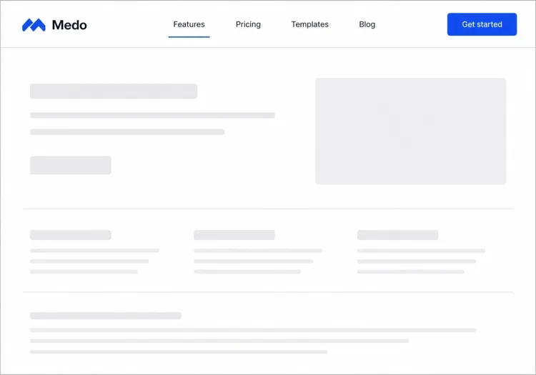
Logo, Five Links, One CTA

The default that fits most product sites. Reach for it only when your top level really is five items or fewer — a single row of nine links makes a small site feel disorganised rather than complete.

Create a horizontal navbar with a logo mark plus wordmark on the left, five links — Product, Pricing, Docs, Customers, Blog — centered, and one filled Get started button on the right. Mark the current route with aria-current="page" plus a 2px underline sitting on the text baseline rather than the container edge. Below 768px, replace the link row with a hamburger button that toggles aria-expanded and opens a full-height drawer sliding in from the right. Trap focus inside the drawer, close it on Escape and on route change, lock body scroll while it is open, and return focus to the hamburger button when it closes.
MeDoで試す
Mega menuMega

Mega Menu With Grouped Columns

For sites with more sections than a link row can hold. The mega panel buys you depth, but it also means two of your top-level items are no longer clickable destinations — decide that deliberately.

Create a navbar where two of five top-level items open a full-width mega menu panel: three columns of grouped links, each label with a one-line description underneath, plus a highlighted card on the right. Open the panel on hover after a 120ms delay and on Enter or Space for keyboard users. Give each trigger aria-expanded and aria-controls, move between panel links with arrow keys, close on Escape and when focus leaves the panel, and let Tab move on to the next top-level item. Below 1024px, flatten every mega panel into a nested accordion inside the mobile drawer instead of a hover panel.

MeDoで試す
CenteredShipfast

Centered Links With a Dual CTA

Sign in beside Start free, links dead center. Use a three-column grid rather than flexbox centering, or the link block drifts every time the button labels change length.

Create a navbar laid out as a three-column grid so the center block stays optically centered regardless of logo width or button label length: logo left, four links centered, and two actions right — a text Sign in link and a filled Start free button. Start fully transparent over the hero, then switch to a solid background with a 1px bottom border once the page scrolls past 80px, transitioning over 200ms, and swap the logo from its light variant to its dark variant at the same threshold. On mobile, collapse the links into a hamburger and keep only the Start free button visible next to it.

MeDoで試す
Docs navDocs

Version Switcher and Search Trigger

A navbar for a documentation site, where the nav is mostly controls rather than links. The search trigger earns more clicks here than every link beside it combined.

Create a navbar for a documentation site: logo on the left, then Docs, API and Changelog links, a version select showing v3.2 with older majors listed beneath, a search button showing a Command-K hint, a theme toggle and a GitHub star count. Bind Command-K and Control-K globally to open search, and make sure the shortcut is ignored while focus is inside an input or textarea. Below the tablet breakpoint, keep the search button and the sidebar toggle visible in the bar and move the links, version switcher and theme toggle into a drawer.

MeDoで試す
CommerceShop

Category Nav With Cart Count

Search takes real width, categories take the rest, and the cart lives at the far right. On a store the navbar is a working control surface, not a signpost — treat the search field as the primary element.

Create an e-commerce navbar: logo on the left, six category links with two opening a dropdown of subcategories, a search input that expands to fill the available row width on focus, and on the right an account link and a cart button with a count badge. Announce cart changes through an aria-live="polite" region so the count is not a silent visual update. Below 768px, keep the logo, a search icon and the cart in the bar, move categories into a left-hand drawer as a nested accordion, and expand search into a full-width overlay when its icon is tapped.

MeDoで試す
MinimalStudio

Wordmark and Four Links

No CTA, no dropdowns — a wordmark and four links, letting the work carry the page. The restraint only holds if the four labels are nouns a stranger recognises.

Create a minimal navbar for a design studio: a lowercase wordmark on the left and four links — Work, Studio, Journal, Contact — right-aligned in a light weight with generous letter spacing. Mark the current route with aria-current="page" and a subtle opacity change rather than an underline. Keep the bar static rather than sticky so it scrolls away with the page. Below 640px, keep all four links visible by dropping to a two-line layout with the wordmark above the links instead of introducing a hamburger, since four short labels do not justify a drawer.

MeDoで試す

ナビバー をカスタマイズする方法

スティッキーポジションで固定する

MeDoにナビバーをスティッキーにするよう依頼して、スクロール時にユーザーについてくるようにしましょう。バックドロップブラーや軽いシャドウをスクロール時に追加して、押し付けがましくなく奥行きを出しましょう。

複雑なサイトにはメガメニューを追加

サイトに多くの製品エリアやドキュメントセクションがある場合は、カラムとアイコン付きのメガメニューをリクエストしましょう。散らかったナビゲーションを整理されたディスカバリーサーフェスに変えます。

ファネルステージに合わせてCTAを調整

ナビバーのCTAはプレミアムな場所です。「無料登録」ボタン、「デモを予約」リンク、またはデュアルボタンレイアウトのどれが欲しいかを指定すれば、MeDoがそれに応じて設定します。

モバイルの動作を明示的に制御

モバイルメニューがどのように開くべきか(スライドインドロワー vs フルスクリーンオーバーレイ)、どのアニメーションを使うか、ハンバーガーアイコンがトグル時にXにアニメーションすべきかを記述してください。

ナビバー コンポーネントを使うのは誰か

SaaS製品

ロゴ、トップレベルの製品/料金/ドキュメントリンク、長いランディングページをスクロールしても表示され続けるスティッキーな「無料トライアル開始」CTAを持つクリーンな2層ナビゲーション。

ECサイト

検索バー、カテゴリドロップダウン、商品数バッジ付きカートアイコン、ログイン/アカウントリンクを持つナビバー — すべてモバイルフレンドリーなサイドドロワーに折りたたまれます。

ドキュメントサイト

ロゴ、バージョンセレクタードロップダウン、GitHubスターボタン、フォーカス時に展開するフル幅検索入力を持つミニマルな固定ナビバー。

マーケティング/代理店サイト

ヒーロー画像の上に重なる透明なナビバーで、スクロール時にソリッドな背景に遷移し、リード獲得のための目立つ「見積もりを取得」ボタンを備えています。

サイト種別ごとの ナビバー パターン

同じ ナビバー コンポーネントを、掲載するサイトの種類に合わせて調整します。

01 / 06

SaaS Product Navbar

Five top-level links and one CTA, grouped by what a visitor is trying to do rather than by your internal teams. If Pricing is not in the top level, expect support tickets asking what it costs — a Pricing link buried in a dropdown reliably suppresses trial starts.

ナビバー のスタイルとバリアント

ページ全体のトーンに合うバリアントを選び、そのまま生成します。

01 / 06

Sticky Navbar

Stays pinned as the page scrolls, usually gaining a border or a backdrop blur once past the fold. Give it an explicit height and set scroll-margin-top on your headings, or in-page anchor links land with the target hidden behind the bar.

React・Next.js・Vue・Svelte での ナビバー

React、Next.js、Vue 3、SvelteKit、Astro、素の HTML — 同じ ナビバー を 6 通りの方法で組み込めます。

01 / 06

React Navbar

One piece of state — whether the mobile drawer is open — so keep the hook at the navbar root and pass the current path in as a prop rather than reading a router inside it.

src/components/Navbar.tsx

export function Navbar({ pathname }) {
  const [open, setOpen] = useState(false)

  return (
    <nav aria-label="Main">
      {links.map((l) => (
        <a key={l.href} href={l.href}
           aria-current={pathname === l.href ? 'page' : undefined}>
          {l.label}
        </a>
      ))}
      <button aria-expanded={open} onClick={() => setOpen(!open)} />
    </nav>
  )
}

ナビバー をプロジェクトに追加する方法

ナビバー テンプレートを選んで本番に載せるまでの 4 ステップ。

01~30s

Pick a Navbar Template

Count your real top-level destinations first. Five or fewer takes the classic row, more than that needs the mega menu, and a store needs the commerce variant with search and cart.

02~10s

Copy the Prompt

Paste it into MeDo, Lovable, Bolt, v0 or Cursor with your actual link labels substituted. Keep the mobile-drawer sentences intact — the focus trap and scroll lock are the parts that get dropped when a prompt is trimmed.

03~1min

Generate and Refine

You get React + Tailwind back with a live preview. Follow up in plain English — "move Pricing before Docs", "add a Sign in link beside the CTA", "close the drawer on route change".

04~2min

Mount It in Your Layout

Put the navbar in your root layout, then wire the active link to your router — usePathname, useRoute or $page.url.pathname — so aria-current is set from the real route rather than a hardcoded index.

ナビバーに関するよくある質問

AIでナビバーを作成するにはどうすればいいですか?

サイトのタイプ、必要なリンク、ドロップダウン構造、好みのビジュアルスタイルを記述したプロンプトを書いてください。MeDoに貼り付けると、プロジェクトにそのままコピーできる完全に構造化されたレスポンシブなナビバーコンポーネントが生成されます。

最高のAIナビバージェネレーターは何ですか?

MeDoは自然言語プロンプトから本番対応のUIコンポーネントを生成するために特化して構築されています。汎用AIコーディングツールとは異なり、MeDoはスティッキーヘッダー、メガメニュー、モバイルドロワーなどのデザインパターンを理解しているため、ボイラープレートではなくクリーンで使えるアウトプットが得られます。

AIでレスポンシブなモバイルナビバーを生成できますか?

はい。プロンプトにモバイルの動作を含めるだけです — 例えば「モバイルでスライドインドロワーを開くハンバーガーメニューを追加」。MeDoはデスクトップレイアウトとともにトグルロジック、アニメーション、レスポンシブブレークポイントを生成します。

AI生成のナビバーにドロップダウンメニューを追加するにはどうすればいいですか?

プロンプトでドロップダウンに言及してください:「製品リンクの下に3つのアイテム(機能、インテグレーション、Changelog)を持つドロップダウンを追加」。MeDoがホバー/フォーカスインタラクションとサブメニューのアクセシブルなキーボードナビゲーションを生成します。

ナビバーとヘッダーの違いは何ですか?

ヘッダーはページ最上部の帯全体で、ロゴ、お知らせバー、そしてその帯のスクロール時の挙動まで含みます。ナビバーはその中にあるナビゲーションリンクの集まりを指します。リンク構成、ドロップダウン、モバイルメニューが知りたいならナビバーを、ブランディング、スティッキーな固定表示、スクロール時のページ上部の挙動が知りたいならAIヘッダージェネレーターをご覧ください。

MeDoはアクセシブルなナビバーコードを生成しますか?

はい。MeDoが生成するナビバーには、セマンティックHTML(nav、ul、li、button要素)、モバイルトグルのARIAラベル、キーボードナビゲーション可能なドロップダウンが含まれています — 追加の労力なしでアクセシビリティが得られます。