MeDo

Generador de Navbar con IA.

Describe tu sitio y obtén una navbar completamente responsiva — con logo, enlaces de navegación, menús desplegables y un menú hamburguesa para móvil — generada desde un único prompt. Sin plantillas, sin complicaciones.

Barra de navegación
Barra de navegación

La navbar es el mapa que los usuarios leen antes que cualquier otra cosa

Una navbar no es decoración en la parte superior de la página; es la tabla de contenidos comprimida de todo tu sitio. El conjunto de enlaces que eliges, el orden en que los colocas y lo que empujas dentro de un menú desplegable le dicen al visitante qué es tu producto y dónde viven las partes importantes. Si te equivocas en la agrupación, los usuarios abandonan aunque la página que buscaban exista a dos clics de distancia. Los rastreadores de búsqueda la leen de la misma forma, tratando los enlaces de la navbar como una señal fuerte sobre qué páginas importan más. Eso hace que valga la pena diseñar la navbar primero como un problema de arquitectura de información y después como un problema de maquetación.

6 plantillas

Plantillas de Barra de navegación que puedes generar

Cada plantilla es un prompt real, no una captura de pantalla. Cópialo en cualquier editor de IA o ejecútalo en MeDo y obtén código React + Tailwind.

ClassicAcme

Logo, Five Links, One CTA

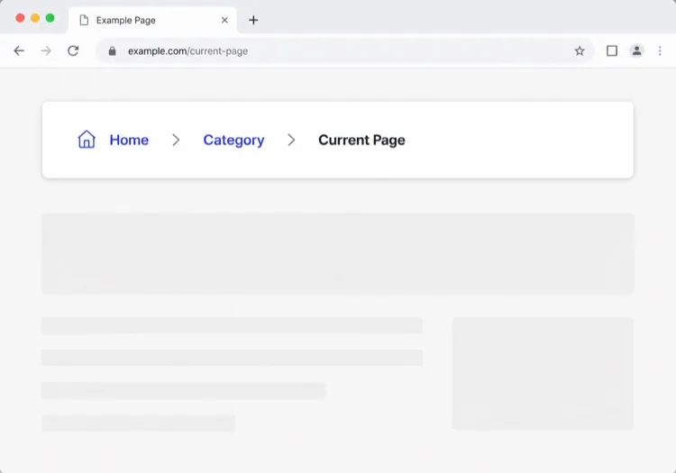
The default that fits most product sites. Reach for it only when your top level really is five items or fewer — a single row of nine links makes a small site feel disorganised rather than complete.

Create a horizontal navbar with a logo mark plus wordmark on the left, five links — Product, Pricing, Docs, Customers, Blog — centered, and one filled Get started button on the right. Mark the current route with aria-current="page" plus a 2px underline sitting on the text baseline rather than the container edge. Below 768px, replace the link row with a hamburger button that toggles aria-expanded and opens a full-height drawer sliding in from the right. Trap focus inside the drawer, close it on Escape and on route change, lock body scroll while it is open, and return focus to the hamburger button when it closes.

Prueba en MeDo
Mega menuMega

Mega Menu With Grouped Columns

For sites with more sections than a link row can hold. The mega panel buys you depth, but it also means two of your top-level items are no longer clickable destinations — decide that deliberately.

Create a navbar where two of five top-level items open a full-width mega menu panel: three columns of grouped links, each label with a one-line description underneath, plus a highlighted card on the right. Open the panel on hover after a 120ms delay and on Enter or Space for keyboard users. Give each trigger aria-expanded and aria-controls, move between panel links with arrow keys, close on Escape and when focus leaves the panel, and let Tab move on to the next top-level item. Below 1024px, flatten every mega panel into a nested accordion inside the mobile drawer instead of a hover panel.

Prueba en MeDo
CenteredShipfast

Centered Links With a Dual CTA

Sign in beside Start free, links dead center. Use a three-column grid rather than flexbox centering, or the link block drifts every time the button labels change length.

Create a navbar laid out as a three-column grid so the center block stays optically centered regardless of logo width or button label length: logo left, four links centered, and two actions right — a text Sign in link and a filled Start free button. Start fully transparent over the hero, then switch to a solid background with a 1px bottom border once the page scrolls past 80px, transitioning over 200ms, and swap the logo from its light variant to its dark variant at the same threshold. On mobile, collapse the links into a hamburger and keep only the Start free button visible next to it.

Prueba en MeDo
Docs navDocs

Version Switcher and Search Trigger

A navbar for a documentation site, where the nav is mostly controls rather than links. The search trigger earns more clicks here than every link beside it combined.

Create a navbar for a documentation site: logo on the left, then Docs, API and Changelog links, a version select showing v3.2 with older majors listed beneath, a search button showing a Command-K hint, a theme toggle and a GitHub star count. Bind Command-K and Control-K globally to open search, and make sure the shortcut is ignored while focus is inside an input or textarea. Below the tablet breakpoint, keep the search button and the sidebar toggle visible in the bar and move the links, version switcher and theme toggle into a drawer.

Prueba en MeDo
CommerceShop

Category Nav With Cart Count

Search takes real width, categories take the rest, and the cart lives at the far right. On a store the navbar is a working control surface, not a signpost — treat the search field as the primary element.

Create an e-commerce navbar: logo on the left, six category links with two opening a dropdown of subcategories, a search input that expands to fill the available row width on focus, and on the right an account link and a cart button with a count badge. Announce cart changes through an aria-live="polite" region so the count is not a silent visual update. Below 768px, keep the logo, a search icon and the cart in the bar, move categories into a left-hand drawer as a nested accordion, and expand search into a full-width overlay when its icon is tapped.

Prueba en MeDo
MinimalStudio

Wordmark and Four Links

No CTA, no dropdowns — a wordmark and four links, letting the work carry the page. The restraint only holds if the four labels are nouns a stranger recognises.

Create a minimal navbar for a design studio: a lowercase wordmark on the left and four links — Work, Studio, Journal, Contact — right-aligned in a light weight with generous letter spacing. Mark the current route with aria-current="page" and a subtle opacity change rather than an underline. Keep the bar static rather than sticky so it scrolls away with the page. Below 640px, keep all four links visible by dropping to a two-line layout with the wordmark above the links instead of introducing a hamburger, since four short labels do not justify a drawer.

Prueba en MeDo

Cómo personalizar tu Barra de navegación

Fíjala con posicionamiento sticky

Pide a MeDo que haga la navbar sticky para que siga a los usuarios mientras se desplazan. Agrega un desenfoque de fondo o una ligera sombra al desplazarse para darle profundidad sin ser intrusiva.

Agrega un mega-menú para sitios complejos

Si tu sitio tiene muchas áreas de producto o secciones de documentación, solicita un mega-menú con columnas e iconos. Convierte una navegación desordenada en una superficie de descubrimiento organizada.

Adapta el CTA a tu etapa del embudo

El CTA de la navbar es un espacio privilegiado. Especifica si quieres un botón "Registrarse gratis", un enlace "Reservar demo" o un diseño de doble botón — y MeDo lo configurará en consecuencia.

Controla el comportamiento móvil explícitamente

Describe cómo debe abrirse el menú móvil (cajón deslizante vs. overlay a pantalla completa), qué animaciones usar y si el ícono hamburguesa debe animarse convirtiéndose en una X al activarse.

Quién usa el componente Barra de navegación

Producto SaaS

Navegación limpia de dos niveles con logo, enlaces de nivel superior a producto/precios/docs y un CTA sticky "Iniciar prueba gratis" que permanece visible mientras los usuarios se desplazan por largas páginas de destino.

Tienda de comercio electrónico

Una navbar con barra de búsqueda, menús desplegables de categorías, un ícono de carrito con badge de cantidad y un enlace de login/cuenta — todo colapsándose en un cajón lateral amigable para móvil.

Sitio de documentación

Una navbar fija minimalista con logo, selector de versión desplegable, un botón de estrella de GitHub y un campo de búsqueda de ancho completo que se expande al enfocarse.

Sitio de marketing / agencia

Una navbar transparente que se sitúa sobre una imagen hero, transiciona a un fondo sólido al desplazarse y presenta un prominente botón "Solicitar cotización" para impulsar la generación de leads.

Patrones de Barra de navegación para distintos sitios web

El mismo componente barra de navegación, adaptado al tipo de sitio donde se publica.

01 / 06

SaaS Product Navbar

Five top-level links and one CTA, grouped by what a visitor is trying to do rather than by your internal teams. If Pricing is not in the top level, expect support tickets asking what it costs — a Pricing link buried in a dropdown reliably suppresses trial starts.

Estilos y variantes de Barra de navegación

Elige la variante que encaje con el resto de la página y genérala.

01 / 06

Sticky Navbar

Stays pinned as the page scrolls, usually gaining a border or a backdrop blur once past the fold. Give it an explicit height and set scroll-margin-top on your headings, or in-page anchor links land with the target hidden behind the bar.

Barra de navegación en React, Next.js, Vue y Svelte

React, Next.js, Vue 3, SvelteKit, Astro o HTML puro: el mismo barra de navegación, seis formas de integrarlo.

01 / 06

React Navbar

One piece of state — whether the mobile drawer is open — so keep the hook at the navbar root and pass the current path in as a prop rather than reading a router inside it.

src/components/Navbar.tsx

export function Navbar({ pathname }) {
  const [open, setOpen] = useState(false)

  return (
    <nav aria-label="Main">
      {links.map((l) => (
        <a key={l.href} href={l.href}
           aria-current={pathname === l.href ? 'page' : undefined}>
          {l.label}
        </a>
      ))}
      <button aria-expanded={open} onClick={() => setOpen(!open)} />
    </nav>
  )
}

Cómo añadir tu Barra de navegación a un proyecto

Cuatro pasos, desde elegir una plantilla de barra de navegación hasta llevarlo a producción.

01~30s

Pick a Navbar Template

Count your real top-level destinations first. Five or fewer takes the classic row, more than that needs the mega menu, and a store needs the commerce variant with search and cart.

02~10s

Copy the Prompt

Paste it into MeDo, Lovable, Bolt, v0 or Cursor with your actual link labels substituted. Keep the mobile-drawer sentences intact — the focus trap and scroll lock are the parts that get dropped when a prompt is trimmed.

03~1min

Generate and Refine

You get React + Tailwind back with a live preview. Follow up in plain English — "move Pricing before Docs", "add a Sign in link beside the CTA", "close the drawer on route change".

04~2min

Mount It in Your Layout

Put the navbar in your root layout, then wire the active link to your router — usePathname, useRoute or $page.url.pathname — so aria-current is set from the real route rather than a hardcoded index.

Preguntas frecuentes sobre Barra de navegación

¿Cómo creo una navbar con IA?

Escribe un prompt describiendo el tipo de sitio, los enlaces que necesitas, la estructura de menús desplegables y tu estilo visual preferido. Pégalo en MeDo y generará un componente navbar completamente estructurado y responsivo que puedes copiar directamente en tu proyecto.

¿Cuál es el mejor generador de navbar con IA?

MeDo está diseñado específicamente para generar componentes UI listos para producción a partir de prompts en lenguaje natural. A diferencia de las herramientas genéricas de codificación con IA, MeDo entiende patrones de diseño como headers fijos, mega-menús y cajones móviles — para que obtengas una salida limpia y usable en lugar de código repetitivo.

¿Puedo generar una navbar móvil responsiva con IA?

Sí. Solo incluye el comportamiento móvil en tu prompt — por ejemplo, "agrega un menú hamburguesa que abre un cajón deslizante en móvil." MeDo generará la lógica del toggle, la animación y los breakpoints responsivos junto con el diseño de escritorio.

¿Cómo agrego un menú desplegable a una navbar generada con IA?

Menciona el desplegable en tu prompt: "agrega un menú desplegable bajo el enlace Productos con tres elementos: Características, Integraciones y Changelog." MeDo generará la interacción de hover/focus y la navegación accesible por teclado para el submenú.

¿Cuál es la diferencia entre una navbar y un encabezado (header)?

Un encabezado es toda la franja superior de la página, incluido el logo, cualquier barra de anuncios y el comportamiento de scroll de esa franja. Una navbar es específicamente el conjunto de enlaces de navegación que hay dentro. Si tu pregunta es sobre estructura de enlaces, menús desplegables y menús móviles, quieres una navbar; si es sobre branding, posicionamiento sticky y cómo se comporta la parte superior de la página al desplazarse, consulta el generador de encabezados con IA.

¿MeDo genera código de navbar accesible?

Sí. Las navbars generadas por MeDo incluyen HTML semántico (elementos nav, ul, li, button), etiquetas ARIA para el toggle móvil y menús desplegables navegables por teclado — para que obtengas accesibilidad sin esfuerzo adicional.