MeDo

Gerador de Navbar com IA.

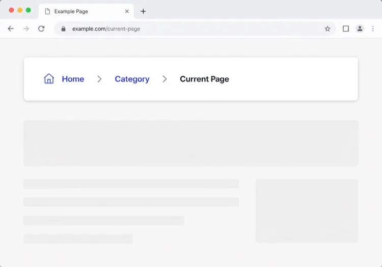
Descreva seu site e obtenha uma navbar completamente responsiva — com logo, links de navegação, menus dropdown e um menu hamburger mobile — gerada a partir de um único prompt. Sem templates, sem complicação.

Barra de navegação
Barra de navegação

A navbar é o mapa que os usuários leem antes de qualquer outra coisa

Uma navbar não é enfeite no topo da página; é o índice comprimido de todo o seu site. O conjunto de links que você escolhe, a ordem em que os coloca e o que empurra para dentro de um dropdown dizem ao visitante o que é o seu produto e onde estão as partes importantes. Erre o agrupamento e os usuários abandonam mesmo que a página que queriam exista a dois cliques de distância. Os crawlers de busca a leem da mesma forma, tratando os links da navbar como um sinal forte sobre quais páginas importam mais. Isso faz com que valha a pena projetar a navbar primeiro como um problema de arquitetura da informação e só depois como um problema de layout.

6 modelos

Modelos de Barra de navegação que você pode gerar

Cada modelo é um prompt real, não uma captura de tela. Copie para qualquer editor de IA, ou rode no MeDo e receba código React + Tailwind.

ClassicAcme

Logo, Five Links, One CTA

The default that fits most product sites. Reach for it only when your top level really is five items or fewer — a single row of nine links makes a small site feel disorganised rather than complete.

Create a horizontal navbar with a logo mark plus wordmark on the left, five links — Product, Pricing, Docs, Customers, Blog — centered, and one filled Get started button on the right. Mark the current route with aria-current="page" plus a 2px underline sitting on the text baseline rather than the container edge. Below 768px, replace the link row with a hamburger button that toggles aria-expanded and opens a full-height drawer sliding in from the right. Trap focus inside the drawer, close it on Escape and on route change, lock body scroll while it is open, and return focus to the hamburger button when it closes.

Teste no MeDo
Mega menuMega

Mega Menu With Grouped Columns

For sites with more sections than a link row can hold. The mega panel buys you depth, but it also means two of your top-level items are no longer clickable destinations — decide that deliberately.

Create a navbar where two of five top-level items open a full-width mega menu panel: three columns of grouped links, each label with a one-line description underneath, plus a highlighted card on the right. Open the panel on hover after a 120ms delay and on Enter or Space for keyboard users. Give each trigger aria-expanded and aria-controls, move between panel links with arrow keys, close on Escape and when focus leaves the panel, and let Tab move on to the next top-level item. Below 1024px, flatten every mega panel into a nested accordion inside the mobile drawer instead of a hover panel.

Teste no MeDo
CenteredShipfast

Centered Links With a Dual CTA

Sign in beside Start free, links dead center. Use a three-column grid rather than flexbox centering, or the link block drifts every time the button labels change length.

Create a navbar laid out as a three-column grid so the center block stays optically centered regardless of logo width or button label length: logo left, four links centered, and two actions right — a text Sign in link and a filled Start free button. Start fully transparent over the hero, then switch to a solid background with a 1px bottom border once the page scrolls past 80px, transitioning over 200ms, and swap the logo from its light variant to its dark variant at the same threshold. On mobile, collapse the links into a hamburger and keep only the Start free button visible next to it.

Teste no MeDo
Docs navDocs

Version Switcher and Search Trigger

A navbar for a documentation site, where the nav is mostly controls rather than links. The search trigger earns more clicks here than every link beside it combined.

Create a navbar for a documentation site: logo on the left, then Docs, API and Changelog links, a version select showing v3.2 with older majors listed beneath, a search button showing a Command-K hint, a theme toggle and a GitHub star count. Bind Command-K and Control-K globally to open search, and make sure the shortcut is ignored while focus is inside an input or textarea. Below the tablet breakpoint, keep the search button and the sidebar toggle visible in the bar and move the links, version switcher and theme toggle into a drawer.

Teste no MeDo
CommerceShop

Category Nav With Cart Count

Search takes real width, categories take the rest, and the cart lives at the far right. On a store the navbar is a working control surface, not a signpost — treat the search field as the primary element.

Create an e-commerce navbar: logo on the left, six category links with two opening a dropdown of subcategories, a search input that expands to fill the available row width on focus, and on the right an account link and a cart button with a count badge. Announce cart changes through an aria-live="polite" region so the count is not a silent visual update. Below 768px, keep the logo, a search icon and the cart in the bar, move categories into a left-hand drawer as a nested accordion, and expand search into a full-width overlay when its icon is tapped.

Teste no MeDo
MinimalStudio

Wordmark and Four Links

No CTA, no dropdowns — a wordmark and four links, letting the work carry the page. The restraint only holds if the four labels are nouns a stranger recognises.

Create a minimal navbar for a design studio: a lowercase wordmark on the left and four links — Work, Studio, Journal, Contact — right-aligned in a light weight with generous letter spacing. Mark the current route with aria-current="page" and a subtle opacity change rather than an underline. Keep the bar static rather than sticky so it scrolls away with the page. Below 640px, keep all four links visible by dropping to a two-line layout with the wordmark above the links instead of introducing a hamburger, since four short labels do not justify a drawer.

Teste no MeDo

Como personalizar seu Barra de navegação

Fixe com posicionamento sticky

Peça ao MeDo para tornar a navbar sticky para que ela siga os usuários durante a rolagem. Adicione um blur de fundo ou uma sombra leve na rolagem para dar profundidade sem ser intrusivo.

Adicione um mega-menu para sites complexos

Se seu site tem muitas áreas de produto ou seções de documentação, solicite um mega-menu com colunas e ícones. Ele transforma uma navegação bagunçada em uma superfície de descoberta organizada.

Adapte o CTA à sua etapa do funil

O CTA da navbar é um espaço premium. Especifique se você quer um botão "Cadastre-se grátis", um link "Agende uma demo" ou um layout de botão duplo — e MeDo configurará de acordo.

Controle o comportamento mobile explicitamente

Descreva como o menu mobile deve abrir (gaveta deslizante vs overlay tela cheia), quais animações usar e se o ícone hamburger deve animar para um X ao alternar.

Quem usa o componente Barra de navegação

Produto SaaS

Navegação limpa de dois níveis com logo, links de nível superior para produto/preços/docs e um CTA sticky "Iniciar teste grátis" que permanece visível enquanto os usuários rolam páginas longas.

Loja de e-commerce

Uma navbar com barra de busca, dropdowns de categorias, um ícone de carrinho com badge de quantidade e link de login/conta — tudo colapsando em uma gaveta lateral mobile.

Site de documentação

Uma navbar fixa minimalista com logo, seletor de versão dropdown, botão estrela do GitHub e um campo de busca em largura total que expande ao focar.

Site de marketing / agência

Uma navbar transparente que fica sobre uma imagem hero, transiciona para um fundo sólido na rolagem e apresenta um botão proeminente "Solicitar orçamento" para gerar leads.

Padrões de Barra de navegação para diferentes sites

O mesmo componente barra de navegação, ajustado ao tipo de site em que ele entra.

01 / 06

SaaS Product Navbar

Five top-level links and one CTA, grouped by what a visitor is trying to do rather than by your internal teams. If Pricing is not in the top level, expect support tickets asking what it costs — a Pricing link buried in a dropdown reliably suppresses trial starts.

Estilos e variações de Barra de navegação

Escolha a variação que combina com o resto da página e gere-a.

01 / 06

Sticky Navbar

Stays pinned as the page scrolls, usually gaining a border or a backdrop blur once past the fold. Give it an explicit height and set scroll-margin-top on your headings, or in-page anchor links land with the target hidden behind the bar.

Barra de navegação em React, Next.js, Vue e Svelte

React, Next.js, Vue 3, SvelteKit, Astro ou HTML puro — o mesmo barra de navegação, seis formas de integrar.

01 / 06

React Navbar

One piece of state — whether the mobile drawer is open — so keep the hook at the navbar root and pass the current path in as a prop rather than reading a router inside it.

src/components/Navbar.tsx

export function Navbar({ pathname }) {
  const [open, setOpen] = useState(false)

  return (
    <nav aria-label="Main">
      {links.map((l) => (
        <a key={l.href} href={l.href}
           aria-current={pathname === l.href ? 'page' : undefined}>
          {l.label}
        </a>
      ))}
      <button aria-expanded={open} onClick={() => setOpen(!open)} />
    </nav>
  )
}

Como adicionar o seu Barra de navegação a um projeto

Quatro passos, de escolher um modelo de barra de navegação até subir para produção.

01~30s

Pick a Navbar Template

Count your real top-level destinations first. Five or fewer takes the classic row, more than that needs the mega menu, and a store needs the commerce variant with search and cart.

02~10s

Copy the Prompt

Paste it into MeDo, Lovable, Bolt, v0 or Cursor with your actual link labels substituted. Keep the mobile-drawer sentences intact — the focus trap and scroll lock are the parts that get dropped when a prompt is trimmed.

03~1min

Generate and Refine

You get React + Tailwind back with a live preview. Follow up in plain English — "move Pricing before Docs", "add a Sign in link beside the CTA", "close the drawer on route change".

04~2min

Mount It in Your Layout

Put the navbar in your root layout, then wire the active link to your router — usePathname, useRoute or $page.url.pathname — so aria-current is set from the real route rather than a hardcoded index.

Perguntas comuns sobre Barra de navegação

Como crio uma navbar com IA?

Escreva um prompt descrevendo o tipo do seu site, os links que precisa, a estrutura de dropdowns e seu estilo visual preferido. Cole no MeDo e ele gerará um componente navbar totalmente estruturado e responsivo que você pode copiar diretamente no seu projeto.

Qual é o melhor gerador de navbar com IA?

MeDo é construído especificamente para gerar componentes UI prontos para produção a partir de prompts em linguagem natural. Diferente de ferramentas genéricas de codificação com IA, MeDo entende padrões de design como headers fixos, mega-menus e gavetas mobile — então você obtém saída limpa e utilizável em vez de boilerplate.

Posso gerar uma navbar mobile responsiva com IA?

Sim. Basta incluir o comportamento mobile no seu prompt — por exemplo, "adicione um menu hamburger que abre uma gaveta deslizante no mobile." MeDo gerará a lógica de toggle, animação e breakpoints responsivos junto com o layout desktop.

Como adiciono um menu dropdown a uma navbar gerada por IA?

Mencione o dropdown no seu prompt: "adicione um dropdown sob o link Produtos com três itens: Recursos, Integrações e Changelog." MeDo gerará a interação hover/focus e a navegação acessível por teclado para o submenu.

Qual é a diferença entre uma navbar e um cabeçalho (header)?

Um cabeçalho é toda a faixa no topo da página, incluindo o logo, qualquer barra de anúncios e o comportamento de scroll dessa faixa. A navbar é especificamente o conjunto de links de navegação dentro dele. Se sua dúvida é sobre estrutura de links, dropdowns e menus mobile, você quer uma navbar; se é sobre branding, posicionamento sticky e como o topo da página se comporta ao rolar, veja o gerador de cabeçalho com IA.

O MeDo gera código de navbar acessível?

Sim. Navbars geradas pelo MeDo incluem HTML semântico (elementos nav, ul, li, button), labels ARIA para o toggle mobile e dropdowns navegáveis por teclado — para que você tenha acessibilidade sem esforço extra.