MeDo

AI 내비바 생성기.

사이트를 설명하고 완전 반응형 내비바를 받으세요 — 로고, 내비 링크, 드롭다운 메뉴, 모바일 햄버거 메뉴 포함 — 하나의 프롬프트로 생성됩니다. 템플릿 없이, 복잡한 설정 없이.

내비게이션 바
내비게이션 바

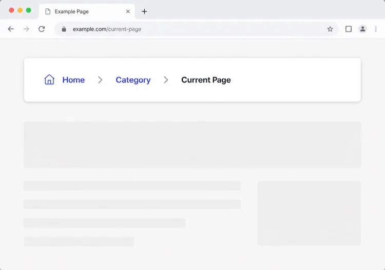
내비바는 사용자가 그 무엇보다 먼저 읽는 지도입니다

내비바는 페이지 상단의 장식이 아니라 사이트 전체를 압축한 목차입니다. 어떤 링크를 고르는지, 어떤 순서로 배치하는지, 무엇을 드롭다운 안으로 밀어넣는지가 방문자에게 이 제품이 무엇이고 중요한 부분이 어디에 있는지를 알려줍니다. 그룹화를 잘못하면 원하던 페이지가 두 번의 클릭 거리에 있어도 사용자는 이탈합니다. 검색 크롤러도 같은 방식으로 읽으며, 내비바 링크를 어떤 페이지가 가장 중요한지에 대한 강한 신호로 취급합니다. 그래서 내비바는 레이아웃 문제이기 전에 정보 구조(IA) 문제로 먼저 설계할 가치가 있습니다.

템플릿 6개

생성할 수 있는 내비게이션 바 템플릿

모든 템플릿은 스크린샷이 아니라 실제 프롬프트입니다. 어떤 AI 에디터에든 붙여넣거나 MeDo에서 실행해 React + Tailwind 코드를 그대로 받으세요.

ClassicAcme

Logo, Five Links, One CTA

The default that fits most product sites. Reach for it only when your top level really is five items or fewer — a single row of nine links makes a small site feel disorganised rather than complete.

Create a horizontal navbar with a logo mark plus wordmark on the left, five links — Product, Pricing, Docs, Customers, Blog — centered, and one filled Get started button on the right. Mark the current route with aria-current="page" plus a 2px underline sitting on the text baseline rather than the container edge. Below 768px, replace the link row with a hamburger button that toggles aria-expanded and opens a full-height drawer sliding in from the right. Trap focus inside the drawer, close it on Escape and on route change, lock body scroll while it is open, and return focus to the hamburger button when it closes.

MeDo에서 시도하기
Mega menuMega

Mega Menu With Grouped Columns

For sites with more sections than a link row can hold. The mega panel buys you depth, but it also means two of your top-level items are no longer clickable destinations — decide that deliberately.

Create a navbar where two of five top-level items open a full-width mega menu panel: three columns of grouped links, each label with a one-line description underneath, plus a highlighted card on the right. Open the panel on hover after a 120ms delay and on Enter or Space for keyboard users. Give each trigger aria-expanded and aria-controls, move between panel links with arrow keys, close on Escape and when focus leaves the panel, and let Tab move on to the next top-level item. Below 1024px, flatten every mega panel into a nested accordion inside the mobile drawer instead of a hover panel.

MeDo에서 시도하기
CenteredShipfast

Centered Links With a Dual CTA

Sign in beside Start free, links dead center. Use a three-column grid rather than flexbox centering, or the link block drifts every time the button labels change length.

Create a navbar laid out as a three-column grid so the center block stays optically centered regardless of logo width or button label length: logo left, four links centered, and two actions right — a text Sign in link and a filled Start free button. Start fully transparent over the hero, then switch to a solid background with a 1px bottom border once the page scrolls past 80px, transitioning over 200ms, and swap the logo from its light variant to its dark variant at the same threshold. On mobile, collapse the links into a hamburger and keep only the Start free button visible next to it.

MeDo에서 시도하기
Docs navDocs

Version Switcher and Search Trigger

A navbar for a documentation site, where the nav is mostly controls rather than links. The search trigger earns more clicks here than every link beside it combined.

Create a navbar for a documentation site: logo on the left, then Docs, API and Changelog links, a version select showing v3.2 with older majors listed beneath, a search button showing a Command-K hint, a theme toggle and a GitHub star count. Bind Command-K and Control-K globally to open search, and make sure the shortcut is ignored while focus is inside an input or textarea. Below the tablet breakpoint, keep the search button and the sidebar toggle visible in the bar and move the links, version switcher and theme toggle into a drawer.

MeDo에서 시도하기
CommerceShop

Category Nav With Cart Count

Search takes real width, categories take the rest, and the cart lives at the far right. On a store the navbar is a working control surface, not a signpost — treat the search field as the primary element.

Create an e-commerce navbar: logo on the left, six category links with two opening a dropdown of subcategories, a search input that expands to fill the available row width on focus, and on the right an account link and a cart button with a count badge. Announce cart changes through an aria-live="polite" region so the count is not a silent visual update. Below 768px, keep the logo, a search icon and the cart in the bar, move categories into a left-hand drawer as a nested accordion, and expand search into a full-width overlay when its icon is tapped.

MeDo에서 시도하기
MinimalStudio

Wordmark and Four Links

No CTA, no dropdowns — a wordmark and four links, letting the work carry the page. The restraint only holds if the four labels are nouns a stranger recognises.

Create a minimal navbar for a design studio: a lowercase wordmark on the left and four links — Work, Studio, Journal, Contact — right-aligned in a light weight with generous letter spacing. Mark the current route with aria-current="page" and a subtle opacity change rather than an underline. Keep the bar static rather than sticky so it scrolls away with the page. Below 640px, keep all four links visible by dropping to a two-line layout with the wordmark above the links instead of introducing a hamburger, since four short labels do not justify a drawer.

MeDo에서 시도하기

내비게이션 바 커스터마이즈 방법

고정 위치로 핀하기

MeDo에 내비바를 sticky로 만들어 달라고 요청하면 사용자가 스크롤할 때 따라옵니다. 스크롤 시 배경 블러나 가벼운 그림자를 추가하여 침입감 없이 깊이감을 줍니다.

복잡한 사이트에는 메가 메뉴 추가

사이트에 많은 제품 영역이나 문서 섹션이 있다면 열과 아이콘이 있는 메가 메뉴를 요청하세요. 복잡한 내비게이션을 정리된 디스커버리 서피스로 변환합니다.

퍼널 단계에 맞게 CTA 조정

내비바 CTA는 프리미엄 공간입니다. "무료 가입" 버튼, "데모 예약" 링크, 또는 이중 버튼 레이아웃 중 원하는 것을 지정하면 MeDo가 그에 맞게 설정합니다.

모바일 동작을 명시적으로 제어

모바일 메뉴가 어떻게 열릴지(슬라이드인 드로어 vs 전체 화면 오버레이), 어떤 애니메이션을 사용할지, 햄버거 아이콘이 토글 시 X로 애니메이션될지 설명하세요.

내비게이션 바 컴포넌트를 사용하는 사람

SaaS 제품

로고, 상위 레벨 제품/요금/문서 링크, 긴 랜딩 페이지를 스크롤해도 보이는 고정 "무료 체험 시작" CTA가 있는 깔끔한 2단 내비게이션.

이커머스 스토어

검색 바, 카테고리 드롭다운, 수량 배지가 있는 장바구니 아이콘, 로그인/계정 링크가 있는 내비바 — 모두 모바일 친화적 사이드 드로어로 접힙니다.

문서 사이트

로고, 버전 선택기 드롭다운, GitHub 스타 버튼, 포커스 시 확장되는 전체 너비 검색 입력이 있는 미니멀한 고정 내비바.

마케팅 / 에이전시 사이트

히어로 이미지 위에 놓이는 투명 내비바로, 스크롤 시 솔리드 배경으로 전환되며 리드 생성을 위한 눈에 띄는 "견적 받기" 버튼이 있습니다.

웹사이트 유형별 내비게이션 바 패턴

같은 내비게이션 바 컴포넌트를 게시되는 사이트 유형에 맞춰 조정합니다.

01 / 06

SaaS Product Navbar

Five top-level links and one CTA, grouped by what a visitor is trying to do rather than by your internal teams. If Pricing is not in the top level, expect support tickets asking what it costs — a Pricing link buried in a dropdown reliably suppresses trial starts.

내비게이션 바 스타일과 변형

페이지의 나머지 부분과 어울리는 변형을 골라 바로 생성하세요.

01 / 06

Sticky Navbar

Stays pinned as the page scrolls, usually gaining a border or a backdrop blur once past the fold. Give it an explicit height and set scroll-margin-top on your headings, or in-page anchor links land with the target hidden behind the bar.

React, Next.js, Vue, Svelte에서의 내비게이션 바

React, Next.js, Vue 3, SvelteKit, Astro 또는 순수 HTML — 같은 내비게이션 바을 여섯 가지 방식으로 넣을 수 있습니다.

01 / 06

React Navbar

One piece of state — whether the mobile drawer is open — so keep the hook at the navbar root and pass the current path in as a prop rather than reading a router inside it.

src/components/Navbar.tsx

export function Navbar({ pathname }) {
  const [open, setOpen] = useState(false)

  return (
    <nav aria-label="Main">
      {links.map((l) => (
        <a key={l.href} href={l.href}
           aria-current={pathname === l.href ? 'page' : undefined}>
          {l.label}
        </a>
      ))}
      <button aria-expanded={open} onClick={() => setOpen(!open)} />
    </nav>
  )
}

내비게이션 바을 프로젝트에 추가하는 방법

내비게이션 바 템플릿을 고르고 프로덕션에 배포하기까지 네 단계.

01~30s

Pick a Navbar Template

Count your real top-level destinations first. Five or fewer takes the classic row, more than that needs the mega menu, and a store needs the commerce variant with search and cart.

02~10s

Copy the Prompt

Paste it into MeDo, Lovable, Bolt, v0 or Cursor with your actual link labels substituted. Keep the mobile-drawer sentences intact — the focus trap and scroll lock are the parts that get dropped when a prompt is trimmed.

03~1min

Generate and Refine

You get React + Tailwind back with a live preview. Follow up in plain English — "move Pricing before Docs", "add a Sign in link beside the CTA", "close the drawer on route change".

04~2min

Mount It in Your Layout

Put the navbar in your root layout, then wire the active link to your router — usePathname, useRoute or $page.url.pathname — so aria-current is set from the real route rather than a hardcoded index.

내비게이션 바에 대한 자주 묻는 질문

AI로 내비바를 어떻게 만드나요?

사이트 유형, 필요한 링크, 드롭다운 구조, 선호하는 비주얼 스타일을 설명하는 프롬프트를 작성하세요. MeDo에 붙여넣으면 프로젝트에 바로 복사할 수 있는 완전히 구조화된 반응형 내비바 컴포넌트를 생성합니다.

최고의 AI 내비바 생성기는 무엇인가요?

MeDo는 자연어 프롬프트에서 프로덕션 준비된 UI 컴포넌트를 생성하기 위해 특별히 만들어졌습니다. 범용 AI 코딩 도구와 달리 MeDo는 고정 헤더, 메가 메뉴, 모바일 드로어 같은 디자인 패턴을 이해하므로 보일러플레이트 대신 깔끔하고 사용 가능한 출력을 얻을 수 있습니다.

AI로 반응형 모바일 내비바를 생성할 수 있나요?

네. 프롬프트에 모바일 동작만 포함하면 됩니다 — 예를 들어 "모바일에서 슬라이드인 드로어를 여는 햄버거 메뉴 추가". MeDo가 데스크톱 레이아웃과 함께 토글 로직, 애니메이션, 반응형 브레이크포인트를 생성합니다.

AI 생성 내비바에 드롭다운 메뉴를 추가하려면 어떻게 하나요?

프롬프트에서 드롭다운을 언급하세요: "제품 링크 아래에 기능, 통합, Changelog 세 항목이 있는 드롭다운 추가". MeDo가 호버/포커스 인터랙션과 서브메뉴의 접근 가능한 키보드 내비게이션을 생성합니다.

내비바와 헤더의 차이는 무엇인가요?

헤더는 페이지 맨 위 전체 띠로, 로고, 공지 바, 그리고 그 띠의 스크롤 동작까지 포함합니다. 내비바는 그 안에 있는 내비게이션 링크의 모음을 가리킵니다. 링크 구조, 드롭다운, 모바일 메뉴에 관한 질문이라면 내비바가 필요하고, 브랜딩과 스티키 고정, 스크롤 시 페이지 상단의 동작에 관한 질문이라면 AI 헤더 생성기를 확인하세요.

MeDo는 접근 가능한 내비바 코드를 생성하나요?

네. MeDo가 생성하는 내비바에는 시맨틱 HTML(nav, ul, li, button 요소), 모바일 토글용 ARIA 레이블, 키보드 탐색 가능한 드롭다운이 포함됩니다 — 추가 노력 없이 접근성을 확보할 수 있습니다.