MeDo

KI-Navbar-Generator.

Beschreiben Sie Ihre Website und erhalten Sie eine vollständig responsive Navbar — mit Logo, Nav-Links, Dropdown-Menüs und einem mobilen Hamburger-Menü — aus einem einzigen Prompt generiert. Keine Vorlagen, kein Herumschrauben.

Navbar
Navbar

Die Navbar ist die Landkarte, die Nutzer vor allem anderen lesen

Eine Navbar ist keine Dekoration am oberen Seitenrand; sie ist das komprimierte Inhaltsverzeichnis Ihrer gesamten Website. Welche Links Sie auswählen, in welcher Reihenfolge Sie sie anordnen und was Sie in ein Dropdown verschieben — all das sagt Besuchern, was Ihr Produkt ist und wo die wichtigen Bereiche liegen. Gruppieren Sie falsch, springen Nutzer ab, obwohl die gesuchte Seite nur zwei Klicks entfernt existiert. Suchmaschinen-Crawler lesen sie genauso und behandeln Navbar-Links als starkes Signal dafür, welche Seiten am wichtigsten sind. Deshalb lohnt es sich, die Navbar zuerst als Frage der Informationsarchitektur und erst danach als Layout-Aufgabe zu entwerfen.

6 Vorlagen

Navbar-Vorlagen, die Sie generieren können

Jede Vorlage ist ein echter Prompt, kein Screenshot. Kopieren Sie ihn in einen KI-Editor oder führen Sie ihn in MeDo aus und erhalten Sie React- und Tailwind-Code zurück.

ClassicAcme

Logo, Five Links, One CTA

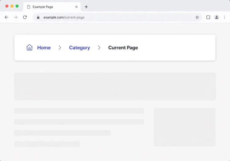
The default that fits most product sites. Reach for it only when your top level really is five items or fewer — a single row of nine links makes a small site feel disorganised rather than complete.

Create a horizontal navbar with a logo mark plus wordmark on the left, five links — Product, Pricing, Docs, Customers, Blog — centered, and one filled Get started button on the right. Mark the current route with aria-current="page" plus a 2px underline sitting on the text baseline rather than the container edge. Below 768px, replace the link row with a hamburger button that toggles aria-expanded and opens a full-height drawer sliding in from the right. Trap focus inside the drawer, close it on Escape and on route change, lock body scroll while it is open, and return focus to the hamburger button when it closes.

In MeDo testen
Mega menuMega

Mega Menu With Grouped Columns

For sites with more sections than a link row can hold. The mega panel buys you depth, but it also means two of your top-level items are no longer clickable destinations — decide that deliberately.

Create a navbar where two of five top-level items open a full-width mega menu panel: three columns of grouped links, each label with a one-line description underneath, plus a highlighted card on the right. Open the panel on hover after a 120ms delay and on Enter or Space for keyboard users. Give each trigger aria-expanded and aria-controls, move between panel links with arrow keys, close on Escape and when focus leaves the panel, and let Tab move on to the next top-level item. Below 1024px, flatten every mega panel into a nested accordion inside the mobile drawer instead of a hover panel.

In MeDo testen
CenteredShipfast

Centered Links With a Dual CTA

Sign in beside Start free, links dead center. Use a three-column grid rather than flexbox centering, or the link block drifts every time the button labels change length.

Create a navbar laid out as a three-column grid so the center block stays optically centered regardless of logo width or button label length: logo left, four links centered, and two actions right — a text Sign in link and a filled Start free button. Start fully transparent over the hero, then switch to a solid background with a 1px bottom border once the page scrolls past 80px, transitioning over 200ms, and swap the logo from its light variant to its dark variant at the same threshold. On mobile, collapse the links into a hamburger and keep only the Start free button visible next to it.

In MeDo testen
Docs navDocs

Version Switcher and Search Trigger

A navbar for a documentation site, where the nav is mostly controls rather than links. The search trigger earns more clicks here than every link beside it combined.

Create a navbar for a documentation site: logo on the left, then Docs, API and Changelog links, a version select showing v3.2 with older majors listed beneath, a search button showing a Command-K hint, a theme toggle and a GitHub star count. Bind Command-K and Control-K globally to open search, and make sure the shortcut is ignored while focus is inside an input or textarea. Below the tablet breakpoint, keep the search button and the sidebar toggle visible in the bar and move the links, version switcher and theme toggle into a drawer.

In MeDo testen
CommerceShop

Category Nav With Cart Count

Search takes real width, categories take the rest, and the cart lives at the far right. On a store the navbar is a working control surface, not a signpost — treat the search field as the primary element.

Create an e-commerce navbar: logo on the left, six category links with two opening a dropdown of subcategories, a search input that expands to fill the available row width on focus, and on the right an account link and a cart button with a count badge. Announce cart changes through an aria-live="polite" region so the count is not a silent visual update. Below 768px, keep the logo, a search icon and the cart in the bar, move categories into a left-hand drawer as a nested accordion, and expand search into a full-width overlay when its icon is tapped.

In MeDo testen
MinimalStudio

Wordmark and Four Links

No CTA, no dropdowns — a wordmark and four links, letting the work carry the page. The restraint only holds if the four labels are nouns a stranger recognises.

Create a minimal navbar for a design studio: a lowercase wordmark on the left and four links — Work, Studio, Journal, Contact — right-aligned in a light weight with generous letter spacing. Mark the current route with aria-current="page" and a subtle opacity change rather than an underline. Keep the bar static rather than sticky so it scrolls away with the page. Below 640px, keep all four links visible by dropping to a two-line layout with the wordmark above the links instead of introducing a hamburger, since four short labels do not justify a drawer.

In MeDo testen

So passen Sie Ihre Navbar an

Mit Sticky-Positionierung fixieren

Bitten Sie MeDo, die Navbar sticky zu machen, damit sie Nutzern beim Scrollen folgt. Fügen Sie beim Scrollen ein Backdrop-Blur oder einen leichten Schatten hinzu, um Tiefe zu erzeugen, ohne aufdringlich zu wirken.

Mega-Menü für komplexe Seiten hinzufügen

Wenn Ihre Website viele Produktbereiche oder Dokumentationsbereiche hat, fordern Sie ein Mega-Menü mit Spalten und Icons an. Es verwandelt eine unübersichtliche Navigation in eine organisierte Discovery-Oberfläche.

CTA an Ihre Funnel-Phase anpassen

Der Navbar-CTA ist wertvolles Immobilienvermögen. Geben Sie an, ob Sie einen "Kostenlos registrieren"-Button, einen "Demo buchen"-Link oder ein Dual-Button-Layout möchten — und MeDo verdrahtet es entsprechend.

Mobiles Verhalten explizit steuern

Beschreiben Sie, wie das mobile Menü geöffnet werden soll (eingleitendes Drawer vs. Vollbild-Overlay), welche Animationen verwendet werden sollen und ob das Hamburger-Icon beim Umschalten zu einem X animieren soll.

Wer die Navbar-Komponente nutzt

SaaS-Produkt

Saubere zweistufige Navigation mit Logo, übergeordneten Produkt-/Preis-/Docs-Links und einem sticky "Jetzt kostenlos testen"-CTA, der beim Durchscrollen langer Landing Pages sichtbar bleibt.

E-Commerce-Shop

Eine Navbar mit Suchleiste, Kategorie-Dropdowns, einem Warenkorb-Icon mit Artikel-Badge und einem Login-/Konto-Link — alles in einem mobilfreundlichen Side-Drawer zusammengeklappt.

Dokumentationsseite

Eine minimale fixierte Navbar mit Logo, Versions-Selektor-Dropdown, einem GitHub-Star-Button und einem vollbreiten Suchinput, der sich beim Fokus ausdehnt.

Marketing-/Agentur-Website

Eine transparente Navbar, die über einem Hero-Bild liegt, beim Scrollen zu einem festen Hintergrund wechselt und einen prominenten "Angebot anfordern"-Button zur Lead-Generierung enthält.

Navbar-Muster für verschiedene Websites

Dieselbe navbar-Komponente, abgestimmt auf die Art der Website, auf der sie läuft.

01 / 06

SaaS Product Navbar

Five top-level links and one CTA, grouped by what a visitor is trying to do rather than by your internal teams. If Pricing is not in the top level, expect support tickets asking what it costs — a Pricing link buried in a dropdown reliably suppresses trial starts.

Navbar-Stile und -Varianten

Wählen Sie die Variante, die zum Rest der Seite passt, und generieren Sie sie.

01 / 06

Sticky Navbar

Stays pinned as the page scrolls, usually gaining a border or a backdrop blur once past the fold. Give it an explicit height and set scroll-margin-top on your headings, or in-page anchor links land with the target hidden behind the bar.

Navbar in React, Next.js, Vue und Svelte

React, Next.js, Vue 3, SvelteKit, Astro oder reines HTML — dieselbe navbar, sechs Wege zur Einbindung.

01 / 06

React Navbar

One piece of state — whether the mobile drawer is open — so keep the hook at the navbar root and pass the current path in as a prop rather than reading a router inside it.

src/components/Navbar.tsx

export function Navbar({ pathname }) {
  const [open, setOpen] = useState(false)

  return (
    <nav aria-label="Main">
      {links.map((l) => (
        <a key={l.href} href={l.href}
           aria-current={pathname === l.href ? 'page' : undefined}>
          {l.label}
        </a>
      ))}
      <button aria-expanded={open} onClick={() => setOpen(!open)} />
    </nav>
  )
}

So fügen Sie Ihre Navbar einem Projekt hinzu

Vier Schritte, von der Auswahl einer navbar-Vorlage bis zum Einsatz in der Produktion.

01~30s

Pick a Navbar Template

Count your real top-level destinations first. Five or fewer takes the classic row, more than that needs the mega menu, and a store needs the commerce variant with search and cart.

02~10s

Copy the Prompt

Paste it into MeDo, Lovable, Bolt, v0 or Cursor with your actual link labels substituted. Keep the mobile-drawer sentences intact — the focus trap and scroll lock are the parts that get dropped when a prompt is trimmed.

03~1min

Generate and Refine

You get React + Tailwind back with a live preview. Follow up in plain English — "move Pricing before Docs", "add a Sign in link beside the CTA", "close the drawer on route change".

04~2min

Mount It in Your Layout

Put the navbar in your root layout, then wire the active link to your router — usePathname, useRoute or $page.url.pathname — so aria-current is set from the real route rather than a hardcoded index.

Häufige Fragen zu Navbar

Wie erstelle ich eine Navbar mit KI?

Schreiben Sie einen Prompt, der Ihren Website-Typ, die benötigten Links, die Dropdown-Struktur und Ihren bevorzugten visuellen Stil beschreibt. Fügen Sie ihn in MeDo ein und es wird eine vollständig strukturierte, responsive Navbar-Komponente generiert, die Sie direkt in Ihr Projekt kopieren können.

Was ist der beste KI-Navbar-Generator?

MeDo ist speziell für die Generierung produktionsreifer UI-Komponenten aus natürlichsprachigen Prompts entwickelt. Im Gegensatz zu generischen KI-Coding-Tools versteht MeDo Designmuster wie Sticky-Header, Mega-Menüs und mobile Drawer — so erhalten Sie saubere, verwendbare Ausgaben statt Boilerplate.

Kann ich mit KI eine responsive mobile Navbar generieren?

Ja. Fügen Sie einfach das mobile Verhalten in Ihren Prompt ein — zum Beispiel "füge ein Hamburger-Menü hinzu, das auf Mobilgeräten einen eingleitenden Drawer öffnet." MeDo generiert die Toggle-Logik, Animation und responsive Breakpoints zusammen mit dem Desktop-Layout.

Wie füge ich ein Dropdown-Menü zu einer KI-generierten Navbar hinzu?

Erwähnen Sie das Dropdown in Ihrem Prompt: "füge ein Dropdown unter dem Produkte-Link mit drei Punkten hinzu: Features, Integrationen und Changelog." MeDo generiert die Hover-/Fokus-Interaktion und die zugängliche Tastaturnavigation für das Untermenü.

Was ist der Unterschied zwischen einer Navbar und einem Header?

Ein Header ist der gesamte Streifen am oberen Seitenrand, einschließlich Logo, eines etwaigen Ankündigungsbanners und des Scroll-Verhaltens dieses Streifens. Eine Navbar ist speziell die Sammlung der Navigationslinks darin. Wenn es Ihnen um Linkstruktur, Dropdowns und mobile Menüs geht, brauchen Sie eine Navbar; wenn es um Branding, Sticky-Positionierung und das Verhalten des Seitenkopfs beim Scrollen geht, sehen Sie sich den KI-Header-Generator an.

Generiert MeDo barrierefreien Navbar-Code?

Ja. MeDo-generierte Navbars enthalten semantisches HTML (nav, ul, li, button-Elemente), ARIA-Labels für den mobilen Toggle und tastaturnavigierbare Dropdowns — so erhalten Sie Barrierefreiheit ohne zusätzlichen Aufwand.