MeDo

Générateur de Spinner de Chargement IA.

Dites à MeDo quel type d'animation de chargement vous avez besoin — anneau, points rebondissants, cercle pulsant, overlay skeleton — et obtenez du code de composant prêt pour la production instantanément. Plus besoin de chercher sur CodePen ni d'ajuster les keyframes manuellement.

Indicateur de Chargement

Un spinner de chargement est la première chose que les utilisateurs voient quand votre app est lente.

Chaque opération asynchrone — récupération de données, envoi de formulaire, téléchargement de fichier — a besoin d'un état de chargement. Un spinner manquant ou saccadé érode la confiance et donne l'impression que l'app est cassée. Un spinner bien conçu communique la progression, s'intègre à votre design system et maintient les utilisateurs patients. C'est un petit composant avec un impact démesuré sur la performance perçue.

6 modèles

Modèles de Indicateur de Chargement que vous pouvez générer

Chaque modèle est un vrai prompt, pas une capture d'écran. Copiez-le dans n'importe quel éditeur IA, ou exécutez-le dans MeDo pour récupérer du code React + Tailwind.

BasicRing

Rotating Ring Spinner

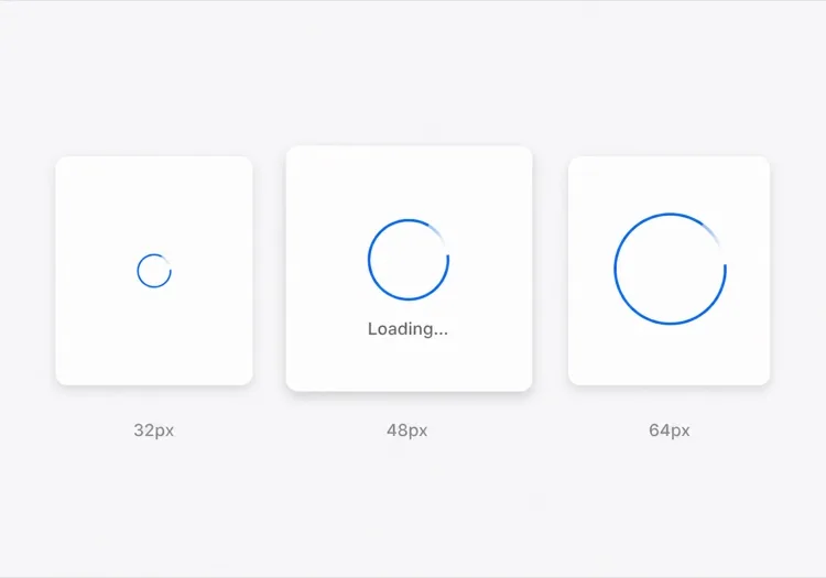
One arc rotating on a faint track. The default for anything under about a second, where a skeleton would flash in and out faster than the eye can resolve it.

Create a circular ring spinner with size variants sm 32px, md 48px and lg 64px, each keeping stroke width proportional so the small variant does not read as a thin grey circle. Render one visible arc over a low-contrast full track so the direction of rotation is legible. Wrap it in an element with role="status" and a visually hidden "Loading" label, and set aria-live="polite" so completion is announced once rather than repeatedly. Under prefers-reduced-motion: reduce, replace the rotation with a two-second opacity pulse rather than removing the indicator. Give the wrapper a fixed height matching the largest variant so mounting the spinner does not shift the surrounding layout.

Tester dans MeDo
IndeterminateDots

Three Bouncing Dots

Reads as activity rather than progress, which is honest when you have no idea how long the request will take. Better than a ring inside a chat bubble or a narrow row.

Create a three-dot loading indicator: dots of 8px with 6px gaps, each animating a 400ms vertical bounce staggered by 120ms so the sequence reads left to right. Keep the total width fixed so the row does not reflow as dots move. Wrap it in role="status" with a visually hidden label describing what is loading — "Loading messages" rather than "Loading" — and set aria-live="polite". Under prefers-reduced-motion: reduce, hold the dots static and cross-fade their opacity instead of translating them. Provide a colour prop that inherits currentColor by default so the indicator matches whatever text it sits beside.

Tester dans MeDo
InlineButton

Button With a Pending Spinner

The spinner that prevents the most damage, because the alternative is a double-submitted order. Keep the button width fixed or the layout jumps at the worst possible moment.

Create a button component with a pending state: when pending is true, prepend a 16px ring spinner before the label, set aria-busy="true" and the disabled attribute, and keep the button width identical to its idle state by reserving the spinner space in both. Do not remove the label text — swapping "Place order" for a bare spinner destroys the accessible name mid-interaction. Announce the state change through a separate role="status" element rather than an aria-live on the button itself. Under prefers-reduced-motion: reduce, use an opacity pulse. Block repeat clicks in the handler as well as via the disabled attribute, since disabled arrives one render late.

Tester dans MeDo
Content shapeSkeleton

Skeleton Blocks Instead of a Spinner

Past roughly 500ms a spinner stops reassuring and starts reading as a stall. Skeletons show the shape of what is coming, which shortens the wait without shortening the request.

Create a skeleton loader for a card list: rounded grey blocks matching the real layout — a 40px circle for the avatar, two text bars at 60% and 40% width, and a 160px image block — with a slow left-to-right shimmer. Match the block heights to the rendered content exactly so swapping in real data causes no layout shift. Mark the container aria-busy="true" and aria-hidden on the blocks themselves so screen readers get one status announcement rather than a stream of empty elements. Under prefers-reduced-motion: reduce, drop the shimmer and hold a flat tint. Add a threshold prop so the skeleton only appears after 300ms and never flashes on a fast response.

Tester dans MeDo
Full pageOverlay

Blocking Route Transition Overlay

A centered spinner over a scrim for the rare case where the whole view is unusable. Use it sparingly — blocking the page for a partial fetch makes a fast app feel slow.

Create a full-page loading overlay: a translucent scrim over the app with a 64px ring spinner and a short label centered in the viewport. Lock body scroll while visible, mark the underlying content aria-hidden="true", and use role="status" with aria-live="polite" on the overlay so the state is announced once. Trap focus inside the overlay or move focus to the status text so the keyboard cannot reach controls behind the scrim. Delay the appearance by 300ms so a fast response never produces a flash, and fade out over 150ms rather than snapping. Under prefers-reduced-motion: reduce, hold a static indicator with a text label instead of rotating.

Tester dans MeDo
DeterminateProgress

Ring With a Percentage Value

When you know the fraction complete — an upload, a multi-step import — show it. A spinning ring on a 40MB upload hides the one number the user wants.

Create a determinate circular progress ring driven by a value prop from 0 to 100: an SVG circle whose stroke-dashoffset is computed from the value, with the percentage rendered in the center. Use role="progressbar" with aria-valuenow, aria-valuemin and aria-valuemax, and an aria-label describing the operation. When value is null, fall back to the indeterminate spinning arc with role="status" instead. Animate stroke-dashoffset transitions over 200ms so incremental updates do not appear to jump, and under prefers-reduced-motion: reduce apply the value changes without a transition. Reserve the full ring diameter in layout from the first render.

Tester dans MeDo

Comment personnaliser votre Indicateur de Chargement

Adaptez la palette de votre marque

Spécifiez votre couleur primaire et l'épaisseur du trait dans le prompt. Un spinner utilisant votre bleu de marque ou couleur d'accent semble intentionnel ; un gris par défaut ressemble à un placeholder jamais remplacé.

Choisissez le bon motif d'animation

Les spinners en anneau conviennent au chargement précis et ciblé (envoi de bouton). Les points rebondissants suggèrent une activité sans impliquer de progression. Les overlays pulsants fonctionnent pour les transitions pleine page. Indiquez le contexte à MeDo et il choisira le bon motif de mouvement.

Ajoutez des variantes de taille dès le départ

Demandez à MeDo de générer des props sm, md et lg pour que le même composant fonctionne comme spinner inline de bouton, loader skeleton de carte et overlay plein écran — le tout depuis une seule source.

Incluez un label accessible

Les spinners sont invisibles pour les lecteurs d'écran sans aria-label ou texte visuellement masqué. Demandez à MeDo d'inclure un label « Chargement » visuellement masqué et une région aria-live pour que les technologies d'assistance annoncent quand le chargement est terminé.

Qui utilise le composant Indicateur de Chargement

Dashboard SaaS

Des spinners anneau inline dans les cellules de tableaux de données et un spinner overlay plein écran lors de la connexion initiale — offrant un retour visuel clair sans bloquer toute l'interface pour de petites requêtes.

Checkout e-commerce

Un spinner de bouton pulsant qui remplace le label « Passer commande » lors de l'envoi, empêchant le double-clic tout en rassurant le client que sa commande est en cours de traitement.

Application web mobile-first

Des spinners à points rebondissants stylisés pour correspondre au thème de l'app, apparaissant dans les skeletons de cartes pendant le chargement du contenu — courant dans les fils d'actualité et interfaces de messagerie.

Outil développeur ou dashboard CLI

Un spinner anneau monochrome minimal en gris atténué, de petite taille pour s'insérer dans les panneaux de sortie de logs ou badges de statut sans détourner l'attention du contenu.

Modèles de Indicateur de Chargement pour différents sites web

Le même composant indicateur de chargement, adapté au type de site sur lequel il est publié.

01 / 06

SaaS Dashboard Loading

Skeleton the widget grid rather than covering the whole dashboard, so the shell, nav and filters stay usable while one chart resolves. A full-page overlay on a dashboard punishes the user for the slowest panel on the screen.

Styles et variantes de Indicateur de Chargement

Choisissez la variante qui correspond au reste de la page, puis générez-la.

01 / 06

Ring Spinner

A single arc over a faint track. Keep the stroke proportional across size variants — a 32px ring with the same 4px stroke as the 64px one reads as a solid donut, not a spinner. The right choice under a second.

Indicateur de Chargement en React, Next.js, Vue et Svelte

React, Next.js, Vue 3, SvelteKit, Astro ou HTML simple — le même indicateur de chargement, six façons de l'intégrer.

01 / 06

React Loading Spinner

No state and no effects — a spinner is pure markup plus a keyframe, so it never needs a hook. Put the delay threshold in the parent that owns the fetch, not in the spinner itself.

src/components/Spinner.tsx

export function Spinner({ size = 'md', label = 'Loading' }) {
  return (
    <span role="status" className={ring[size]}>
      <span className="sr-only">{label}</span>
    </span>
  )
}

Comment ajouter votre Indicateur de Chargement à un projet

Quatre étapes, du choix d'un modèle de indicateur de chargement à sa mise en production.

01~30s

Pick a Loading Pattern

Choose by expected duration and how much of the view is blocked — a ring under a second, a skeleton past 500ms, an inline button spinner for a submit, a determinate ring when you know the percentage.

02~10s

Copy the Prompt

Paste it into MeDo, Lovable, Bolt, v0 or Cursor. Name what is loading in the label — "Loading invoices" beats "Loading", because the hidden label is the only thing a screen reader gets.

03~1min

Generate and Refine

You get React + Tailwind with a live preview. Follow up in plain English — "add a 300ms delay before it shows", "swap rotation for a pulse under reduced motion", "keep the button width fixed".

04~1min

Wire It to Your Loading State

Hook it to Suspense, a route loading file or an isPending flag, and reserve the space it occupies. Throttle the network in devtools and confirm nothing shifts when the real content lands.

Questions fréquentes à propos de Indicateur de Chargement

Comment créer un spinner de chargement avec l'IA ?

Dans MeDo, décrivez le spinner dont vous avez besoin — style d'animation (anneau, points, pulsation), taille, couleur, et si vous avez besoin de variantes de taille ou d'un label. MeDo génère le code complet du composant, incluant les keyframes CSS ou les classes d'animation Tailwind, prêt à coller dans votre projet.

Quel est le meilleur générateur de spinners de chargement IA ?

MeDo est conçu spécifiquement pour générer des composants UI prêts pour la production. Contrairement aux outils IA génériques qui produisent des snippets approximatifs, MeDo produit des composants spinner propres et accessibles avec des attributs aria corrects, des props configurables et des animations qui s'intègrent à votre design system.

Puis-je générer un spinner CSS uniquement avec l'IA ?

Oui. Spécifiez « CSS uniquement, pas de JavaScript » dans votre prompt MeDo et il générera un spinner utilisant des animations CSS keyframe pures — aucune dépendance, aucun JavaScript requis. Idéal pour des pages marketing légères ou des situations où ajouter une bibliothèque de composants n'est pas une option.

Comment rendre un spinner de chargement accessible ?

Demandez à MeDo d'inclure un label texte visuellement masqué (ex., « Chargement en cours, veuillez patienter ») et de définir aria-busy sur le conteneur de chargement. MeDo produira le aria-label correct, role="status", et une région live pour que les lecteurs d'écran annoncent automatiquement les changements d'état de chargement.

Comment ajouter un spinner de chargement à un bouton en React ?

Donnez ce prompt à MeDo : « Crée un composant bouton React avec un état de chargement qui remplace le label par un petit spinner inline quand isLoading est true, désactive le bouton et empêche la double soumission. » MeDo générera le composant complet avec le spinner intégré et accessible.

Quelle est la différence entre un spinner de chargement et un skeleton loader ?

Un spinner de chargement est une animation générique indiquant que quelque chose charge sans révéler la mise en page. Un skeleton loader imite la forme du contenu à venir, réduisant le temps d'attente perçu en montrant la structure immédiatement. MeDo peut générer l'un ou l'autre — ou un spinner qui transitionne vers un skeleton — selon votre prompt.
