MeDo

Gerador de Spinner de Carregamento com IA.

Diga ao MeDo que tipo de animação de carregamento você precisa — anel, pontos saltitantes, círculo pulsante, overlay skeleton — e receba código de componente pronto para produção instantaneamente. Sem pesquisar no CodePen, sem ajustar keyframes na mão.

Indicador de Carregamento

Um spinner de carregamento é a primeira coisa que os usuários veem quando seu app está lento.

Toda operação assíncrona — busca de dados, envio de formulário, upload de arquivo — precisa de um estado de carregamento. Um spinner ausente ou brusco corrói a confiança e faz o app parecer quebrado. Um bem elaborado comunica progresso, combina com seu design system e mantém os usuários pacientes. É um componente pequeno com um impacto desproporcional na performance percebida.

6 modelos

Modelos de Indicador de Carregamento que você pode gerar

Cada modelo é um prompt real, não uma captura de tela. Copie para qualquer editor de IA, ou rode no MeDo e receba código React + Tailwind.

BasicRing

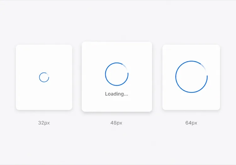
Rotating Ring Spinner

One arc rotating on a faint track. The default for anything under about a second, where a skeleton would flash in and out faster than the eye can resolve it.

Create a circular ring spinner with size variants sm 32px, md 48px and lg 64px, each keeping stroke width proportional so the small variant does not read as a thin grey circle. Render one visible arc over a low-contrast full track so the direction of rotation is legible. Wrap it in an element with role="status" and a visually hidden "Loading" label, and set aria-live="polite" so completion is announced once rather than repeatedly. Under prefers-reduced-motion: reduce, replace the rotation with a two-second opacity pulse rather than removing the indicator. Give the wrapper a fixed height matching the largest variant so mounting the spinner does not shift the surrounding layout.

Teste no MeDo
IndeterminateDots

Three Bouncing Dots

Reads as activity rather than progress, which is honest when you have no idea how long the request will take. Better than a ring inside a chat bubble or a narrow row.

Create a three-dot loading indicator: dots of 8px with 6px gaps, each animating a 400ms vertical bounce staggered by 120ms so the sequence reads left to right. Keep the total width fixed so the row does not reflow as dots move. Wrap it in role="status" with a visually hidden label describing what is loading — "Loading messages" rather than "Loading" — and set aria-live="polite". Under prefers-reduced-motion: reduce, hold the dots static and cross-fade their opacity instead of translating them. Provide a colour prop that inherits currentColor by default so the indicator matches whatever text it sits beside.

Teste no MeDo
InlineButton

Button With a Pending Spinner

The spinner that prevents the most damage, because the alternative is a double-submitted order. Keep the button width fixed or the layout jumps at the worst possible moment.

Create a button component with a pending state: when pending is true, prepend a 16px ring spinner before the label, set aria-busy="true" and the disabled attribute, and keep the button width identical to its idle state by reserving the spinner space in both. Do not remove the label text — swapping "Place order" for a bare spinner destroys the accessible name mid-interaction. Announce the state change through a separate role="status" element rather than an aria-live on the button itself. Under prefers-reduced-motion: reduce, use an opacity pulse. Block repeat clicks in the handler as well as via the disabled attribute, since disabled arrives one render late.

Teste no MeDo
Content shapeSkeleton

Skeleton Blocks Instead of a Spinner

Past roughly 500ms a spinner stops reassuring and starts reading as a stall. Skeletons show the shape of what is coming, which shortens the wait without shortening the request.

Create a skeleton loader for a card list: rounded grey blocks matching the real layout — a 40px circle for the avatar, two text bars at 60% and 40% width, and a 160px image block — with a slow left-to-right shimmer. Match the block heights to the rendered content exactly so swapping in real data causes no layout shift. Mark the container aria-busy="true" and aria-hidden on the blocks themselves so screen readers get one status announcement rather than a stream of empty elements. Under prefers-reduced-motion: reduce, drop the shimmer and hold a flat tint. Add a threshold prop so the skeleton only appears after 300ms and never flashes on a fast response.

Teste no MeDo
Full pageOverlay

Blocking Route Transition Overlay

A centered spinner over a scrim for the rare case where the whole view is unusable. Use it sparingly — blocking the page for a partial fetch makes a fast app feel slow.

Create a full-page loading overlay: a translucent scrim over the app with a 64px ring spinner and a short label centered in the viewport. Lock body scroll while visible, mark the underlying content aria-hidden="true", and use role="status" with aria-live="polite" on the overlay so the state is announced once. Trap focus inside the overlay or move focus to the status text so the keyboard cannot reach controls behind the scrim. Delay the appearance by 300ms so a fast response never produces a flash, and fade out over 150ms rather than snapping. Under prefers-reduced-motion: reduce, hold a static indicator with a text label instead of rotating.

Teste no MeDo
DeterminateProgress

Ring With a Percentage Value

When you know the fraction complete — an upload, a multi-step import — show it. A spinning ring on a 40MB upload hides the one number the user wants.

Create a determinate circular progress ring driven by a value prop from 0 to 100: an SVG circle whose stroke-dashoffset is computed from the value, with the percentage rendered in the center. Use role="progressbar" with aria-valuenow, aria-valuemin and aria-valuemax, and an aria-label describing the operation. When value is null, fall back to the indeterminate spinning arc with role="status" instead. Animate stroke-dashoffset transitions over 200ms so incremental updates do not appear to jump, and under prefers-reduced-motion: reduce apply the value changes without a transition. Reserve the full ring diameter in layout from the first render.

Teste no MeDo

Como personalizar seu Indicador de Carregamento

Combine com a paleta da sua marca

Especifique sua cor primária e espessura do traço no prompt. Um spinner que usa seu azul de marca ou cor de destaque parece intencional; um cinza padrão parece um placeholder que nunca foi substituído.

Escolha o padrão de animação certo

Spinners de anel se encaixam em carregamentos precisos e focados (envio de botão). Pontos saltitantes sugerem atividade sem implicar progresso. Overlays pulsantes funcionam para transições de página inteira. Diga ao MeDo o contexto e ele escolherá o padrão de movimento certo.

Adicione variantes de tamanho desde o início

Peça ao MeDo para gerar props de tamanho sm, md e lg para que o mesmo componente funcione como spinner inline de botão, loader skeleton de card e overlay de tela cheia — tudo de uma única fonte.

Inclua um label acessível

Spinners são invisíveis para leitores de tela sem um aria-label ou texto visualmente oculto. Peça ao MeDo para incluir um label "Carregando" visualmente oculto e uma região aria-live para que a tecnologia assistiva anuncie quando o carregamento for concluído.

Quem usa o componente Indicador de Carregamento

Dashboard SaaS

Spinners de anel inline dentro de células de tabelas de dados e um spinner overlay de tela cheia no login inicial — dando aos usuários feedback claro sem bloquear toda a interface para requisições pequenas.

Checkout de e-commerce

Um spinner de botão pulsante que substitui o label "Finalizar Pedido" no envio, prevenindo duplo clique enquanto tranquiliza o cliente de que seu pedido está sendo processado.

App web mobile-first

Spinners de pontos saltitantes estilizados para combinar com o tema do app, aparecendo em skeletons de cards durante o carregamento do conteúdo — comum em feeds sociais e interfaces de mensagens.

Ferramenta de desenvolvimento ou dashboard CLI

Um spinner de anel monocromático mínimo em cinza suave, de tamanho pequeno para ficar dentro de painéis de saída de logs ou badges de status sem desviar a atenção do conteúdo.

Padrões de Indicador de Carregamento para diferentes sites

O mesmo componente indicador de carregamento, ajustado ao tipo de site em que ele entra.

01 / 06

SaaS Dashboard Loading

Skeleton the widget grid rather than covering the whole dashboard, so the shell, nav and filters stay usable while one chart resolves. A full-page overlay on a dashboard punishes the user for the slowest panel on the screen.

Estilos e variações de Indicador de Carregamento

Escolha a variação que combina com o resto da página e gere-a.

01 / 06

Ring Spinner

A single arc over a faint track. Keep the stroke proportional across size variants — a 32px ring with the same 4px stroke as the 64px one reads as a solid donut, not a spinner. The right choice under a second.

Indicador de Carregamento em React, Next.js, Vue e Svelte

React, Next.js, Vue 3, SvelteKit, Astro ou HTML puro — o mesmo indicador de carregamento, seis formas de integrar.

01 / 06

React Loading Spinner

No state and no effects — a spinner is pure markup plus a keyframe, so it never needs a hook. Put the delay threshold in the parent that owns the fetch, not in the spinner itself.

src/components/Spinner.tsx

export function Spinner({ size = 'md', label = 'Loading' }) {
  return (
    <span role="status" className={ring[size]}>
      <span className="sr-only">{label}</span>
    </span>
  )
}

Como adicionar o seu Indicador de Carregamento a um projeto

Quatro passos, de escolher um modelo de indicador de carregamento até subir para produção.

01~30s

Pick a Loading Pattern

Choose by expected duration and how much of the view is blocked — a ring under a second, a skeleton past 500ms, an inline button spinner for a submit, a determinate ring when you know the percentage.

02~10s

Copy the Prompt

Paste it into MeDo, Lovable, Bolt, v0 or Cursor. Name what is loading in the label — "Loading invoices" beats "Loading", because the hidden label is the only thing a screen reader gets.

03~1min

Generate and Refine

You get React + Tailwind with a live preview. Follow up in plain English — "add a 300ms delay before it shows", "swap rotation for a pulse under reduced motion", "keep the button width fixed".

04~1min

Wire It to Your Loading State

Hook it to Suspense, a route loading file or an isPending flag, and reserve the space it occupies. Throttle the network in devtools and confirm nothing shifts when the real content lands.

Perguntas comuns sobre Indicador de Carregamento

Como criar um spinner de carregamento com IA?

No MeDo, descreva o spinner que você precisa — estilo de animação (anel, pontos, pulso), tamanho, cor, e se você precisa de variantes de tamanho ou um label. MeDo gera o código completo do componente, incluindo CSS keyframes ou classes de animação Tailwind, pronto para colar no seu projeto.

Qual é o melhor gerador de spinners de carregamento com IA?

MeDo é construído especificamente para gerar componentes UI prontos para produção. Diferente de ferramentas IA genéricas que produzem snippets toscos, MeDo produz componentes spinner limpos e acessíveis com atributos aria corretos, props configuráveis e animações que combinam com seu design system.

Posso gerar um spinner de carregamento apenas com CSS usando IA?

Sim. Especifique "apenas CSS, sem JavaScript" no seu prompt MeDo e ele gerará um spinner usando animações CSS keyframe puras — sem dependências, sem JavaScript necessário. Ideal para páginas de marketing leves ou situações onde adicionar uma biblioteca de componentes não é uma opção.

Como tornar um spinner de carregamento acessível?

Peça ao MeDo para incluir um label de texto visualmente oculto (ex., "Carregando, por favor aguarde") e definir aria-busy no container de carregamento. MeDo produzirá o aria-label correto, role="status", e uma região live para que leitores de tela anunciem automaticamente mudanças no estado de carregamento.

Como adicionar um spinner de carregamento a um botão em React?

Dê este prompt ao MeDo: "Crie um componente botão React com um estado de carregamento que substitui o label por um pequeno spinner inline quando isLoading é true, desabilita o botão e previne envio duplo." MeDo gerará o componente completo com o spinner integrado e acessível.

Qual a diferença entre um spinner de carregamento e um skeleton loader?

Um spinner de carregamento é uma animação genérica indicando que algo está carregando sem revelar o layout. Um skeleton loader imita a forma do conteúdo que está chegando, reduzindo o tempo de espera percebido ao mostrar a estrutura imediatamente. MeDo pode gerar qualquer um dos dois — ou um spinner que transiciona para um skeleton — dependendo do seu prompt.
