MeDo

AIローディングスピナージェネレーター。

どんなローディングアニメーションが必要か MeDo に伝えてください — リング、バウンスドット、パルスサークル、スケルトンオーバーレイ — 本番対応のコンポーネントコードを即座に取得できます。CodePenを検索したり、キーフレームを手動で調整する必要はありません。

ローディングスピナー
ローディングスピナー

ローディングスピナーは、アプリが遅い時にユーザーが最初に目にするものです。

すべての非同期操作 — データ取得、フォーム送信、ファイルアップロード — にはローディング状態が必要です。スピナーがない、または不自然なスピナーは信頼を損ない、アプリが壊れているように感じさせます。よく作られたスピナーは進行状況を伝え、デザインシステムにマッチし、ユーザーを辛抱強く保ちます。体感パフォーマンスに対して不釣り合いに大きな影響を持つ小さなコンポーネントです。

6 個のテンプレート

生成できる ローディングスピナー テンプレート

どのテンプレートもスクリーンショットではなく実際のプロンプトです。任意の AI エディタに貼り付けるか、MeDo で実行して React + Tailwind のコードを受け取れます。

BasicRing

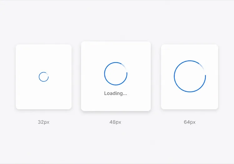
Rotating Ring Spinner

One arc rotating on a faint track. The default for anything under about a second, where a skeleton would flash in and out faster than the eye can resolve it.

Create a circular ring spinner with size variants sm 32px, md 48px and lg 64px, each keeping stroke width proportional so the small variant does not read as a thin grey circle. Render one visible arc over a low-contrast full track so the direction of rotation is legible. Wrap it in an element with role="status" and a visually hidden "Loading" label, and set aria-live="polite" so completion is announced once rather than repeatedly. Under prefers-reduced-motion: reduce, replace the rotation with a two-second opacity pulse rather than removing the indicator. Give the wrapper a fixed height matching the largest variant so mounting the spinner does not shift the surrounding layout.

MeDoで試す
IndeterminateDots

Three Bouncing Dots

Reads as activity rather than progress, which is honest when you have no idea how long the request will take. Better than a ring inside a chat bubble or a narrow row.

Create a three-dot loading indicator: dots of 8px with 6px gaps, each animating a 400ms vertical bounce staggered by 120ms so the sequence reads left to right. Keep the total width fixed so the row does not reflow as dots move. Wrap it in role="status" with a visually hidden label describing what is loading — "Loading messages" rather than "Loading" — and set aria-live="polite". Under prefers-reduced-motion: reduce, hold the dots static and cross-fade their opacity instead of translating them. Provide a colour prop that inherits currentColor by default so the indicator matches whatever text it sits beside.

MeDoで試す
InlineButton

Button With a Pending Spinner

The spinner that prevents the most damage, because the alternative is a double-submitted order. Keep the button width fixed or the layout jumps at the worst possible moment.

Create a button component with a pending state: when pending is true, prepend a 16px ring spinner before the label, set aria-busy="true" and the disabled attribute, and keep the button width identical to its idle state by reserving the spinner space in both. Do not remove the label text — swapping "Place order" for a bare spinner destroys the accessible name mid-interaction. Announce the state change through a separate role="status" element rather than an aria-live on the button itself. Under prefers-reduced-motion: reduce, use an opacity pulse. Block repeat clicks in the handler as well as via the disabled attribute, since disabled arrives one render late.

MeDoで試す
Content shapeSkeleton

Skeleton Blocks Instead of a Spinner

Past roughly 500ms a spinner stops reassuring and starts reading as a stall. Skeletons show the shape of what is coming, which shortens the wait without shortening the request.

Create a skeleton loader for a card list: rounded grey blocks matching the real layout — a 40px circle for the avatar, two text bars at 60% and 40% width, and a 160px image block — with a slow left-to-right shimmer. Match the block heights to the rendered content exactly so swapping in real data causes no layout shift. Mark the container aria-busy="true" and aria-hidden on the blocks themselves so screen readers get one status announcement rather than a stream of empty elements. Under prefers-reduced-motion: reduce, drop the shimmer and hold a flat tint. Add a threshold prop so the skeleton only appears after 300ms and never flashes on a fast response.

MeDoで試す
Full pageOverlay

Blocking Route Transition Overlay

A centered spinner over a scrim for the rare case where the whole view is unusable. Use it sparingly — blocking the page for a partial fetch makes a fast app feel slow.

Create a full-page loading overlay: a translucent scrim over the app with a 64px ring spinner and a short label centered in the viewport. Lock body scroll while visible, mark the underlying content aria-hidden="true", and use role="status" with aria-live="polite" on the overlay so the state is announced once. Trap focus inside the overlay or move focus to the status text so the keyboard cannot reach controls behind the scrim. Delay the appearance by 300ms so a fast response never produces a flash, and fade out over 150ms rather than snapping. Under prefers-reduced-motion: reduce, hold a static indicator with a text label instead of rotating.

MeDoで試す
DeterminateProgress

Ring With a Percentage Value

When you know the fraction complete — an upload, a multi-step import — show it. A spinning ring on a 40MB upload hides the one number the user wants.

Create a determinate circular progress ring driven by a value prop from 0 to 100: an SVG circle whose stroke-dashoffset is computed from the value, with the percentage rendered in the center. Use role="progressbar" with aria-valuenow, aria-valuemin and aria-valuemax, and an aria-label describing the operation. When value is null, fall back to the indeterminate spinning arc with role="status" instead. Animate stroke-dashoffset transitions over 200ms so incremental updates do not appear to jump, and under prefers-reduced-motion: reduce apply the value changes without a transition. Reserve the full ring diameter in layout from the first render.

MeDoで試す

ローディングスピナー をカスタマイズする方法

ブランドカラーに合わせる

プロンプトでプライマリカラーとストロークの太さを指定してください。ブランドブルーやアクセントカラーを使ったスピナーは意図的に見えます。デフォルトのグレーは置き換え忘れたプレースホルダーのように見えます。

適切なアニメーションパターンを選ぶ

リングスピナーは精密で焦点を絞ったローディング(ボタン送信)に適しています。バウンスドットは進行を示唆せずに活動を示します。パルスオーバーレイはフルページトランジションに適しています。MeDoにコンテキストを伝えれば、適切なモーションパターンを選択します。

最初からサイズバリアントを追加する

MeDoにsm、md、lgのサイズpropsを生成するよう依頼すれば、同じコンポーネントがインラインボタンスピナー、カードスケルトンローダー、フルスクリーンオーバーレイとして機能します — すべて1つのソースから。

アクセシブルなラベルを含める

スピナーはaria-labelや視覚的に隠されたテキストがないとスクリーンリーダーには見えません。MeDoに視覚的に隠された「読み込み中」ラベルとaria-liveリージョンを含めるよう依頼し、支援技術がローディング完了を通知できるようにしてください。

ローディングスピナー コンポーネントを使うのは誰か

SaaSダッシュボード

データテーブルセル内のインラインリングスピナーと初回ログイン時のフルページオーバーレイスピナー — 小さなリクエストでインターフェース全体をブロックせずにユーザーに明確なフィードバックを提供します。

ECサイトのチェックアウト

送信時に「注文する」ラベルを置き換えるパルスボタンスピナー — ダブルクリックを防ぎながら、注文が処理中であることを顧客に安心させます。

モバイルファーストWebアプリ

アプリテーマに合わせてスタイリングされたバウンスドットスピナー。コンテンツロード中にカードスケルトンに表示されます — ソーシャルフィードやメッセージングインターフェースで一般的です。

開発者ツールまたはCLIダッシュボード

ミュートグレーの最小限モノクロリングスピナー。ログ出力パネルやステータスバッジ内に配置するのに適した小さなサイズで、コンテンツから注意をそらしません。

サイト種別ごとの ローディングスピナー パターン

同じ ローディングスピナー コンポーネントを、掲載するサイトの種類に合わせて調整します。

01 / 06

SaaS Dashboard Loading

Skeleton the widget grid rather than covering the whole dashboard, so the shell, nav and filters stay usable while one chart resolves. A full-page overlay on a dashboard punishes the user for the slowest panel on the screen.

ローディングスピナー のスタイルとバリアント

ページ全体のトーンに合うバリアントを選び、そのまま生成します。

01 / 06

Ring Spinner

A single arc over a faint track. Keep the stroke proportional across size variants — a 32px ring with the same 4px stroke as the 64px one reads as a solid donut, not a spinner. The right choice under a second.

React・Next.js・Vue・Svelte での ローディングスピナー

React、Next.js、Vue 3、SvelteKit、Astro、素の HTML — 同じ ローディングスピナー を 6 通りの方法で組み込めます。

01 / 06

React Loading Spinner

No state and no effects — a spinner is pure markup plus a keyframe, so it never needs a hook. Put the delay threshold in the parent that owns the fetch, not in the spinner itself.

src/components/Spinner.tsx

export function Spinner({ size = 'md', label = 'Loading' }) {
  return (
    <span role="status" className={ring[size]}>
      <span className="sr-only">{label}</span>
    </span>
  )
}

ローディングスピナー をプロジェクトに追加する方法

ローディングスピナー テンプレートを選んで本番に載せるまでの 4 ステップ。

01~30s

Pick a Loading Pattern

Choose by expected duration and how much of the view is blocked — a ring under a second, a skeleton past 500ms, an inline button spinner for a submit, a determinate ring when you know the percentage.

02~10s

Copy the Prompt

Paste it into MeDo, Lovable, Bolt, v0 or Cursor. Name what is loading in the label — "Loading invoices" beats "Loading", because the hidden label is the only thing a screen reader gets.

03~1min

Generate and Refine

You get React + Tailwind with a live preview. Follow up in plain English — "add a 300ms delay before it shows", "swap rotation for a pulse under reduced motion", "keep the button width fixed".

04~1min

Wire It to Your Loading State

Hook it to Suspense, a route loading file or an isPending flag, and reserve the space it occupies. Throttle the network in devtools and confirm nothing shifts when the real content lands.

ローディングスピナーに関するよくある質問

AIでローディングスピナーを作成するには?

MeDoで必要なスピナーを記述してください — アニメーションスタイル(リング、ドット、パルス)、サイズ、色、サイズバリアントやラベルが必要かどうか。MeDoがCSSキーフレームやTailwindアニメーションクラスを含む完全なコンポーネントコードを生成し、プロジェクトに貼り付ける準備ができます。

最高のAIローディングスピナージェネレーターは?

MeDoは本番対応のUIコンポーネント生成に特化して作られています。粗いスニペットを出力する汎用AIツールとは異なり、MeDoは正しいaria属性、設定可能なprops、デザインシステムにマッチするアニメーションを備えたクリーンでアクセシブルなスピナーコンポーネントを生成します。

AIでCSS専用のローディングスピナーを生成できますか?

はい。MeDoのプロンプトで「CSS専用、JavaScriptなし」と指定すれば、純粋なCSSキーフレームアニメーションを使用したスピナーが生成されます — 依存関係なし、JavaScriptは不要です。軽量なマーケティングページやコンポーネントライブラリの追加が選択肢にない状況に最適です。

ローディングスピナーをアクセシブルにするには?

MeDoに視覚的に隠されたテキストラベル(例:「読み込み中、お待ちください」)を含め、ローディングコンテナにaria-busyを設定するよう依頼してください。MeDoが正しいaria-label、role="status"、ライブリージョンを出力し、スクリーンリーダーがローディング状態の変化を自動的に通知します。

Reactでボタンにローディングスピナーを追加するには?

MeDoにこのプロンプトを与えてください:「isLoadingがtrueの時にラベルを小さなインラインスピナーに置き換え、ボタンを無効にし、二重送信を防ぐローディング状態を持つReactボタンコンポーネントを作成してください。」MeDoがスピナー統合済みでアクセシブルな完全なコンポーネントを生成します。

ローディングスピナーとスケルトンローダーの違いは?

ローディングスピナーはレイアウトを明かさずに何かが読み込み中であることを示す汎用アニメーションです。スケルトンローダーは到着するコンテンツの形を模倣し、すぐに構造を表示することで体感待ち時間を短縮します。MeDoはプロンプトに応じてどちらでも — またはスケルトンに移行するスピナーも — 生成できます。
