MeDo

AI 로딩 스피너 생성기.

MeDo에게 어떤 로딩 애니메이션이 필요한지 알려주세요 — 링, 바운싱 도트, 펄싱 서클, 스켈레톤 오버레이 — 프로덕션 준비된 컴포넌트 코드를 즉시 받을 수 있습니다. CodePen 검색도, 키프레임 수동 조정도 필요 없습니다.

로딩 스피너
로딩 스피너

로딩 스피너는 앱이 느릴 때 사용자가 가장 먼저 보는 것입니다.

모든 비동기 작업 — 데이터 가져오기, 폼 제출, 파일 업로드 — 에는 로딩 상태가 필요합니다. 스피너가 없거나 어색한 스피너는 신뢰를 떨어뜨리고 앱이 고장 난 것처럼 느끼게 합니다. 잘 만들어진 스피너는 진행 상황을 전달하고, 디자인 시스템에 맞으며, 사용자를 인내심 있게 유지합니다. 체감 성능에 대해 크기에 비해 과도한 영향을 미치는 작은 컴포넌트입니다.

템플릿 6개

생성할 수 있는 로딩 스피너 템플릿

모든 템플릿은 스크린샷이 아니라 실제 프롬프트입니다. 어떤 AI 에디터에든 붙여넣거나 MeDo에서 실행해 React + Tailwind 코드를 그대로 받으세요.

BasicRing

Rotating Ring Spinner

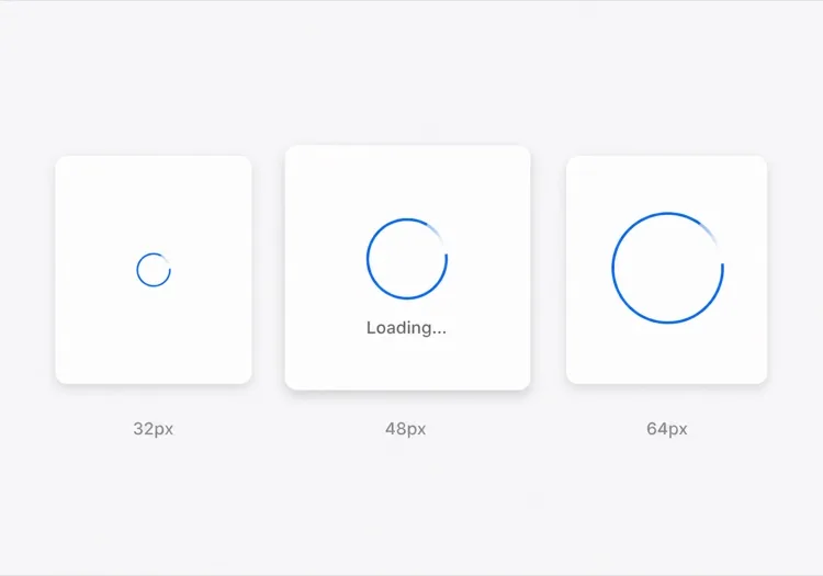
One arc rotating on a faint track. The default for anything under about a second, where a skeleton would flash in and out faster than the eye can resolve it.

Create a circular ring spinner with size variants sm 32px, md 48px and lg 64px, each keeping stroke width proportional so the small variant does not read as a thin grey circle. Render one visible arc over a low-contrast full track so the direction of rotation is legible. Wrap it in an element with role="status" and a visually hidden "Loading" label, and set aria-live="polite" so completion is announced once rather than repeatedly. Under prefers-reduced-motion: reduce, replace the rotation with a two-second opacity pulse rather than removing the indicator. Give the wrapper a fixed height matching the largest variant so mounting the spinner does not shift the surrounding layout.

MeDo에서 시도하기
IndeterminateDots

Three Bouncing Dots

Reads as activity rather than progress, which is honest when you have no idea how long the request will take. Better than a ring inside a chat bubble or a narrow row.

Create a three-dot loading indicator: dots of 8px with 6px gaps, each animating a 400ms vertical bounce staggered by 120ms so the sequence reads left to right. Keep the total width fixed so the row does not reflow as dots move. Wrap it in role="status" with a visually hidden label describing what is loading — "Loading messages" rather than "Loading" — and set aria-live="polite". Under prefers-reduced-motion: reduce, hold the dots static and cross-fade their opacity instead of translating them. Provide a colour prop that inherits currentColor by default so the indicator matches whatever text it sits beside.

MeDo에서 시도하기
InlineButton

Button With a Pending Spinner

The spinner that prevents the most damage, because the alternative is a double-submitted order. Keep the button width fixed or the layout jumps at the worst possible moment.

Create a button component with a pending state: when pending is true, prepend a 16px ring spinner before the label, set aria-busy="true" and the disabled attribute, and keep the button width identical to its idle state by reserving the spinner space in both. Do not remove the label text — swapping "Place order" for a bare spinner destroys the accessible name mid-interaction. Announce the state change through a separate role="status" element rather than an aria-live on the button itself. Under prefers-reduced-motion: reduce, use an opacity pulse. Block repeat clicks in the handler as well as via the disabled attribute, since disabled arrives one render late.

MeDo에서 시도하기
Content shapeSkeleton

Skeleton Blocks Instead of a Spinner

Past roughly 500ms a spinner stops reassuring and starts reading as a stall. Skeletons show the shape of what is coming, which shortens the wait without shortening the request.

Create a skeleton loader for a card list: rounded grey blocks matching the real layout — a 40px circle for the avatar, two text bars at 60% and 40% width, and a 160px image block — with a slow left-to-right shimmer. Match the block heights to the rendered content exactly so swapping in real data causes no layout shift. Mark the container aria-busy="true" and aria-hidden on the blocks themselves so screen readers get one status announcement rather than a stream of empty elements. Under prefers-reduced-motion: reduce, drop the shimmer and hold a flat tint. Add a threshold prop so the skeleton only appears after 300ms and never flashes on a fast response.

MeDo에서 시도하기
Full pageOverlay

Blocking Route Transition Overlay

A centered spinner over a scrim for the rare case where the whole view is unusable. Use it sparingly — blocking the page for a partial fetch makes a fast app feel slow.

Create a full-page loading overlay: a translucent scrim over the app with a 64px ring spinner and a short label centered in the viewport. Lock body scroll while visible, mark the underlying content aria-hidden="true", and use role="status" with aria-live="polite" on the overlay so the state is announced once. Trap focus inside the overlay or move focus to the status text so the keyboard cannot reach controls behind the scrim. Delay the appearance by 300ms so a fast response never produces a flash, and fade out over 150ms rather than snapping. Under prefers-reduced-motion: reduce, hold a static indicator with a text label instead of rotating.

MeDo에서 시도하기
DeterminateProgress

Ring With a Percentage Value

When you know the fraction complete — an upload, a multi-step import — show it. A spinning ring on a 40MB upload hides the one number the user wants.

Create a determinate circular progress ring driven by a value prop from 0 to 100: an SVG circle whose stroke-dashoffset is computed from the value, with the percentage rendered in the center. Use role="progressbar" with aria-valuenow, aria-valuemin and aria-valuemax, and an aria-label describing the operation. When value is null, fall back to the indeterminate spinning arc with role="status" instead. Animate stroke-dashoffset transitions over 200ms so incremental updates do not appear to jump, and under prefers-reduced-motion: reduce apply the value changes without a transition. Reserve the full ring diameter in layout from the first render.

MeDo에서 시도하기

로딩 스피너 커스터마이즈 방법

브랜드 팔레트에 맞추기

프롬프트에서 기본 색상과 스트로크 두께를 지정하세요. 브랜드 블루나 강조 색상을 사용하는 스피너는 의도적으로 보입니다. 기본 회색은 교체하지 않은 플레이스홀더처럼 보입니다.

올바른 애니메이션 패턴 선택

링 스피너는 정밀하고 집중된 로딩(버튼 제출)에 적합합니다. 바운싱 도트는 진행을 암시하지 않고 활동을 나타냅니다. 펄싱 오버레이는 전체 페이지 전환에 적합합니다. MeDo에게 맥락을 알려주면 적절한 모션 패턴을 선택합니다.

처음부터 크기 변형 추가

MeDo에게 sm, md, lg 크기 props를 생성하도록 요청하면 동일한 컴포넌트가 인라인 버튼 스피너, 카드 스켈레톤 로더, 전체 화면 오버레이로 모두 작동합니다 — 하나의 소스에서.

접근성 라벨 포함

스피너는 aria-label이나 시각적으로 숨겨진 텍스트가 없으면 스크린 리더에 보이지 않습니다. MeDo에게 시각적으로 숨겨진 "로딩 중" 라벨과 aria-live 영역을 포함하도록 요청하여 보조 기술이 로딩 완료를 알릴 수 있도록 하세요.

로딩 스피너 컴포넌트를 사용하는 사람

SaaS 대시보드

데이터 테이블 셀 내 인라인 링 스피너와 초기 로그인 시 전체 페이지 오버레이 스피너 — 작은 요청에 전체 인터페이스를 차단하지 않으면서 사용자에게 명확한 피드백을 제공합니다.

이커머스 결제

제출 시 "주문하기" 라벨을 대체하는 펄싱 버튼 스피너 — 이중 클릭을 방지하면서 주문이 처리 중임을 고객에게 안심시킵니다.

모바일 퍼스트 웹앱

앱 테마에 맞게 스타일링된 바운싱 도트 스피너가 콘텐츠 로드 중 카드 스켈레톤에 나타납니다 — 소셜 피드와 메시징 인터페이스에서 흔합니다.

개발자 도구 또는 CLI 대시보드

뮤트 그레이의 최소한 모노크롬 링 스피너. 로그 출력 패널이나 상태 배지 안에 배치하기에 적합한 작은 크기로, 콘텐츠에서 주의를 빼앗지 않습니다.

웹사이트 유형별 로딩 스피너 패턴

같은 로딩 스피너 컴포넌트를 게시되는 사이트 유형에 맞춰 조정합니다.

01 / 06

SaaS Dashboard Loading

Skeleton the widget grid rather than covering the whole dashboard, so the shell, nav and filters stay usable while one chart resolves. A full-page overlay on a dashboard punishes the user for the slowest panel on the screen.

로딩 스피너 스타일과 변형

페이지의 나머지 부분과 어울리는 변형을 골라 바로 생성하세요.

01 / 06

Ring Spinner

A single arc over a faint track. Keep the stroke proportional across size variants — a 32px ring with the same 4px stroke as the 64px one reads as a solid donut, not a spinner. The right choice under a second.

React, Next.js, Vue, Svelte에서의 로딩 스피너

React, Next.js, Vue 3, SvelteKit, Astro 또는 순수 HTML — 같은 로딩 스피너을 여섯 가지 방식으로 넣을 수 있습니다.

01 / 06

React Loading Spinner

No state and no effects — a spinner is pure markup plus a keyframe, so it never needs a hook. Put the delay threshold in the parent that owns the fetch, not in the spinner itself.

src/components/Spinner.tsx

export function Spinner({ size = 'md', label = 'Loading' }) {
  return (
    <span role="status" className={ring[size]}>
      <span className="sr-only">{label}</span>
    </span>
  )
}

로딩 스피너을 프로젝트에 추가하는 방법

로딩 스피너 템플릿을 고르고 프로덕션에 배포하기까지 네 단계.

01~30s

Pick a Loading Pattern

Choose by expected duration and how much of the view is blocked — a ring under a second, a skeleton past 500ms, an inline button spinner for a submit, a determinate ring when you know the percentage.

02~10s

Copy the Prompt

Paste it into MeDo, Lovable, Bolt, v0 or Cursor. Name what is loading in the label — "Loading invoices" beats "Loading", because the hidden label is the only thing a screen reader gets.

03~1min

Generate and Refine

You get React + Tailwind with a live preview. Follow up in plain English — "add a 300ms delay before it shows", "swap rotation for a pulse under reduced motion", "keep the button width fixed".

04~1min

Wire It to Your Loading State

Hook it to Suspense, a route loading file or an isPending flag, and reserve the space it occupies. Throttle the network in devtools and confirm nothing shifts when the real content lands.

로딩 스피너에 대한 자주 묻는 질문

AI로 로딩 스피너를 만드는 방법은?

MeDo에서 필요한 스피너를 설명하세요 — 애니메이션 스타일(링, 도트, 펄스), 크기, 색상, 크기 변형이나 라벨이 필요한지 여부. MeDo가 CSS 키프레임이나 Tailwind 애니메이션 클래스를 포함한 완전한 컴포넌트 코드를 생성하여 프로젝트에 바로 붙여넣을 수 있습니다.

최고의 AI 로딩 스피너 생성기는?

MeDo는 프로덕션 준비된 UI 컴포넌트 생성을 위해 특별히 설계되었습니다. 대략적인 스니펫을 출력하는 범용 AI 도구와 달리, MeDo는 올바른 aria 속성, 구성 가능한 props, 디자인 시스템에 맞는 애니메이션을 갖춘 깔끔하고 접근성 있는 스피너 컴포넌트를 생성합니다.

AI로 CSS 전용 로딩 스피너를 생성할 수 있나요?

네. MeDo 프롬프트에서 "CSS 전용, JavaScript 없음"이라고 지정하면 순수 CSS 키프레임 애니메이션을 사용하는 스피너가 생성됩니다 — 의존성 없음, JavaScript 불필요. 가벼운 마케팅 페이지나 컴포넌트 라이브러리 추가가 불가능한 상황에 이상적입니다.

로딩 스피너를 접근성 있게 만드는 방법은?

MeDo에게 시각적으로 숨겨진 텍스트 라벨(예: "로딩 중, 잠시 기다려 주세요")을 포함하고 로딩 컨테이너에 aria-busy를 설정하도록 요청하세요. MeDo가 올바른 aria-label, role="status", 라이브 영역을 출력하여 스크린 리더가 로딩 상태 변경을 자동으로 알립니다.

React에서 버튼에 로딩 스피너를 추가하는 방법은?

MeDo에 이 프롬프트를 주세요: "isLoading이 true일 때 라벨을 작은 인라인 스피너로 대체하고, 버튼을 비활성화하고, 이중 제출을 방지하는 로딩 상태가 있는 React 버튼 컴포넌트를 만들어 주세요." MeDo가 스피너가 통합되고 접근성 있는 완전한 컴포넌트를 생성합니다.

로딩 스피너와 스켈레톤 로더의 차이점은?

로딩 스피너는 레이아웃을 드러내지 않고 무언가가 로드 중임을 나타내는 범용 애니메이션입니다. 스켈레톤 로더는 들어올 콘텐츠의 형태를 모방하여 즉시 구조를 보여줌으로써 체감 대기 시간을 줄입니다. MeDo는 프롬프트에 따라 둘 중 하나를 — 또는 스켈레톤으로 전환되는 스피너를 — 생성할 수 있습니다.
