MeDo

Generatore di Spinner di Caricamento IA.

Di' a MeDo che tipo di animazione di caricamento ti serve — anello, punti rimbalzanti, cerchio pulsante, overlay skeleton — e ottieni codice componente pronto per la produzione all'istante. Senza cercare su CodePen, senza modificare keyframes a mano.

Indicatore di Caricamento

Uno spinner di caricamento è la prima cosa che gli utenti vedono quando la tua app è lenta.

Ogni operazione asincrona — recupero dati, invio modulo, caricamento file — ha bisogno di uno stato di caricamento. Uno spinner mancante o brusco erode la fiducia e fa sembrare l'app rotta. Uno ben progettato comunica progresso, si integra con il tuo design system e mantiene gli utenti pazienti. È un componente piccolo con un impatto sproporzionato sulla performance percepita.

6 modelli

Modelli di Indicatore di Caricamento che puoi generare

Ogni modello è un prompt reale, non uno screenshot. Copialo in qualsiasi editor IA, oppure eseguilo in MeDo e ottieni codice React + Tailwind.

BasicRing

Rotating Ring Spinner

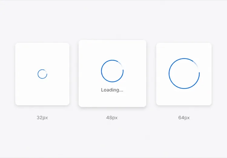
One arc rotating on a faint track. The default for anything under about a second, where a skeleton would flash in and out faster than the eye can resolve it.

Create a circular ring spinner with size variants sm 32px, md 48px and lg 64px, each keeping stroke width proportional so the small variant does not read as a thin grey circle. Render one visible arc over a low-contrast full track so the direction of rotation is legible. Wrap it in an element with role="status" and a visually hidden "Loading" label, and set aria-live="polite" so completion is announced once rather than repeatedly. Under prefers-reduced-motion: reduce, replace the rotation with a two-second opacity pulse rather than removing the indicator. Give the wrapper a fixed height matching the largest variant so mounting the spinner does not shift the surrounding layout.

Prova in MeDo
IndeterminateDots

Three Bouncing Dots

Reads as activity rather than progress, which is honest when you have no idea how long the request will take. Better than a ring inside a chat bubble or a narrow row.

Create a three-dot loading indicator: dots of 8px with 6px gaps, each animating a 400ms vertical bounce staggered by 120ms so the sequence reads left to right. Keep the total width fixed so the row does not reflow as dots move. Wrap it in role="status" with a visually hidden label describing what is loading — "Loading messages" rather than "Loading" — and set aria-live="polite". Under prefers-reduced-motion: reduce, hold the dots static and cross-fade their opacity instead of translating them. Provide a colour prop that inherits currentColor by default so the indicator matches whatever text it sits beside.

Prova in MeDo
InlineButton

Button With a Pending Spinner

The spinner that prevents the most damage, because the alternative is a double-submitted order. Keep the button width fixed or the layout jumps at the worst possible moment.

Create a button component with a pending state: when pending is true, prepend a 16px ring spinner before the label, set aria-busy="true" and the disabled attribute, and keep the button width identical to its idle state by reserving the spinner space in both. Do not remove the label text — swapping "Place order" for a bare spinner destroys the accessible name mid-interaction. Announce the state change through a separate role="status" element rather than an aria-live on the button itself. Under prefers-reduced-motion: reduce, use an opacity pulse. Block repeat clicks in the handler as well as via the disabled attribute, since disabled arrives one render late.

Prova in MeDo
Content shapeSkeleton

Skeleton Blocks Instead of a Spinner

Past roughly 500ms a spinner stops reassuring and starts reading as a stall. Skeletons show the shape of what is coming, which shortens the wait without shortening the request.

Create a skeleton loader for a card list: rounded grey blocks matching the real layout — a 40px circle for the avatar, two text bars at 60% and 40% width, and a 160px image block — with a slow left-to-right shimmer. Match the block heights to the rendered content exactly so swapping in real data causes no layout shift. Mark the container aria-busy="true" and aria-hidden on the blocks themselves so screen readers get one status announcement rather than a stream of empty elements. Under prefers-reduced-motion: reduce, drop the shimmer and hold a flat tint. Add a threshold prop so the skeleton only appears after 300ms and never flashes on a fast response.

Prova in MeDo
Full pageOverlay

Blocking Route Transition Overlay

A centered spinner over a scrim for the rare case where the whole view is unusable. Use it sparingly — blocking the page for a partial fetch makes a fast app feel slow.

Create a full-page loading overlay: a translucent scrim over the app with a 64px ring spinner and a short label centered in the viewport. Lock body scroll while visible, mark the underlying content aria-hidden="true", and use role="status" with aria-live="polite" on the overlay so the state is announced once. Trap focus inside the overlay or move focus to the status text so the keyboard cannot reach controls behind the scrim. Delay the appearance by 300ms so a fast response never produces a flash, and fade out over 150ms rather than snapping. Under prefers-reduced-motion: reduce, hold a static indicator with a text label instead of rotating.

Prova in MeDo
DeterminateProgress

Ring With a Percentage Value

When you know the fraction complete — an upload, a multi-step import — show it. A spinning ring on a 40MB upload hides the one number the user wants.

Create a determinate circular progress ring driven by a value prop from 0 to 100: an SVG circle whose stroke-dashoffset is computed from the value, with the percentage rendered in the center. Use role="progressbar" with aria-valuenow, aria-valuemin and aria-valuemax, and an aria-label describing the operation. When value is null, fall back to the indeterminate spinning arc with role="status" instead. Animate stroke-dashoffset transitions over 200ms so incremental updates do not appear to jump, and under prefers-reduced-motion: reduce apply the value changes without a transition. Reserve the full ring diameter in layout from the first render.

Prova in MeDo

Come personalizzare il tuo Indicatore di Caricamento

Adatta la palette del tuo brand

Specifica il tuo colore primario e lo spessore del tratto nel prompt. Uno spinner che usa il tuo blu di marca o colore d'accento sembra intenzionale; uno grigio predefinito sembra un placeholder mai sostituito.

Scegli il pattern di animazione giusto

Gli spinner ad anello si adattano al caricamento preciso e focalizzato (invio bottone). I punti rimbalzanti suggeriscono attività senza implicare progresso. Gli overlay pulsanti funzionano per le transizioni a pagina intera. Comunica il contesto a MeDo e sceglierà il pattern di movimento corretto.

Aggiungi varianti di dimensione fin dall'inizio

Chiedi a MeDo di generare props sm, md e lg così lo stesso componente funziona come spinner inline per bottoni, skeleton loader per card e overlay a schermo intero — tutto da un'unica fonte.

Includi un label accessibile

Gli spinner sono invisibili per gli screen reader senza un aria-label o testo visivamente nascosto. Chiedi a MeDo di includere un label "Caricamento" visivamente nascosto e una regione aria-live così le tecnologie assistive annunciano quando il caricamento è completato.

Chi usa il componente Indicatore di Caricamento

Dashboard SaaS

Spinner ad anello inline nelle celle delle tabelle dati e uno spinner overlay a schermo intero al login iniziale — offrendo feedback chiaro agli utenti senza bloccare l'intera interfaccia per piccole richieste.

Checkout e-commerce

Uno spinner pulsante nel bottone che sostituisce il label "Effettua Ordine" all'invio, prevenendo il doppio clic mentre rassicura il cliente che il suo ordine è in elaborazione.

App web mobile-first

Spinner a punti rimbalzanti stilizzati per corrispondere al tema dell'app, che appaiono negli skeleton delle card durante il caricamento del contenuto — comuni nei feed social e nelle interfacce di messaggistica.

Strumento sviluppatore o dashboard CLI

Uno spinner ad anello monocromo minimale in grigio attenuato, di piccole dimensioni per inserirsi nei pannelli di output dei log o badge di stato senza distogliere l'attenzione dal contenuto.

Pattern di Indicatore di Caricamento per siti web diversi

Lo stesso componente indicatore di caricamento, calibrato sul tipo di sito su cui viene pubblicato.

01 / 06

SaaS Dashboard Loading

Skeleton the widget grid rather than covering the whole dashboard, so the shell, nav and filters stay usable while one chart resolves. A full-page overlay on a dashboard punishes the user for the slowest panel on the screen.

Stili e varianti di Indicatore di Caricamento

Scegli la variante che si adatta al resto della pagina, poi generala.

01 / 06

Ring Spinner

A single arc over a faint track. Keep the stroke proportional across size variants — a 32px ring with the same 4px stroke as the 64px one reads as a solid donut, not a spinner. The right choice under a second.

Indicatore di Caricamento in React, Next.js, Vue e Svelte

React, Next.js, Vue 3, SvelteKit, Astro o HTML puro: lo stesso indicatore di caricamento, sei modi per integrarlo.

01 / 06

React Loading Spinner

No state and no effects — a spinner is pure markup plus a keyframe, so it never needs a hook. Put the delay threshold in the parent that owns the fetch, not in the spinner itself.

src/components/Spinner.tsx

export function Spinner({ size = 'md', label = 'Loading' }) {
  return (
    <span role="status" className={ring[size]}>
      <span className="sr-only">{label}</span>
    </span>
  )
}

Come aggiungere il tuo Indicatore di Caricamento a un progetto

Quattro passaggi, dalla scelta di un modello di indicatore di caricamento alla messa in produzione.

01~30s

Pick a Loading Pattern

Choose by expected duration and how much of the view is blocked — a ring under a second, a skeleton past 500ms, an inline button spinner for a submit, a determinate ring when you know the percentage.

02~10s

Copy the Prompt

Paste it into MeDo, Lovable, Bolt, v0 or Cursor. Name what is loading in the label — "Loading invoices" beats "Loading", because the hidden label is the only thing a screen reader gets.

03~1min

Generate and Refine

You get React + Tailwind with a live preview. Follow up in plain English — "add a 300ms delay before it shows", "swap rotation for a pulse under reduced motion", "keep the button width fixed".

04~1min

Wire It to Your Loading State

Hook it to Suspense, a route loading file or an isPending flag, and reserve the space it occupies. Throttle the network in devtools and confirm nothing shifts when the real content lands.

Domande comuni su Indicatore di Caricamento

Come creo uno spinner di caricamento con l'IA?

In MeDo, descrivi lo spinner di cui hai bisogno — stile di animazione (anello, punti, pulsazione), dimensione, colore, e se hai bisogno di varianti di dimensione o un label. MeDo genera il codice completo del componente, inclusi keyframes CSS o classi di animazione Tailwind, pronto da incollare nel tuo progetto.

Qual è il miglior generatore di spinner di caricamento IA?

MeDo è progettato specificamente per generare componenti UI pronti per la produzione. A differenza degli strumenti IA generici che producono snippet approssimativi, MeDo produce componenti spinner puliti e accessibili con attributi aria corretti, props configurabili e animazioni che si integrano con il tuo design system.

Posso generare uno spinner solo CSS con l'IA?

Sì. Specifica "solo CSS, niente JavaScript" nel tuo prompt MeDo e genererà uno spinner usando animazioni CSS keyframe pure — nessuna dipendenza, nessun JavaScript richiesto. Ideale per pagine marketing leggere o situazioni dove aggiungere una libreria di componenti non è un'opzione.

Come rendo uno spinner di caricamento accessibile?

Chiedi a MeDo di includere un label di testo visivamente nascosto (es., "Caricamento in corso, attendere prego") e di impostare aria-busy sul container di caricamento. MeDo produrrà il corretto aria-label, role="status", e una regione live così gli screen reader annunciano automaticamente i cambiamenti di stato del caricamento.

Come aggiungo uno spinner di caricamento a un bottone in React?

Dai questo prompt a MeDo: "Crea un componente bottone React con uno stato di caricamento che sostituisce il label con un piccolo spinner inline quando isLoading è true, disabilita il bottone e previene il doppio invio." MeDo genererà il componente completo con lo spinner integrato e accessibile.

Qual è la differenza tra uno spinner di caricamento e uno skeleton loader?

Uno spinner di caricamento è un'animazione generica che indica che qualcosa si sta caricando senza rivelare il layout. Uno skeleton loader imita la forma del contenuto in arrivo, riducendo il tempo di attesa percepito mostrando immediatamente la struttura. MeDo può generare entrambi — o uno spinner che transiziona in uno skeleton — a seconda del tuo prompt.
