MeDo

KI-Ladeanimation-Generator.

Sagen Sie MeDo, welche Ladeanimation Sie brauchen — Ring, hüpfende Punkte, pulsierender Kreis, Skeleton-Overlay — und erhalten Sie sofort produktionsreifen Komponentencode. Kein Durchsuchen von CodePen, kein manuelles Anpassen von Keyframes.

Ladeanimation
Ladeanimation

Eine Ladeanimation ist das Erste, was Nutzer sehen, wenn Ihre App langsam ist.

Jede asynchrone Operation — Datenabruf, Formularübermittlung, Datei-Upload — braucht einen Ladezustand. Ein fehlender oder störender Spinner untergräbt das Vertrauen und lässt die App defekt wirken. Ein gut gestalteter Spinner kommuniziert Fortschritt, passt zu Ihrem Design-System und hält die Nutzer geduldig. Es ist eine kleine Komponente mit überproportional großem Einfluss auf die wahrgenommene Performance.

6 Vorlagen

Ladeanimation-Vorlagen, die Sie generieren können

Jede Vorlage ist ein echter Prompt, kein Screenshot. Kopieren Sie ihn in einen KI-Editor oder führen Sie ihn in MeDo aus und erhalten Sie React- und Tailwind-Code zurück.

BasicRing

Rotating Ring Spinner

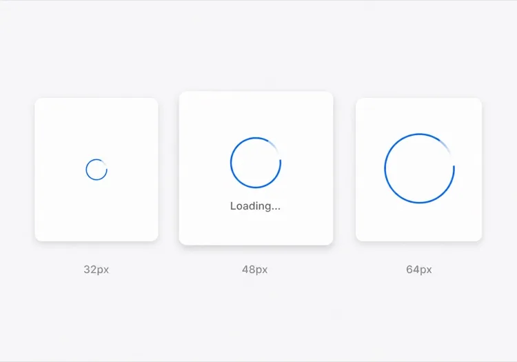
One arc rotating on a faint track. The default for anything under about a second, where a skeleton would flash in and out faster than the eye can resolve it.

Create a circular ring spinner with size variants sm 32px, md 48px and lg 64px, each keeping stroke width proportional so the small variant does not read as a thin grey circle. Render one visible arc over a low-contrast full track so the direction of rotation is legible. Wrap it in an element with role="status" and a visually hidden "Loading" label, and set aria-live="polite" so completion is announced once rather than repeatedly. Under prefers-reduced-motion: reduce, replace the rotation with a two-second opacity pulse rather than removing the indicator. Give the wrapper a fixed height matching the largest variant so mounting the spinner does not shift the surrounding layout.

In MeDo testen
IndeterminateDots

Three Bouncing Dots

Reads as activity rather than progress, which is honest when you have no idea how long the request will take. Better than a ring inside a chat bubble or a narrow row.

Create a three-dot loading indicator: dots of 8px with 6px gaps, each animating a 400ms vertical bounce staggered by 120ms so the sequence reads left to right. Keep the total width fixed so the row does not reflow as dots move. Wrap it in role="status" with a visually hidden label describing what is loading — "Loading messages" rather than "Loading" — and set aria-live="polite". Under prefers-reduced-motion: reduce, hold the dots static and cross-fade their opacity instead of translating them. Provide a colour prop that inherits currentColor by default so the indicator matches whatever text it sits beside.

In MeDo testen
InlineButton

Button With a Pending Spinner

The spinner that prevents the most damage, because the alternative is a double-submitted order. Keep the button width fixed or the layout jumps at the worst possible moment.

Create a button component with a pending state: when pending is true, prepend a 16px ring spinner before the label, set aria-busy="true" and the disabled attribute, and keep the button width identical to its idle state by reserving the spinner space in both. Do not remove the label text — swapping "Place order" for a bare spinner destroys the accessible name mid-interaction. Announce the state change through a separate role="status" element rather than an aria-live on the button itself. Under prefers-reduced-motion: reduce, use an opacity pulse. Block repeat clicks in the handler as well as via the disabled attribute, since disabled arrives one render late.

In MeDo testen
Content shapeSkeleton

Skeleton Blocks Instead of a Spinner

Past roughly 500ms a spinner stops reassuring and starts reading as a stall. Skeletons show the shape of what is coming, which shortens the wait without shortening the request.

Create a skeleton loader for a card list: rounded grey blocks matching the real layout — a 40px circle for the avatar, two text bars at 60% and 40% width, and a 160px image block — with a slow left-to-right shimmer. Match the block heights to the rendered content exactly so swapping in real data causes no layout shift. Mark the container aria-busy="true" and aria-hidden on the blocks themselves so screen readers get one status announcement rather than a stream of empty elements. Under prefers-reduced-motion: reduce, drop the shimmer and hold a flat tint. Add a threshold prop so the skeleton only appears after 300ms and never flashes on a fast response.

In MeDo testen
Full pageOverlay

Blocking Route Transition Overlay

A centered spinner over a scrim for the rare case where the whole view is unusable. Use it sparingly — blocking the page for a partial fetch makes a fast app feel slow.

Create a full-page loading overlay: a translucent scrim over the app with a 64px ring spinner and a short label centered in the viewport. Lock body scroll while visible, mark the underlying content aria-hidden="true", and use role="status" with aria-live="polite" on the overlay so the state is announced once. Trap focus inside the overlay or move focus to the status text so the keyboard cannot reach controls behind the scrim. Delay the appearance by 300ms so a fast response never produces a flash, and fade out over 150ms rather than snapping. Under prefers-reduced-motion: reduce, hold a static indicator with a text label instead of rotating.

In MeDo testen
DeterminateProgress

Ring With a Percentage Value

When you know the fraction complete — an upload, a multi-step import — show it. A spinning ring on a 40MB upload hides the one number the user wants.

Create a determinate circular progress ring driven by a value prop from 0 to 100: an SVG circle whose stroke-dashoffset is computed from the value, with the percentage rendered in the center. Use role="progressbar" with aria-valuenow, aria-valuemin and aria-valuemax, and an aria-label describing the operation. When value is null, fall back to the indeterminate spinning arc with role="status" instead. Animate stroke-dashoffset transitions over 200ms so incremental updates do not appear to jump, and under prefers-reduced-motion: reduce apply the value changes without a transition. Reserve the full ring diameter in layout from the first render.

In MeDo testen

So passen Sie Ihre Ladeanimation an

Passen Sie die Markenfarben an

Geben Sie Ihre Primärfarbe und Strichstärke im Prompt an. Ein Spinner in Ihrem Markenblau oder Ihrer Akzentfarbe wirkt beabsichtigt; ein standardmäßiges Grau wirkt wie ein nie ersetzter Platzhalter.

Wählen Sie das richtige Animationsmuster

Ring-Spinner eignen sich für präzises, fokussiertes Laden (Button-Submit). Hüpfende Punkte suggerieren Aktivität ohne Fortschritt zu implizieren. Pulsierende Overlays funktionieren für Ganzseitenübergänge. Teilen Sie MeDo den Kontext mit und es wählt das passende Bewegungsmuster.

Fügen Sie von Anfang an Größenvarianten hinzu

Bitten Sie MeDo um sm, md und lg Größen-Props, damit dieselbe Komponente als Inline-Button-Spinner, Card-Skeleton-Loader und Vollbild-Overlay funktioniert — alles aus einer Quelle.

Fügen Sie ein barrierefreies Label hinzu

Spinner sind für Screenreader ohne aria-label oder visuell versteckten Text unsichtbar. Bitten Sie MeDo, ein visuell verstecktes „Wird geladen"-Label und eine aria-live-Region einzufügen, damit assistive Technologie den Abschluss des Ladens ankündigt.

Wer die Ladeanimation-Komponente nutzt

SaaS-Dashboard

Inline-Ring-Spinner in Datentabellenzellen und ein Vollbild-Overlay-Spinner beim ersten Login — gibt Nutzern klares Feedback, ohne die gesamte Oberfläche für kleine Abrufe zu blockieren.

E-Commerce-Checkout

Ein pulsierender Button-Spinner, der beim Absenden das „Bestellung aufgeben"-Label ersetzt — verhindert Doppelklicks und beruhigt den Kunden, dass seine Bestellung verarbeitet wird.

Mobile-First-Webanwendung

Hüpfende Punkt-Spinner im App-Design, die in Card-Skeletons während des Inhaltsladens erscheinen — verbreitet in Social-Feeds und Messaging-Oberflächen.

Entwickler-Tool oder CLI-Dashboard

Ein minimaler monochromer Ring-Spinner in gedämpftem Grau, klein dimensioniert für Log-Ausgabe-Panels oder Status-Badges, ohne vom Inhalt abzulenken.

Ladeanimation-Muster für verschiedene Websites

Dieselbe ladeanimation-Komponente, abgestimmt auf die Art der Website, auf der sie läuft.

01 / 06

SaaS Dashboard Loading

Skeleton the widget grid rather than covering the whole dashboard, so the shell, nav and filters stay usable while one chart resolves. A full-page overlay on a dashboard punishes the user for the slowest panel on the screen.

Ladeanimation-Stile und -Varianten

Wählen Sie die Variante, die zum Rest der Seite passt, und generieren Sie sie.

01 / 06

Ring Spinner

A single arc over a faint track. Keep the stroke proportional across size variants — a 32px ring with the same 4px stroke as the 64px one reads as a solid donut, not a spinner. The right choice under a second.

Ladeanimation in React, Next.js, Vue und Svelte

React, Next.js, Vue 3, SvelteKit, Astro oder reines HTML — dieselbe ladeanimation, sechs Wege zur Einbindung.

01 / 06

React Loading Spinner

No state and no effects — a spinner is pure markup plus a keyframe, so it never needs a hook. Put the delay threshold in the parent that owns the fetch, not in the spinner itself.

src/components/Spinner.tsx

export function Spinner({ size = 'md', label = 'Loading' }) {
  return (
    <span role="status" className={ring[size]}>
      <span className="sr-only">{label}</span>
    </span>
  )
}

So fügen Sie Ihre Ladeanimation einem Projekt hinzu

Vier Schritte, von der Auswahl einer ladeanimation-Vorlage bis zum Einsatz in der Produktion.

01~30s

Pick a Loading Pattern

Choose by expected duration and how much of the view is blocked — a ring under a second, a skeleton past 500ms, an inline button spinner for a submit, a determinate ring when you know the percentage.

02~10s

Copy the Prompt

Paste it into MeDo, Lovable, Bolt, v0 or Cursor. Name what is loading in the label — "Loading invoices" beats "Loading", because the hidden label is the only thing a screen reader gets.

03~1min

Generate and Refine

You get React + Tailwind with a live preview. Follow up in plain English — "add a 300ms delay before it shows", "swap rotation for a pulse under reduced motion", "keep the button width fixed".

04~1min

Wire It to Your Loading State

Hook it to Suspense, a route loading file or an isPending flag, and reserve the space it occupies. Throttle the network in devtools and confirm nothing shifts when the real content lands.

Häufige Fragen zu Ladeanimation

Wie erstelle ich eine Ladeanimation mit KI?

Beschreiben Sie in MeDo den gewünschten Spinner — Animationsstil (Ring, Punkte, Puls), Größe, Farbe und ob Sie Größenvarianten oder ein Label benötigen. MeDo generiert den vollständigen Komponentencode inklusive CSS-Keyframes oder Tailwind-Animationsklassen, bereit zum Einfügen in Ihr Projekt.

Was ist der beste KI-Ladeanimation-Generator?

MeDo ist speziell für die Generierung produktionsreifer UI-Komponenten entwickelt. Im Gegensatz zu generischen KI-Tools, die grobe Snippets ausgeben, produziert MeDo saubere, barrierefreie Spinner-Komponenten mit korrekten aria-Attributen, konfigurierbaren Props und Animationen, die zu Ihrem Design-System passen.

Kann ich einen reinen CSS-Spinner mit KI generieren?

Ja. Geben Sie „Nur CSS, kein JavaScript" in Ihrem MeDo-Prompt an und es wird ein Spinner mit reinen CSS-Keyframe-Animationen generiert — keine Abhängigkeiten, kein JavaScript erforderlich. Ideal für leichtgewichtige Marketing-Seiten oder Situationen, in denen eine Komponentenbibliothek nicht in Frage kommt.

Wie mache ich eine Ladeanimation barrierefrei?

Bitten Sie MeDo, ein visuell verstecktes Textlabel (z. B. „Wird geladen, bitte warten") einzufügen und aria-busy auf dem Lade-Container zu setzen. MeDo gibt das korrekte aria-label, role="status" und eine Live-Region aus, damit Screenreader Ladezustandsänderungen automatisch ankündigen.

Wie füge ich einen Lade-Spinner zu einem Button in React hinzu?

Geben Sie MeDo den Prompt: „Erstelle eine React-Button-Komponente mit einem Ladezustand, der das Label durch einen kleinen Inline-Spinner ersetzt wenn isLoading wahr ist, den Button deaktiviert und doppeltes Absenden verhindert." MeDo generiert die vollständige Komponente mit integriertem und barrierefreiem Spinner.

Was ist der Unterschied zwischen einem Lade-Spinner und einem Skeleton-Loader?

Ein Lade-Spinner ist eine generische Animation, die anzeigt, dass etwas geladen wird, ohne das Layout zu verraten. Ein Skeleton-Loader imitiert die Form des kommenden Inhalts und reduziert die wahrgenommene Wartezeit, indem sofort Struktur gezeigt wird. MeDo kann beides generieren — oder einen Spinner, der in ein Skeleton übergeht — je nach Prompt.
