MeDo

Gerador de Tabs com IA.

Descreva seus painéis e o MeDo gera um componente de tabs completo — papéis ARIA corretos, navegação por setas, um indicador ativo animado, tratamento de overflow no mobile e uma aba ativa que sincroniza com a URL e sobrevive a um recarregamento.

Tabs
Tabs

Tabs são uma decisão de rotas disfarçada de decisão de estilo

Um conjunto de tabs não apenas esconde conteúdo: ele divide uma página em várias visões que compartilham uma única URL. No momento em que alguém quer compartilhar a aba de Preços, linkar para ela de um artigo de suporte ou recarregar sem perder o lugar, o componente precisa de estado real que viva fora do React. As equipes normalmente descobrem isso depois de as tabs irem ao ar e então enxertam um tratamento de query string que briga com a animação e com a renderização inicial. Decidir de antemão que a aba ativa é derivada da URL em vez do estado local simplifica todo o componente: o gatilho se torna uma ação parecida com um link, deep links funcionam de graça e a renderização no servidor produz o painel correto já no primeiro paint. Isso também muda como você escreve a marcação, e é por isso que gerar assim custa muito menos do que adaptar depois.

6 modelos

Modelos de Tabs que você pode gerar

Cada modelo é um prompt real, não uma captura de tela. Copie para qualquer editor de IA, ou rode no MeDo e receba código React + Tailwind.

BasicUnderline

Underlined Tab Row With a Sliding Indicator

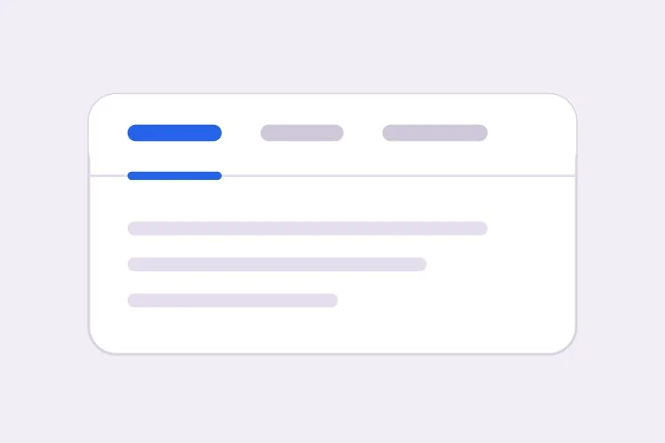
The default that reads as tabs without any explanation. Reach for it when the panels are static content and you want the indicator to do the signalling rather than a border box.

Create a tabs component with four triggers using the ARIA tabs pattern: role="tablist" on the container, role="tab" with aria-selected and aria-controls on each trigger, and role="tabpanel" with aria-labelledby on each panel. Use roving tabindex so only the selected tab has tabindex 0 and Tab moves out of the group entirely rather than through it. Left and Right arrows move focus and wrap at both ends, Home and End jump to the first and last tab, and activation is automatic because the panels are static text. Triggers are 40px tall with 15px medium labels, muted grey when inactive and near-black when active. Measure the active trigger and slide a 2px underline using translateX and scaleX over 200ms — never animate left or width.

Teste no MeDo
SegmentedPill Segmented

Segmented Control With a Sliding Pill

Two or three mutually exclusive options that belong on one control, like monthly versus annual. Do not use it past four tabs — the track stops fitting on a phone and equal widths force truncation.

Create a segmented-control tabs component: one rounded 36px-tall track with a light grey background and 2px inner padding, holding three equal-width triggers. The active trigger is a white pill with a soft shadow that moves between positions with translateX over 180ms, so the label text never reflows mid-transition. Keep the full ARIA tabs roles and roving tabindex — Left and Right arrows move focus with wrapping, Home and End jump to the ends, and activation is automatic. Give every trigger the same explicit min-width so switching from a short label to a long one does not resize the track. Under prefers-reduced-motion, cross-fade the pill background instead of sliding it.

Teste no MeDo
Deep linkableURL-Synced

Tabs Backed by a Query Parameter

The active tab lives in the URL, so support can link to one panel and a reload keeps your place. Worth doing before launch, because retrofitting it means rewriting the initial render.

Create a tabs component whose active tab is derived from a ?tab= query parameter rather than local state, so the first server render already paints the correct panel with no post-hydration flash. Read the parameter, validate it against the known tab ids, and fall back to the first tab when the value is unrecognised. On selection, write the new value with a replace-style navigation so the back button is not filled with tab switches, and preserve every other query parameter already on the URL. Keep the ARIA tabs wiring intact: roving tabindex, Left and Right arrows with wrapping, Home and End, and manual activation on Enter or Space.

Teste no MeDo
OverflowScrollable

Horizontally Scrolling Tablist

What happens when seven labels meet a 390px viewport. The part teams forget is scrolling the newly focused tab into view — arrow keys otherwise move focus to a tab nobody can see.

Create a tabs component that handles overflow by scrolling rather than wrapping or clipping. Under 640px the tablist scrolls horizontally with momentum, the scrollbar is hidden, and a gradient fade appears on either edge only while content remains in that direction. When Left or Right arrow moves the roving tabindex, call scrollIntoView with inline nearest on the newly focused trigger so keyboard focus is never off screen, and do the same for Home and End. Use scroll-snap-align on each trigger so a flick settles on a label boundary instead of mid-word. Keep the full ARIA roles and aria-controls wiring, and recompute the indicator position on scroll and on resize.

Teste no MeDo
PerformanceLazy Panels

Tabs With Deferred Panel Mounting

Only the active panel mounts, so opening Settings does not fetch invoices nobody asked for. The catch is state loss, so name the panels that must survive a switch.

Create a tabs component that mounts only the active panel and keeps every inactive panel out of the DOM entirely, so charts, video players and data fetches for unseen tabs never run. Use manual activation — arrow keys move the roving tabindex and only Enter or Space commits the change — because automatic activation would fire a request for every tab a keyboard user passes through. Accept a keepMounted list of tab ids whose panels stay in the DOM hidden with the hidden attribute instead, for panels holding half-filled forms or scroll position. Show a skeleton inside a newly mounted panel while its data resolves, and keep the panel container height stable so the page below does not jump.

Teste no MeDo
SidebarVertical

Vertical Tabs for Settings Screens

A left rail of labels beside one panel. The one thing that changes beyond layout is the arrow axis — Up and Down, not Left and Right, and aria-orientation has to say so.

Create a vertical tabs component for a settings screen: a 200px left rail of triggers with a single panel to its right. Set aria-orientation="vertical" on the tablist and bind Arrow Up and Arrow Down to move the roving tabindex with wrapping, since Left and Right are wrong on this axis; keep Home and End for the ends. Triggers are left-aligned rows, 36px tall, with a 2px indicator on the left edge that translates vertically over 200ms. Below 768px collapse the rail into a horizontal scrolling tablist above the panel and switch the arrow bindings and aria-orientation to match. Use manual activation, and give the panel tabindex="-1" so a programmatic focus move after selection is possible.

Teste no MeDo

Como personalizar seu Tabs

Escolha ativação automática ou manual de forma deliberada

A ativação automática troca de painel conforme as setas movem o foco, o que é rápido mas inútil quando os painéis são caros de renderizar ou buscam dados. A ativação manual move primeiro o foco e só ativa com Enter ou Espaço. Diga qual você quer, porque o código de teclado é diferente.

Anime o indicador com transform, não com width

Peça um sublinhado que meça o gatilho ativo e deslize usando translateX e scaleX. Animar left e width provoca recálculo de layout em todo frame, tremula em fronteiras de subpixel e quebra por completo quando a tablist pode rolar.

Decida o que acontece quando as abas transbordam

Quatro rótulos curtos cabem em um celular; sete não. Escolha um comportamento e declare-o: uma tablist com rolagem horizontal e fade na borda, quebra para uma segunda linha, ou colapso em um select nativo abaixo de um breakpoint. Sem especificar, as tabs geradas normalmente só são cortadas.

Diga se painéis inativos continuam montados

Desmontar painéis inativos mantém o DOM enxuto e evita rodar gráficos ou players de vídeo que ninguém vê, mas também descarta a posição de rolagem e campos de formulário parcialmente preenchidos. Mencione quais painéis guardam estado para que justamente esses sejam escondidos com CSS.

Quem usa o componente Tabs

Página de preços

Cobrança mensal e anual como duas abas acima de uma única grade de preços, com a escolha gravada na URL para que o time de vendas possa linkar direto para o preço anual e o desconto anual fique visível no primeiro carregamento.

Documentação de produto

Exemplos de código divididos por linguagem — curl, Node, Python, Go — em que selecionar uma linguagem uma vez se aplica a todos os grupos de abas da página e é lembrado na próxima visita.

Dashboard ou ferramenta admin

Uma tela de configurações com abas de Perfil, Time, Faturamento e Chaves de API onde cada painel é montado de forma preguiçosa, de modo que abrir Configurações não busca faturas que ninguém pediu.

Página de produto de e-commerce

Descrição, Especificações e Avaliações como abas abaixo da galeria, com a contagem de avaliações no rótulo do gatilho e a descrição também renderizada no corpo da página, para que o texto principal não fique acessível apenas atrás de uma aba.

Padrões de Tabs para diferentes sites

O mesmo componente tabs, ajustado ao tipo de site em que ele entra.

01 / 06

SaaS Pricing Page Tabs

Monthly and annual billing as a two-tab segmented control above one price grid. Sync the choice to the URL so a sales email can open annual pricing directly — a pricing page where the discount is one unshareable click away is losing the conversation before it starts.

Estilos e variações de Tabs

Escolha a variação que combina com o resto da página e gere-a.

01 / 06

Underlined Tabs

A muted label row with a 2px indicator sliding beneath the active trigger. The most legible default because the underline gives the eye a single moving object to track. Animate it with translateX and scaleX — animating left and width thrashes layout every frame and jitters on subpixel boundaries.

Tabs em React, Next.js, Vue e Svelte

React, Next.js, Vue 3, SvelteKit, Astro ou HTML puro — o mesmo tabs, seis formas de integrar.

01 / 06

React Tabs

Keep the selected id in one piece of state and derive tabindex from it — that is the whole roving tabindex mechanism. Hold refs to the triggers so the arrow handler can focus the next one directly.

src/components/Tabs.tsx

const [active, setActive] = useState(tabs[0].id)

<div role="tablist" onKeyDown={onArrowKeys}>
  {tabs.map((t) => (
    <button
      key={t.id}
      role="tab"
      aria-selected={t.id === active}
      aria-controls={`panel-${t.id}`}
      tabIndex={t.id === active ? 0 : -1}
      onClick={() => setActive(t.id)}
    >
      {t.label}
    </button>
  ))}
</div>

Como adicionar o seu Tabs a um projeto

Quatro passos, de escolher um modelo de tabs até subir para produção.

01~30s

Pick a Tabs Template

Choose by constraint, not by looks: segmented for two or three alternatives, scrollable once labels overflow a phone, vertical for a long settings rail, lazy when a panel fetches data.

02~10s

Copy the Prompt

Take the prompt into MeDo, Lovable, Bolt, v0 or Cursor, then edit two things — your real tab labels, and whether activation is automatic or manual. That second choice changes the keyboard code, so decide it before you generate.

03~1min

Generate and Refine

You get React + Tailwind back with a live preview. Follow up in plain English — "sync the active tab to ?tab=", "collapse to a select under 640px", "keep the chart panel mounted" — rather than editing the keydown handler by hand.

04~2min

Wire the Panels and Ship

Replace the placeholder panels with your real content and check three things with the keyboard only: Tab enters and leaves the group in one stop, arrows move within it, and a reload on a deep link opens the right panel.

Perguntas comuns sobre Tabs

Como gerar um componente de tabs acessível com IA?

Descreva os rótulos das abas e o comportamento desejado em um único prompt, incluindo se a ativação é automática ou manual. O MeDo gera os papéis tablist, tab e tabpanel com a ligação correspondente de aria-controls e aria-labelledby, além de roving tabindex para que as setas circulem entre as abas e o Tab saia do grupo por completo.

Qual é a diferença entre ativação automática e manual de abas?

Com ativação automática, mover o foco com uma seta mostra aquele painel imediatamente, o que combina com conteúdo estático e barato. Com ativação manual, as setas apenas movem o foco e o usuário confirma com Enter ou Espaço. Use manual sempre que um painel buscar dados, renderizar um gráfico ou for lento, já que a ativação automática dispararia uma requisição para cada aba pela qual um usuário de teclado passa.

Posso linkar diretamente para uma aba específica?

Sim, se a aba ativa estiver guardada na URL e não no estado do componente. Peça um parâmetro de consulta como ?tab=pricing que alimente a renderização inicial e seja atualizado com uma navegação do tipo replace, para que o botão voltar não fique cheio de trocas de aba. Evite um fragmento de hash para isso, porque o navegador também tentará rolar até um elemento com aquele id.

Conteúdo escondido em abas inativas prejudica o SEO?

Os mecanismos de busca indexam o texto presente no HTML mesmo quando um painel está oculto visualmente, então conteúdo em abas não é invisível. Ele geralmente é ponderado como secundário em relação ao conteúdo que o visitante vê de imediato, e painéis renderizados apenas depois de um clique podem não ser rastreados. Mantenha seu título principal, sua proposta de valor e suas palavras-chave alvo na parte sempre visível da página e use as abas para detalhes de apoio.

Como as tabs devem se comportar no mobile?

Escolha uma única estratégia em vez de deixar os rótulos encolherem. Uma tablist com rolagem horizontal e fade na borda que transborda funciona bem até cerca de seis rótulos curtos; acima disso, colapsar em um select nativo dá uma área de toque melhor e evita abas escondidas. Informe ao MeDo o breakpoint e a estratégia e ele gerará os dois layouts a partir de um componente.

Devo usar tabs ou um acordeão?

Use tabs quando os painéis são alternativas que o usuário compara uma por vez, como períodos de cobrança ou linguagens de código, e quando os rótulos são curtos o bastante para ficar em uma linha. Use um acordeão quando as seções são itens independentes que alguém pode querer abertos ao mesmo tempo, quando os rótulos são perguntas completas, ou quando o conteúdo é longo o suficiente para que o empilhamento vertical se leia melhor — uma lista de FAQ é o caso canônico de acordeão, não de tabs.