MeDo

Gerador de Toast com IA.

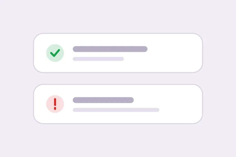
Descreva o comportamento das suas notificações e o MeDo gera o sistema de toast completo — quatro tipos semânticos, uma fila de empilhamento, temporizadores de fechamento automático que pausam ao passar o cursor, fechar deslizando no toque e a polidez aria-live correta para cada tipo.

Toast
Toast

Um toast é um temporizador, uma fila e uma live region fingindo ser uma caixinha

A parte visual de um toast leva minutos. Tudo que está por baixo, não. Um toast precisa decidir quanto tempo permanece, o que acontece quando três chegam ao mesmo tempo, o que acontece quando o usuário está no meio de uma frase em um formulário e como um leitor de tela o anuncia sem ser interrompido. A consequência menos óbvia é que bugs de toast aparecem como bugs de confiança: uma confirmação de salvamento que desaparece antes de ser lida, ou um erro que se esvai enquanto o usuário lê o campo a que ele se refere, ensina as pessoas a não acreditar na interface. Gerar juntas as regras de tempo, os limites de fila e a polidez da live region mantém essas decisões consistentes em vez de espalhadas por cada ponto de chamada que disparou a notificação.

6 modelos

Modelos de Toast que você pode gerar

Cada modelo é um prompt real, não uma captura de tela. Copie para qualquer editor de IA, ou rode no MeDo e receba código React + Tailwind.

BasicFour Tones

Success, Error, Warning, Info Stack

The baseline set, and the only one where per-type rules matter more than styling. Errors that auto-dismiss are the single most common toast bug in production.

Create a toast system with four semantic types — success with a check icon and green accent, error with an alert icon and red accent, warning with a triangle and amber accent, info with a circle and blue accent. Each toast is 360px wide with a 12px radius, 16px padding, a semibold title, an optional description and a close button with an accessible label. Stack in the bottom-right with 8px gaps, newest on top, three visible at once and the rest queued. Auto-dismiss success, info and warning after 5000ms; keep errors until the user closes them. Wrap non-error toasts in role="status" with aria-live="polite" and give errors role="alert". Slide in 16px from the right and fade out; under prefers-reduced-motion, fade only.


Teste no MeDo
TimingPausable Timer

Countdown Bar That Freezes on Hover

A visible progress bar plus a timer that stops while the pointer or keyboard focus is on the toast. Without the pause, a toast can vanish while the user is reaching for its own action button.

Create a toast with a visible dismiss countdown: a 2px progress bar along the bottom edge animating from full to zero over the toast duration. Pause the timer and freeze the bar on pointerenter and on focusin anywhere inside the toast, then resume from the remaining time on pointerleave and focusout — track elapsed time explicitly rather than restarting the interval, or the toast will live longer every time the pointer crosses it. Reset to the full duration when the toast content is updated in place. Under prefers-reduced-motion, replace the animated bar with a static severity stripe and keep the timer behaviour unchanged. Keep the toast in a role="status" region with aria-live="polite".

Teste no MeDo
UndoAction Toast

Toast With an Undo or Retry Action

The moment a toast carries a button, it stops being decoration and becomes the only route to a reversible operation — so it must not auto-dismiss while the action is still valid.

Create a toast variant with a single inline action button — Undo or Retry — beside the close control. Do not auto-dismiss while an action is present unless the caller passes an explicit duration, and never dismiss on a timer shorter than the window in which the action is still valid server-side. Move keyboard focus nowhere on mount; instead expose the toast region via a landmark and make the action reachable through a documented shortcut plus normal tab order, so a toast never steals focus from a form the user is typing in. Announce the toast with role="status" and aria-live="polite", and include the action label in the announced text so the option is heard, not just seen.

Teste no MeDo
AsyncPromise Toast

One Toast That Updates in Place

Pending, then success or error, on the same node. Firing a second toast when a request resolves stacks two notifications about one event and doubles the screen reader announcement.

Create a promise-driven toast that mounts in a pending state with a spinner and a loading title, then updates the same toast node to success or error when the promise settles rather than mounting a second toast. Keep the toast ID stable across the transition so the stack position does not change, swap the icon and accent, and start the auto-dismiss timer only once the promise resolves. On rejection, switch the container to role="alert" and cancel auto-dismiss. Because the live region content changes in place, debounce the announcement so a request that resolves in under 400ms announces the final state only. Cap the pending state with a timeout that converts to an error toast rather than spinning forever.

Teste no MeDo
MobileSwipe Toast

Top-Center Toast With Swipe Dismiss

On a phone the bottom corner is under the thumb and the home indicator. Top-center with a horizontal drag threshold is the only placement that does not fight the platform.

Create a mobile-first toast pinned to the top-center with a safe-area inset using env(safe-area-inset-top), full width minus 16px gutters, capped at a single line of title text with the description truncated to two lines. Add horizontal swipe-to-dismiss with a 60px or 40% drag threshold, translating with the pointer and springing back below the threshold; suppress the pointer handlers while the user is scrolling the page underneath. Keep the close button hit area at 44px even though the glyph is 16px. Show one toast at a time and replace rather than stack, since a stack on a 375px viewport covers the content. Use role="status" with aria-live="polite" and disable the spring under prefers-reduced-motion.

Teste no MeDo
SnackbarCompact Snackbar

Single-Line Bar With No Icon

One line, no title, no icon — for low-stakes confirmations like "Link copied" where a 360px card with an icon block is more furniture than the message deserves.

Create a compact snackbar toast: a single line of 14px text on a dark surface, 8px radius, 12px vertical and 16px horizontal padding, no icon and no separate title, with an optional text-only action on the right. Anchor it bottom-center with a 24px offset and allow only one at a time — a new snackbar replaces the current one and resets its 4000ms timer instead of queueing, because these fire from rapid interactions like copy and toggle. Announce via role="status" with aria-live="polite", and when the text is identical to the previous message, force re-announcement by clearing the live region for one frame. Fade and lift 8px on entry; fade only under prefers-reduced-motion.

Teste no MeDo

Como personalizar seu Toast

Dê aos erros regras diferentes de todo o resto

Peça fechamento automático para success, info e warning, e que os erros persistam até serem fechados. Erros geralmente exigem que o usuário faça algo, e uma mensagem que se remove antes de ser compreendida é pior do que mensagem nenhuma.

Defina um limite de empilhamento e diga o que o excesso faz

Especifique quantos toasts podem ficar visíveis ao mesmo tempo — três é um teto razoável — e se os extras entram na fila atrás ou substituem o mais antigo. Sem limite, um laço que dispara uma notificação por item vai forrar toda a viewport.

Peça que o temporizador pause no hover e no foco

Peça no prompt que a contagem para fechar congele enquanto o ponteiro estiver sobre o toast ou um controle dentro dele tiver foco de teclado. Caso contrário, um toast pode desaparecer justamente quando o usuário está indo clicar no botão de ação dele.

Nomeie o canto e a área segura

Escolha uma posição e descreva: o canto inferior direito fica longe da maior parte da navegação principal, o topo centralizado é lido mais rápido. No mobile, peça padding com env(safe-area-inset-bottom) para que os toasts não caiam sob o indicador de home ou uma barra de abas fixa.

Quem usa o componente Toast

Produto SaaS

Toasts de sucesso curtos confirmando salvamentos automáticos e convites, com toasts de erro persistentes trazendo uma ação "Tentar novamente" quando uma sincronização em segundo plano falha. A posição inferior direita os mantém longe da barra lateral do app.

Loja de e-commerce

Um toast "Adicionado ao carrinho" com miniatura e um link "Ver carrinho", fechando após cinco segundos. Falhas de estoque e pagamento usam o tipo erro e permanecem para que o comprador possa ler o que deu errado.

Dashboard ou ferramenta administrativa

Operações em massa emitem um único toast de resumo em vez de um por registro, e tarefas longas atualizam um único toast no lugar, de pendente para sucesso, em vez de empilhar uma segunda notificação em cima.

Aplicativo web mobile

Toasts no topo centralizados com fechar deslizando e safe-area insets, dimensionados para uma única linha, para nunca cobrirem o campo em que o usuário está digitando.

Padrões de Toast para diferentes sites

O mesmo componente toast, ajustado ao tipo de site em que ele entra.

01 / 06

SaaS Product Toasts

Autosave confirmations and invite receipts, bottom-right so they clear the sidebar. The rule that matters most here is that background-sync failures get persistent error toasts with a Retry action — a sync error that dismisses itself is indistinguishable from a sync that worked.

Estilos e variações de Toast

Escolha a variação que combina com o resto da página e gere-a.

01 / 06

Card Toast With Icon and Accent

The full anatomy: icon, semibold title, description, close button, colored accent. Worth the vertical space when the message has a subject and a detail. It is overkill for "Copied" — use the snackbar for those.

Toast em React, Next.js, Vue e Svelte

React, Next.js, Vue 3, SvelteKit, Astro ou HTML puro — o mesmo toast, seis formas de integrar.

01 / 06

React Toast

A context provider holding the queue plus a portal for the container. Mount the provider once above the router so navigating between routes does not unmount the toast that was just fired.

src/components/ToastProvider.tsx

export function ToastProvider({ children }) {
  const [toasts, setToasts] = useState([])
  const push = (t) => setToasts((prev) => [...prev, { id: uid(), ...t }])

  return (
    <ToastContext.Provider value={{ push }}>
      {children}
      {createPortal(<ToastStack toasts={toasts} />, document.body)}
    </ToastContext.Provider>
  )
}

Como adicionar o seu Toast a um projeto

Quatro passos, de escolher um modelo de toast até subir para produção.

01~30s

Pick a Toast Pattern

Choose by the event, not the look: the four-tone stack for general notifications, the promise toast for async jobs, the action toast for anything reversible, the swipe variant for phone-first surfaces.

02~10s

Copy the Prompt

Take it into MeDo, Lovable, Bolt, v0 or Cursor. Set the duration and the stack limit before you run it, and decide there whether errors auto-dismiss — that is the decision you will otherwise relitigate at every call site.

03~1min

Generate and Refine

You get the provider, the queue and the toast back with a live preview. Follow up in plain English — "pause the timer on hover", "move it to top-center on mobile", "cap the stack at two" — instead of hand-editing timer logic.

04~2min

Mount the Provider Once

Put it above the router in your root layout so a toast fired just before a navigation survives it, then fire one from a real form submit and confirm a screen reader announces it without cutting off the page.

Perguntas comuns sobre Toast

Como gerar um componente de notificação toast com IA?

Descreva os tipos semânticos, a posição e os tempos em um único prompt — por exemplo "toasts de success, error, warning e info empilhados no canto inferior direito, fechamento automático após 5 segundos exceto os erros" — e o MeDo gera o provider, a fila e o próprio toast. Você recebe a função de disparo junto com a marcação, não uma caixa estática que ainda precisa ser conectada.

Por quanto tempo um toast deve ficar na tela?

Quatro a seis segundos funciona para uma confirmação curta, e 5000ms é um padrão sensato. Mensagens mais longas precisam de mais tempo porque é a velocidade de leitura, não a estética, que define o piso. Erros e qualquer coisa com botão de ação não deveriam fechar automaticamente.

Qual é a diferença entre um alert e um toast?

Um toast é transitório e flutua sobre a página em um canto fixo, então serve para confirmar algo que o usuário acabou de fazer. Um alert inline faz parte do fluxo do documento e persiste até a condição mudar, então serve para um estado que sobrevive a uma única ação — um método de cobrança que falhou, uma janela de manutenção, um erro de nível de formulário. Se o usuário precisa poder voltar e ler, use um alert.

Um toast deve usar role="status" ou role="alert"?

Use role="status" com aria-live="polite" para toasts de sucesso e informativos, para que o anúncio aguarde uma pausa na fala. Reserve role="alert", que é implicitamente assertivo e interrompe, para erros e avisos que exigem atenção imediata. Marcar todo toast como alert faz o leitor de tela falar por cima do usuário constantemente.

Posso empilhar vários toasts sem que eles se sobreponham?

Sim. Peça ao MeDo um container de toasts que renderize uma pilha limitada com espaçamento fixo e coloque na fila tudo além do limite, liberando o próximo item conforme um fecha. Adicionar uma transição de saída e reservar a altura do item que sai até a animação terminar evita que os toasts restantes pulem.

Toast funciona em dispositivos de toque?

Funciona se você pedir suporte a gestos. Especifique fechar deslizando horizontalmente com um limite de arrasto, mantenha o botão de fechar com pelo menos 44px de área tocável e adicione padding de safe-area inset para que o toast passe longe do indicador de home e de qualquer barra inferior fixa.
