MeDo

Gerador de Input com IA.

Descreva seu formulário e o MeDo gera o input de texto e o textarea juntos — labels, texto de ajuda, estados de erro, afixos de prefixo e sufixo, contadores de caracteres e ajuste automático de altura, tudo ligado aos atributos de acessibilidade corretos.

Input
Input

A caixa é a menor parte de um input

A maior parte do trabalho em um input não tem nada a ver com o campo em si. O label, o texto de ajuda, o espaço de erro e o espaçamento entre eles são o que torna um formulário utilizável, e são justamente as partes que as bibliotecas de componentes costumam deixar para quem consome. Assim, os times escrevem markup de wrapper sob medida para cada formulário, e o ritmo vertical desvia campo a campo até que nada mais fique alinhado. Gerar o label, a descrição e a região de erro como uma única unidade resolve a relação entre eles de uma vez. Isso também elimina o defeito de acessibilidade mais comum em formulários web: uma mensagem de erro renderizada ao lado de um campo, mas nunca conectada programaticamente a ele.

6 modelos

Modelos de Input que você pode gerar

Cada modelo é um prompt real, não uma captura de tela. Copie para qualquer editor de IA, ou rode no MeDo e receba código React + Tailwind.

BasicLabel + Field

Labeled Input With Helper Text

The baseline every other field extends. Label, field, and a message region that already occupies its line at rest so the form does not grow when an error appears.

Create a text input component with a visible label above the field, wired with a generated id and a matching for attribute rather than wrapping the input in the label. Below it, a helper text line linked through aria-describedby. Reserve the height of that line at rest so the form does not shift when an error replaces it. The field is 40px tall with an 8px radius, a 1px grey border, and a 2px focus-visible ring offset from the border. Add a required prop that sets the required attribute and appends a visually hidden "required" to the label rather than relying on an asterisk alone. Accept type, inputMode and autocomplete as props with no defaults, so each call site declares them.


Teste no MeDo
ErrorsValidation States

Error, Success and Warning States

Where most form bugs live. An error message rendered beside a field but never connected to it is the most common accessibility defect in web forms.

Add validation states to a text input: error with a red border, a red message replacing the helper text, aria-invalid="true", and the message linked through aria-describedby so it is announced when focus enters the field. Add success and warning states that change the border and the leading icon but keep the same message slot and line height. Never signal state by border color alone — pair every state with an icon and text. Validate on blur, then revalidate on change only once the field is already in an error state, so a half-typed email is not flagged mid-entry. Announce late server-side errors through a polite live region.

Teste no MeDo
AffixesAffix Slots

Prefix and Suffix Inside the Field

Search icons, currency symbols, unit suffixes, password toggles. The trap is padding — an affix rendered over the field without matching inset padding lets typed text slide underneath it.

Create a text input with optional prefix and suffix slots rendered inside the field border. Static affixes such as a currency symbol or a .com suffix get aria-hidden and muted text; interactive affixes such as a password visibility toggle or a clear button render as real buttons with their own aria-label and stay reachable by keyboard. Increase the field padding to match each affix width so typed text never slides under it. Keep the focus ring on the outer wrapper, not the bare input, so the ring surrounds the affixes too. Include a search variant with a leading magnifier and a trailing clear button that appears only when the field has a value.

Teste no MeDo
TextareaAutosize Textarea

Growing Textarea With a Counter

A fixed three-row box for a support message forces people to scroll inside a scroll. Growing to a cap keeps the submit button on screen.

Create a textarea that shares the label, helper text and error layout of the text input. Autosize from a three-row minimum up to eight rows, recalculating the height from scrollHeight on input after resetting it, then switch to internal scrolling at the cap so a long message cannot push the submit button off screen. Add an optional character counter in the bottom right showing used and total, turning amber at 90 percent of the limit and red at the limit, announced through a polite live region rather than on every keystroke. Disable the native resize handle only when autosizing is on, otherwise leave it available.

Teste no MeDo
FormattingMasked Field

Card, Phone and Date Inputs

Formatted fields where the input event rewrites the value. Get the caret handling wrong and editing the middle of a card number jumps the cursor to the end on every keystroke.

Create a formatted input for card numbers, phone numbers and expiry dates. Insert separators as the user types — spaces every four digits for cards, a slash after the month for expiry — while storing the unformatted value in state and submitting that. Preserve the caret position when the mask inserts a character mid-string, rather than letting the value reset send it to the end. Set inputMode="numeric" and the correct autocomplete token: cc-number, tel, cc-exp. Accept paste of an already-formatted value by stripping non-digits first. Validate length on blur and keep the field editable in the error state.

Teste no MeDo
LayoutField Group

Multi-Field Row With Shared Rhythm

City and postcode on one line, expiry and CVC side by side. The point is a single spacing scale, since per-form wrapper markup is what makes vertical rhythm drift.

Create a form field group component that lays out two or three inputs on one row using a grid, collapsing to a single column below 640px. Keep a shared vertical gap between rows and align the labels on a single baseline even when one field carries helper text and its neighbor does not, by reserving the message line in every field. Group semantically related fields in a fieldset with a legend, such as an address block, so screen readers announce the group name before each field. Let each field declare its own width in grid columns rather than a hardcoded percentage, so a postcode field can be narrower than a city field.

Teste no MeDo

Como personalizar seu Input

Peça sempre um label de verdade

Um placeholder não é um label. Ele desaparece no momento em que alguém começa a digitar, o que deixa na mão quem foi interrompido no meio do formulário, e a maioria dos leitores de tela o trata como texto opcional. Peça um label visível ligado ao campo com <label for>, e use o placeholder apenas para exemplos de formato como MM/AA.

Reserve espaço para a mensagem de erro

Se o texto de erro aparece só quando a validação falha, o campo de baixo salta ao enviar. Diga que a região de ajuda e erro ocupa uma altura de linha fixa em repouso, para que a altura do formulário nunca mude quando as mensagens surgirem.

Nomeie os tipos de input que você precisa

Especifique type e inputMode por campo: email, tel e numeric abrem teclados móveis diferentes. Combine-os com os tokens de autocomplete corretos, como email, tel, current-password e one-time-code, para que navegadores e gerenciadores de senha consigam preencher o formulário.

Defina quando a validação dispara

Validar a cada tecla marca um e-mail digitado pela metade como errado antes de alguém terminar. Peça validação no blur com revalidação no change quando o campo já estiver em estado de erro: corrige os equívocos sem ficar insistindo.

Quem usa o componente Input

Formulário de cadastro ou login

Campos de e-mail e senha com um botão de visibilidade embutido no espaço de sufixo, uma dica de força da senha no texto de ajuda e tokens de autocomplete definidos para que os navegadores ofereçam credenciais salvas em vez de campos vazios.

Fluxo de checkout

Inputs de número do cartão, validade e CEP com modos de entrada numéricos, um prefixo de moeda no campo de valor e validação no blur para que um número de cartão digitado parcialmente nunca seja sinalizado como inválido.

Formulário de suporte ou contato

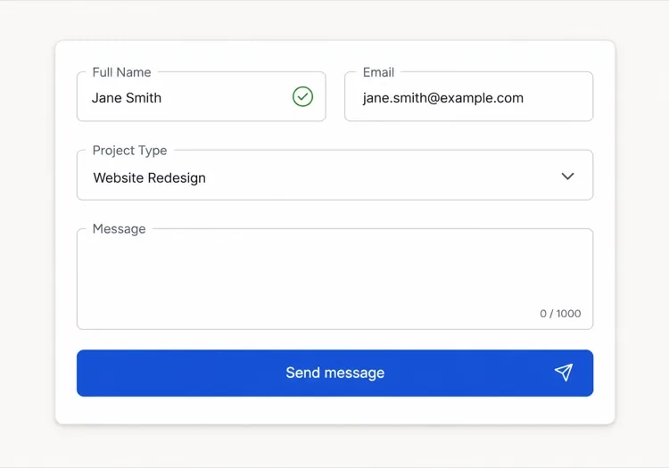
Um input curto de assunto acima de um textarea de mensagem com ajuste automático e contador de 1.000 caracteres, para que mensagens longas expandam o campo em vez de forçar a rolagem dentro de uma caixa fixa.

Painel de configurações do dashboard

Linhas densas de inputs pequenos com labels alinhados à esquerda, campos read-only para valores que o usuário não pode alterar e texto de ajuda explicando o que cada configuração afeta.

Padrões de Input para diferentes sites

O mesmo componente input, ajustado ao tipo de site em que ele entra.

01 / 06

SaaS Signup and Login Inputs

Two fields decide whether the account gets created, so the autocomplete tokens matter more than the styling. Set email and current-password on login and new-password on signup, or password managers offer the wrong entry and people retype credentials they already saved. Put the visibility toggle in the suffix slot as a real button, not a click handler on an icon.

Estilos e variações de Input

Escolha a variação que combina com o resto da página e gere-a.

01 / 06

Outlined Input

A 1px border on a light surface with the label above — the default that works in the widest range of layouts. Keep the focus ring offset from the border rather than replacing it, so the resting and focused widths match and the field does not appear to move on focus.

Input em React, Next.js, Vue e Svelte

React, Next.js, Vue 3, SvelteKit, Astro ou HTML puro — o mesmo input, seis formas de integrar.

01 / 06

React Input

Generate the id with useId so label association survives rendering the field twice on one page. Forward the ref so form libraries like React Hook Form can register the element directly.

src/components/Input.tsx

export const Input = forwardRef(function Input(
  { label, hint, error, ...props },
  ref
) {
  const id = useId()
  return (
    <div className="space-y-1.5">
      <label htmlFor={id}>{label}</label>
      <input id={id} ref={ref} aria-invalid={!!error}
        aria-describedby={id + '-msg'} {...props} />
      <p id={id + '-msg'}>{error ?? hint}</p>
    </div>
  )
})

Como adicionar o seu Input a um projeto

Quatro passos, de escolher um modelo de input até subir para produção.

01~30s

Pick an Input Template

Scan the six templates and start from the field you actually need — labeled text input, affix slots for search or currency, autosizing textarea, or a masked card field.

02~10s

Copy the Prompt

Take the prompt into MeDo, Lovable, Bolt, v0 or Cursor. Name the type, inputMode and autocomplete token per field before you run it, since those three decide which mobile keyboard opens and whether autofill works.

03~1min

Generate and Refine

You get React + Tailwind back with a live preview. Follow up in plain English — "validate on blur only", "add a clear button in the suffix", "reserve the error line" — rather than editing the aria wiring by hand.

04~2min

Wire It to Your Form State

Register the forwarded ref with React Hook Form, Formik or a Server Action and pass the resolver error straight into the error prop. The component owns layout and aria; your form library owns the validation rules.

Perguntas comuns sobre Input

Como gerar um campo de formulário com IA?

Descreva o campo, seu label, seu texto de ajuda e os estados que você precisa em um único prompt, como "input de e-mail com label, texto de dica e estado de erro". O MeDo gera o label, o campo e a região de mensagem como um só componente, com os atributos aria já conectados. Você pode listar vários tipos de campo no mesmo prompt e receber um conjunto consistente.

Qual é a diferença entre placeholder e label?

Um label nomeia o campo de forma permanente e continua visível enquanto a pessoa digita. Um placeholder é texto de dica temporário dentro do campo que desaparece ao digitar, então usá-lo como único label deixa as pessoas adivinhando o que já preencheram. Use um label para o nome do campo e um placeholder apenas para um exemplo de formato.

Os erros de input devem aparecer ao digitar ou depois de enviar?

Valide no blur em vez de a cada tecla, para que um valor digitado parcialmente não seja marcado como errado no meio da entrada. Quando o campo já exibe um erro, revalide no change para que a mensagem desapareça assim que o valor ficar válido. Reserve a validação no envio para checagens que exigem o formulário inteiro, como a confirmação de senha.

A IA pode gerar campos de input acessíveis?

Sim. O MeDo associa o label ao campo usando for e id, liga os textos de ajuda e de erro por aria-describedby e define aria-invalid quando a validação falha. Mencione os campos obrigatórios no seu prompt e ele os marcará com o atributo required em vez de depender apenas de um asterisco.

Como faço um textarea crescer junto com o conteúdo?

Peça um textarea com ajuste automático e uma contagem mínima e máxima de linhas, por exemplo três linhas crescendo até oito antes de rolar. A altura é recalculada a partir do scroll height a cada entrada, e limitar o máximo evita que uma mensagem longa empurre o botão de enviar para fora da tela.

O atributo autocomplete realmente importa?

Importa. Tokens de autocomplete corretos permitem que navegadores e gerenciadores de senha preencham campos em um passo, o que reduz de forma mensurável o abandono em formulários de cadastro e checkout. Diga ao MeDo o que cada campo coleta e ele definirá o token correspondente, incluindo os valores de endereço e pagamento que é fácil errar.