MeDo

Gerador de Alerts com IA.

Descreva a mensagem e o MeDo gera o conjunto completo de alerts inline — variantes de info, sucesso, aviso e erro com barra de destaque, ícone, título, descrição, link de ação opcional e um controle de fechar quando o alert não é permanente.

Alert
Alert

A severidade precisa sobreviver sem a cor

Alertas são o único componente cujo trabalho inteiro é comunicar a gravidade de algo, e a cor é o canal menos confiável para isso. Aproximadamente um em cada doze homens tem alguma forma de deficiência na visão de cores, vermelho e verde são o par mais frequentemente confundido, e o mesmo alerta renderizado em tema escuro, num notebook com pouco brilho ou impresso em escala de cinza perde a distinção por completo. A consequência prática é que um alerta precisa de codificação redundante por construção: uma forma de ícone distinta por severidade e um texto que declare a situação em vez de contar que o leitor a deduza de um tom. Gerar as quatro severidades a partir de uma única descrição é o que mantém o conjunto de ícones genuinamente distinguível, porque eles são escolhidos uns em relação aos outros e não um por vez.

6 modelos

Modelos de Alert que você pode gerar

Cada modelo é um prompt real, não uma captura de tela. Copie para qualquer editor de IA, ou rode no MeDo e receba código React + Tailwind.

BasicFour Severities

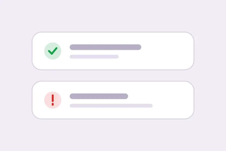
Accent-Bar Alert in Four Tones

The baseline set. Generating all four together is what keeps the icon shapes distinguishable from each other rather than four recolors of one glyph.

Create an inline alert component with four severities — info in blue with a circle icon, success in green with a check, warning in amber with a triangle, error in red with an octagon. Each is full width within its container with a 4px left accent bar in the severity color, a background tinted to roughly 8% of that color, 16px padding, an 8px radius, and a 20px icon aligned to the first text line rather than vertically centered. Render a semibold 15px title with an optional 14px muted description below. Because the alert renders with the page rather than appearing dynamically, use role="region" with an aria-label naming the severity, not role="alert" — an assertive live region on initial paint talks over everything else. Check every tinted background against its text color for 4.5:1 contrast.

Teste no MeDo
ClosableDismissible

Alert With an Opt-In Close Button

Dismissal has to be per-instance, not global. A close button on an expired-payment alert lets the user hide a problem that still exists, and they will.

Add an opt-in dismiss control to an inline alert: a 32px icon button on the right with aria-label="Dismiss" and a visible focus ring, rendered only when a dismissible prop is passed so permanent alerts cannot be closed by accident. On dismiss, remove the alert from the DOM and move focus to the next focusable element after it rather than leaving focus on a detached node. Animate the collapse with height and opacity over 150ms, and skip the animation entirely under prefers-reduced-motion. Accept an onDismiss callback so the caller can persist the dismissal, and document that the alert should reappear on the next session while the underlying condition is unresolved.

Teste no MeDo
With actionActionable

Alert Carrying One Next Step

An alert that names a problem without a route out of it just relocates the work. One action, concretely worded — two actions and neither reads as the primary.

Create an alert variant with a single inline action below the description, rendered in the severity color as a text link with an underline on hover and focus. Keep it to exactly one action so the next step is unambiguous, and require concrete wording in the label — "Update payment method", not "Learn more". If the action navigates, use an anchor; if it mutates state, use a button, and show an inline pending state on the button rather than replacing the alert while the request is in flight. Place the action inside the alert region so its purpose is announced together with the message, and keep its hit area at least 44px tall on touch.

Teste no MeDo
CompactField Error

Single-Line Error Under an Input

No title, no icon block, no accent bar — just the message wired to the input it belongs to. The full alert anatomy next to a text field is visual noise that pushes the form apart.

Create a compact single-line alert for form-field errors: 13px text in the error color with a 14px inline icon, no title, no accent bar and no background tint, sitting 6px below its input with no vertical margin collapse. Give it a stable ID and reference it from the input with aria-describedby, and set aria-invalid="true" on the input at the same time. Because the message appears in response to a submit attempt, wrap it in role="alert" so it is announced immediately — but render the element only when there is an error rather than keeping an empty live region in the DOM, or the first error will be announced as a change to existing content. Reserve the line height so the layout does not jump when the message appears.

Teste no MeDo
GlobalPage Banner

Full-Width Banner Above the App Shell

Trial countdowns, maintenance windows, degraded service. It sits above the layout rather than inside a page, so the thing that breaks is sticky-header offset math, not the alert itself.

Create a full-width alert banner that mounts above the application shell: edge-to-edge tinted background, centered content capped at the app container width, a 16px icon, one line of text and a single inline action, at 44px total height. Because it displaces the layout, expose its height as a CSS custom property on the root element so a sticky header can offset itself instead of being covered. Support a dismissible mode that persists to localStorage keyed by banner ID and version, so editing the message re-shows it to users who dismissed the previous one. Use role="region" with an aria-label rather than role="alert", since the banner is present on load and should not interrupt.

Teste no MeDo
ValidationError Summary

Alert Listing Every Failed Field

The summary above the submit button, with one link per failure jumping to its input. It tells the user how many problems exist — the field-level messages tell them what to fix.

Create a validation summary alert for the top of a form: an error-severity block with a title stating the count — "3 fields need attention" — and an unordered list of links, each labelled with the field name plus the specific problem, each jumping to and focusing its input on click. Render it only after a submit attempt fails, give it role="alert" and move keyboard focus to the alert container itself with tabindex="-1" so a screen reader user lands on the summary rather than hunting for it. Rebuild the list on every failed submit and re-announce even when the set of errors is unchanged. Pair it with per-field messages wired through aria-describedby rather than replacing them.

Teste no MeDo

Como personalizar seu Alert

Pareie uma forma de ícone distinta com cada cor

Peça um ícone específico por severidade — um check para sucesso, um triângulo para aviso, um octógono para erro, um círculo para info. Formas continuam legíveis em escala de cinza e para usuários com daltonismo, e permitem identificar a severidade pela visão periférica antes de ler uma palavra.

Decida de antemão se o alerta é dispensável

Um botão de fechar em um alerta que descreve uma condição não resolvida, como um método de pagamento expirado, deixa o usuário esconder um problema que continua existindo. Faça o fechamento opt-in por instância e mantenha alertas permanentes quando a mensagem só deve desaparecer depois que o estado subjacente mudar.

Separe banners de página de erros de campo

Um alerta de nível de página resume e fica no topo do formulário; um erro de nível de campo fica diretamente sob seu input e é referenciado por aria-describedby. Peça uma variante compacta de uma linha para o caso do campo, para que ela não carregue um bloco de título e ícone ao lado de uma entrada de texto.

Escreva a ação dentro do alerta

Um alerta que descreve um problema sem oferecer uma saída apenas transfere o trabalho de lugar. Especifique um único link de ação inline com texto concreto, como "Atualizar método de pagamento", e mantenha uma só ação para que o próximo passo permaneça óbvio.

Quem usa o componente Alert

Produto SaaS

Um banner de aviso permanente no topo do app quando faltam três dias de teste, com um link de ação "Fazer upgrade", além de alertas de sucesso dentro das páginas de configurações confirmando uma configuração salva.

Loja de e-commerce

Um alerta de info na página do carrinho descrevendo o horário-limite de envio, e um alerta de erro acima do formulário de checkout resumindo os detalhes do pagamento recusado para que a mensagem sobreviva à re-renderização da página.

Dashboard ou ferramenta admin

Alertas de erro nas telas de importação de dados listando quais linhas falharam na validação, e um alerta de info explicando uma janela de manutenção programada que permanece visível até a janela passar.

Site de documentação

Alertas de destaque inline marcando APIs descontinuadas como aviso e comportamentos específicos de versão como info, situados no fluxo do texto onde uma notificação flutuante seria inútil.

Padrões de Alert para diferentes sites

O mesmo componente alert, ajustado ao tipo de site em que ele entra.

01 / 06

SaaS Product Alerts

Trial countdowns and plan limits as permanent banners above the app shell, success alerts inside settings pages after a save. The banner is the tricky one: expose its height as a custom property or your sticky header will sit under it on every route.

Estilos e variações de Alert

Escolha a variação que combina com o resto da página e gere-a.

01 / 06

Left Accent Bar Alert

A 4px bar in the severity color with a tinted fill. The bar gives the eye a vertical edge to scan a stack of alerts against, which matters when three appear together on a settings page — four flat tinted boxes are much harder to separate.

Alert em React, Next.js, Vue e Svelte

React, Next.js, Vue 3, SvelteKit, Astro ou HTML puro — o mesmo alert, seis formas de integrar.

01 / 06

React Alert

A static alert needs no state at all — keep the severity map outside the component so tones and icons stay in one place. Only the dismissible variant needs a hook, so split it out rather than making every alert stateful.

src/components/Alert.tsx

const tones = {
  info: { bar: 'bg-blue-500', bg: 'bg-blue-50', Icon: InfoIcon },
  error: { bar: 'bg-red-500', bg: 'bg-red-50', Icon: OctagonIcon },
}

export function Alert({ severity = 'info', title, children }) {
  const { bar, bg, Icon } = tones[severity]
  return (
    <div role="region" aria-label={severity} className={`flex gap-3 ${bg}`}>
      <span className={`w-1 ${bar}`} />
      <Icon className="mt-0.5 h-5 w-5" />
      <div>
        <p className="font-semibold">{title}</p>
        {children}
      </div>
    </div>
  )
}

Como adicionar o seu Alert a um projeto

Quatro passos, de escolher um modelo de alert até subir para produção.

01~30s

Pick an Alert Pattern

Choose by where the message lives: the four-severity block for in-page state, the compact variant for a field error, the summary for a failed submit, the banner for something app-wide.

02~10s

Copy the Prompt

Take it into MeDo, Lovable, Bolt, v0 or Cursor. Decide whether this alert is dismissible before you run it — that choice determines whether a user can hide an unresolved problem.

03~1min

Generate and Refine

You get all four severities back with a live preview. Follow up in plain English — "add an Update payment method link", "make the error variant outlined", "drop the title on the compact one" — rather than recoloring tints by hand.

04~2min

Place It and Check the Roles

Put page-level alerts above the submit area and field errors under their inputs with aria-describedby. Then confirm the load-time alerts are not using role="alert", or a screen reader will announce them over the rest of the page.

Perguntas comuns sobre Alert

Como gerar um componente de alerta com IA?

Descreva as severidades, a anatomia e se o alerta pode ser dispensado — por exemplo "alertas de info, sucesso, aviso e erro com barra de destaque à esquerda, ícone, título, descrição e um link de ação opcional" — e o MeDo gera as quatro variantes a partir dessa única descrição. Como são produzidas juntas, o padding, o raio e o tamanho dos ícones coincidem entre as severidades.

Qual é a diferença entre um alert e um toast?

Um alert inline vive no layout da página e persiste até que a condição que ele descreve mude, então serve para estados que o usuário pode precisar reler: um problema de faturamento, um aviso de manutenção, um erro de formulário. Um toast é uma notificação passageira que flutua sobre a página e desaparece após alguns segundos, então serve para confirmar uma ação que o usuário acabou de realizar. Use um alert quando a mensagem tiver que continuar lá depois de um scroll ou um recarregamento.

Um alerta deve ser dispensável?

Só quando a mensagem é informativa e perdê-la não custa nada. Se o alerta descreve um problema não resolvido, mantenha-o permanente e deixe que ele se limpe sozinho quando o estado for resolvido; caso contrário, dispensar esconde uma questão que ainda precisa de atenção. Um meio-termo comum é ser dispensável, mas o alerta reaparecer na próxima sessão até ser corrigido.

Um alerta consegue transmitir severidade sem usar cor?

Tem que conseguir. Pareie cada severidade com uma forma de ícone distinta e um texto que nomeie a situação, para que uma tela em escala de cinza ou um leitor com daltonismo ainda receba a mensagem. Peça ao MeDo codificação de ícone mais texto no prompt e ele atribuirá um glifo diferente por severidade em vez de recolorir o mesmo ícone quatro vezes.

Onde deve ficar um alerta de erro de formulário?

Coloque um alerta de resumo logo acima da área de envio ou no topo do formulário, e as mensagens individuais sob seus próprios campos, conectadas com aria-describedby e aria-invalid. O resumo diz ao usuário quantos problemas existem, as mensagens de campo dizem o que corrigir, e ter os dois significa que usuários de teclado e leitor de tela não ficam caçando a falha.

Um alerta precisa de role="alert"?

Nem sempre. Use role="alert" apenas para mensagens que aparecem dinamicamente e precisam interromper, como uma falha de validação após uma tentativa de envio. Um alerta presente quando a página carrega deveria ser uma região simples ou usar role="status", porque uma live region assertiva na renderização inicial simplesmente fala por cima de todo o resto da página.