MeDo

Gerador de Seção de Blog com IA.

Descreva o layout de blog que você quer — estilo de card, número de posts, artigo em destaque, filtros de categoria — e MeDo gera o componente completo. Entregue uma seção de blog polida sem tocar em uma única propriedade CSS grid.

Seção de Blog
Seção de Blog

Uma ótima seção de blog transforma leitores em visitantes recorrentes.

Seu blog é um dos seus ativos mais valiosos para SEO e construção de confiança — mas somente se os visitantes conseguirem encontrá-lo e explorá-lo. Uma seção de blog bem projetada exibe seu melhor conteúdo imediatamente, comunica autoridade temática através de categorias visíveis e guia os leitores de uma página de destino para seu funil de conteúdo. MeDo permite gerar exatamente o layout que se adapta à sua marca e volume de conteúdo, em vez de se encaixar em um tema genérico.

6 modelos

Modelos de Seção de Blog que você pode gerar

Cada modelo é um prompt real, não uma captura de tela. Copie para qualquer editor de IA, ou rode no MeDo e receba código React + Tailwind.

Three cardAcme

Three-Card Homepage Preview

The smallest blog section that still looks intentional. Three posts and a View all link — enough to prove the blog is alive without turning a marketing page into an index.

Create a blog preview section with a section heading, a one-line subheading and a three-column card grid. Each card holds a 16:9 cover image in a fixed aspect-ratio box, a category pill above the title, a two-line title clamped with line-clamp-2, a two-line excerpt clamped with line-clamp-2, and a footer row with author name, publish date in a time element with a machine-readable datetime, and a reading-time estimate. Make the whole card one link with the heading as the accessible name rather than adding a separate Read more link. Below the grid, a centred View all posts link. Two columns on tablet, one on mobile, with the cover images lazy loaded.

Teste no MeDo
Featured splitEditorial

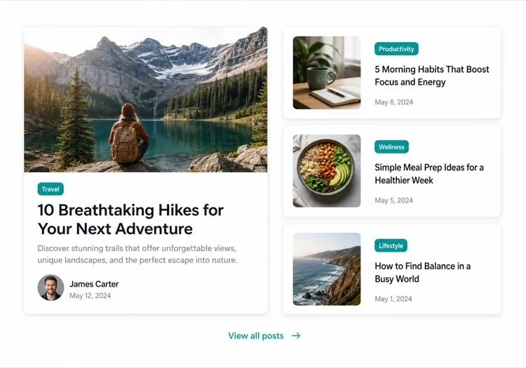
One Featured Post, Three Stacked

Creates a clear lead story, which an even grid never does. Only works if the featured post is genuinely your best — promoting whatever published last makes the asymmetry look arbitrary.

Create an asymmetric blog section: on the left, a featured post card taking about 60% of the width with a large 3:2 cover image, a category pill, a headline at display size, a three-line excerpt and an author row with avatar, date and reading time. On the right, three compact cards stacked vertically, each with a small square thumbnail on the left and a category, a two-line clamped title and a date on the right. Divide the stacked cards with hairline rules rather than shadows so they read as a list next to the feature. Stack the feature above the list on tablet and below on mobile, keeping the feature image eager loaded.

Teste no MeDo
Index gridMega

Paginated Post Index

The standalone blog page rather than a homepage teaser. Nine cards is the ceiling before the grid stops being scannable — past that, pagination beats a longer page or infinite scroll.

Create a blog index section: a page heading, a horizontal row of category filter chips, and a nine-card grid at three columns. Each card carries a cover image in a fixed 16:9 box, a category pill, a clamped two-line title, a clamped two-line excerpt, and a meta row with author, a time element for the date and a reading time. Below the grid, numbered pagination with previous and next controls, aria-current on the active page, and real anchor hrefs to /blog/page/2 so pages are crawlable and linkable rather than swapped in by client state. Show a labelled empty state when a filter returns nothing. Two columns on tablet, one on mobile.

Teste no MeDo
Text listLedger

Dated List With No Images

No thumbnails, just date, title and one line of description. Faster to scan than any card grid and the honest choice when your posts have no cover art — a grid of stock photography reads worse than plain text.

Create an image-free blog list: rows separated by hairline rules, each row showing a left-aligned date in a fixed-width muted column, then the post title as a link at large text size, a one-line clamped description beneath it, and a right-aligned reading time. Group the rows under year headings when the list spans multiple years. Give each row a full-width hover background so the whole row reads as the hit target, and keep the vertical rhythm tight so twenty posts fit in two screens. Stack the date above the title on mobile. Use an ordered list with time elements for the dates.

Teste no MeDo
Category tabsStudio

Topic Tabs Over a Card Grid

Turns a mixed blog into something a reader can navigate by interest. Needs at least a few posts per tab — a tab that opens onto two articles makes the blog look thinner than one undivided grid would.

Create a blog section with topic tabs above a six-card grid: tabs labelled All, Engineering, Design and Product with a post count beside each. Use real tab semantics — a tablist with arrow-key navigation, aria-selected, and managed focus — and reflect the active tab in the URL so a topic view is linkable. Switching a tab swaps the card set with a short fade rather than a layout jump, and keeps the grid height stable by always rendering a fixed number of card slots. Each card has a cover image, category pill, clamped title and excerpt, and a meta row with author and date. Announce the result count in an aria-live region.

Teste no MeDo
ChangelogShipfast

Release Notes Timeline

A blog section for product updates, where version and date matter more than a cover image. Keep the newest entry expanded and the rest collapsed so the page opens on what changed most recently.

Create a changelog-style blog section: a vertical timeline with a left rail of dots and connecting line, each entry showing a version tag, a date in a time element, a type pill for Added, Fixed or Changed, a title and a two-to-three sentence summary. Expand the most recent entry by default and render the rest as collapsed disclosure panels using button plus aria-expanded so keyboard users can open them. Add anchor links on each version so a specific release can be linked directly, and a Subscribe to updates link at the top of the section. Collapse the left rail to a simple stacked list on mobile.

Teste no MeDo

Como personalizar seu Seção de Blog

Comece com um post em destaque

Destaque seu artigo mais importante com um card maior — inclua uma imagem de capa de largura total, um trecho mais longo e um tratamento visual distinto. Diga ao MeDo qual post é "featured" e ele criará o layout assimétrico automaticamente.

Adicione filtros de categoria ou tag

Se você publica sobre vários tópicos, peça ao MeDo para incluir uma barra de filtros horizontal acima da grade. Isso transforma sua seção de blog em uma ferramenta de descoberta de autoatendimento e mantém os leitores na página por mais tempo.

Mostre o contexto do autor

Incluir um avatar do autor, nome e estimativa de tempo de leitura cria confiança e define as expectativas dos leitores. Mencione esses campos de metadados no seu prompt para que sejam incorporados em cada card.

Controle a densidade dos cards com a contagem de posts

Especifique exatamente quantos posts mostrar — três cards para uma prévia compacta na página inicial, seis a nove para uma página de índice de blog independente. Combine com um CTA "Ver todos" para evitar uma grade infinita em páginas de marketing.

Quem usa o componente Seção de Blog

Site de marketing SaaS

Uma seção de prévia de três cards na página inicial com links para tutoriais de produtos, histórias de clientes e notas de versão — gerando tráfego para o blog sem sobrecarregar o fluxo de conversão.

Publicação focada em conteúdo

Um layout editorial de largura total com um artigo principal, abas de categorias e uma grade de cards paginada — tudo o que os leitores esperam de uma publicação profissional.

Agência ou estúdio

Um mosaico minimalista de duas colunas com estudos de caso e posts de liderança de pensamento, mostrando profundidade de expertise para clientes potenciais antes mesmo de clicarem.

Marca de e-commerce

Uma seção de blog lifestyle com imagens grandes e teasers curtos que levam a guias de compra, compilações de tendências e histórias dos bastidores que aumentam a intenção de compra.

Padrões de Seção de Blog para diferentes sites

O mesmo componente seção de blog, ajustado ao tipo de site em que ele entra.

01 / 06

SaaS Marketing Blog Section

A three-card teaser on the homepage, not an index. The job is proving the product is maintained and that someone is writing about the problem, so lead with the tutorial or customer story — release notes belong in their own changelog, not competing for the same three slots.

Estilos e variações de Seção de Blog

Escolha a variação que combina com o resto da página e gere-a.

01 / 06

Three-Card Grid

Equal cards in one row with a View all link beneath. The right default on a marketing page where the blog is supporting evidence rather than the destination, and it stays honest when you have only published a handful of posts.

Seção de Blog em React, Next.js, Vue e Svelte

React, Next.js, Vue 3, SvelteKit, Astro ou HTML puro — o mesmo seção de blog, seis formas de integrar.

01 / 06

React Blog Section

Keep the posts in one typed array and let the card be a pure function of a post. No state is needed unless you add filters, which is what makes this section safe to render on the server.

src/components/BlogSection.tsx

type Post = { slug: string; title: string; excerpt: string; date: string; minutes: number }

export function BlogSection({ posts }: { posts: Post[] }) {
  return (
    <ul className="grid gap-8 md:grid-cols-3">
      {posts.map((post) => (
        <PostCard key={post.slug} post={post} />
      ))}
    </ul>
  )
}

Como adicionar o seu Seção de Blog a um projeto

Quatro passos, de escolher um modelo de seção de blog até subir para produção.

01~30s

Pick a Blog Layout

Choose by post volume and by whether you have cover art — three cards for a homepage teaser, a featured split when one post should lead, a dated list when the posts have no images worth showing.

02~10s

Copy the Prompt

Take the prompt into MeDo, or paste it into Lovable, Bolt, v0 or Cursor. Name the metadata you actually have first — author, reading time, category — since a card designed around fields you cannot populate is the usual reason these sections get rebuilt.

03~1min

Generate and Refine

You get React + Tailwind back with a live preview. Follow up in plain English — "clamp titles to two lines", "drop the excerpt on mobile", "move the category above the title" — instead of tuning class strings by hand.

04~2min

Connect Your Posts

Point the component at your real source — an MDX directory, a content collection or a CMS query — and map the fields once. Sort by date server-side and let the card stay a pure function of a post.

Perguntas comuns sobre Seção de Blog

Como criar uma seção de blog com IA?

Abra o MeDo e descreva o layout de blog que você precisa — estilo de card, número de posts, se quer um artigo em destaque, quais campos de metadados mostrar (autor, data, tempo de leitura) e quaisquer filtros. MeDo gera o código completo do componente em segundos. Você pode então copiá-lo para seu projeto e continuar refinando com prompts adicionais.

Qual é o melhor gerador de seção de blog com IA?

MeDo é construído especificamente para gerar componentes de sites reais, não apenas mockups de design. Ao contrário das ferramentas de chat de IA gerais, MeDo entende sistemas de layout, padrões de cards e comportamento responsivo — então sua seção de blog sai como código limpo pronto para produção em vez de um ponto de partida bruto que precisa de edição pesada.

A IA pode gerar uma grade de cards de blog responsiva?

Sim. MeDo gera componentes responsivos em primeiro lugar. Especifique quantas colunas você quer no tamanho desktop e ele lida com os breakpoints automaticamente — colapsando para uma pilha de coluna única em dispositivos móveis sem trabalho extra da sua parte.

Como adicionar filtros de categoria a uma seção de blog gerada por IA?

Inclua o requisito de filtro no seu prompt — por exemplo, "adicione abas de filtro de categoria para Design, Engenharia e Produto acima da grade de cards." MeDo gerará a UI do filtro e a lógica de exibição condicional correspondente.

Posso usar IA para gerar um layout de post de blog em destaque?

Com certeza. Peça ao MeDo um layout assimétrico com um grande card em destaque e cards secundários menores ao lado. Esse padrão editorial é uma das formas mais eficazes de destacar o conteúdo principal enquanto ainda exibe vários posts recentes.

A seção de blog gerada por IA inclui metadados de autor e data?

Sim — apenas mencione os metadados que você quer no seu prompt. MeDo pode incluir nome e avatar do autor, data de publicação, tempo estimado de leitura, tag de categoria e trecho. Você controla exatamente o que aparece em cada card.