MeDo

Generador de Inputs con IA.

Describe tu formulario y MeDo genera el input de texto y el textarea a la vez — etiquetas, texto de ayuda, estados de error, afijos de prefijo y sufijo, contadores de caracteres y autoajuste de altura, todo conectado a los atributos de accesibilidad correctos.

Input
Input

La caja es la parte más pequeña de un input

Casi todo el trabajo de un input no tiene nada que ver con el campo en sí. La etiqueta, el texto de ayuda, el espacio de error y el espaciado entre ellos son lo que hace usable un formulario, y son justo las partes que las librerías de componentes suelen dejar al consumidor. Así los equipos escriben markup envolvente a medida para cada formulario, y el ritmo vertical se desvía campo por campo hasta que nada queda alineado. Generar la etiqueta, la descripción y la región de error como una sola unidad fija su relación una vez para siempre. También elimina el defecto de accesibilidad más común en formularios web: un mensaje de error renderizado junto a un campo pero nunca conectado programáticamente a él.

6 plantillas

Plantillas de Input que puedes generar

Cada plantilla es un prompt real, no una captura de pantalla. Cópialo en cualquier editor de IA o ejecútalo en MeDo y obtén código React + Tailwind.

BasicLabel + Field

Labeled Input With Helper Text

The baseline every other field extends. Label, field, and a message region that already occupies its line at rest so the form does not grow when an error appears.

Create a text input component with a visible label above the field, wired with a generated id and a matching for attribute rather than wrapping the input in the label. Below it, a helper text line linked through aria-describedby. Reserve the height of that line at rest so the form does not shift when an error replaces it. The field is 40px tall with an 8px radius, a 1px grey border, and a 2px focus-visible ring offset from the border. Add a required prop that sets the required attribute and appends a visually hidden "required" to the label rather than relying on an asterisk alone. Accept type, inputMode and autocomplete as props with no defaults, so each call site declares them.


Prueba en MeDo
ErrorsValidation States

Error, Success and Warning States

Where most form bugs live. An error message rendered beside a field but never connected to it is the most common accessibility defect in web forms.

Add validation states to a text input: error with a red border, a red message replacing the helper text, aria-invalid="true", and the message linked through aria-describedby so it is announced when focus enters the field. Add success and warning states that change the border and the leading icon but keep the same message slot and line height. Never signal state by border color alone — pair every state with an icon and text. Validate on blur, then revalidate on change only once the field is already in an error state, so a half-typed email is not flagged mid-entry. Announce late server-side errors through a polite live region.

Prueba en MeDo
AffixesAffix Slots

Prefix and Suffix Inside the Field

Search icons, currency symbols, unit suffixes, password toggles. The trap is padding — an affix rendered over the field without matching inset padding lets typed text slide underneath it.

Create a text input with optional prefix and suffix slots rendered inside the field border. Static affixes such as a currency symbol or a .com suffix get aria-hidden and muted text; interactive affixes such as a password visibility toggle or a clear button render as real buttons with their own aria-label and stay reachable by keyboard. Increase the field padding to match each affix width so typed text never slides under it. Keep the focus ring on the outer wrapper, not the bare input, so the ring surrounds the affixes too. Include a search variant with a leading magnifier and a trailing clear button that appears only when the field has a value.

Prueba en MeDo
TextareaAutosize Textarea

Growing Textarea With a Counter

A fixed three-row box for a support message forces people to scroll inside a scroll. Growing to a cap keeps the submit button on screen.

Create a textarea that shares the label, helper text and error layout of the text input. Autosize from a three-row minimum up to eight rows, recalculating the height from scrollHeight on input after resetting it, then switch to internal scrolling at the cap so a long message cannot push the submit button off screen. Add an optional character counter in the bottom right showing used and total, turning amber at 90 percent of the limit and red at the limit, announced through a polite live region rather than on every keystroke. Disable the native resize handle only when autosizing is on, otherwise leave it available.

Prueba en MeDo
FormattingMasked Field

Card, Phone and Date Inputs

Formatted fields where the input event rewrites the value. Get the caret handling wrong and editing the middle of a card number jumps the cursor to the end on every keystroke.

Create a formatted input for card numbers, phone numbers and expiry dates. Insert separators as the user types — spaces every four digits for cards, a slash after the month for expiry — while storing the unformatted value in state and submitting that. Preserve the caret position when the mask inserts a character mid-string, rather than letting the value reset send it to the end. Set inputMode="numeric" and the correct autocomplete token: cc-number, tel, cc-exp. Accept paste of an already-formatted value by stripping non-digits first. Validate length on blur and keep the field editable in the error state.

Prueba en MeDo
LayoutField Group

Multi-Field Row With Shared Rhythm

City and postcode on one line, expiry and CVC side by side. The point is a single spacing scale, since per-form wrapper markup is what makes vertical rhythm drift.

Create a form field group component that lays out two or three inputs on one row using a grid, collapsing to a single column below 640px. Keep a shared vertical gap between rows and align the labels on a single baseline even when one field carries helper text and its neighbor does not, by reserving the message line in every field. Group semantically related fields in a fieldset with a legend, such as an address block, so screen readers announce the group name before each field. Let each field declare its own width in grid columns rather than a hardcoded percentage, so a postcode field can be narrower than a city field.

Prueba en MeDo

Cómo personalizar tu Input

Pide siempre una etiqueta real

Un placeholder no es una etiqueta. Desaparece en el momento en que alguien empieza a escribir, lo que deja perdido a quien se interrumpe a medio formulario, y la mayoría de lectores de pantalla lo tratan como texto opcional. Pide una etiqueta visible vinculada al campo con <label for>, y usa el placeholder solo para ejemplos de formato como MM/AA.

Reserva espacio para el mensaje de error

Si el texto de error aparece solo cuando falla la validación, el campo de abajo salta al enviar. Indica que la región de ayuda y error ocupe una altura de línea fija en reposo, para que la altura del formulario nunca cambie cuando aparecen mensajes.

Nombra los tipos de input que necesitas

Especifica type e inputMode por campo: email, tel y numeric abren teclados móviles distintos. Combínalos con los tokens de autocomplete correctos, como email, tel, current-password y one-time-code, para que navegadores y gestores de contraseñas puedan rellenar el formulario.

Decide cuándo se dispara la validación

Validar en cada pulsación marca como incorrecto un email a medio escribir antes de que nadie termine. Pide validación en blur con revalidación en change una vez que el campo ya está en estado de error: corrige los fallos sin agobiar.

Quién usa el componente Input

Formulario de registro o inicio de sesión

Campos de email y contraseña con un botón de visibilidad en el espacio de sufijo, una pista de fortaleza de contraseña en el texto de ayuda y tokens de autocomplete definidos para que los navegadores ofrezcan credenciales guardadas en lugar de campos vacíos.

Flujo de pago

Inputs de número de tarjeta, caducidad y código postal con modos de entrada numéricos, un prefijo de moneda en el campo de importe y validación en blur para que un número de tarjeta a medio escribir nunca se marque como inválido.

Formulario de soporte o contacto

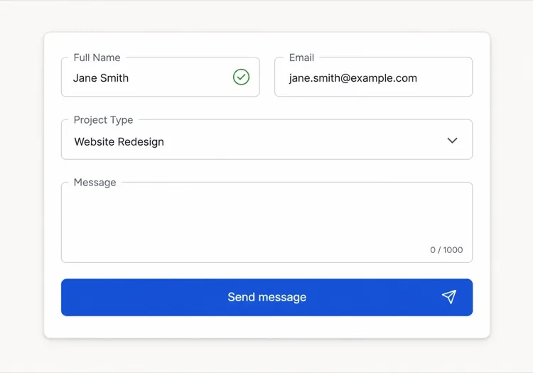
Un input corto de asunto sobre un textarea de mensaje con autoajuste y contador de 1.000 caracteres, para que los mensajes largos expandan el campo en lugar de obligar a hacer scroll dentro de una caja fija.

Panel de ajustes del dashboard

Filas densas de inputs pequeños con etiquetas alineadas a la izquierda, campos read-only para valores que el usuario no puede cambiar y texto de ayuda que explica a qué afecta cada ajuste.

Patrones de Input para distintos sitios web

El mismo componente input, adaptado al tipo de sitio donde se publica.

01 / 06

SaaS Signup and Login Inputs

Two fields decide whether the account gets created, so the autocomplete tokens matter more than the styling. Set email and current-password on login and new-password on signup, or password managers offer the wrong entry and people retype credentials they already saved. Put the visibility toggle in the suffix slot as a real button, not a click handler on an icon.

Estilos y variantes de Input

Elige la variante que encaje con el resto de la página y genérala.

01 / 06

Outlined Input

A 1px border on a light surface with the label above — the default that works in the widest range of layouts. Keep the focus ring offset from the border rather than replacing it, so the resting and focused widths match and the field does not appear to move on focus.

Input en React, Next.js, Vue y Svelte

React, Next.js, Vue 3, SvelteKit, Astro o HTML puro: el mismo input, seis formas de integrarlo.

01 / 06

React Input

Generate the id with useId so label association survives rendering the field twice on one page. Forward the ref so form libraries like React Hook Form can register the element directly.

src/components/Input.tsx

export const Input = forwardRef(function Input(
  { label, hint, error, ...props },
  ref
) {
  const id = useId()
  return (
    <div className="space-y-1.5">
      <label htmlFor={id}>{label}</label>
      <input id={id} ref={ref} aria-invalid={!!error}
        aria-describedby={id + '-msg'} {...props} />
      <p id={id + '-msg'}>{error ?? hint}</p>
    </div>
  )
})

Cómo añadir tu Input a un proyecto

Cuatro pasos, desde elegir una plantilla de input hasta llevarlo a producción.

01~30s

Pick an Input Template

Scan the six templates and start from the field you actually need — labeled text input, affix slots for search or currency, autosizing textarea, or a masked card field.

02~10s

Copy the Prompt

Take the prompt into MeDo, Lovable, Bolt, v0 or Cursor. Name the type, inputMode and autocomplete token per field before you run it, since those three decide which mobile keyboard opens and whether autofill works.

03~1min

Generate and Refine

You get React + Tailwind back with a live preview. Follow up in plain English — "validate on blur only", "add a clear button in the suffix", "reserve the error line" — rather than editing the aria wiring by hand.

04~2min

Wire It to Your Form State

Register the forwarded ref with React Hook Form, Formik or a Server Action and pass the resolver error straight into the error prop. The component owns layout and aria; your form library owns the validation rules.

Preguntas frecuentes sobre Input

¿Cómo genero un campo de formulario con IA?

Describe el campo, su etiqueta, su texto de ayuda y los estados que necesitas en un solo prompt, por ejemplo "input de email con etiqueta, texto de pista y estado de error". MeDo genera la etiqueta, el campo y la región de mensajes como un único componente con los atributos aria ya conectados. Puedes listar varios tipos de campo en el mismo prompt y recibir un conjunto coherente.

¿Cuál es la diferencia entre un placeholder y una etiqueta?

Una etiqueta nombra el campo de forma permanente y sigue visible mientras alguien escribe. Un placeholder es texto de pista temporal dentro del campo que desaparece al escribir, así que usarlo como única etiqueta deja a la gente adivinando qué ya ha rellenado. Usa una etiqueta para el nombre del campo y un placeholder solo para un ejemplo de formato.

¿Los errores del input deben aparecer al escribir o después de enviar?

Valida en blur en lugar de en cada pulsación, para que un valor a medio escribir no se marque como erróneo durante la entrada. Cuando un campo ya muestra un error, revalida en change para que el mensaje desaparezca en cuanto el valor sea válido. Reserva la validación al enviar para comprobaciones que necesitan todo el formulario, como la confirmación de contraseña.

¿Puede la IA generar campos de entrada accesibles?

Sí. MeDo asocia la etiqueta al campo mediante for e id, vincula el texto de ayuda y de error con aria-describedby, y establece aria-invalid cuando la validación falla. Menciona los campos obligatorios en tu prompt y los marcará con el atributo required en lugar de depender solo de un asterisco.

¿Cómo hago que un textarea crezca con su contenido?

Pide un textarea con autoajuste y un número mínimo y máximo de filas, por ejemplo tres filas que crezcan hasta ocho antes de hacer scroll. La altura se recalcula a partir del scroll height en cada entrada, y limitar el máximo evita que un mensaje largo empuje el botón de enviar fuera de pantalla.

¿Realmente importa el atributo autocomplete?

Sí. Los tokens de autocomplete correctos permiten a navegadores y gestores de contraseñas rellenar campos en un paso, lo que reduce de forma medible el abandono en formularios de registro y pago. Dile a MeDo qué recoge cada campo y definirá el token adecuado, incluidos los valores de dirección y pago que es fácil equivocar.