MeDo

Generatore di Input IA.

Descrivi il tuo form e MeDo genera insieme input di testo e textarea — label, testo di aiuto, stati di errore, affissi prefisso e suffisso, contatori di caratteri e ridimensionamento automatico, tutto collegato ai giusti attributi di accessibilità.

Input
Input

La casella è la parte più piccola di un input

La maggior parte del lavoro su un input non riguarda il campo in sé. La label, il testo di aiuto, lo spazio per l'errore e la spaziatura tra di essi sono ciò che rende un form utilizzabile, e sono proprio le parti che le librerie di componenti tendono a lasciare al consumatore. Così i team scrivono markup wrapper su misura per ogni form, e il ritmo verticale devia campo dopo campo finché nulla è più allineato. Generare label, descrizione e area di errore come un'unica unità fissa la loro relazione una volta per tutte. Elimina anche il difetto di accessibilità più comune nei form web: un messaggio di errore mostrato accanto a un campo ma mai collegato programmaticamente ad esso.

6 modelli

Modelli di Input che puoi generare

Ogni modello è un prompt reale, non uno screenshot. Copialo in qualsiasi editor IA, oppure eseguilo in MeDo e ottieni codice React + Tailwind.

BasicLabel + Field

Labeled Input With Helper Text

The baseline every other field extends. Label, field, and a message region that already occupies its line at rest so the form does not grow when an error appears.

Create a text input component with a visible label above the field, wired with a generated id and a matching for attribute rather than wrapping the input in the label. Below it, a helper text line linked through aria-describedby. Reserve the height of that line at rest so the form does not shift when an error replaces it. The field is 40px tall with an 8px radius, a 1px grey border, and a 2px focus-visible ring offset from the border. Add a required prop that sets the required attribute and appends a visually hidden "required" to the label rather than relying on an asterisk alone. Accept type, inputMode and autocomplete as props with no defaults, so each call site declares them.


Prova in MeDo
ErrorsValidation States

Error, Success and Warning States

Where most form bugs live. An error message rendered beside a field but never connected to it is the most common accessibility defect in web forms.

Add validation states to a text input: error with a red border, a red message replacing the helper text, aria-invalid="true", and the message linked through aria-describedby so it is announced when focus enters the field. Add success and warning states that change the border and the leading icon but keep the same message slot and line height. Never signal state by border color alone — pair every state with an icon and text. Validate on blur, then revalidate on change only once the field is already in an error state, so a half-typed email is not flagged mid-entry. Announce late server-side errors through a polite live region.

Prova in MeDo
AffixesAffix Slots

Prefix and Suffix Inside the Field

Search icons, currency symbols, unit suffixes, password toggles. The trap is padding — an affix rendered over the field without matching inset padding lets typed text slide underneath it.

Create a text input with optional prefix and suffix slots rendered inside the field border. Static affixes such as a currency symbol or a .com suffix get aria-hidden and muted text; interactive affixes such as a password visibility toggle or a clear button render as real buttons with their own aria-label and stay reachable by keyboard. Increase the field padding to match each affix width so typed text never slides under it. Keep the focus ring on the outer wrapper, not the bare input, so the ring surrounds the affixes too. Include a search variant with a leading magnifier and a trailing clear button that appears only when the field has a value.

Prova in MeDo
TextareaAutosize Textarea

Growing Textarea With a Counter

A fixed three-row box for a support message forces people to scroll inside a scroll. Growing to a cap keeps the submit button on screen.

Create a textarea that shares the label, helper text and error layout of the text input. Autosize from a three-row minimum up to eight rows, recalculating the height from scrollHeight on input after resetting it, then switch to internal scrolling at the cap so a long message cannot push the submit button off screen. Add an optional character counter in the bottom right showing used and total, turning amber at 90 percent of the limit and red at the limit, announced through a polite live region rather than on every keystroke. Disable the native resize handle only when autosizing is on, otherwise leave it available.

Prova in MeDo
FormattingMasked Field

Card, Phone and Date Inputs

Formatted fields where the input event rewrites the value. Get the caret handling wrong and editing the middle of a card number jumps the cursor to the end on every keystroke.

Create a formatted input for card numbers, phone numbers and expiry dates. Insert separators as the user types — spaces every four digits for cards, a slash after the month for expiry — while storing the unformatted value in state and submitting that. Preserve the caret position when the mask inserts a character mid-string, rather than letting the value reset send it to the end. Set inputMode="numeric" and the correct autocomplete token: cc-number, tel, cc-exp. Accept paste of an already-formatted value by stripping non-digits first. Validate length on blur and keep the field editable in the error state.

Prova in MeDo
LayoutField Group

Multi-Field Row With Shared Rhythm

City and postcode on one line, expiry and CVC side by side. The point is a single spacing scale, since per-form wrapper markup is what makes vertical rhythm drift.

Create a form field group component that lays out two or three inputs on one row using a grid, collapsing to a single column below 640px. Keep a shared vertical gap between rows and align the labels on a single baseline even when one field carries helper text and its neighbor does not, by reserving the message line in every field. Group semantically related fields in a fieldset with a legend, such as an address block, so screen readers announce the group name before each field. Let each field declare its own width in grid columns rather than a hardcoded percentage, so a postcode field can be narrower than a city field.

Prova in MeDo

Come personalizzare il tuo Input

Chiedi sempre una label vera

Un placeholder non è una label. Scompare nel momento in cui qualcuno inizia a digitare, lasciando in difficoltà chi viene interrotto a metà form, e la maggior parte degli screen reader lo tratta come testo opzionale. Chiedi una label visibile collegata al campo con <label for> e usa il placeholder solo per esempi di formato come MM/AA.

Riserva spazio per il messaggio di errore

Se il testo di errore compare solo quando la validazione fallisce, il campo sottostante si sposta in basso all'invio. Specifica che l'area di aiuto ed errore occupi un'altezza di riga fissa a riposo, così l'altezza del form non cambia mai quando appaiono i messaggi.

Indica i tipi di input che ti servono

Specifica type e inputMode per ogni campo: email, tel e numeric richiamano tastiere mobili diverse. Abbinali ai token autocomplete corretti, come email, tel, current-password e one-time-code, così browser e gestori di password possono compilare il form.

Decidi quando scatta la validazione

Validare a ogni battuta segnala un'email digitata a metà come errata prima che qualcuno abbia finito. Chiedi la validazione al blur con rivalidazione al change quando un campo è già in stato di errore: corregge gli errori senza risultare insistente.

Chi usa il componente Input

Form di registrazione o login

Campi email e password con un pulsante di visibilità inline nello slot suffisso, un suggerimento sulla robustezza della password nel testo di aiuto e token autocomplete impostati perché i browser propongano le credenziali salvate invece di campi vuoti.

Flusso di checkout

Input per numero di carta, scadenza e CAP con modalità di inserimento numerica, un prefisso di valuta sul campo importo e validazione al blur perché un numero di carta digitato parzialmente non venga mai segnalato come non valido.

Form di supporto o contatto

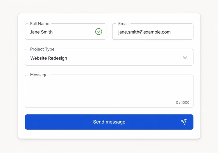
Un breve input oggetto sopra una textarea messaggio auto-espandibile con contatore da 1.000 caratteri, così i messaggi lunghi allargano il campo invece di costringere a scorrere dentro una casella fissa.

Pannello impostazioni della dashboard

Righe dense di input piccoli con label allineate a sinistra, campi read-only per i valori che l'utente non può modificare e testo di aiuto che spiega cosa influenza ogni impostazione.

Pattern di Input per siti web diversi

Lo stesso componente input, calibrato sul tipo di sito su cui viene pubblicato.

01 / 06

SaaS Signup and Login Inputs

Two fields decide whether the account gets created, so the autocomplete tokens matter more than the styling. Set email and current-password on login and new-password on signup, or password managers offer the wrong entry and people retype credentials they already saved. Put the visibility toggle in the suffix slot as a real button, not a click handler on an icon.

Stili e varianti di Input

Scegli la variante che si adatta al resto della pagina, poi generala.

01 / 06

Outlined Input

A 1px border on a light surface with the label above — the default that works in the widest range of layouts. Keep the focus ring offset from the border rather than replacing it, so the resting and focused widths match and the field does not appear to move on focus.

Input in React, Next.js, Vue e Svelte

React, Next.js, Vue 3, SvelteKit, Astro o HTML puro: lo stesso input, sei modi per integrarlo.

01 / 06

React Input

Generate the id with useId so label association survives rendering the field twice on one page. Forward the ref so form libraries like React Hook Form can register the element directly.

src/components/Input.tsx

export const Input = forwardRef(function Input(
  { label, hint, error, ...props },
  ref
) {
  const id = useId()
  return (
    <div className="space-y-1.5">
      <label htmlFor={id}>{label}</label>
      <input id={id} ref={ref} aria-invalid={!!error}
        aria-describedby={id + '-msg'} {...props} />
      <p id={id + '-msg'}>{error ?? hint}</p>
    </div>
  )
})

Come aggiungere il tuo Input a un progetto

Quattro passaggi, dalla scelta di un modello di input alla messa in produzione.

01~30s

Pick an Input Template

Scan the six templates and start from the field you actually need — labeled text input, affix slots for search or currency, autosizing textarea, or a masked card field.

02~10s

Copy the Prompt

Take the prompt into MeDo, Lovable, Bolt, v0 or Cursor. Name the type, inputMode and autocomplete token per field before you run it, since those three decide which mobile keyboard opens and whether autofill works.

03~1min

Generate and Refine

You get React + Tailwind back with a live preview. Follow up in plain English — "validate on blur only", "add a clear button in the suffix", "reserve the error line" — rather than editing the aria wiring by hand.

04~2min

Wire It to Your Form State

Register the forwarded ref with React Hook Form, Formik or a Server Action and pass the resolver error straight into the error prop. The component owns layout and aria; your form library owns the validation rules.

Domande comuni su Input

Come genero un campo form con l'IA?

Descrivi il campo, la sua label, il testo di aiuto e gli stati che ti servono in un unico prompt, ad esempio "input email con label, testo di suggerimento e stato di errore". MeDo genera label, campo e area messaggi come un singolo componente con gli attributi aria già collegati. Puoi elencare più tipi di campo nello stesso prompt e ottenere un set coerente.

Qual è la differenza tra placeholder e label?

Una label nomina il campo in modo permanente e resta visibile mentre si digita. Un placeholder è un testo di suggerimento temporaneo dentro il campo che svanisce all'input, quindi usarlo come unica label costringe le persone a indovinare cosa hanno già compilato. Usa una label per il nome del campo e un placeholder solo per un esempio di formato.

Gli errori dell'input devono comparire durante la digitazione o dopo l'invio?

Valida al blur invece che a ogni battuta, così un valore digitato parzialmente non viene segnalato come errato durante l'inserimento. Quando un campo mostra già un errore, rivalida al change perché il messaggio scompaia appena il valore diventa valido. Riserva la validazione all'invio ai controlli che richiedono tutto il form, come la conferma della password.

L'IA può generare campi di input accessibili?

Sì. MeDo associa la label al campo tramite for e id, collega i testi di aiuto ed errore con aria-describedby e imposta aria-invalid quando la validazione fallisce. Menziona i campi obbligatori nel prompt e verranno contrassegnati con l'attributo required invece di affidarsi al solo asterisco.

Come faccio crescere una textarea con il suo contenuto?

Chiedi una textarea auto-espandibile con un numero minimo e massimo di righe, per esempio tre righe che crescono fino a otto prima di scorrere. L'altezza viene ricalcolata dallo scroll height a ogni input, e limitare il massimo evita che un messaggio lungo spinga il pulsante di invio fuori dallo schermo.

L'attributo autocomplete conta davvero?

Sì. Token autocomplete corretti permettono a browser e gestori di password di compilare i campi in un passaggio, riducendo in modo misurabile l'abbandono nei form di registrazione e checkout. Di' a MeDo cosa raccoglie ogni campo e imposterà il token corrispondente, inclusi i valori di indirizzo e pagamento che è facile sbagliare.