MeDo

AI入力フィールドジェネレーター。

フォームを説明すれば、MeDoがテキスト入力とテキストエリアをまとめて生成します。ラベル、ヘルプテキスト、エラー状態、プレフィックスとサフィックス、文字数カウンター、自動リサイズ — すべて適切なアクセシビリティ属性に接続された状態で。

Input
Input

入力欄の箱は、Inputの最も小さな部分

入力フィールドの作業の大半は、フィールド本体とは関係ありません。ラベル、ヘルプテキスト、エラー枠、そしてそれらの間隔こそがフォームの使いやすさを決めますが、これらはコンポーネントライブラリが利用者に丸投げしがちな部分です。その結果、チームはフォームごとに独自のラッパーマークアップを書き、縦方向のリズムがフィールドごとにずれていき、最終的に何も揃わなくなります。ラベル・説明・エラー領域を一つの単位として生成すれば、それらの関係を一度で確定できます。さらに、ウェブフォームで最も多いアクセシビリティ上の欠陥 — フィールドの隣に表示されているのにプログラム的には結び付けられていないエラーメッセージ — も解消されます。

6 個のテンプレート

生成できる Input テンプレート

どのテンプレートもスクリーンショットではなく実際のプロンプトです。任意の AI エディタに貼り付けるか、MeDo で実行して React + Tailwind のコードを受け取れます。

BasicLabel + Field

Labeled Input With Helper Text

The baseline every other field extends. Label, field, and a message region that already occupies its line at rest so the form does not grow when an error appears.

Create a text input component with a visible label above the field, wired with a generated id and a matching for attribute rather than wrapping the input in the label. Below it, a helper text line linked through aria-describedby. Reserve the height of that line at rest so the form does not shift when an error replaces it. The field is 40px tall with an 8px radius, a 1px grey border, and a 2px focus-visible ring offset from the border. Add a required prop that sets the required attribute and appends a visually hidden "required" to the label rather than relying on an asterisk alone. Accept type, inputMode and autocomplete as props with no defaults, so each call site declares them.


MeDoで試す
ErrorsValidation States

Error, Success and Warning States

Where most form bugs live. An error message rendered beside a field but never connected to it is the most common accessibility defect in web forms.

Add validation states to a text input: error with a red border, a red message replacing the helper text, aria-invalid="true", and the message linked through aria-describedby so it is announced when focus enters the field. Add success and warning states that change the border and the leading icon but keep the same message slot and line height. Never signal state by border color alone — pair every state with an icon and text. Validate on blur, then revalidate on change only once the field is already in an error state, so a half-typed email is not flagged mid-entry. Announce late server-side errors through a polite live region.

MeDoで試す
AffixesAffix Slots

Prefix and Suffix Inside the Field

Search icons, currency symbols, unit suffixes, password toggles. The trap is padding — an affix rendered over the field without matching inset padding lets typed text slide underneath it.

Create a text input with optional prefix and suffix slots rendered inside the field border. Static affixes such as a currency symbol or a .com suffix get aria-hidden and muted text; interactive affixes such as a password visibility toggle or a clear button render as real buttons with their own aria-label and stay reachable by keyboard. Increase the field padding to match each affix width so typed text never slides under it. Keep the focus ring on the outer wrapper, not the bare input, so the ring surrounds the affixes too. Include a search variant with a leading magnifier and a trailing clear button that appears only when the field has a value.

MeDoで試す
TextareaAutosize Textarea

Growing Textarea With a Counter

A fixed three-row box for a support message forces people to scroll inside a scroll. Growing to a cap keeps the submit button on screen.

Create a textarea that shares the label, helper text and error layout of the text input. Autosize from a three-row minimum up to eight rows, recalculating the height from scrollHeight on input after resetting it, then switch to internal scrolling at the cap so a long message cannot push the submit button off screen. Add an optional character counter in the bottom right showing used and total, turning amber at 90 percent of the limit and red at the limit, announced through a polite live region rather than on every keystroke. Disable the native resize handle only when autosizing is on, otherwise leave it available.

MeDoで試す
FormattingMasked Field

Card, Phone and Date Inputs

Formatted fields where the input event rewrites the value. Get the caret handling wrong and editing the middle of a card number jumps the cursor to the end on every keystroke.

Create a formatted input for card numbers, phone numbers and expiry dates. Insert separators as the user types — spaces every four digits for cards, a slash after the month for expiry — while storing the unformatted value in state and submitting that. Preserve the caret position when the mask inserts a character mid-string, rather than letting the value reset send it to the end. Set inputMode="numeric" and the correct autocomplete token: cc-number, tel, cc-exp. Accept paste of an already-formatted value by stripping non-digits first. Validate length on blur and keep the field editable in the error state.

MeDoで試す
LayoutField Group

Multi-Field Row With Shared Rhythm

City and postcode on one line, expiry and CVC side by side. The point is a single spacing scale, since per-form wrapper markup is what makes vertical rhythm drift.

Create a form field group component that lays out two or three inputs on one row using a grid, collapsing to a single column below 640px. Keep a shared vertical gap between rows and align the labels on a single baseline even when one field carries helper text and its neighbor does not, by reserving the message line in every field. Group semantically related fields in a fieldset with a legend, such as an address block, so screen readers announce the group name before each field. Let each field declare its own width in grid columns rather than a hardcoded percentage, so a postcode field can be narrower than a city field.

MeDoで試す

Input をカスタマイズする方法

必ず本物のラベルを要求する

プレースホルダーはラベルではありません。入力が始まった瞬間に消えるため、フォーム途中で中断された人は手がかりを失いますし、多くのスクリーンリーダーは補助的なテキストとして扱います。<label for> でフィールドに紐づけた可視ラベルを要求し、プレースホルダーは MM/YY のような書式例だけに使ってください。

エラーメッセージ用の領域を確保する

バリデーション失敗時にだけエラーテキストが現れる設計だと、送信時に下のフィールドが飛び跳ねます。ヘルプとエラー領域が通常時も固定の行高を占めるよう指定すれば、メッセージ表示時にフォームの高さが変わりません。

必要な input の型を明示する

フィールドごとに type と inputMode を指定してください。email、tel、numeric はそれぞれ異なるモバイルキーボードを呼び出します。email、tel、current-password、one-time-code といった適切な autocomplete トークンと組み合わせれば、ブラウザやパスワードマネージャーがフォームを補完できます。

バリデーションの発火タイミングを決める

キー入力ごとに検証すると、書き終える前に途中のメールアドレスを誤りと判定してしまいます。blur で検証し、すでにエラー状態のフィールドは change で再検証するよう指定すれば、うるさくならずに誤りを直せます。

Input コンポーネントを使うのは誰か

登録・ログインフォーム

サフィックス枠にインラインの表示切替を備えたメールとパスワードのフィールド、ヘルプテキストにパスワード強度のヒント、そして autocomplete トークンを設定してブラウザが空欄ではなく保存済み認証情報を提案するようにします。

チェックアウトフロー

カード番号・有効期限・郵便番号の入力に数値入力モードを設定し、金額フィールドに通貨プレフィックスを付け、blur で検証することで入力途中のカード番号が無効と判定されないようにします。

サポート・お問い合わせフォーム

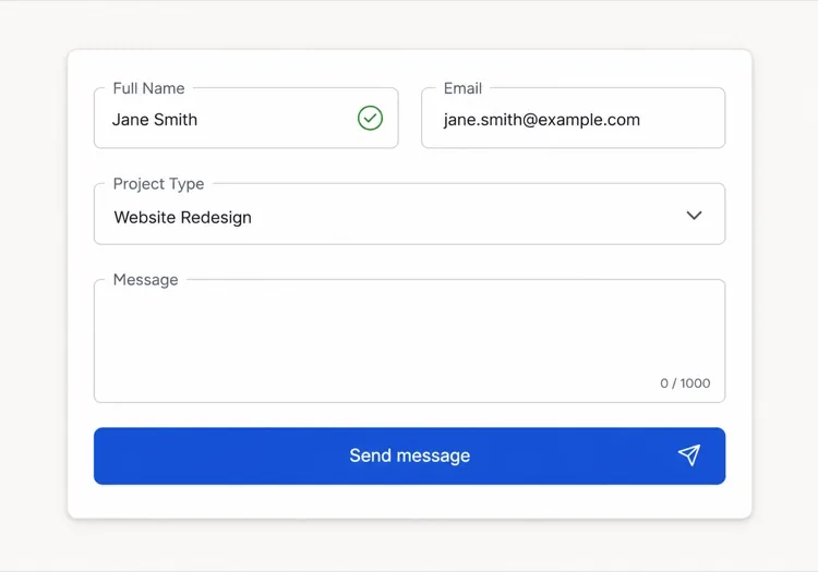
短い件名入力の下に1,000文字カウンター付きの自動リサイズ型メッセージテキストエリアを配置し、長文でも固定の箱の中をスクロールさせるのではなくフィールド自体が広がるようにします。

ダッシュボードの設定パネル

左揃えのラベルを持つ小さな入力欄の密な行、ユーザーが変更できない値のための read-only フィールド、各設定が何に影響するかを説明するヘルプテキスト。

サイト種別ごとの Input パターン

同じ input コンポーネントを、掲載するサイトの種類に合わせて調整します。

01 / 06

SaaS Signup and Login Inputs

Two fields decide whether the account gets created, so the autocomplete tokens matter more than the styling. Set email and current-password on login and new-password on signup, or password managers offer the wrong entry and people retype credentials they already saved. Put the visibility toggle in the suffix slot as a real button, not a click handler on an icon.

Input のスタイルとバリアント

ページ全体のトーンに合うバリアントを選び、そのまま生成します。

01 / 06

Outlined Input

A 1px border on a light surface with the label above — the default that works in the widest range of layouts. Keep the focus ring offset from the border rather than replacing it, so the resting and focused widths match and the field does not appear to move on focus.

React・Next.js・Vue・Svelte での Input

React、Next.js、Vue 3、SvelteKit、Astro、素の HTML — 同じ input を 6 通りの方法で組み込めます。

01 / 06

React Input

Generate the id with useId so label association survives rendering the field twice on one page. Forward the ref so form libraries like React Hook Form can register the element directly.

src/components/Input.tsx

export const Input = forwardRef(function Input(
  { label, hint, error, ...props },
  ref
) {
  const id = useId()
  return (
    <div className="space-y-1.5">
      <label htmlFor={id}>{label}</label>
      <input id={id} ref={ref} aria-invalid={!!error}
        aria-describedby={id + '-msg'} {...props} />
      <p id={id + '-msg'}>{error ?? hint}</p>
    </div>
  )
})

Input をプロジェクトに追加する方法

input テンプレートを選んで本番に載せるまでの 4 ステップ。

01~30s

Pick an Input Template

Scan the six templates and start from the field you actually need — labeled text input, affix slots for search or currency, autosizing textarea, or a masked card field.

02~10s

Copy the Prompt

Take the prompt into MeDo, Lovable, Bolt, v0 or Cursor. Name the type, inputMode and autocomplete token per field before you run it, since those three decide which mobile keyboard opens and whether autofill works.

03~1min

Generate and Refine

You get React + Tailwind back with a live preview. Follow up in plain English — "validate on blur only", "add a clear button in the suffix", "reserve the error line" — rather than editing the aria wiring by hand.

04~2min

Wire It to Your Form State

Register the forwarded ref with React Hook Form, Formik or a Server Action and pass the resolver error straight into the error prop. The component owns layout and aria; your form library owns the validation rules.

Inputに関するよくある質問

AIでフォーム入力を生成するには?

「ラベル、ヒントテキスト、エラー状態を備えたメール入力」のように、フィールド・ラベル・ヘルプテキスト・必要な状態を一つのプロンプトで説明してください。MeDoはラベル、フィールド、メッセージ領域を、aria属性が既に接続された単一のコンポーネントとして生成します。同じプロンプトに複数のフィールド型を並べれば、一貫した一式が返ってきます。

プレースホルダーとラベルの違いは?

ラベルはフィールドに恒久的な名前を与え、入力中も表示され続けます。プレースホルダーはフィールド内の一時的なヒントで、入力すると消えるため、これだけをラベル代わりにすると何を入力したのか分からなくなります。フィールド名にはラベルを、書式例だけにプレースホルダーを使ってください。

入力エラーは入力中に出すべきか、送信後に出すべきか?

キー入力ごとではなく blur で検証すれば、入力途中の値が誤りと判定されません。すでにエラーを表示しているフィールドは change で再検証し、値が有効になった時点でメッセージを消してください。送信時の検証は、パスワード確認のようにフォーム全体が必要なチェックに限りましょう。

AIはアクセシブルな入力フィールドを生成できますか?

はい。MeDoは for と id でラベルとフィールドを関連付け、aria-describedby でヘルプテキストとエラーテキストを紐づけ、検証失敗時に aria-invalid を設定します。プロンプトで必須フィールドに触れれば、アスタリスクだけに頼らず required 属性を付けます。

テキストエリアを内容に応じて広げる方法は?

最小行数と最大行数を指定した自動リサイズ型テキストエリアを依頼してください。例えば3行から8行まで拡張し、それを超えるとスクロールする形です。高さは入力ごとに scroll height から再計算され、上限を設けることで長文が送信ボタンを画面外へ押し出すのを防げます。

autocomplete 属性は本当に重要ですか?

重要です。正しい autocomplete トークンがあればブラウザとパスワードマネージャーが一度でフィールドを埋められ、登録やチェックアウトの離脱率が実測で下がります。各フィールドが何を収集するかMeDoに伝えれば、間違えやすい住所や決済の値も含めて適切なトークンを設定します。