MeDo

AI 인풋 생성기.

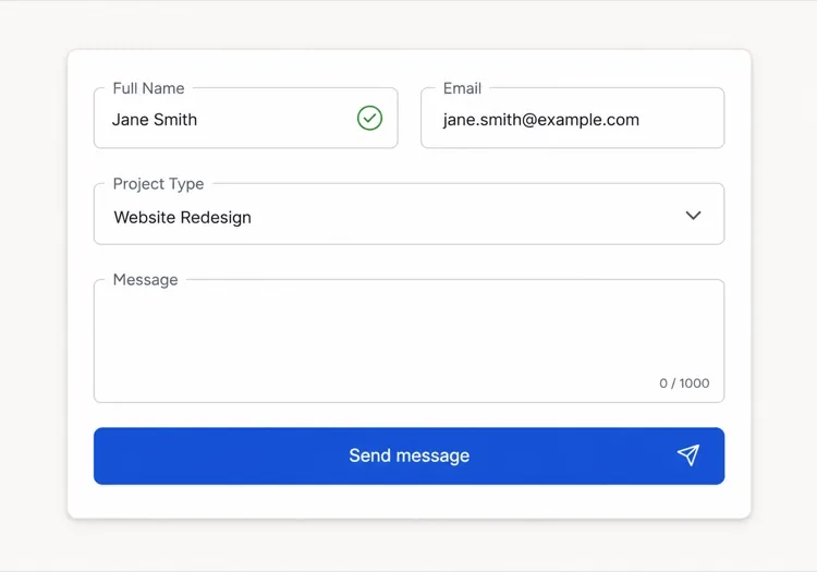
폼을 설명하면 MeDo가 텍스트 인풋과 텍스트에어리어를 함께 생성합니다 — 레이블, 도움말 텍스트, 오류 상태, 프리픽스와 서픽스, 글자 수 카운터, 자동 높이 조절까지 모두 올바른 접근성 속성에 연결된 상태로.

Input
Input

입력 박스는 인풋에서 가장 작은 부분입니다

인풋 작업의 대부분은 필드 자체와 무관합니다. 레이블, 도움말 텍스트, 오류 영역, 그리고 그 사이의 간격이 폼의 사용성을 결정하지만, 이 부분은 컴포넌트 라이브러리가 사용자에게 떠넘기기 쉬운 영역입니다. 그래서 팀은 폼마다 맞춤 래퍼 마크업을 작성하게 되고, 수직 리듬이 필드마다 어긋나다가 결국 아무것도 정렬되지 않습니다. 레이블, 설명, 오류 영역을 하나의 단위로 생성하면 그 관계를 한 번에 확정할 수 있습니다. 또한 웹 폼에서 가장 흔한 접근성 결함 — 필드 옆에 렌더링되지만 프로그램적으로는 전혀 연결되지 않은 오류 메시지 — 도 함께 해결됩니다.

템플릿 6개

생성할 수 있는 Input 템플릿

모든 템플릿은 스크린샷이 아니라 실제 프롬프트입니다. 어떤 AI 에디터에든 붙여넣거나 MeDo에서 실행해 React + Tailwind 코드를 그대로 받으세요.

BasicLabel + Field

Labeled Input With Helper Text

The baseline every other field extends. Label, field, and a message region that already occupies its line at rest so the form does not grow when an error appears.

Create a text input component with a visible label above the field, wired with a generated id and a matching for attribute rather than wrapping the input in the label. Below it, a helper text line linked through aria-describedby. Reserve the height of that line at rest so the form does not shift when an error replaces it. The field is 40px tall with an 8px radius, a 1px grey border, and a 2px focus-visible ring offset from the border. Add a required prop that sets the required attribute and appends a visually hidden "required" to the label rather than relying on an asterisk alone. Accept type, inputMode and autocomplete as props with no defaults, so each call site declares them.


MeDo에서 시도하기
ErrorsValidation States

Error, Success and Warning States

Where most form bugs live. An error message rendered beside a field but never connected to it is the most common accessibility defect in web forms.

Add validation states to a text input: error with a red border, a red message replacing the helper text, aria-invalid="true", and the message linked through aria-describedby so it is announced when focus enters the field. Add success and warning states that change the border and the leading icon but keep the same message slot and line height. Never signal state by border color alone — pair every state with an icon and text. Validate on blur, then revalidate on change only once the field is already in an error state, so a half-typed email is not flagged mid-entry. Announce late server-side errors through a polite live region.

MeDo에서 시도하기
AffixesAffix Slots

Prefix and Suffix Inside the Field

Search icons, currency symbols, unit suffixes, password toggles. The trap is padding — an affix rendered over the field without matching inset padding lets typed text slide underneath it.

Create a text input with optional prefix and suffix slots rendered inside the field border. Static affixes such as a currency symbol or a .com suffix get aria-hidden and muted text; interactive affixes such as a password visibility toggle or a clear button render as real buttons with their own aria-label and stay reachable by keyboard. Increase the field padding to match each affix width so typed text never slides under it. Keep the focus ring on the outer wrapper, not the bare input, so the ring surrounds the affixes too. Include a search variant with a leading magnifier and a trailing clear button that appears only when the field has a value.

MeDo에서 시도하기
TextareaAutosize Textarea

Growing Textarea With a Counter

A fixed three-row box for a support message forces people to scroll inside a scroll. Growing to a cap keeps the submit button on screen.

Create a textarea that shares the label, helper text and error layout of the text input. Autosize from a three-row minimum up to eight rows, recalculating the height from scrollHeight on input after resetting it, then switch to internal scrolling at the cap so a long message cannot push the submit button off screen. Add an optional character counter in the bottom right showing used and total, turning amber at 90 percent of the limit and red at the limit, announced through a polite live region rather than on every keystroke. Disable the native resize handle only when autosizing is on, otherwise leave it available.

MeDo에서 시도하기
FormattingMasked Field

Card, Phone and Date Inputs

Formatted fields where the input event rewrites the value. Get the caret handling wrong and editing the middle of a card number jumps the cursor to the end on every keystroke.

Create a formatted input for card numbers, phone numbers and expiry dates. Insert separators as the user types — spaces every four digits for cards, a slash after the month for expiry — while storing the unformatted value in state and submitting that. Preserve the caret position when the mask inserts a character mid-string, rather than letting the value reset send it to the end. Set inputMode="numeric" and the correct autocomplete token: cc-number, tel, cc-exp. Accept paste of an already-formatted value by stripping non-digits first. Validate length on blur and keep the field editable in the error state.

MeDo에서 시도하기
LayoutField Group

Multi-Field Row With Shared Rhythm

City and postcode on one line, expiry and CVC side by side. The point is a single spacing scale, since per-form wrapper markup is what makes vertical rhythm drift.

Create a form field group component that lays out two or three inputs on one row using a grid, collapsing to a single column below 640px. Keep a shared vertical gap between rows and align the labels on a single baseline even when one field carries helper text and its neighbor does not, by reserving the message line in every field. Group semantically related fields in a fieldset with a legend, such as an address block, so screen readers announce the group name before each field. Let each field declare its own width in grid columns rather than a hardcoded percentage, so a postcode field can be narrower than a city field.

MeDo에서 시도하기

Input 커스터마이즈 방법

항상 진짜 레이블을 요청하세요

플레이스홀더는 레이블이 아닙니다. 입력이 시작되는 순간 사라지므로 폼 작성 중 방해를 받은 사용자는 단서를 잃게 되고, 대부분의 스크린 리더는 이를 선택적 텍스트로 취급합니다. <label for>로 필드에 연결된 보이는 레이블을 요청하고, 플레이스홀더는 MM/YY 같은 형식 예시에만 사용하세요.

오류 메시지를 위한 공간을 확보하세요

유효성 검사 실패 시에만 오류 텍스트가 나타나면 제출할 때 아래 필드가 아래로 밀립니다. 도움말과 오류 영역이 평상시에도 고정된 줄 높이를 차지하도록 지정하면 메시지가 나타날 때 폼 높이가 변하지 않습니다.

필요한 인풋 타입을 명시하세요

필드별로 type과 inputMode를 지정하세요. email, tel, numeric은 각기 다른 모바일 키보드를 불러옵니다. email, tel, current-password, one-time-code 같은 올바른 autocomplete 토큰과 짝지으면 브라우저와 비밀번호 관리자가 폼을 채울 수 있습니다.

유효성 검사 시점을 정하세요

입력마다 검사하면 다 쓰기도 전에 절반만 입력된 이메일을 오류로 표시합니다. blur에서 검사하고, 이미 오류 상태인 필드는 change에서 재검사하도록 요청하면 잔소리 없이 실수를 바로잡을 수 있습니다.

Input 컴포넌트를 사용하는 사람

회원가입 또는 로그인 폼

서픽스 슬롯에 인라인 표시 토글이 있는 이메일과 비밀번호 필드, 도움말 텍스트에 비밀번호 강도 힌트, 그리고 autocomplete 토큰을 설정해 브라우저가 빈 필드 대신 저장된 자격 증명을 제안하도록 합니다.

결제 플로우

카드 번호, 유효기간, 우편번호 인풋에 숫자 입력 모드를 적용하고, 금액 필드에 통화 프리픽스를 붙이고, blur에서 검사해 입력 중인 카드 번호가 유효하지 않다고 표시되지 않게 합니다.

지원 또는 문의 폼

짧은 제목 인풋 아래에 1,000자 카운터가 있는 자동 높이 조절 메시지 텍스트에어리어를 배치해, 긴 메시지가 고정된 박스 안에서 스크롤되는 대신 필드를 확장하도록 합니다.

대시보드 설정 패널

왼쪽으로 정렬된 레이블을 가진 작은 인풋의 촘촘한 행, 사용자가 변경할 수 없는 값을 위한 read-only 필드, 각 설정이 무엇에 영향을 주는지 설명하는 도움말 텍스트.

웹사이트 유형별 Input 패턴

같은 input 컴포넌트를 게시되는 사이트 유형에 맞춰 조정합니다.

01 / 06

SaaS Signup and Login Inputs

Two fields decide whether the account gets created, so the autocomplete tokens matter more than the styling. Set email and current-password on login and new-password on signup, or password managers offer the wrong entry and people retype credentials they already saved. Put the visibility toggle in the suffix slot as a real button, not a click handler on an icon.

Input 스타일과 변형

페이지의 나머지 부분과 어울리는 변형을 골라 바로 생성하세요.

01 / 06

Outlined Input

A 1px border on a light surface with the label above — the default that works in the widest range of layouts. Keep the focus ring offset from the border rather than replacing it, so the resting and focused widths match and the field does not appear to move on focus.

React, Next.js, Vue, Svelte에서의 Input

React, Next.js, Vue 3, SvelteKit, Astro 또는 순수 HTML — 같은 input을 여섯 가지 방식으로 넣을 수 있습니다.

01 / 06

React Input

Generate the id with useId so label association survives rendering the field twice on one page. Forward the ref so form libraries like React Hook Form can register the element directly.

src/components/Input.tsx

export const Input = forwardRef(function Input(
  { label, hint, error, ...props },
  ref
) {
  const id = useId()
  return (
    <div className="space-y-1.5">
      <label htmlFor={id}>{label}</label>
      <input id={id} ref={ref} aria-invalid={!!error}
        aria-describedby={id + '-msg'} {...props} />
      <p id={id + '-msg'}>{error ?? hint}</p>
    </div>
  )
})

Input을 프로젝트에 추가하는 방법

input 템플릿을 고르고 프로덕션에 배포하기까지 네 단계.

01~30s

Pick an Input Template

Scan the six templates and start from the field you actually need — labeled text input, affix slots for search or currency, autosizing textarea, or a masked card field.

02~10s

Copy the Prompt

Take the prompt into MeDo, Lovable, Bolt, v0 or Cursor. Name the type, inputMode and autocomplete token per field before you run it, since those three decide which mobile keyboard opens and whether autofill works.

03~1min

Generate and Refine

You get React + Tailwind back with a live preview. Follow up in plain English — "validate on blur only", "add a clear button in the suffix", "reserve the error line" — rather than editing the aria wiring by hand.

04~2min

Wire It to Your Form State

Register the forwarded ref with React Hook Form, Formik or a Server Action and pass the resolver error straight into the error prop. The component owns layout and aria; your form library owns the validation rules.

Input에 대한 자주 묻는 질문

AI로 폼 입력 필드를 생성하는 방법은?

"레이블, 힌트 텍스트, 오류 상태가 있는 이메일 인풋"처럼 필드, 레이블, 도움말 텍스트, 필요한 상태를 하나의 프롬프트로 설명하세요. MeDo는 레이블, 필드, 메시지 영역을 aria 속성이 이미 연결된 단일 컴포넌트로 생성합니다. 같은 프롬프트에 여러 필드 타입을 나열하면 일관된 세트를 받을 수 있습니다.

플레이스홀더와 레이블의 차이는 무엇인가요?

레이블은 필드의 이름을 영구적으로 표시하며 입력 중에도 계속 보입니다. 플레이스홀더는 필드 안의 임시 힌트 텍스트로 입력하면 사라지므로, 이것만 레이블로 쓰면 사용자는 자신이 무엇을 입력했는지 추측해야 합니다. 필드 이름에는 레이블을, 형식 예시에만 플레이스홀더를 사용하세요.

인풋 오류는 입력 중에 표시해야 하나요, 제출 후에 표시해야 하나요?

입력마다 검사하는 대신 blur에서 검사하면 입력 중인 값이 도중에 오류로 표시되지 않습니다. 이미 오류를 보여주는 필드는 change에서 재검사해 값이 유효해지는 즉시 메시지가 사라지게 하세요. 제출 시점 검사는 비밀번호 확인처럼 폼 전체가 필요한 검사에만 사용하세요.

AI가 접근 가능한 입력 필드를 생성할 수 있나요?

네. MeDo는 for와 id로 레이블을 필드에 연결하고, aria-describedby로 도움말과 오류 텍스트를 연결하며, 유효성 검사가 실패하면 aria-invalid를 설정합니다. 프롬프트에서 필수 필드를 언급하면 별표에만 의존하지 않고 required 속성으로 표시합니다.

텍스트에어리어를 내용에 따라 늘리려면 어떻게 하나요?

최소 및 최대 줄 수를 지정한 자동 높이 조절 텍스트에어리어를 요청하세요. 예를 들어 세 줄에서 여덟 줄까지 늘어난 뒤 스크롤되는 형태입니다. 높이는 입력할 때마다 scroll height에서 다시 계산되며, 최대치를 제한하면 긴 메시지가 제출 버튼을 화면 밖으로 밀어내지 않습니다.

autocomplete 속성이 실제로 중요한가요?

중요합니다. 올바른 autocomplete 토큰은 브라우저와 비밀번호 관리자가 한 번에 필드를 채우도록 해주며, 이는 회원가입과 결제 폼의 이탈률을 측정 가능한 수준으로 낮춥니다. 각 필드가 무엇을 수집하는지 MeDo에 알려주면 틀리기 쉬운 주소와 결제 값까지 포함해 맞는 토큰을 설정합니다.