MeDo

منشئ حقول الإدخال بالذكاء الاصطناعي.

صِف نموذجك ويُنشئ MeDo حقل النص والمنطقة النصية معاً — التسميات ونص المساعدة وحالات الخطأ واللواحق البادئة واللاحقة وعدّادات الأحرف والتوسّع التلقائي، كلها موصولة بسمات إمكانية الوصول الصحيحة.

حقل الإدخال
حقل الإدخال

الصندوق هو أصغر جزء من حقل الإدخال

معظم العمل في حقل الإدخال لا علاقة له بالحقل نفسه. التسمية ونص المساعدة ومساحة الخطأ والتباعد بينها هي ما يجعل النموذج قابلاً للاستخدام، وهي تحديداً الأجزاء التي تتركها مكتبات المكوّنات للمستخدم. لذا تكتب الفرق ترميز تغليف مخصصاً لكل نموذج، وينحرف الإيقاع الرأسي حقلاً بعد حقل حتى لا يبقى شيء متوازياً. إنشاء التسمية والوصف ومنطقة الخطأ كوحدة واحدة يثبّت علاقتها مرة واحدة. كما يزيل أكثر عيوب إمكانية الوصول شيوعاً في نماذج الويب: رسالة خطأ تُعرض بجانب الحقل لكنها غير مرتبطة به برمجياً على الإطلاق.

6 قالبًا

قوالب حقل الإدخال التي يمكنك توليدها

كل قالب هو طلب حقيقي لا صورة. انسخه إلى أي محرّر ذكاء اصطناعي، أو شغّله في MeDo لتحصل على كود React و Tailwind مباشرة.

BasicLabel + Field

Labeled Input With Helper Text

The baseline every other field extends. Label, field, and a message region that already occupies its line at rest so the form does not grow when an error appears.

Create a text input component with a visible label above the field, wired with a generated id and a matching for attribute rather than wrapping the input in the label. Below it, a helper text line linked through aria-describedby. Reserve the height of that line at rest so the form does not shift when an error replaces it. The field is 40px tall with an 8px radius, a 1px grey border, and a 2px focus-visible ring offset from the border. Add a required prop that sets the required attribute and appends a visually hidden "required" to the label rather than relying on an asterisk alone. Accept type, inputMode and autocomplete as props with no defaults, so each call site declares them.


جرّبه في MeDo
ErrorsValidation States

Error, Success and Warning States

Where most form bugs live. An error message rendered beside a field but never connected to it is the most common accessibility defect in web forms.

Add validation states to a text input: error with a red border, a red message replacing the helper text, aria-invalid="true", and the message linked through aria-describedby so it is announced when focus enters the field. Add success and warning states that change the border and the leading icon but keep the same message slot and line height. Never signal state by border color alone — pair every state with an icon and text. Validate on blur, then revalidate on change only once the field is already in an error state, so a half-typed email is not flagged mid-entry. Announce late server-side errors through a polite live region.

جرّبه في MeDo
AffixesAffix Slots

Prefix and Suffix Inside the Field

Search icons, currency symbols, unit suffixes, password toggles. The trap is padding — an affix rendered over the field without matching inset padding lets typed text slide underneath it.

Create a text input with optional prefix and suffix slots rendered inside the field border. Static affixes such as a currency symbol or a .com suffix get aria-hidden and muted text; interactive affixes such as a password visibility toggle or a clear button render as real buttons with their own aria-label and stay reachable by keyboard. Increase the field padding to match each affix width so typed text never slides under it. Keep the focus ring on the outer wrapper, not the bare input, so the ring surrounds the affixes too. Include a search variant with a leading magnifier and a trailing clear button that appears only when the field has a value.

جرّبه في MeDo
TextareaAutosize Textarea

Growing Textarea With a Counter

A fixed three-row box for a support message forces people to scroll inside a scroll. Growing to a cap keeps the submit button on screen.

Create a textarea that shares the label, helper text and error layout of the text input. Autosize from a three-row minimum up to eight rows, recalculating the height from scrollHeight on input after resetting it, then switch to internal scrolling at the cap so a long message cannot push the submit button off screen. Add an optional character counter in the bottom right showing used and total, turning amber at 90 percent of the limit and red at the limit, announced through a polite live region rather than on every keystroke. Disable the native resize handle only when autosizing is on, otherwise leave it available.

جرّبه في MeDo
FormattingMasked Field

Card, Phone and Date Inputs

Formatted fields where the input event rewrites the value. Get the caret handling wrong and editing the middle of a card number jumps the cursor to the end on every keystroke.

Create a formatted input for card numbers, phone numbers and expiry dates. Insert separators as the user types — spaces every four digits for cards, a slash after the month for expiry — while storing the unformatted value in state and submitting that. Preserve the caret position when the mask inserts a character mid-string, rather than letting the value reset send it to the end. Set inputMode="numeric" and the correct autocomplete token: cc-number, tel, cc-exp. Accept paste of an already-formatted value by stripping non-digits first. Validate length on blur and keep the field editable in the error state.

جرّبه في MeDo
LayoutField Group

Multi-Field Row With Shared Rhythm

City and postcode on one line, expiry and CVC side by side. The point is a single spacing scale, since per-form wrapper markup is what makes vertical rhythm drift.

Create a form field group component that lays out two or three inputs on one row using a grid, collapsing to a single column below 640px. Keep a shared vertical gap between rows and align the labels on a single baseline even when one field carries helper text and its neighbor does not, by reserving the message line in every field. Group semantically related fields in a fieldset with a legend, such as an address block, so screen readers announce the group name before each field. Let each field declare its own width in grid columns rather than a hardcoded percentage, so a postcode field can be narrower than a city field.

جرّبه في MeDo

كيف تخصّص حقل الإدخال الخاص بك

اطلب دائماً تسمية حقيقية

النص البديل ليس تسمية. يختفي لحظة بدء الكتابة، ما يترك من انقطع في منتصف النموذج بلا مرجع، ومعظم قارئات الشاشة تتعامل معه كنص اختياري. اطلب تسمية مرئية مرتبطة بالحقل عبر <label for>، واستخدم النص البديل فقط لأمثلة التنسيق مثل MM/YY.

احتفظ بمساحة لرسالة الخطأ

إذا ظهر نص الخطأ فقط عند فشل التحقق، فسينزلق الحقل الذي تحته للأسفل عند الإرسال. حدّد أن منطقة المساعدة والخطأ تشغل ارتفاع سطر ثابتاً في حالة السكون، حتى لا يتغير ارتفاع النموذج أبداً عند ظهور الرسائل.

سمِّ أنواع الإدخال التي تحتاجها

حدّد type و inputMode لكل حقل: فـ email و tel و numeric تستدعي لوحات مفاتيح مختلفة على الجوّال. اقرنها بقيم autocomplete الصحيحة مثل email و tel و current-password و one-time-code، حتى تتمكن المتصفحات ومديرو كلمات المرور من تعبئة النموذج.

حدّد وقت تشغيل التحقق

التحقق عند كل ضغطة مفتاح يعلّم بريداً إلكترونياً نصف مكتوب كخطأ قبل أن ينتهي أحد من كتابته. اطلب التحقق عند blur مع إعادة التحقق عند change بعد أن يصبح الحقل في حالة خطأ، فهذا يصحّح الأخطاء دون إزعاج.

من يستخدم مكوّن حقل الإدخال

نموذج تسجيل أو دخول

حقول البريد الإلكتروني وكلمة المرور مع زر إظهار مدمج في مساحة اللاحقة، وتلميح لقوة كلمة المرور في نص المساعدة، وقيم autocomplete مضبوطة حتى تعرض المتصفحات بيانات الدخول المحفوظة بدل حقول فارغة.

مسار الدفع

حقول رقم البطاقة وتاريخ الانتهاء والرمز البريدي بأنماط إدخال رقمية، وبادئة عملة على حقل المبلغ، وتحقق عند blur حتى لا يُعلَّم رقم بطاقة نصف مكتوب كغير صالح.

نموذج دعم أو تواصل

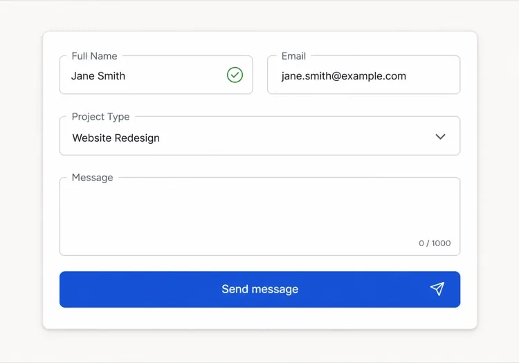
حقل موضوع قصير فوق منطقة نصية للرسالة تتوسّع تلقائياً مع عدّاد 1,000 حرف، فتتسع المساحة للرسائل الطويلة بدل إجبار الناس على التمرير داخل صندوق ثابت.

لوحة إعدادات في لوحة التحكم

صفوف مكتظة من الحقول الصغيرة مع تسميات مصفوفة إلى اليمين، وحقول read-only للقيم التي لا يمكن للمستخدم تغييرها، ونص مساعدة يوضح ما يؤثر فيه كل إعداد.

أنماط حقل الإدخال لمواقع مختلفة

المكوّن حقل الإدخال نفسه، مُهيّأ لنوع الموقع الذي يُنشر عليه.

01 / 06

SaaS Signup and Login Inputs

Two fields decide whether the account gets created, so the autocomplete tokens matter more than the styling. Set email and current-password on login and new-password on signup, or password managers offer the wrong entry and people retype credentials they already saved. Put the visibility toggle in the suffix slot as a real button, not a click handler on an icon.

أنماط حقل الإدخال وتنويعاته

اختر التنويعة التي تناسب بقية الصفحة، ثم ولّدها.

01 / 06

Outlined Input

A 1px border on a light surface with the label above — the default that works in the widest range of layouts. Keep the focus ring offset from the border rather than replacing it, so the resting and focused widths match and the field does not appear to move on focus.

حقل الإدخال في React و Next.js و Vue و Svelte

React و Next.js و Vue 3 و SvelteKit و Astro أو HTML صِرف — المكوّن حقل الإدخال نفسه بست طرق للإضافة.

01 / 06

React Input

Generate the id with useId so label association survives rendering the field twice on one page. Forward the ref so form libraries like React Hook Form can register the element directly.

src/components/Input.tsx

export const Input = forwardRef(function Input(
  { label, hint, error, ...props },
  ref
) {
  const id = useId()
  return (
    <div className="space-y-1.5">
      <label htmlFor={id}>{label}</label>
      <input id={id} ref={ref} aria-invalid={!!error}
        aria-describedby={id + '-msg'} {...props} />
      <p id={id + '-msg'}>{error ?? hint}</p>
    </div>
  )
})

كيف تضيف حقل الإدخال إلى مشروعك

أربع خطوات، من اختيار قالب حقل الإدخال إلى إطلاقه في الإنتاج.

01~30s

Pick an Input Template

Scan the six templates and start from the field you actually need — labeled text input, affix slots for search or currency, autosizing textarea, or a masked card field.

02~10s

Copy the Prompt

Take the prompt into MeDo, Lovable, Bolt, v0 or Cursor. Name the type, inputMode and autocomplete token per field before you run it, since those three decide which mobile keyboard opens and whether autofill works.

03~1min

Generate and Refine

You get React + Tailwind back with a live preview. Follow up in plain English — "validate on blur only", "add a clear button in the suffix", "reserve the error line" — rather than editing the aria wiring by hand.

04~2min

Wire It to Your Form State

Register the forwarded ref with React Hook Form, Formik or a Server Action and pass the resolver error straight into the error prop. The component owns layout and aria; your form library owns the validation rules.

أسئلة شائعة حول حقل الإدخال

كيف أُنشئ حقل نموذج بالذكاء الاصطناعي؟

صِف الحقل وتسميته ونص المساعدة والحالات التي تحتاجها في موجه واحد، مثل «حقل بريد إلكتروني مع تسمية ونص تلميح وحالة خطأ». يُنشئ MeDo التسمية والحقل ومنطقة الرسالة كمكوّن واحد بسمات aria موصولة مسبقاً. يمكنك سرد عدة أنواع حقول في الموجه نفسه والحصول على مجموعة متسقة.

ما الفرق بين النص البديل والتسمية؟

التسمية تسمّي الحقل بشكل دائم وتبقى مرئية أثناء الكتابة. النص البديل هو نص تلميح مؤقت داخل الحقل يختفي عند الإدخال، فاستخدامه كتسمية وحيدة يترك الناس يخمّنون ما أدخلوه. استخدم التسمية لاسم الحقل والنص البديل لمثال التنسيق فقط.

هل تظهر أخطاء الإدخال أثناء الكتابة أم بعد الإرسال؟

تحقّق عند blur بدلاً من كل ضغطة مفتاح، حتى لا تُعلَّم قيمة نصف مكتوبة كخطأ أثناء الإدخال. وعندما يعرض الحقل خطأً بالفعل، أعد التحقق عند change حتى تُمحى الرسالة بمجرد أن تصبح القيمة صحيحة. واحتفظ بالتحقق عند الإرسال للفحوصات التي تحتاج النموذج كاملاً، مثل تأكيد كلمة المرور.

هل يمكن للذكاء الاصطناعي إنشاء حقول إدخال سهلة الوصول؟

نعم. يربط MeDo التسمية بالحقل عبر for و id، ويصل نص المساعدة والخطأ عبر aria-describedby، ويضبط aria-invalid عند فشل التحقق. اذكر الحقول الإلزامية في موجهك وسيعلّمها بسمة required بدل الاعتماد على علامة النجمة وحدها.

كيف أجعل المنطقة النصية تنمو مع محتواها؟

اطلب منطقة نصية متوسّعة تلقائياً بعدد أسطر أدنى وأقصى، مثلاً ثلاثة أسطر تنمو حتى ثمانية قبل التمرير. يُعاد حساب الارتفاع من scroll height عند كل إدخال، وتحديد الحد الأقصى يمنع رسالة طويلة من دفع زر الإرسال خارج الشاشة.

هل سمة autocomplete مهمة فعلاً؟

نعم. قيم autocomplete الصحيحة تتيح للمتصفحات ومديري كلمات المرور تعبئة الحقول بخطوة واحدة، وهذا يقلّل بشكل ملموس التخلي عن نماذج التسجيل والدفع. أخبر MeDo بما يجمعه كل حقل وسيضبط القيمة المطابقة، بما فيها قيم العنوان والدفع التي يسهل الخطأ فيها.