MeDo

KI-Button-Generator.

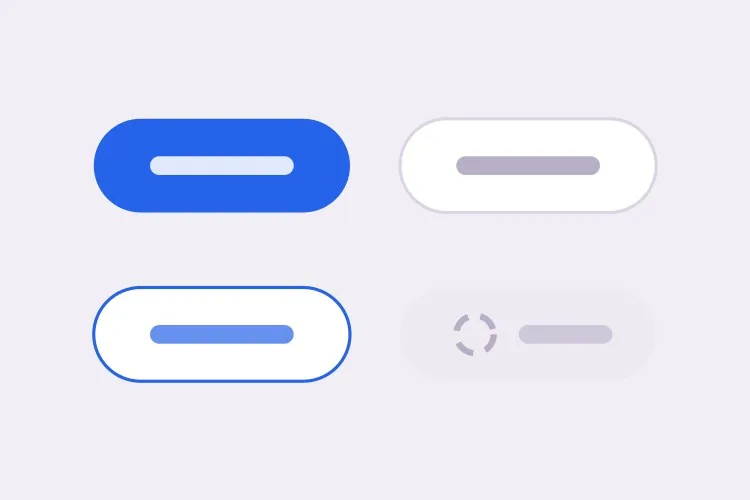
Beschreiben Sie Ihre Marke und MeDo generiert das gesamte Button-System — Primary-, Secondary-, Ghost- und Destructive-Varianten, drei Größen sowie Hover-, Fokus-, Lade- und Deaktiviert-Zustände. Ein Prompt, ein konsistentes Set.

Button
Button

Buttons machen rund ein Viertel jedes Designsystems aus

Keine Komponente wird häufiger verwendet. Jedes Formular, jeder CTA, jeder Bestätigungsdialog läuft über einen Button — genau deshalb fällt Inkonsistenz hier so stark auf. Zehn leicht unterschiedliche Buttons in einem Produkt wirken schlampig, lange bevor jemand benennen kann, warum. Wenn Sie das ganze Set auf einmal aus einer Beschreibung generieren, teilen die Varianten Abstandsskala, Radius und Fokusbehandlung schon von der Konstruktion her — nicht erst durch Disziplin.

6 Vorlagen

Button-Vorlagen, die Sie generieren können

Jede Vorlage ist ein echter Prompt, kein Screenshot. Kopieren Sie ihn in einen KI-Editor oder führen Sie ihn in MeDo aus und erhalten Sie React- und Tailwind-Code zurück.

BasicVariant Set

Four Roles, Three Sizes

The set you generate first and edit for a year. Roles rather than colors, so a rebrand moves one token instead of forty class strings.

Create a reusable button component with four role-based variants: primary as a solid brand fill with white text, secondary as a white surface with a grey border, ghost as transparent with a tinted background on hover, and destructive as a solid red. Support sm at 32px tall, md at 40px and lg at 48px, plus a fullWidth prop. Wire hover, active, focus-visible, disabled and loading states for every variant, keeping the focus ring on focus-visible only so mouse clicks do not draw it. Render a real button element with an explicit type attribute, and drive all four variants from one shared spacing and radius scale rather than per-variant values.
In MeDo testen
IconsIcon + Label

Leading and Trailing Icon Slots

Two slots, one gap token. Most icon bugs are spacing bugs — an icon glued to its label, or optically misaligned because the SVG box is taller than the cap height.

Extend a button component with optional leading and trailing icon slots. Size the icon to 16px at sm and md and 18px at lg, set a consistent 8px gap between icon and label, and add aria-hidden="true" to the icon so screen readers announce the label only. Flip the slot order automatically under a right-to-left direction. Use inline-flex with items-center so the icon aligns to the label cap height rather than the line box, and give the SVG shrink-0 so a long wrapping label cannot squash it. Accept any React node so a spinner or an avatar can occupy the same slot.

In MeDo testen
LoadingAsync Submit

Loading Button With a Locked Width

A submit button that shrinks when the spinner replaces the label makes the whole form jump. Reserve the width and the click feels instant instead of broken.

Create a submit button with a loading prop. While loading, replace the label with a centered spinner but keep the button at its resting width by rendering the label at zero opacity underneath the spinner rather than removing it from the DOM. Set aria-busy="true" and aria-disabled="true", block repeat submissions, and keep the button focusable so a screen reader can still read the pending state. Respect prefers-reduced-motion by swapping the rotating spinner for a static pulsing dot. Add an optional loadingText prop that announces progress through a polite live region instead of changing the visible label.

In MeDo testen
ToolbarIcon Only

Square Icon Button With a Tooltip

Dense toolbars need it, and it fails accessibility more often than any other button. No visible text means the accessible name has to come from somewhere explicit.

Create an icon-only button for a dense toolbar: a square target at 32px, 36px and 40px with the icon centered and no label. Require an ariaLabel prop and render it as aria-label on the button, since there is no visible text to name the control. Expand the hit area to at least 44px with a negative-margin pseudo-element so touch targets meet the minimum without widening the toolbar. Pair it with a tooltip that appears on hover and on keyboard focus, referenced with aria-describedby so the tooltip supplements the label rather than replacing it. Include a pressed state driven by aria-pressed for toggle uses.

In MeDo testen
GroupSplit Action

Split Button With a Menu Half

One default action plus a menu of alternates — Save and Save as, Deploy and Deploy to staging. Two buttons that must look like one and stay independently reachable.

Create a split button: a primary action on the left and a narrow chevron trigger on the right, joined into one visual unit with a 1px divider, the outer corners rounded and the inner corners square. Render them as two separate button elements so each keeps its own accessible name, giving the chevron a label such as "More save options". Wire the chevron to a menu with aria-haspopup="menu" and aria-expanded, opening on click and on ArrowDown, closing on Escape with focus returned to the trigger. Keep the focus ring visible on each half by drawing it outside the shared border rather than inside it.

In MeDo testen
PolymorphicLink as Button

Anchor With Button Styling

A styled div with an onClick is not a button and a button that navigates is not a link. One asChild prop keeps the styling while the correct element still ships.

Create a polymorphic button that accepts an asChild prop and forwards its variant, size and state classes onto a child element, so a Next.js Link or a plain anchor can carry button styling without nesting an interactive element inside a button. Forward the ref, merge className rather than overwriting it, and skip the type attribute when the rendered element is not a button. When the target is an anchor, omit the disabled attribute — which anchors ignore — and instead drop href and set aria-disabled with pointer-events none. Add an external variant that appends rel="noopener noreferrer" and a visually hidden "opens in a new tab" note.

In MeDo testen

So passen Sie Ihre Button an

Definieren Sie die Varianten, nicht nur die Farben

Fordern Sie Varianten nach Rolle an — primary, secondary, ghost, destructive — statt nach Farbe. Rollenbasierte Benennung übersteht jeden Rebrand: Wenn sich Ihre Markenfarbe ändert, bedeutet „primary" weiterhin dasselbe und nur ein Token muss angepasst werden.

Legen Sie den Ladezustand explizit fest

Geben Sie an, dass der Spinner das Label ersetzen und dabei die Button-Breite erhalten soll. Andernfalls schrumpfen Buttons mitten im Absenden und das umgebende Layout springt — einer der häufigsten Feinschliff-Fehler in generierter UI.

Fragen Sie nach focus-visible, nicht nach focus

Ein Ring bei :focus erscheint auch bei Mausklicks und sieht wie ein Fehler aus. Fordern Sie :focus-visible an, damit der Ring nur für Tastatur- und Hilfsmittelnutzer sichtbar wird — genau das prüfen Accessibility-Audits.

Klären Sie die Disabled-Semantik

Entscheiden Sie, ob deaktivierte Buttons das disabled-Attribut oder aria-disabled verwenden. Das Attribut blockiert alle Events einschließlich Fokus; aria-disabled hält den Button fokussierbar, sodass Screenreader weiterhin ansagen können, warum er nicht verfügbar ist. Sagen Sie, was Sie wollen.

Wer die Button-Komponente nutzt

SaaS-Produkt

Ein Primary-Button für den Trial-CTA, Secondary für „Demo buchen", Ghost für Tertiärlinks in Karten und Destructive für die Kontolöschung — alle mit gleichem Radius und Fokusring, damit die Oberfläche als ein Produkt wirkt.

Online-Shop

Ein kontraststarker „In den Warenkorb"-Button mit Ladezustand während der Bestandsprüfung, plus eine ruhigere Secondary-Variante „Später speichern", die nicht um Aufmerksamkeit konkurriert.

Dashboard oder Admin-Tool

Dichte Toolbars brauchen kleine Icon-Buttons mit barrierefreien Labels neben Aktionsbuttons in Standardgröße. Eine Größenskala von sm bis lg hält die Toolbar kompakt, ohne Einzelfall-Stile zu erfinden.

Marketing-Landingpage

Ein einzelner übergroßer Primary-Button above the fold, am Seitenende wiederholt, mit einer Ghost-Variante für den sekundären Link „So funktioniert es", der scrollt statt konvertiert.

Button-Muster für verschiedene Websites

Dieselbe button-Komponente, abgestimmt auf die Art der Website, auf der sie läuft.

01 / 06

SaaS Product Buttons

One primary per screen is the rule that keeps a product feeling directed. Everything else drops to secondary or ghost, and destructive stays reserved for irreversible actions so a red button always means the same thing. The moment two primaries appear in one view, users start reading the layout instead of acting on it.

Button-Stile und -Varianten

Wählen Sie die Variante, die zum Rest der Seite passt, und generieren Sie sie.

01 / 06

Solid Button

A filled surface with white or near-white text, carrying the highest visual weight on the page. Check the contrast against the fill rather than the page background, and remember that a lightened hover state can quietly drop a passing 4.5:1 pairing below the line.

Button in React, Next.js, Vue und Svelte

React, Next.js, Vue 3, SvelteKit, Astro oder reines HTML — dieselbe button, sechs Wege zur Einbindung.

01 / 06

React Button

Derive the class string from variant and size lookups instead of chained ternaries, and forward the ref so tooltips and popovers can anchor to the element. Spread the remaining props last so a caller can still pass type or aria attributes through.

src/components/Button.tsx

export const Button = forwardRef(function Button(
  { variant = 'primary', size = 'md', loading, ...props },
  ref
) {
  return (
    <button
      ref={ref}
      type="button"
      aria-busy={loading}
      className={cn(base, variants[variant], sizes[size])}
      {...props}
    />
  )
})

So fügen Sie Ihre Button einem Projekt hinzu

Vier Schritte, von der Auswahl einer button-Vorlage bis zum Einsatz in der Produktion.

01~30s

Pick a Button Template

Scan the six templates and start from the closest surface — the full variant set for a design system, the async submit for a form, the icon-only for a toolbar.

02~10s

Copy the Prompt

Take the prompt into MeDo, Lovable, Bolt, v0 or Cursor. Swap in your brand color, radius and font before you run it, since those three values are what every variant inherits.

03~1min

Generate and Refine

You get React + Tailwind back with a live preview. Follow up in plain English — "add an xs size", "make the disabled state use aria-disabled" — rather than hand-editing the class lookups.

04~2min

Replace Your Ad-Hoc Buttons

Import one Button and delete the one-off styles it supersedes. The value is in the variants sharing a spacing scale and focus ring by construction, which only holds if nothing else on the page is styling its own button.

Häufige Fragen zu Button

Wie generiere ich eine Button-Komponente mit KI?

Beschreiben Sie Varianten, Größen und Zustände in einem Prompt — etwa „Primary-, Secondary- und Ghost-Varianten in drei Größen mit Hover-, Disabled- und Loading-Zuständen" — und MeDo generiert die vollständige Komponente mit allen verdrahteten Kombinationen. Sie erhalten eine Datei für das ganze Set statt eines einzelnen fest verdrahteten Buttons.

Welche Button-Varianten braucht ein Designsystem?

Die meisten Produkte brauchen vier: primary für die wichtigste Aktion auf einem Screen, secondary für unterstützende Aktionen, ghost oder tertiär für Aktionen mit geringer Betonung in dichter UI und destructive für alles Unwiderrufliche. Mehr Varianten deuten meist auf ein Hierarchieproblem hin, nicht auf einen fehlenden Stil.

Kann KI barrierefreie Buttons generieren?

Ja. MeDo rendert echte button-Elemente mit explizitem type-Attribut, focus-visible-Ringen, barrierefreien Namen für Icon-Buttons und Disabled-Zuständen, die Screenreader korrekt ansagen. Erwähnen Sie Barrierefreiheit im Prompt und es ergänzt zusätzlich aria-busy während des Ladens.

Wie füge ich einem Button einen Ladezustand hinzu?

Fordern Sie eine loading-Prop an, die das Label durch einen Spinner ersetzt, die Button-Breite fixiert hält, Interaktion deaktiviert und aria-busy setzt, damit Hilfstechnologien den Wartezustand ansagen. Die feste Breite ist der Teil, den man vergisst — ohne sie fließt die Seite bei jedem Klick neu um.

Sollte ein Button ein Button oder ein Link sein?

Navigiert es, sollte es ein Anchor sein; führt es eine Aktion aus, ein Button. Sagen Sie MeDo, welches Verhalten Sie brauchen, und es rendert das richtige Element — mit einem asChild-artigen Ausweg, wenn Sie das Button-Styling auf einem Routing-Link benötigen.

Kann ich Buttons generieren, die zu meiner Marke passen?

Ja. Geben Sie MeDo Markenfarbe, Eckenradius, Schrift und eine bestehende Abstandsskala im Prompt, und die generierten Varianten nutzen sie konsistent. Sie können auch einen bestehenden Button aus Ihrer Codebase einfügen und MeDo bitten, ihn zu einem vollständigen Variantenset zu erweitern.