MeDo

AI 버튼 생성기.

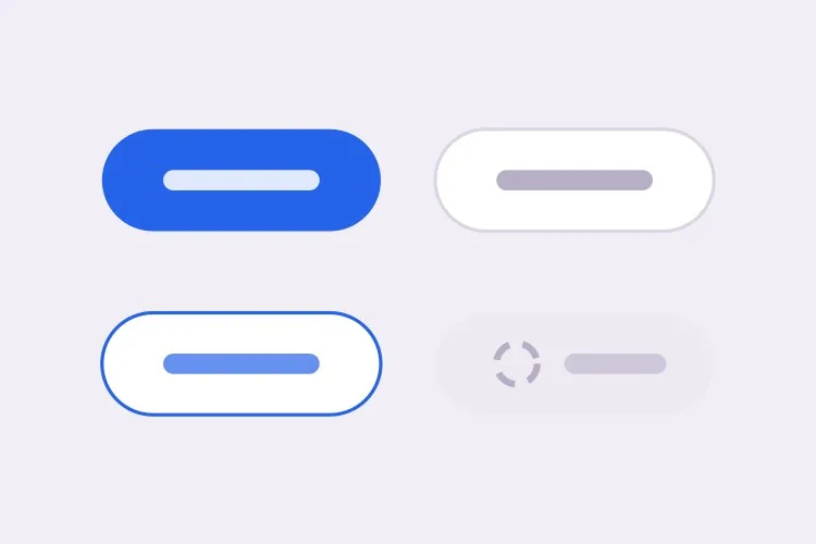
브랜드를 설명하면 MeDo가 버튼 시스템 전체를 생성합니다 — primary, secondary, ghost, destructive 배리언트, 세 가지 사이즈, 그리고 hover, 포커스, 로딩, 비활성 상태까지. 프롬프트 하나로 일관된 세트를 얻습니다.

버튼
버튼

버튼은 디자인 시스템의 약 4분의 1을 차지합니다

이보다 자주 쓰이는 컴포넌트는 없습니다. 모든 폼 제출, 모든 CTA, 모든 확인 다이얼로그가 버튼을 거칩니다. 그래서 여기서의 불일치가 가장 눈에 띕니다. 제품 안에 미묘하게 다른 버튼이 열 개 있으면, 누구도 이유를 설명하기 전에 이미 조잡하다는 인상을 줍니다. 하나의 설명으로 전체 세트를 한 번에 생성하면 배리언트들이 간격 스케일, 반경, 포커스 처리를 규율이 아니라 구조적으로 공유합니다.

템플릿 6개

생성할 수 있는 버튼 템플릿

모든 템플릿은 스크린샷이 아니라 실제 프롬프트입니다. 어떤 AI 에디터에든 붙여넣거나 MeDo에서 실행해 React + Tailwind 코드를 그대로 받으세요.

BasicVariant Set

Four Roles, Three Sizes

The set you generate first and edit for a year. Roles rather than colors, so a rebrand moves one token instead of forty class strings.

Create a reusable button component with four role-based variants: primary as a solid brand fill with white text, secondary as a white surface with a grey border, ghost as transparent with a tinted background on hover, and destructive as a solid red. Support sm at 32px tall, md at 40px and lg at 48px, plus a fullWidth prop. Wire hover, active, focus-visible, disabled and loading states for every variant, keeping the focus ring on focus-visible only so mouse clicks do not draw it. Render a real button element with an explicit type attribute, and drive all four variants from one shared spacing and radius scale rather than per-variant values.
MeDo에서 시도하기
IconsIcon + Label

Leading and Trailing Icon Slots

Two slots, one gap token. Most icon bugs are spacing bugs — an icon glued to its label, or optically misaligned because the SVG box is taller than the cap height.

Extend a button component with optional leading and trailing icon slots. Size the icon to 16px at sm and md and 18px at lg, set a consistent 8px gap between icon and label, and add aria-hidden="true" to the icon so screen readers announce the label only. Flip the slot order automatically under a right-to-left direction. Use inline-flex with items-center so the icon aligns to the label cap height rather than the line box, and give the SVG shrink-0 so a long wrapping label cannot squash it. Accept any React node so a spinner or an avatar can occupy the same slot.

MeDo에서 시도하기
LoadingAsync Submit

Loading Button With a Locked Width

A submit button that shrinks when the spinner replaces the label makes the whole form jump. Reserve the width and the click feels instant instead of broken.

Create a submit button with a loading prop. While loading, replace the label with a centered spinner but keep the button at its resting width by rendering the label at zero opacity underneath the spinner rather than removing it from the DOM. Set aria-busy="true" and aria-disabled="true", block repeat submissions, and keep the button focusable so a screen reader can still read the pending state. Respect prefers-reduced-motion by swapping the rotating spinner for a static pulsing dot. Add an optional loadingText prop that announces progress through a polite live region instead of changing the visible label.

MeDo에서 시도하기
ToolbarIcon Only

Square Icon Button With a Tooltip

Dense toolbars need it, and it fails accessibility more often than any other button. No visible text means the accessible name has to come from somewhere explicit.

Create an icon-only button for a dense toolbar: a square target at 32px, 36px and 40px with the icon centered and no label. Require an ariaLabel prop and render it as aria-label on the button, since there is no visible text to name the control. Expand the hit area to at least 44px with a negative-margin pseudo-element so touch targets meet the minimum without widening the toolbar. Pair it with a tooltip that appears on hover and on keyboard focus, referenced with aria-describedby so the tooltip supplements the label rather than replacing it. Include a pressed state driven by aria-pressed for toggle uses.

MeDo에서 시도하기
GroupSplit Action

Split Button With a Menu Half

One default action plus a menu of alternates — Save and Save as, Deploy and Deploy to staging. Two buttons that must look like one and stay independently reachable.

Create a split button: a primary action on the left and a narrow chevron trigger on the right, joined into one visual unit with a 1px divider, the outer corners rounded and the inner corners square. Render them as two separate button elements so each keeps its own accessible name, giving the chevron a label such as "More save options". Wire the chevron to a menu with aria-haspopup="menu" and aria-expanded, opening on click and on ArrowDown, closing on Escape with focus returned to the trigger. Keep the focus ring visible on each half by drawing it outside the shared border rather than inside it.

MeDo에서 시도하기
PolymorphicLink as Button

Anchor With Button Styling

A styled div with an onClick is not a button and a button that navigates is not a link. One asChild prop keeps the styling while the correct element still ships.

Create a polymorphic button that accepts an asChild prop and forwards its variant, size and state classes onto a child element, so a Next.js Link or a plain anchor can carry button styling without nesting an interactive element inside a button. Forward the ref, merge className rather than overwriting it, and skip the type attribute when the rendered element is not a button. When the target is an anchor, omit the disabled attribute — which anchors ignore — and instead drop href and set aria-disabled with pointer-events none. Add an external variant that appends rel="noopener noreferrer" and a visually hidden "opens in a new tab" note.

MeDo에서 시도하기

버튼 커스터마이즈 방법

색이 아니라 배리언트를 정의하세요

색상이 아니라 역할로 배리언트를 요청하세요 — primary, secondary, ghost, destructive. 역할 기반 네이밍은 리브랜딩을 견딥니다. 브랜드 색상이 바뀌어도 "primary"의 의미는 그대로이고 토큰 하나만 옮기면 됩니다.

로딩 상태를 명시적으로 지정하세요

스피너가 레이블을 대체하면서 버튼 너비는 유지해야 한다고 명시하세요. 그렇지 않으면 제출 중에 버튼이 줄어들고 주변 레이아웃이 튑니다 — 생성된 UI에서 가장 흔한 마감 결함입니다.

focus가 아니라 focus-visible을 요청하세요

:focus에 링을 주면 마우스 클릭에서도 나타나 버그처럼 보입니다. :focus-visible을 요청하면 링이 키보드와 보조기술 사용자에게만 표시되며, 접근성 감사가 실제로 확인하는 것도 이 쪽입니다.

비활성 의미를 확정하세요

비활성 버튼에 disabled 속성을 쓸지 aria-disabled를 쓸지 정하세요. 속성은 포커스를 포함한 모든 이벤트를 차단합니다. aria-disabled는 버튼을 포커스 가능한 상태로 두어 스크린 리더가 사용 불가 이유를 안내할 수 있습니다. 어느 쪽을 원하는지 말해 주세요.

버튼 컴포넌트를 사용하는 사람

SaaS 제품

무료 체험 CTA에는 primary, "데모 예약"에는 secondary, 카드 안의 3차 링크에는 ghost, 계정 삭제에는 destructive — 모두 같은 반경과 포커스 링을 공유해 인터페이스가 하나의 제품처럼 읽힙니다.

이커머스 스토어

재고 확인 중 로딩 상태를 보여주는 고대비 "장바구니에 담기" 버튼과, 주목을 다투지 않는 조용한 "나중에 저장" secondary 배리언트.

대시보드 또는 관리자 도구

밀도 높은 툴바에는 표준 크기 액션 버튼과 함께 접근성 레이블을 갖춘 작은 아이콘 전용 버튼이 필요합니다. sm부터 lg까지의 사이즈 스케일 하나면 일회성 스타일을 만들지 않고도 툴바를 촘촘하게 유지할 수 있습니다.

마케팅 랜딩 페이지

스크롤 없이 보이는 영역에 큰 primary 버튼 하나를 두고 페이지 하단에서 반복합니다. 전환이 아니라 스크롤을 유도하는 보조 링크 "작동 방식 보기"에는 ghost 배리언트를 씁니다.

웹사이트 유형별 버튼 패턴

같은 버튼 컴포넌트를 게시되는 사이트 유형에 맞춰 조정합니다.

01 / 06

SaaS Product Buttons

One primary per screen is the rule that keeps a product feeling directed. Everything else drops to secondary or ghost, and destructive stays reserved for irreversible actions so a red button always means the same thing. The moment two primaries appear in one view, users start reading the layout instead of acting on it.

버튼 스타일과 변형

페이지의 나머지 부분과 어울리는 변형을 골라 바로 생성하세요.

01 / 06

Solid Button

A filled surface with white or near-white text, carrying the highest visual weight on the page. Check the contrast against the fill rather than the page background, and remember that a lightened hover state can quietly drop a passing 4.5:1 pairing below the line.

React, Next.js, Vue, Svelte에서의 버튼

React, Next.js, Vue 3, SvelteKit, Astro 또는 순수 HTML — 같은 버튼을 여섯 가지 방식으로 넣을 수 있습니다.

01 / 06

React Button

Derive the class string from variant and size lookups instead of chained ternaries, and forward the ref so tooltips and popovers can anchor to the element. Spread the remaining props last so a caller can still pass type or aria attributes through.

src/components/Button.tsx

export const Button = forwardRef(function Button(
  { variant = 'primary', size = 'md', loading, ...props },
  ref
) {
  return (
    <button
      ref={ref}
      type="button"
      aria-busy={loading}
      className={cn(base, variants[variant], sizes[size])}
      {...props}
    />
  )
})

버튼을 프로젝트에 추가하는 방법

버튼 템플릿을 고르고 프로덕션에 배포하기까지 네 단계.

01~30s

Pick a Button Template

Scan the six templates and start from the closest surface — the full variant set for a design system, the async submit for a form, the icon-only for a toolbar.

02~10s

Copy the Prompt

Take the prompt into MeDo, Lovable, Bolt, v0 or Cursor. Swap in your brand color, radius and font before you run it, since those three values are what every variant inherits.

03~1min

Generate and Refine

You get React + Tailwind back with a live preview. Follow up in plain English — "add an xs size", "make the disabled state use aria-disabled" — rather than hand-editing the class lookups.

04~2min

Replace Your Ad-Hoc Buttons

Import one Button and delete the one-off styles it supersedes. The value is in the variants sharing a spacing scale and focus ring by construction, which only holds if nothing else on the page is styling its own button.

버튼에 대한 자주 묻는 질문

AI로 버튼 컴포넌트를 생성하는 방법은?

필요한 배리언트, 사이즈, 상태를 한 프롬프트에 설명하세요 — 예를 들어 "primary, secondary, ghost 배리언트를 세 가지 사이즈로, hover, disabled, loading 상태 포함" — 그러면 MeDo가 모든 조합이 연결된 완전한 컴포넌트를 생성합니다. 하드코딩된 버튼 하나가 아니라 세트 전체를 담은 파일 하나를 받게 됩니다.

디자인 시스템에 필요한 버튼 배리언트는?

대부분의 제품은 네 가지가 필요합니다: 화면에서 가장 중요한 액션을 위한 primary, 보조 액션을 위한 secondary, 밀도 높은 UI에서 강조를 낮춘 액션을 위한 ghost 또는 3차, 되돌릴 수 없는 작업을 위한 destructive. 그보다 많아진다면 보통 스타일이 부족한 것이 아니라 위계 설계에 문제가 있다는 신호입니다.

AI가 접근성 있는 버튼을 생성할 수 있나요?

네. MeDo는 명시적인 type 속성을 가진 실제 button 요소, focus-visible 링, 아이콘 전용 버튼의 접근 가능한 이름, 스크린 리더가 올바르게 안내하는 비활성 상태를 렌더링합니다. 프롬프트에서 접근성을 언급하면 로딩 중 aria-busy도 추가합니다.

버튼에 로딩 상태를 추가하려면?

레이블을 스피너로 바꾸면서 버튼 너비를 고정하고, 인터랙션을 비활성화하며, 보조기술이 대기 상태를 안내하도록 aria-busy를 설정하는 loading prop을 요청하세요. 사람들이 놓치는 부분이 바로 너비 고정입니다 — 이것이 없으면 클릭마다 페이지가 다시 흐릅니다.

버튼은 button이어야 하나요, 링크여야 하나요?

이동한다면 anchor, 동작을 수행한다면 button이어야 합니다. 원하는 동작을 MeDo에 알려주면 올바른 요소를 렌더링하며, 라우팅 링크에 버튼 스타일이 필요할 때 쓸 asChild 방식의 우회 수단도 제공합니다.

기존 브랜드에 맞는 버튼을 생성할 수 있나요?

네. 프롬프트에 브랜드 색상, 코너 반경, 폰트, 기존 간격 스케일을 알려주면 생성된 배리언트가 이를 일관되게 사용합니다. 코드베이스에 있는 기존 버튼을 붙여넣고 MeDo에 완전한 배리언트 세트로 확장해 달라고 요청할 수도 있습니다.