MeDo

AIボタンジェネレーター。

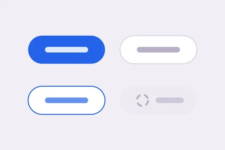
ブランドを説明するだけで、MeDoがボタンシステム全体を生成します — primary、secondary、ghost、destructiveの4バリアント、3つのサイズ、さらにhover、focus、ローディング、無効の各状態まで。1つのプロンプトで一貫したセットが完成します。

ボタン
ボタン

ボタンはデザインシステムのおよそ4分の1を占めます

これほど頻繁に使われるコンポーネントは他にありません。フォーム送信、CTA、確認ダイアログはすべてボタンを経由します。だからこそ、ここでの不統一は非常に目立ちます。製品内に少しずつ違うボタンが10種類あると、理由を言葉にできる前に「雑な作り」と伝わってしまいます。一つの説明からセット全体を一度に生成すれば、各バリアントは規律ではなく設計上の必然として、余白スケール・角丸・フォーカス処理を共有します。

6 個のテンプレート

生成できる ボタン テンプレート

どのテンプレートもスクリーンショットではなく実際のプロンプトです。任意の AI エディタに貼り付けるか、MeDo で実行して React + Tailwind のコードを受け取れます。

BasicVariant Set

Four Roles, Three Sizes

The set you generate first and edit for a year. Roles rather than colors, so a rebrand moves one token instead of forty class strings.

Create a reusable button component with four role-based variants: primary as a solid brand fill with white text, secondary as a white surface with a grey border, ghost as transparent with a tinted background on hover, and destructive as a solid red. Support sm at 32px tall, md at 40px and lg at 48px, plus a fullWidth prop. Wire hover, active, focus-visible, disabled and loading states for every variant, keeping the focus ring on focus-visible only so mouse clicks do not draw it. Render a real button element with an explicit type attribute, and drive all four variants from one shared spacing and radius scale rather than per-variant values.
MeDoで試す
IconsIcon + Label

Leading and Trailing Icon Slots

Two slots, one gap token. Most icon bugs are spacing bugs — an icon glued to its label, or optically misaligned because the SVG box is taller than the cap height.

Extend a button component with optional leading and trailing icon slots. Size the icon to 16px at sm and md and 18px at lg, set a consistent 8px gap between icon and label, and add aria-hidden="true" to the icon so screen readers announce the label only. Flip the slot order automatically under a right-to-left direction. Use inline-flex with items-center so the icon aligns to the label cap height rather than the line box, and give the SVG shrink-0 so a long wrapping label cannot squash it. Accept any React node so a spinner or an avatar can occupy the same slot.

MeDoで試す
LoadingAsync Submit

Loading Button With a Locked Width

A submit button that shrinks when the spinner replaces the label makes the whole form jump. Reserve the width and the click feels instant instead of broken.

Create a submit button with a loading prop. While loading, replace the label with a centered spinner but keep the button at its resting width by rendering the label at zero opacity underneath the spinner rather than removing it from the DOM. Set aria-busy="true" and aria-disabled="true", block repeat submissions, and keep the button focusable so a screen reader can still read the pending state. Respect prefers-reduced-motion by swapping the rotating spinner for a static pulsing dot. Add an optional loadingText prop that announces progress through a polite live region instead of changing the visible label.

MeDoで試す
ToolbarIcon Only

Square Icon Button With a Tooltip

Dense toolbars need it, and it fails accessibility more often than any other button. No visible text means the accessible name has to come from somewhere explicit.

Create an icon-only button for a dense toolbar: a square target at 32px, 36px and 40px with the icon centered and no label. Require an ariaLabel prop and render it as aria-label on the button, since there is no visible text to name the control. Expand the hit area to at least 44px with a negative-margin pseudo-element so touch targets meet the minimum without widening the toolbar. Pair it with a tooltip that appears on hover and on keyboard focus, referenced with aria-describedby so the tooltip supplements the label rather than replacing it. Include a pressed state driven by aria-pressed for toggle uses.

MeDoで試す
GroupSplit Action

Split Button With a Menu Half

One default action plus a menu of alternates — Save and Save as, Deploy and Deploy to staging. Two buttons that must look like one and stay independently reachable.

Create a split button: a primary action on the left and a narrow chevron trigger on the right, joined into one visual unit with a 1px divider, the outer corners rounded and the inner corners square. Render them as two separate button elements so each keeps its own accessible name, giving the chevron a label such as "More save options". Wire the chevron to a menu with aria-haspopup="menu" and aria-expanded, opening on click and on ArrowDown, closing on Escape with focus returned to the trigger. Keep the focus ring visible on each half by drawing it outside the shared border rather than inside it.

MeDoで試す
PolymorphicLink as Button

Anchor With Button Styling

A styled div with an onClick is not a button and a button that navigates is not a link. One asChild prop keeps the styling while the correct element still ships.

Create a polymorphic button that accepts an asChild prop and forwards its variant, size and state classes onto a child element, so a Next.js Link or a plain anchor can carry button styling without nesting an interactive element inside a button. Forward the ref, merge className rather than overwriting it, and skip the type attribute when the rendered element is not a button. When the target is an anchor, omit the disabled attribute — which anchors ignore — and instead drop href and set aria-disabled with pointer-events none. Add an external variant that appends rel="noopener noreferrer" and a visually hidden "opens in a new tab" note.

MeDoで試す

ボタン をカスタマイズする方法

色ではなくバリアントを定義する

色ではなく役割でバリアントを指定しましょう — primary、secondary、ghost、destructive。役割ベースの命名はリブランドを乗り越えます。ブランドカラーが変わっても「primary」の意味は同じで、変更が必要なのはトークン1つだけです。

ローディング状態を明示的に指定する

スピナーはラベルを置き換えつつボタンの幅を維持する、と明記しましょう。そうしなければ送信中にボタンが縮み、周囲のレイアウトが跳ねます — 生成されたUIで最も多い仕上げ不良の一つです。

focusではなくfocus-visibleを指定する

:focusのリングはマウスクリックでも発火し、バグのように見えます。:focus-visibleを指定すれば、リングはキーボードや支援技術の利用者にのみ表示されます。アクセシビリティ監査が実際に確認するのはこちらです。

disabledのセマンティクスを決める

無効なボタンにdisabled属性を使うかaria-disabledを使うかを決めましょう。属性はフォーカスを含むすべてのイベントをブロックします。aria-disabledはフォーカス可能なまま残るため、スクリーンリーダーが利用できない理由を読み上げられます。どちらが必要か伝えてください。

ボタン コンポーネントを使うのは誰か

SaaSプロダクト

トライアルのCTAにはprimary、「デモを予約」にはsecondary、カード内の第三階層リンクにはghost、アカウント削除にはdestructive — すべて同じ角丸とフォーカスリングを共有するため、UI全体が一つの製品として読めます。

Eコマースストア

在庫確認中にローディング状態を見せる高コントラストの「カートに追加」ボタンと、注意を奪い合わない控えめな「後で保存」のsecondaryバリアント。

ダッシュボード・管理ツール

密度の高いツールバーには、標準サイズのアクションボタンと並ぶ小さなアイコンのみのボタン(アクセシブルなラベル付き)が必要です。smからlgまでの一つのサイズスケールがあれば、その場しのぎのスタイルを作らずツールバーを引き締められます。

マーケティングLP

ファーストビューに大きなprimaryボタンを1つ置き、ページ下部で繰り返します。コンバージョンではなくスクロールを促す副次リンク「仕組みを見る」にはghostバリアントを使います。

サイト種別ごとの ボタン パターン

同じ ボタン コンポーネントを、掲載するサイトの種類に合わせて調整します。

01 / 06

SaaS Product Buttons

One primary per screen is the rule that keeps a product feeling directed. Everything else drops to secondary or ghost, and destructive stays reserved for irreversible actions so a red button always means the same thing. The moment two primaries appear in one view, users start reading the layout instead of acting on it.

ボタン のスタイルとバリアント

ページ全体のトーンに合うバリアントを選び、そのまま生成します。

01 / 06

Solid Button

A filled surface with white or near-white text, carrying the highest visual weight on the page. Check the contrast against the fill rather than the page background, and remember that a lightened hover state can quietly drop a passing 4.5:1 pairing below the line.

React・Next.js・Vue・Svelte での ボタン

React、Next.js、Vue 3、SvelteKit、Astro、素の HTML — 同じ ボタン を 6 通りの方法で組み込めます。

01 / 06

React Button

Derive the class string from variant and size lookups instead of chained ternaries, and forward the ref so tooltips and popovers can anchor to the element. Spread the remaining props last so a caller can still pass type or aria attributes through.

src/components/Button.tsx

export const Button = forwardRef(function Button(
  { variant = 'primary', size = 'md', loading, ...props },
  ref
) {
  return (
    <button
      ref={ref}
      type="button"
      aria-busy={loading}
      className={cn(base, variants[variant], sizes[size])}
      {...props}
    />
  )
})

ボタン をプロジェクトに追加する方法

ボタン テンプレートを選んで本番に載せるまでの 4 ステップ。

01~30s

Pick a Button Template

Scan the six templates and start from the closest surface — the full variant set for a design system, the async submit for a form, the icon-only for a toolbar.

02~10s

Copy the Prompt

Take the prompt into MeDo, Lovable, Bolt, v0 or Cursor. Swap in your brand color, radius and font before you run it, since those three values are what every variant inherits.

03~1min

Generate and Refine

You get React + Tailwind back with a live preview. Follow up in plain English — "add an xs size", "make the disabled state use aria-disabled" — rather than hand-editing the class lookups.

04~2min

Replace Your Ad-Hoc Buttons

Import one Button and delete the one-off styles it supersedes. The value is in the variants sharing a spacing scale and focus ring by construction, which only holds if nothing else on the page is styling its own button.

ボタンに関するよくある質問

AIでボタンコンポーネントを生成するには?

必要なバリアント、サイズ、状態を1つのプロンプトで説明してください — 例えば「primary、secondary、ghostのバリアントを3サイズで、hover、disabled、loading状態付き」 — MeDoがすべての組み合わせを組み込んだ完全なコンポーネントを生成します。ハードコードされた単一のボタンではなく、セット全体をカバーする1ファイルが得られます。

デザインシステムに必要なボタンバリアントは?

ほとんどの製品には4つ必要です:画面上で最も重要なアクション用のprimary、補助アクション用のsecondary、密度の高いUI内で強調を抑えたいアクション用のghostまたは第三階層、そして取り消せない操作用のdestructive。これ以上増やす場合、多くはスタイル不足ではなく階層設計の問題を示しています。

AIはアクセシブルなボタンを生成できますか?

はい。MeDoは明示的なtype属性を持つ本物のbutton要素、focus-visibleリング、アイコンのみのボタンへのアクセシブルネーム、スクリーンリーダーが正しく読み上げる無効状態を生成します。プロンプトでアクセシビリティに触れれば、ローディング中のaria-busyも追加します。

ボタンにローディング状態を追加するには?

ラベルをスピナーに置き換えつつボタン幅を固定し、操作を無効化し、支援技術が待機状態を読み上げられるようaria-busyを設定するloadingプロパティを依頼してください。忘れられがちなのは幅の固定です — これがないとクリックごとにページが再レイアウトされます。

ボタンはbuttonにすべきかlinkにすべきか?

画面遷移するならanchor、アクションを実行するならbuttonです。どの挙動が必要かをMeDoに伝えれば正しい要素をレンダリングします。ルーティングリンクにボタンのスタイルを当てたい場合は、asChild相当の抜け道も用意されています。

既存のブランドに合わせたボタンを生成できますか?

はい。プロンプトでブランドカラー、角丸半径、フォント、既存の余白スケールを渡せば、生成される各バリアントがそれらを一貫して使用します。既存のコードベースからボタンを貼り付けて、完全なバリアントセットに拡張するよう依頼することもできます。