MeDo

AI साइडबार जनरेटर।

जिस साइडबार की आपको ज़रूरत है उसे बताएं — नेविगेशन लिंक, नेस्टेड मेन्यू, फ़िल्टर या विजेट — और MeDo सेकंडों में क्लीन, प्रोडक्शन-रेडी कोड जनरेट करता है। कोई स्कैफ़ोल्डिंग नहीं, कोई बॉयलरप्लेट नहीं।

साइडबार
साइडबार

एक अच्छी तरह से डिज़ाइन किया गया साइडबार हर जटिल ऐप की रीढ़ है

साइडबार सिर्फ़ लिंक नहीं दिखाते — वे आपके ऐप की सूचना पदानुक्रम को परिभाषित करते हैं, नेविगेशन की परेशानी कम करते हैं और उपयोगकर्ताओं को हर गहराई पर दिशा देते हैं। खराब संरचित साइडबार उपयोगकर्ताओं को संदर्भ खो देने और फ़्लो छोड़ने पर मजबूर करती है। AI-जनरेटेड संरचना के साथ शुरू से ही सही करें जो दर्शाती है कि आपके उपयोगकर्ता वास्तव में कैसे सोचते हैं।

6 टेम्पलेट

साइडबार टेम्पलेट जो आप जेनरेट कर सकते हैं

हर टेम्पलेट एक असली प्रॉम्प्ट है, स्क्रीनशॉट नहीं। इसे किसी भी AI एडिटर में कॉपी करें, या MeDo में चलाकर React + Tailwind कोड सीधे पाएं।

App shellAcme

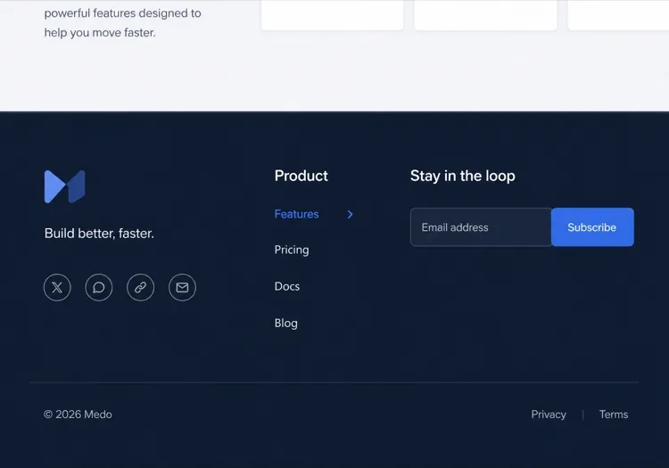
Fixed 240px Nav With Nested Sections

The dashboard default: icon plus label rows, two levels of nesting, a user block pinned to the bottom. Persist which sections are expanded, or the sidebar resets its shape on every page load.

Create a fixed 240px sidebar for an app shell: logo at the top, then icon-and-label rows for Dashboard, Analytics, Content and Settings, with Analytics and Content expanding into two or three nested sub-items behind a chevron that rotates 90 degrees when open. Mark the active route with aria-current="page", a left accent bar and a tinted row background, and auto-expand the section containing it on load. Persist expanded sections in localStorage. Pin a user block with avatar, name and workspace to the bottom with margin-top auto. Below 1024px, hide the sidebar off-canvas and open it as a drawer from a header toggle.

MeDo में आज़माएं
CollapsibleMega

Rail That Expands to Full Width

Toggles between a 64px icon rail and a 240px labelled panel. Icons alone are not self-explanatory — without tooltips in the collapsed state, users learn the rail by clicking things at random.

Create a collapsible sidebar that toggles between a 64px icon rail and a 240px expanded panel, animating the width over 200ms with a transform-friendly transition and no layout thrash on the main content. In the collapsed state, center each icon, hide the labels, and show the label as a tooltip on hover and on keyboard focus so the icons are not guesswork. Keep the toggle button at the bottom of the rail with aria-expanded and a chevron that mirrors direction. Persist the collapsed state in localStorage and honour it during server rendering so the panel does not flash open on load.

MeDo में आज़माएं
Docs TOCDocs

Scroll-Spy Table of Contents

A full documentation tree with the current heading tracked as you scroll. The hard part is not the highlight — it is keeping the active item inside the sidebar's own scroll viewport on load.

Create a documentation sidebar showing a full table of contents: six collapsible guide groups with four to eight page links each, the current page marked with aria-current="page", and beneath it an on-page heading list tracked by an IntersectionObserver so the visible section highlights as the reader scrolls. Give the sidebar its own overflow-y-auto scroll container with the header height subtracted from its max height, and scroll the active item into view on load using scrollIntoView with block: nearest so the page itself does not jump. Below 1024px, move the whole tree into a drawer.

MeDo में आज़माएं
FiltersShop

Faceted Filter Panel

Not navigation at all — a form that happens to sit in the left column. Each applied filter has to survive a page refresh, which means the URL is the state, not a hook.

Create a faceted filter sidebar for a product listing page: collapsible groups for Category with checkboxes and result counts, Price as a dual-handle range with numeric inputs, Brand as a searchable checkbox list capped at six visible items behind a Show all toggle, plus Rating and In stock. Reflect every applied filter in the URL query string so the filtered view is refreshable and shareable, and show applied filters as removable chips at the top with a Clear all. Announce the updated result count through an aria-live="polite" region. Below 1024px, present the whole panel as a bottom sheet behind a Filters button showing the active count.

MeDo में आज़माएं
Content railStudio

Sticky Article Companion

A right-hand rail on a blog or docs article carrying the table of contents, share links and related posts. Sticky positioning fails silently here if any ancestor has overflow set.

Create a sticky right-hand sidebar for a long article: an On this page heading list built from the h2 and h3 elements with the current section highlighted by an IntersectionObserver, a reading-time estimate, a vertical share row, and a three-item related-posts list at the bottom. Use position: sticky with a top offset equal to the header height, and make sure no ancestor of the sidebar sets overflow to hidden or auto, since that silently breaks sticky. Hide the rail entirely below 1280px and render the heading list as a collapsed details element above the article body instead.

MeDo में आज़माएं
Multi-levelShipfast

Three-Level Tree With Search

For CMS and admin tools where the tree is genuinely deep. Filtering the tree is what makes three levels usable — without a search field, level three is effectively unreachable.

Create a three-level sidebar tree for a CMS: a filter input at the top that matches labels at any depth and auto-expands the branches containing a match, then top-level sections each holding groups which hold page links. Indent each level by 12px with a hairline guide line rather than more padding, so depth stays readable at 240px. Support full keyboard traversal with arrow keys — down and up between visible rows, right to expand, left to collapse or move to the parent — and give each expandable row aria-expanded. Keep the active branch expanded across navigations.

MeDo में आज़माएं

अपने साइडबार को कैसे कस्टमाइज़ करें

अपनी सूचना गहराई से मिलान करें

5-8 सेक्शन वाले फ़्लैट ऐप्स के लिए, सिंगल-लेवल साइडबार ज़्यादा साफ़ होता है। एडमिन डैशबोर्ड या डॉक्यूमेंटेशन साइट जैसे गहरे ऐप्स के लिए, एक्सपैंड/कोलैप्स बिहेवियर के साथ 2-3 लेवल की नेस्टिंग का अनुरोध करें।

कोलैप्स बिहेवियर निर्दिष्ट करें

MeDo को बताएं कि साइडबार मोबाइल पर आइकन में कोलैप्स होना चाहिए, हैमबर्गर टॉगल के साथ ऑफ़-कैनवास स्लाइड करना चाहिए, या हमेशा दिखाई देना चाहिए। प्रत्येक पैटर्न अलग-अलग स्क्रीन साइज़ और उपयोग मामलों के लिए उपयुक्त है।

कॉन्टेक्स्टुअल विजेट जोड़ें

साइडबार सिर्फ़ नेविगेशन नहीं है — यूज़र प्रोफ़ाइल कार्ड, स्टोरेज यूसेज बार, नोटिफ़िकेशन बैज या क्विक-एक्शन बटन के लिए प्रॉम्प्ट करें ताकि इसे एक वास्तविक प्रोडक्टिविटी हब बनाया जा सके।

चौड़ाई और पिनिंग नियंत्रित करें

एक निश्चित साइडबार चौड़ाई (जैसे 240px) या रीसाइज़ करने योग्य पैनल निर्दिष्ट करें। लंबी कंटेंट वाले पेज के लिए, स्क्रॉल के साथ फ़ॉलो करने वाला स्टिकी साइडबार का अनुरोध करें ताकि नेविगेशन हमेशा पहुंच में रहे।

साइडबार कंपोनेंट का उपयोग कौन करता है

SaaS डैशबोर्ड

एडमिन और एनालिटिक्स डैशबोर्ड साइडबार का उपयोग यूज़र्स, रिपोर्ट्स, बिलिंग और सेटिंग्स जैसे मॉड्यूल को व्यवस्थित करने के लिए करते हैं — नेस्टेड सब-आइटम और अनरीड नोटिफ़िकेशन के बैज काउंटर के साथ।

डॉक्यूमेंटेशन साइट

डॉक्स साइट साइडबार पर निर्भर करती हैं पूरी विषय-सूची दिखाने के लिए, अक्सर प्रति गाइड कोलैप्सिबल सेक्शन और स्टिकी स्क्रॉल-स्पाई के साथ ताकि पाठक हमेशा जानें कि वे कहां हैं।

ई-कॉमर्स कैटेगरी फ़िल्टर

प्रोडक्ट लिस्टिंग पेज फ़ेसेटेड फ़िल्टरिंग के लिए साइडबार पैनल का उपयोग करते हैं — कैटेगरी, प्राइस रेंज, ब्रांड चेकबॉक्स — जिससे शॉपर्स पेज छोड़े बिना हज़ारों परिणामों को सीमित कर सकते हैं।

कंटेंट मैनेजमेंट सिस्टम

CMS इंटरफ़ेस साइडबार का उपयोग कंटेंट टाइप, ड्राफ़्ट, मीडिया लाइब्रेरी और पब्लिशिंग वर्कफ़्लो नेविगेट करने के लिए करते हैं, मुख्य कैनवास को एडिटिंग के लिए साफ़ रखते हुए।

अलग-अलग वेबसाइटों के लिए साइडबार पैटर्न

वही साइडबार कंपोनेंट, उस वेबसाइट के प्रकार के हिसाब से ढाला गया जहाँ वह लगेगा।

01 / 06

SaaS Dashboard Sidebar

The primary navigation for a logged-in product: sections, sub-items, badge counts and a user block at the bottom. Persist which groups are expanded — a sidebar that collapses back to its default shape on every page load makes the app feel like it forgets you.

साइडबार की शैलियाँ और वेरिएंट

जो वेरिएंट बाकी पेज से मेल खाता है उसे चुनें और जेनरेट करें।

01 / 06

Fixed Sidebar

Always visible at 240 to 280px, with the main content offset by the same width. The right default for a dashboard on desktop: navigation that never has to be summoned is navigation people actually use.

React, Next.js, Vue और Svelte में साइडबार

React, Next.js, Vue 3, SvelteKit, Astro या सादा HTML — वही साइडबार, जोड़ने के छह तरीके।

01 / 06

React Sidebar

Two pieces of state — the expanded groups and the mobile drawer — so keep both in the sidebar rather than lifting them to a layout provider. Take the current path as a prop so the component stays router-agnostic.

src/components/Sidebar.tsx

export function Sidebar({ sections, pathname }) {
  const [open, setOpen] = useState(() => activeGroup(sections, pathname))

  return (
    <aside className="w-60 shrink-0 overflow-y-auto">
      <nav aria-label="Sidebar">
        {sections.map((s) => (
          <Group key={s.id} section={s} expanded={open === s.id} />
        ))}
      </nav>
    </aside>
  )
}

अपने साइडबार को प्रोजेक्ट में कैसे जोड़ें

साइडबार टेम्पलेट चुनने से प्रोडक्शन में भेजने तक, चार चरण।

01~30s

Pick a Sidebar Template

Match it to what the column actually holds: app routes take the fixed nav, a docs tree takes scroll-spy, product facets take the filter panel. Those three have almost nothing in common beyond their position on screen.

02~10s

Copy the Prompt

Paste it into MeDo, Lovable, Bolt, v0 or Cursor with your real section names. Keep the persistence and mobile-drawer clauses — the localStorage state and the focus trap are the first things a trimmed prompt loses.

03~1min

Generate and Refine

You get React + Tailwind back with a live preview. Follow up in plain English — "add badge counts to Inbox", "collapse to an icon rail", "pin the user block to the bottom".

04~2min

Mount It in Your Layout

Put it in a nested layout — app/(app)/layout.tsx or +layout.svelte — beside a flex-1 main, not inside the page. Mounted per page it remounts on every navigation and loses its scroll position and expanded groups.

साइडबार के बारे में सामान्य प्रश्न

AI से साइडबार कैसे बनाएं?

MeDo खोलें, अपनी चाही हुई साइडबार को सादे टेक्स्ट में बताएं — लिंक स्ट्रक्चर, बिहेवियर (कोलैप्सिबल, स्टिकी, आइकन-ओनली) और कलर स्कीम सहित — और MeDo पूरा कंपोनेंट कोड जनरेट करता है। आप अपने प्रॉम्प्ट को रिफ़ाइन करके तब तक इटरेट कर सकते हैं जब तक यह आपकी कल्पना से बिल्कुल मेल नहीं खाता।

सबसे अच्छा AI साइडबार जनरेटर कौन सा है?

MeDo विशेष रूप से साइडबार जैसे पॉलिश्ड UI कंपोनेंट जनरेट करने के लिए बनाया गया है। जनरल-पर्पस कोड जनरेटर के विपरीत, MeDo लेआउट सेमेंटिक्स, रेस्पॉन्सिव बिहेवियर और डिज़ाइन सिस्टम समझता है — तो आपको एक साइडबार मिलता है जो काम करता है, न कि सिर्फ़ स्क्रीनशॉट में अच्छा दिखता है।

क्या AI से कोलैप्सिबल साइडबार जनरेट कर सकते हैं?

हां। बस अपने प्रॉम्प्ट में "कोलैप्सिबल" शामिल करें और कोलैप्स टारगेट निर्दिष्ट करें — आइकन-ओनली मोड, पूर्ण ऑफ़-कैनवास, या रीसाइज़ करने योग्य पैनल। MeDo JavaScript टॉगल लॉजिक और CSS ट्रांज़िशन अपने आप हैंडल करता है।

मोबाइल पर काम करने वाला रेस्पॉन्सिव साइडबार कैसे बनाएं?

MeDo से एक साइडबार जनरेट करने का अनुरोध करें जो ब्रेकपॉइंट (जैसे 768px) से नीचे की स्क्रीन पर हैमबर्गर-ट्रिगर्ड ड्रॉवर में कोलैप्स हो। जनरेटेड कंपोनेंट में मीडिया क्वेरी और टॉगल स्टेट मैनेजमेंट शामिल होते हैं ताकि यह शुरू से सही ढंग से काम करे।

क्या AI नेस्टेड मेन्यू आइटम वाला साइडबार जनरेट कर सकता है?

बिल्कुल। प्रॉम्प्ट में अपने मेन्यू की गहराई बताएं — उदाहरण के लिए, "एक दो-स्तरीय साइडबार जहां प्रत्येक टॉप-लेवल आइटम एनिमेटेड शेवरॉन के साथ 3 सब-आइटम दिखाने के लिए एक्सपैंड होता है" — और MeDo तदनुसार रिकर्सिव या फ़्लैट नेस्टेड स्ट्रक्चर जनरेट करता है।

क्या MeDo React और Next.js के लिए साइडबार कंपोनेंट सपोर्ट करता है?

हां। MeDo आपके द्वारा निर्दिष्ट फ़्रेमवर्क और भाषा में कंपोनेंट जनरेट करता है। TypeScript के साथ React फ़ंक्शनल कंपोनेंट, Next.js App Router लेआउट साइडबार, या प्लेन HTML/CSS/JS वर्शन का अनुरोध करें — आउटपुट आपके स्टैक के अनुसार अनुकूलित होता है।

अभी अपना साइडबार जेनरेट करें।

कोई भी प्रॉम्प्ट आज़माएं — मुफ्त, कोई साइन अप नहीं।