AI側邊欄生成器。

描述您需要的側邊欄 — 導航連結、巢狀選單、過濾器或小工具 — MeDo在幾秒內生成乾淨的、可投入生產的程式碼。無需腳手架,無需樣板程式碼。

側邊欄
側邊欄

精心設計的側邊欄是每個複雜應用的骨幹

側邊欄遠不止是列出連結 — 它們定義應用的資訊層級,減少導航摩擦,並在每個深度保持使用者的方向感。結構不良的側邊欄會導致使用者迷失上下文並放棄流程。使用AI生成的結構從一開始就做對,反映使用者真實的思維方式。

6 個模板

可以產生的 側邊欄 模板

每個模板都是真實的提示詞,而非截圖。複製到任何 AI 編輯器,或在 MeDo 中執行,直接取得 React + Tailwind 程式碼。

App shellAcme

Fixed 240px Nav With Nested Sections

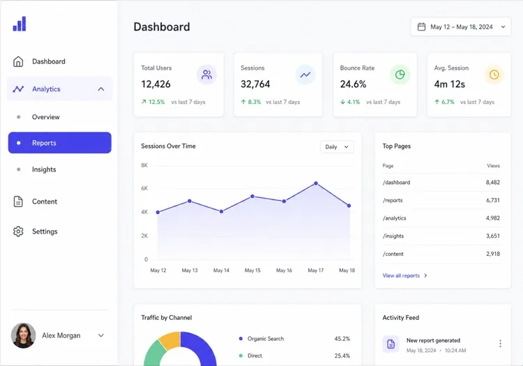
The dashboard default: icon plus label rows, two levels of nesting, a user block pinned to the bottom. Persist which sections are expanded, or the sidebar resets its shape on every page load.

Create a fixed 240px sidebar for an app shell: logo at the top, then icon-and-label rows for Dashboard, Analytics, Content and Settings, with Analytics and Content expanding into two or three nested sub-items behind a chevron that rotates 90 degrees when open. Mark the active route with aria-current="page", a left accent bar and a tinted row background, and auto-expand the section containing it on load. Persist expanded sections in localStorage. Pin a user block with avatar, name and workspace to the bottom with margin-top auto. Below 1024px, hide the sidebar off-canvas and open it as a drawer from a header toggle.

在 MeDo 中試試
CollapsibleMega

Rail That Expands to Full Width

Toggles between a 64px icon rail and a 240px labelled panel. Icons alone are not self-explanatory — without tooltips in the collapsed state, users learn the rail by clicking things at random.

Create a collapsible sidebar that toggles between a 64px icon rail and a 240px expanded panel, animating the width over 200ms with a transform-friendly transition and no layout thrash on the main content. In the collapsed state, center each icon, hide the labels, and show the label as a tooltip on hover and on keyboard focus so the icons are not guesswork. Keep the toggle button at the bottom of the rail with aria-expanded and a chevron that mirrors direction. Persist the collapsed state in localStorage and honour it during server rendering so the panel does not flash open on load.

在 MeDo 中試試
Docs TOCDocs

Scroll-Spy Table of Contents

A full documentation tree with the current heading tracked as you scroll. The hard part is not the highlight — it is keeping the active item inside the sidebar's own scroll viewport on load.

Create a documentation sidebar showing a full table of contents: six collapsible guide groups with four to eight page links each, the current page marked with aria-current="page", and beneath it an on-page heading list tracked by an IntersectionObserver so the visible section highlights as the reader scrolls. Give the sidebar its own overflow-y-auto scroll container with the header height subtracted from its max height, and scroll the active item into view on load using scrollIntoView with block: nearest so the page itself does not jump. Below 1024px, move the whole tree into a drawer.

在 MeDo 中試試
FiltersShop

Faceted Filter Panel

Not navigation at all — a form that happens to sit in the left column. Each applied filter has to survive a page refresh, which means the URL is the state, not a hook.

Create a faceted filter sidebar for a product listing page: collapsible groups for Category with checkboxes and result counts, Price as a dual-handle range with numeric inputs, Brand as a searchable checkbox list capped at six visible items behind a Show all toggle, plus Rating and In stock. Reflect every applied filter in the URL query string so the filtered view is refreshable and shareable, and show applied filters as removable chips at the top with a Clear all. Announce the updated result count through an aria-live="polite" region. Below 1024px, present the whole panel as a bottom sheet behind a Filters button showing the active count.

在 MeDo 中試試
Content railStudio

Sticky Article Companion

A right-hand rail on a blog or docs article carrying the table of contents, share links and related posts. Sticky positioning fails silently here if any ancestor has overflow set.

Create a sticky right-hand sidebar for a long article: an On this page heading list built from the h2 and h3 elements with the current section highlighted by an IntersectionObserver, a reading-time estimate, a vertical share row, and a three-item related-posts list at the bottom. Use position: sticky with a top offset equal to the header height, and make sure no ancestor of the sidebar sets overflow to hidden or auto, since that silently breaks sticky. Hide the rail entirely below 1280px and render the heading list as a collapsed details element above the article body instead.

在 MeDo 中試試
Multi-levelShipfast

Three-Level Tree With Search

For CMS and admin tools where the tree is genuinely deep. Filtering the tree is what makes three levels usable — without a search field, level three is effectively unreachable.

Create a three-level sidebar tree for a CMS: a filter input at the top that matches labels at any depth and auto-expands the branches containing a match, then top-level sections each holding groups which hold page links. Indent each level by 12px with a hairline guide line rather than more padding, so depth stays readable at 240px. Support full keyboard traversal with arrow keys — down and up between visible rows, right to expand, left to collapse or move to the parent — and give each expandable row aria-expanded. Keep the active branch expanded across navigations.

在 MeDo 中試試

如何自訂你的 側邊欄

匹配您的資訊深度

對於擁有5-8個區段的扁平應用,單級側邊欄更簡潔。對於管理面板或文件站點等深層應用,請指定2-3級巢狀並帶有展開/摺疊行為。

指定摺疊行為

告訴MeDo側邊欄應該在行動裝置摺疊為圖示、透過漢堡按鈕滑出畫布、還是始終可見。每種模式適合不同的螢幕尺寸和使用場景。

新增上下文小工具

側邊欄不僅僅是導航 — 要求使用者資料卡、儲存使用量條、通知徽章或快捷操作按鈕,使您的側邊欄成為真正的生產力中心。

控制寬度和固定

指定固定的側邊欄寬度(如240px)或可調整大小的面板。對於長內容頁面,要求一個跟隨捲動的黏性側邊欄,使導航始終可達。

誰在使用 側邊欄 組件

SaaS儀表板

管理和分析儀表板使用側邊欄來組織使用者、報告、帳單和設定等模組 — 帶有巢狀子項目和未讀通知的徽章計數器。

文件站點

文件站點依靠側邊欄展示完整的目錄,通常每個指南有可摺疊的區段和黏性的捲動監聽,讓讀者始終知道自己在哪裡。

電商分類過濾器

產品列表頁面使用側邊欄面板進行分面過濾 — 分類、價格範圍、品牌核取方塊 — 讓購物者無需離開頁面即可縮小數千個結果的範圍。

內容管理系統

CMS介面使用側邊欄來瀏覽內容類型、草稿、媒體庫和發布工作流程,保持主畫布乾淨用於編輯。

不同網站的 側邊欄 方案

同一個 側邊欄 組件,針對它所在網站的類型作調整。

01 / 06

SaaS Dashboard Sidebar

The primary navigation for a logged-in product: sections, sub-items, badge counts and a user block at the bottom. Persist which groups are expanded — a sidebar that collapses back to its default shape on every page load makes the app feel like it forgets you.

側邊欄 的風格與變體

挑選與頁面其餘部分相襯的變體,然後產生它。

01 / 06

Fixed Sidebar

Always visible at 240 to 280px, with the main content offset by the same width. The right default for a dashboard on desktop: navigation that never has to be summoned is navigation people actually use.

在 React、Next.js、Vue 與 Svelte 中使用 側邊欄

React、Next.js、Vue 3、SvelteKit、Astro 或純 HTML —— 同一個 側邊欄,六種接入方式。

01 / 06

React Sidebar

Two pieces of state — the expanded groups and the mobile drawer — so keep both in the sidebar rather than lifting them to a layout provider. Take the current path as a prop so the component stays router-agnostic.

src/components/Sidebar.tsx

export function Sidebar({ sections, pathname }) {
  const [open, setOpen] = useState(() => activeGroup(sections, pathname))

  return (
    <aside className="w-60 shrink-0 overflow-y-auto">
      <nav aria-label="Sidebar">
        {sections.map((s) => (
          <Group key={s.id} section={s} expanded={open === s.id} />
        ))}
      </nav>
    </aside>
  )
}

如何把 側邊欄 加入專案

四個步驟,從挑選 側邊欄 模板到推上生產環境。

01~30s

Pick a Sidebar Template

Match it to what the column actually holds: app routes take the fixed nav, a docs tree takes scroll-spy, product facets take the filter panel. Those three have almost nothing in common beyond their position on screen.

02~10s

Copy the Prompt

Paste it into MeDo, Lovable, Bolt, v0 or Cursor with your real section names. Keep the persistence and mobile-drawer clauses — the localStorage state and the focus trap are the first things a trimmed prompt loses.

03~1min

Generate and Refine

You get React + Tailwind back with a live preview. Follow up in plain English — "add badge counts to Inbox", "collapse to an icon rail", "pin the user block to the bottom".

04~2min

Mount It in Your Layout

Put it in a nested layout — app/(app)/layout.tsx or +layout.svelte — beside a flex-1 main, not inside the page. Mounted per page it remounts on every navigation and loses its scroll position and expanded groups.

關於 側邊欄 的常見問題

如何用AI建立側邊欄?

開啟MeDo,用純文字描述您想要的側邊欄 — 包括連結結構、行為(可摺疊、黏性、純圖示)和配色方案 — MeDo會生成完整的組件程式碼。您可以透過優化提示詞來迭代,直到完全符合您的設想。

最好的AI側邊欄生成器是什麼?

MeDo專門為生成側邊欄等精美UI組件而構建。與通用程式碼生成器不同,MeDo理解佈局語義、響應式行為和設計系統 — 所以您獲得的側邊欄是真正可用的,而不僅僅是截圖上好看的。

能用AI生成可摺疊的側邊欄嗎?

可以。只需在提示詞中包含「可摺疊」並指定摺疊目標 — 純圖示模式、完全畫布外或可調整大小的面板。MeDo會自動處理JavaScript切換邏輯和CSS過渡效果。

如何製作適用於行動裝置的響應式側邊欄?

要求MeDo生成在斷點(如768px)以下螢幕摺疊為漢堡觸發抽屜的側邊欄。生成的組件包含媒體查詢和切換狀態管理,可以立即正確運行。

AI能生成帶巢狀選單項目的側邊欄嗎?

完全可以。在提示詞中描述選單深度 — 例如「一個兩級側邊欄,每個頂級項目展開顯示3個帶動畫摺疊箭頭的子項目」 — MeDo會相應地生成遞迴或扁平巢狀結構。

MeDo支援React和Next.js的側邊欄組件嗎?

支援。MeDo以您指定的框架和語言生成組件。要求TypeScript的React函式組件、Next.js App Router佈局側邊欄或純HTML/CSS/JS版本 — 輸出會適配您的技術棧。